
Changes occurs in respiratory system during exercise
respiratory changes during exercise ventilation oxygen consumption
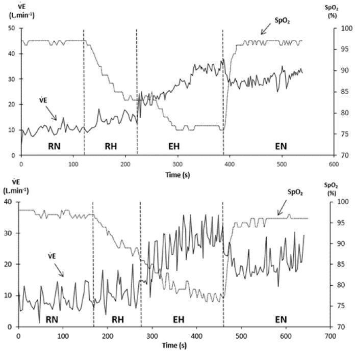
This physiological comparison chart displays breath-by-breath recordings of minute ventilation (VșE, L/min) and pulse oxygen saturation (SpO2, %) during a hypoxia exercise test across four phases: Resting Normoxia (RN), Resting Hypoxia (RH), Exercise Hypoxia (EH), and Exercise Normoxia (EN). The upper panel represents a subject with a high hypoxic ventilatory response (HVRe), while the lower panel shows a subject with a low HVRe. Both subjects exhibit a sharp decline in SpO2 during RH and EH, which recovers in the EN phase. The key educational focus is the respiratory stability difference during the EH phase: the high HVRe subject maintains a relatively stable, increasing VșE trend, whereas the low HVRe subject demonstrates pronounced periodic breathing, characterized by high-amplitude oscillations in minute ventilation and corresponding fluctuations in SpO2. These data illustrate the role of peripheral chemosensitivity in maintaining ventilatory stability under hypoxic stress and exercise conditions, relevant for studies in exercise physiology and high-altitude medicine.
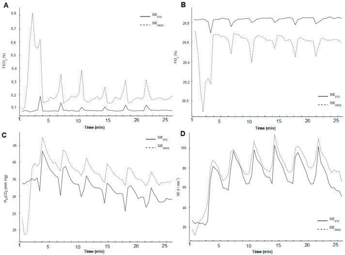
A set of four line graphs (A-D) comparing respiratory physiological parameters between standard short interval exercise (SIESTD, solid line) and exercise with acute respiratory distress syndrome ventilation simulation (SIEARDS, dashed line) over a 27-minute duration. (A) Fraction of inspired carbon dioxide (FiCO2 %): SIEARDS displays markedly elevated, cyclical peaks exceeding 0.6% early on, while SIESTD remains stable below 0.1%. (B) Fraction of inspired oxygen (FiO2 %): SIEARDS shows significant dips reaching 19.9% early in the session, consistently tracking lower than the stable baseline of SIESTD. (C) End-tidal partial pressure of CO2 (PETCO2 mmHg): Both protocols show an initial rise followed by a gradual decline, with SIEARDS maintaining consistently higher partial pressure values throughout the exercise bouts. (D) Ventilation (VE L·min⁻¹): Both protocols exhibit cyclical peaks corresponding to exercise intervals, with SIEARDS demonstrating higher peak ventilation and higher baseline values during recovery periods. This chart illustrates the impact of restricted ventilation on gas exchange dynamics and compensatory ventilatory responses during high-intensity interval training.
![This composite educational graphic details the physiological adjustments of the pulmonary and cardiovascular systems during prolonged exercise-induced dehydration and hyperthermia. On the left, a pathophysiology diagram centers on an anatomical illustration of the heart and lungs, surrounded by metabolic and respiratory equations. Red upward arrows indicate increases in ventilation (Vȩ), breathing frequency (fb), core temperature (Tc), and plasma catecholamines ([NA], [A]), signifying stimulatory effects (+) on central respiratory drive. Conversely, blue downward arrows indicate reductions in body fluids, arterial CO2 (PaCO2), and cardiac output (Q̇), with a (0) symbol noting factors that do not directly stimulate ventilation. The diagram illustrates how alveolar hyperventilation compensates for reduced systemic circulation to maintain oxygen uptake (VȩO2) and increase CO2 excretion (VȩCO2). On the right, a clinical photograph shows an endurance-trained participant in a laboratory setting, equipped with a metabolic mask, thoracic heart rate monitors, and peripheral arterial/venous catheters, demonstrating the experimental setup used to measure these cardiorespiratory variables during active exercise.](https://cdn.orris.care/cdss_images/pmc_clinical_VQA_84eb8c3aa8a501c894708214ada5837795a241c371fd4ae9697cba131aa53802.jpg)
This composite educational graphic details the physiological adjustments of the pulmonary and cardiovascular systems during prolonged exercise-induced dehydration and hyperthermia. On the left, a pathophysiology diagram centers on an anatomical illustration of the heart and lungs, surrounded by metabolic and respiratory equations. Red upward arrows indicate increases in ventilation (Vȩ), breathing frequency (fb), core temperature (Tc), and plasma catecholamines ([NA], [A]), signifying stimulatory effects (+) on central respiratory drive. Conversely, blue downward arrows indicate reductions in body fluids, arterial CO2 (PaCO2), and cardiac output (Q̇), with a (0) symbol noting factors that do not directly stimulate ventilation. The diagram illustrates how alveolar hyperventilation compensates for reduced systemic circulation to maintain oxygen uptake (VȩO2) and increase CO2 excretion (VȩCO2). On the right, a clinical photograph shows an endurance-trained participant in a laboratory setting, equipped with a metabolic mask, thoracic heart rate monitors, and peripheral arterial/venous catheters, demonstrating the experimental setup used to measure these cardiorespiratory variables during active exercise.
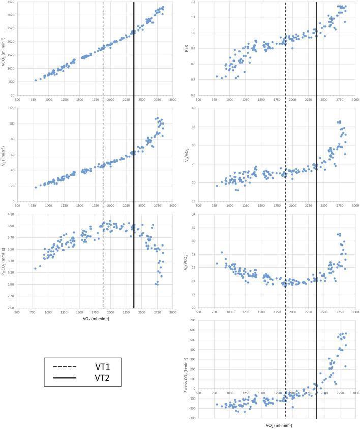
This diagnostic comparison chart displays six scatter plots illustrating respiratory gas exchange parameters from an incremental exercise test used for cardiopulmonary exercise testing (CPET). All plots use oxygen uptake (VO2 in ml/min) on the x-axis, ranging from 500 to 3000 ml/min. The vertical lines denote the first ventilatory threshold (VT1, dashed line) and the second ventilatory threshold (VT2, solid line). The y-axes measure: carbon dioxide output (VCO2), ventilation (VE), end-tidal CO2 pressure (PETCO2), respiratory exchange ratio (RER), the ventilatory equivalent for CO2 (VE/VCO2), and excess carbon dioxide output. Key physiological transitions are visible: VT1 typically corresponds to the point where VE/VO2 and PETCO2 begin to increase, while VT2 (the respiratory compensation point) is marked by a rapid, non-linear increase in VE, RER exceeding 1.0, and a secondary sharp rise in excess CO2 output. This chart is a standard tool in sports medicine and clinical physiology for assessing aerobic capacity and determining metabolic transition zones.
Respiratory Changes During Exercise
1. Ventilatory Changes
Minute Ventilation (VE)
- VE rises throughout exercise due to increases in both tidal volume (VT) and respiratory rate (RR)
- Tidal volume increases first and plateaus at 50-60% of vital capacity, after which further increases in VE are driven by rising RR
- At peak exercise, VE is typically less than 80% of the predicted maximum (estimated as MVV or FEV1 × 40), meaning healthy individuals retain a ventilatory reserve
- Murray & Nadel's Textbook of Respiratory Medicine, p. 793
Respiratory Rate (RR)
- Increases progressively throughout exercise
- At mild-moderate exercise, rate increases modestly; at high intensities (above the ventilatory threshold), RR accelerates sharply
Dead-Space Fraction (VD/VT)
- Decreases from 0.3-0.4 at rest to less than 0.3 at peak exercise
- This occurs because increased tidal volume and recruitment of pulmonary vasculature (from increased pulmonary blood flow) reduce wasted ventilation
- Murray & Nadel's Textbook of Respiratory Medicine, p. 793
2. Gas Exchange Changes
Oxygen Consumption (VO2)
- VO2 increases linearly with workload from ~250 mL/min at rest, plateauing at VO2max at maximum effort
- Sedentary individuals: VO2max ~30-40 mL/kg/min; elite athletes: 80-90 mL/kg/min
- With intensive training, unfit subjects can increase VO2max by 15-25%
- Murray & Nadel's Textbook of Respiratory Medicine, p. 791
Carbon Dioxide Output (VCO2)
- In early exercise, VCO2 increases linearly (similar rate to VO2)
- Above the ventilatory threshold, VCO2 rises more steeply as bicarbonate buffering of accumulating lactate generates extra CO2 beyond aerobic metabolism alone
- Murray & Nadel's Textbook of Respiratory Medicine, p. 791
Respiratory Exchange Ratio (R = VCO2/VO2)
- Remains stable at 0.8-0.9 in early to mid-exercise
- Rises above 1.0 at high intensities (above ventilatory threshold) due to extra CO2 released from bicarbonate buffering
- Murray & Nadel's Textbook of Respiratory Medicine, p. 791
Arterial PCO2
- Remains constant and near normal during early-moderate exercise because alveolar ventilation rises proportionally with VCO2
- After the ventilatory threshold, ventilation rises out of proportion to VCO2 so arterial PCO2 decreases - at VO2max, values are nearly always less than 40 mmHg
- Murray & Nadel's Textbook of Respiratory Medicine, p. 793
Arterial PO2 and Oxygen Saturation
- Below the ventilatory threshold: end-tidal PO2, arterial PO2, and SpO2 remain normal
- At high intensities in healthy individuals: modest widening of the alveolar-arterial oxygen gradient may occur due to diffusion limitation and mild V/Q mismatch
- Arterial oxygen saturation is generally preserved throughout exercise in healthy people
3. The Ventilatory Threshold (Anaerobic Threshold)
- As exercise intensity rises, a point is reached (the first ventilatory threshold / anaerobic threshold) where lactic acid accumulation exceeds the buffering capacity
- Bicarbonate buffers the excess lactate: H+ + HCO3- → H2O + CO2
- This generates extra CO2, stimulating disproportionate hyperventilation
- VE/VO2 and VE/VCO2 (ventilatory equivalents) both rise sharply
- Beyond this, a second ventilatory threshold (respiratory compensation point) is reached where rising lactate can no longer be buffered and pH falls rapidly, driving further hyperventilation
- Murray & Nadel's Textbook of Respiratory Medicine, p. 792
4. Ventilatory Equivalents (VE/VO2 and VE/VCO2)
- Both ratios remain relatively steady at ~24-30 through early exercise
- After the ventilatory threshold, both rise, peaking around 35-40 at peak exercise
- VE/VO2 rises slightly more than VE/VCO2
- Murray & Nadel's Textbook of Respiratory Medicine, p. 793
5. Pulmonary Circulatory Changes
- Pulmonary arterial pressure rises only modestly due to recruitment and distension of the pulmonary vasculature and a net decrease in pulmonary vascular resistance
- Increased pulmonary blood flow improves ventilation-perfusion matching and reduces physiological dead space
- Murray & Nadel's Textbook of Respiratory Medicine, p. 793
6. Control of Ventilation During Exercise
| Mechanism | Timing | Role |
|---|---|---|
| Central command (cortical drive) | Immediate onset | Anticipatory rise in ventilation even before metabolic changes |
| Mechanoreceptors (muscles/joints) | Early exercise | Afferent signals from moving limbs stimulate respiratory centers |
| Peripheral chemoreceptors (carotid bodies) | Throughout | Respond to rising CO2, falling O2, and falling pH |
| Central chemoreceptors (medulla) | Slower onset | Respond to rising PCO2 / H+ in CSF |
| Lactate/H+ excess | Above threshold | Drives the late, steep rise in ventilation |
7. Summary Table
| Parameter | Change During Exercise |
|---|---|
| Tidal volume | Increases (up to 50-60% of VC) |
| Respiratory rate | Increases (especially above threshold) |
| Minute ventilation | Increases markedly |
| Dead-space fraction (VD/VT) | Decreases (0.3-0.4 → <0.3) |
| Arterial PCO2 | Maintained early; decreases at high intensity |
| Arterial PO2 | Maintained throughout (in healthy subjects) |
| VO2 | Increases linearly with workload |
| VCO2 | Increases; steep rise above ventilatory threshold |
| Respiratory exchange ratio (R) | 0.8-0.9 early, rises >1.0 at high intensity |
| Pulmonary arterial pressure | Modest rise |
| Ventilatory equivalents | Rise after ventilatory threshold |
Visual Reference
Brown squared syndrome
Brown syndrome superior oblique tendon sheath eye movement restriction
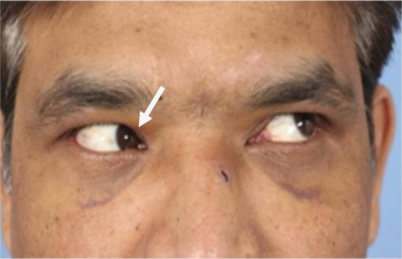
A clinical photograph of an adult male patient demonstrating extraocular muscle restriction during a diagnostic gaze test. The patient is attempting a superior-lateral (upper left) gaze. While the left eye successfully abducts and elevates, the right eye exhibits a failure to elevate during adduction, a clinical sign often associated with Brown syndrome or mechanical entrapment. A white arrow points to the right eye's medial canthus area, highlighting the restricted elevation. Visible periorbital ecchymosis (bruising) and swelling are present infraorbitally bilaterally, consistent with trauma or recent maxillofacial surgery. A faint horizontal surgical scar is visible on the left side of the face. This visual represents an orthoptic assessment of a patient with a nasoorbitoethmoidal (NOE) fracture, specifically illustrating preoperative diplopia and ocular motility deficits secondary to facial trauma. The image is intended for educational use in ophthalmology and trauma surgery to demonstrate mechanical restriction of the inferior oblique or superior oblique tendon complex.
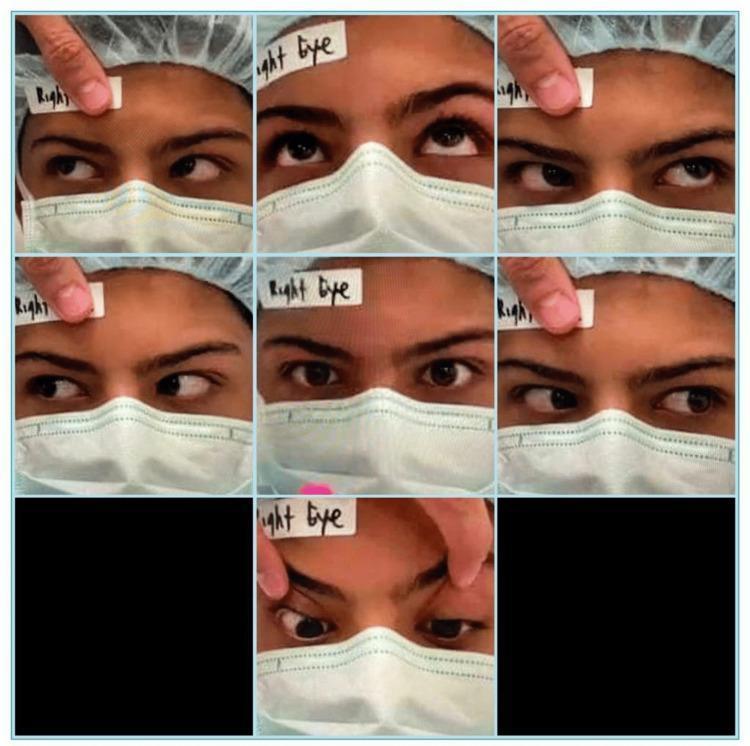
Clinical photograph showing a preoperative orthoptic assessment of a 15-year-old male. The composite image displays a 3x3 grid (with seven active frames) documenting the nine cardinal positions of gaze. The patient is wearing a surgical cap and mask, with a 'Right Eye' label on the forehead for orientation. The assessment demonstrates a limitation of elevation in the right eye, most prominent when the eye is in an adducted position (looking toward the nose and up), characteristic of Brown syndrome. Specifically, in the top-left frame (leversion and elevation), the right eye shows a failure to elevate compared to the left eye, resulting in a vertical misalignment (hypotropia). The central frame shows orthotropia in the primary position. This visual documentation supports the diagnosis of traumatic Brown syndrome involving the superior oblique tendon, illustrating the classic mechanical restriction of the inferior oblique muscle's action during adduction.
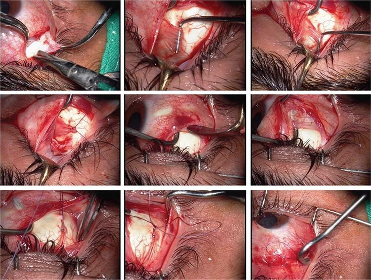
A series of nine intraoperative clinical photographs illustrating a modified Harada-Ito procedure with an adjustable suture technique for the treatment of superior oblique muscle palsy. The images depict a surgical field of the human eye, showing the temporal and superior aspects of the sclera following conjunctival peritomy. Key anatomical structures visible include the sclera, conjunctiva, eyelashes, and the superior oblique tendon. The sequence demonstrates the identification and isolation of the anterior fibers of the superior oblique tendon using muscle hooks. Surgical instrumentation, including forceps, Westcott scissors, and various retractors, are used to manipulate the extraocular tissue. Non-absorbable sutures are shown being placed through the anterior portion of the superior oblique tendon and anchored more anteriorly and laterally on the sclera to achieve torsion correction. The final frames highlight the adjustable suture loop, allowing for postoperative alignment modification. This surgical montage is an educational resource for ophthalmic surgeons and residents, demonstrating the technical steps for correcting excyclotorsion through the selective advancement of the superior oblique tendon fibers.
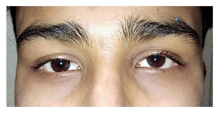
A clinical photograph focusing on the periorbital region and eyes of a patient, demonstrating clinical improvement after 4 weeks of oral steroid therapy (1 mg/kg) for idiopathic acquired superior oblique (SO) palsy. The image shows the eyes in primary gaze with relatively symmetrical alignment. The irises are dark brown, and the sclera appears clear and non-icteric. There is a slight residual hyperdeviation of the left eye compared to the right, consistent with resolving hypertropia. The eyelids and surrounding skin are free of inflammatory signs, redness, or swelling. A small blue marking is visible on the patient's right eyebrow, likely a clinical marker for follow-up or examination. The visual illustrates the therapeutic response in a case of steroid-responsive cranial nerve palsy, where clinical features such as diplopia and ocular misalignment are being monitored during treatment tapering.
Brown (Superior Oblique Tendon Sheath) Syndrome
Anatomy - Why This Tendon?
Classification
True Brown Syndrome (always congenital)
- Congenital shortening or rigidity of the superior oblique tendon sheath
- The tendon physically cannot pass through the trochlea in normal fashion
Simulated Brown Syndrome
- Idiopathic
- "Congenital click syndrome" - impaired movement of the superior oblique tendon through the trochlea, sometimes with a palpable/audible click
- Thickening of the posterior tendon
- Firm attachment of the posterior sheath to the tendon
- Trauma to the trochlea or superior oblique tendon
- Inflammation of the tendon: rheumatoid arthritis, pansinusitis, scleritis
- Orbital floor fracture, frontal-ethmoidal fracture, crush fracture of nasal bones
- Sinusitis or frontal sinus surgery
- Surgical tucking of the superior oblique tendon (iatrogenic)
Clinical Features
Cardinal Sign
Severity Classification
| Grade | Primary Position | Adduction Finding |
|---|---|---|
| Mild | Orthotropia (straight) | No down-shoot; just limited elevation in adduction |
| Moderate | Orthotropia | Down-shoot in adduction (eye moves inferiorly when adducted) |
| Severe | Hypotropia | Down-shoot in adduction + abnormal head posture |
Associated Features
- Widening of palpebral fissure on attempted elevation in adduction (as the eye pulls back in the orbit against the restriction)
- Positive forced duction test - passive elevation of the eye in adduction is restricted (key diagnostic finding)
- Chin-up head posture in severe cases (to maintain binocular fusion)
- Face turn away from the affected eye in severe cases
- The eye is typically orthotropic (straight) in the primary position in mild-moderate cases - unlike inferior oblique palsy
- No overaction of the superior oblique (distinguishes it from inferior oblique palsy)
- V-pattern may be present
Key Clinical Photo
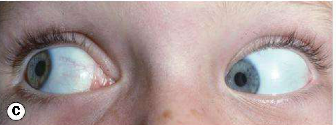
Diagnosis
| Test | Finding in Brown Syndrome |
|---|---|
| Forced duction test | Positive - restricted passive elevation in adduction (key test) |
| Cover test (primary position) | Usually orthophoric (mild/moderate) or hypotropia (severe) |
| Versions | Limitation of elevation in adduction only; free in all other positions |
| Prism cover test | Measures any vertical deviation |
| Hess chart / Lees screen | Shows limitation of elevation in adduction |
Distinguishing Brown from Inferior Oblique Palsy
| Feature | Brown Syndrome | Inferior Oblique Palsy |
|---|---|---|
| Elevation in adduction | Restricted | Restricted |
| Forced duction | Positive (mechanical) | Negative (paretic) |
| Superior oblique overaction | Absent | Present |
| Down-shoot in adduction | Present (moderate/severe) | Absent |
| Primary position | Usually ortho | Often hypotropia |
Treatment
Congenital Brown Syndrome
- Most cases do not require treatment as long as binocular function is maintained with an acceptable head posture
- Spontaneous improvement is often seen towards the end of the first decade of life
- Indications for surgery: significant primary position hypotropia, deteriorating control, or an unacceptable head posture
- Procedure of choice: lengthening (tenotomy or tenectomy) of the superior oblique tendon
Acquired Brown Syndrome
- Treat the underlying cause first
- Steroids (oral or injection near the trochlea) may help if inflammatory aetiology (e.g., rheumatoid arthritis, tenosynovitis)
- If persistent and symptomatic, surgical intervention may be needed
Key Points to Remember
- Hallmark = limitation of elevation in adduction with positive forced duction test
- Congenital form is most common; acquired is rarer but important (think RA, trauma, sinusitis)
- The trochlea is the anatomical key - restriction at this pulley causes the syndrome
- Primary position is usually straight (unlike many other ocular motility disorders)
- Congenital cases often improve spontaneously and usually do not need surgery
- Surgical treatment is superior oblique tendon lengthening, NOT weakening of the inferior oblique
Cerebellum 15 mark answ
cerebellum anatomy lobes fissures diagram
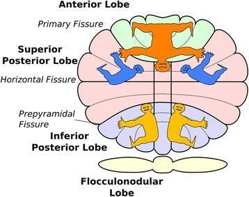
This anatomical and functional diagram illustrates the somatotopic organization of the human cerebellum across its four primary lobes: the Anterior Lobe, Superior Posterior Lobe, Inferior Posterior Lobe, and Flocculonodular Lobe. Key anatomical landmarks identified include the Primary Fissure (separating the anterior and posterior lobes), the Horizontal Fissure, and the Prepyramidal Fissure. The diagram features stylized homunculi representing multiple body maps within the cerebellar cortex. An inverted orange homunculus is shown in the Anterior Lobe, representing the primary sensorimotor map. In the Superior Posterior Lobe, secondary representations are depicted in blue. The Inferior Posterior Lobe contains a third upright representation shown in yellow. Specialized finger representations are localized within Lobule VI (indicated by pink shading). This illustration highlights the discrete spatial arrangement of body part representations—somatotopy—across different cerebellar lobules, which is essential for understanding the organ's role in motor planning, sequence detection, and cognitive processes like arithmetic and language. The vertical arrangement demonstrates the topographical relationship between the anatomical fissures and the functional sensory/motor areas.
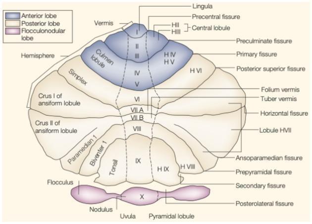
This anatomical diagram presents a flattened or unfolded view of the human cerebellar cortex, illustrating the topographical arrangement of its lobes, fissures, and lobules. The map is divided into three primary regions: the Anterior Lobe (blue), the Posterior Lobe (beige), and the Flocculonodular Lobe (pink/purple). The central vertical axis represents the vermis (lobules I-X), flanked by the cerebellar hemispheres (labeled with H prefixes). Key landmarks include the primary fissure, which separates the anterior lobe (lobules I-V) from the posterior lobe (lobule VI and below), and the posterolateral fissure, which demarcates the flocculonodular lobe (lobule X). Notable lobules identified include the lingula, central lobule, culmen, simplex, crus I and II of the ansiform lobule, paramedian, biventer, tonsil, and uvula. Major anatomical fissures such as the precentral, preculminate, horizontal, ansoparamedian, and secondary fissures are precisely mapped to show the structural boundaries essential for neuroanatomical study and functional localization of motor and cognitive centers within the cerebellum.
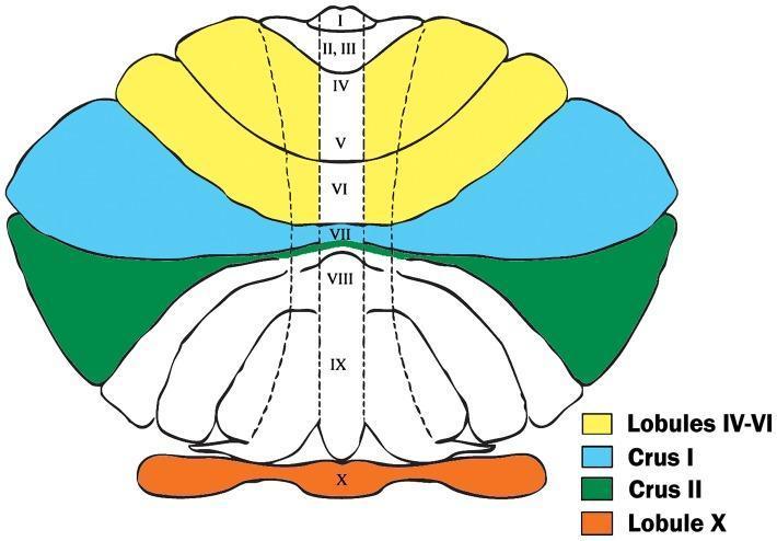
Anatomical diagram representing a Larsell flatmap of the human cerebellum, color-coded to highlight four specific regions of interest (ROIs) for clinical study. The flatmap unfolds the cerebellar cortex into a two-dimensional view to illustrate the relationship between lobules and fissures. The yellow-shaded area identifies hemispheric lobules IV-VI in the anterior and superior posterior lobes, bordered by the preculminate and superior posterior fissures. The light blue region represents Crus I, delineated by the superior posterior and horizontal fissures. Below this, the green-shaded area indicates Crus II, bounded by the horizontal and ansoparamedian fissures. At the inferior-most pole, the orange region highlights Lobule X (flocculonodular lobe), separated by the posterolateral fissure. The central vermis is labeled with Roman numerals I-X, showing the midline organization. This visual aid is primarily used in neuroanatomical research and clinical imaging studies to define boundaries for stereological assays, particularly in investigations related to Purkinje cell density and neurodevelopmental disorders like autism.
cerebellar circuit Purkinje cell deep nuclei cortical layers histology
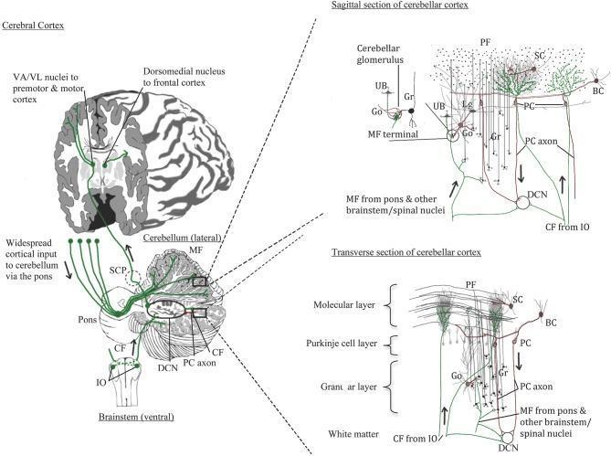
Anatomical diagrams illustrating normal human cerebellar neurocircuitry and cortical microarchitecture. The left panel shows a macro-level view of the pathways between the cerebral cortex, brainstem (pons and inferior olivary nucleus), and cerebellum. It identifies the Superior Cerebellar Peduncle (SCP) and the Deep Cerebellar Nuclei (DCN). The right panel features detailed sagittal and transverse sections of the cerebellar cortex, organized into the molecular layer (ML), Purkinje cell layer (PCL), and granular layer (GL) above the white matter. Key cell types depicted include Purkinje cells (PC) with elaborate dendritic arbors, granule cells (Gr) forming parallel fibers (PF), stellate cells (SC), basket cells (BC), Golgi cells (Go), Lugaro cells (Lg), and unipolar brush cells (UB). The diagram highlights the two primary excitatory inputs: Climbing Fibers (CF) from the inferior olive directly innervating Purkinje cells, and Mossy Fibers (MF) from the pons/spinal nuclei synapsing in cerebellar glomeruli. The inhibitory output is provided by Purkinje cell axons projecting to the DCN, completing the regulatory loops relevant to motor control and cognitive function.
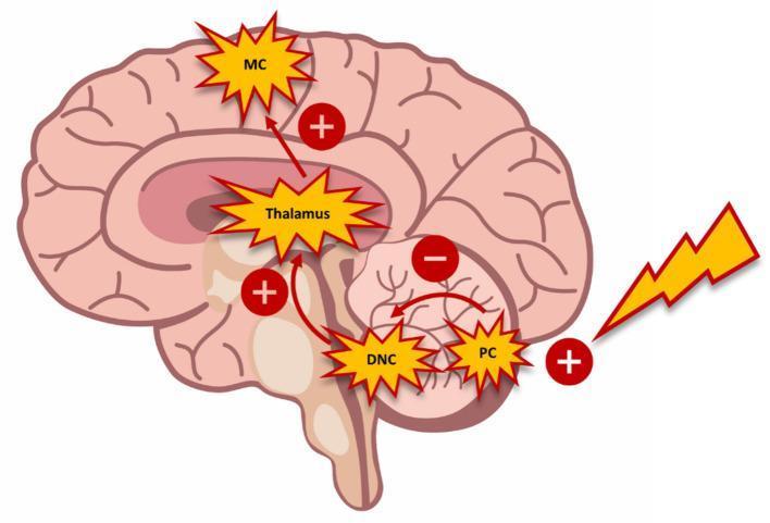
This pathophysiology diagram illustrates the cerebello-thalamo-cortical circuit and the mechanism of cerebellar brain inhibition (CBI) within a sagittal view of the human brain. The schematic highlights the functional connectivity between the Purkinje cells (PC) of the cerebellar cortex, the deep cerebellar nuclei (DCN), the thalamus (specifically the ventrolateral nucleus), and the motor cortex (MC). An external stimulus, representing transcranial magnetic stimulation (TMS), is depicted as a lightning bolt triggering an excitatory (+) effect on the Purkinje cells. This activation leads to an inhibitory (-) connection from the PC to the DCN. Subsequent excitatory (+) pathways are shown ascending from the DCN to the thalamus, and from the thalamus to the motor cortex. The diagram demonstrates how cerebellar activation can modulate motor cortex excitability through this multi-synaptic pathway. Key labels include MC (Motor Cortex), Thalamus, DCN (Deep Cerebellar Nuclei), and PC (Purkinje Cells), with red arrows indicating the flow of neural signals and +/- signs denoting the nature of the synaptic influence.
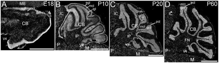
This figure presents a series of sagittal fluorescence microscopy images illustrating the expression of ELOVL4 in the developing cerebellum across four stages: embryonic day 18 (E18), postnatal day 10 (P10), P20, and P60. (A) At E18, ELOVL4 labeling is prominent in the nascent external granule cell layer (egl) and inner granule cell layer (igl) of the developing cerebellum (CB). (B) By P10, intense labeling persists in the egl and igl, with additional expression in cells traversing the molecular cell layer (mcl) and within the deep cerebellar nuclei, such as the interpositus nucleus (IP). (C) At P20, reflecting mature cerebellar layering, labeling is most intense in the granule cell layer (gcl), with moderate labeling in the Purkinje cell layer (pcl) and molecular layer. (D) The P60 stage shows a distribution pattern similar to P20, with continued high-intensity expression in the gcl and deep nuclei, including the fastigial nucleus (FN). These images demonstrate the developmental regulation of ELOVL4, a protein involved in the synthesis of very-long-chain fatty acids, primarily localized within neuronal cell bodies and specific cerebellar cortical layers.
THE CEREBELLUM - Comprehensive 15-Mark Answer
1. Introduction
2. Gross Anatomy
External Features
- Divided into two hemispheres connected by the midline vermis
- Surface consists of narrow parallel folds called folia, separated by fissures
- Three main lobes separated by fissures:
| Lobe | Fissure Boundary | Functional Division |
|---|---|---|
| Anterior lobe | Anterior to primary fissure | Spinocerebellum |
| Posterior lobe | Between primary & posterolateral fissures | Cerebrocerebellum (largest lobe) |
| Flocculonodular lobe | Posterior to posterolateral fissure | Vestibulocerebellum |
3. Functional Subdivisions
| Functional Division | Anatomical Region | Input | Function |
|---|---|---|---|
| Vestibulocerebellum | Flocculonodular lobe | Vestibular apparatus, visual cortex | Balance and equilibrium; eye movements (VOR) |
| Spinocerebellum | Vermis + intermediate hemisphere (paravermis) | Spinal cord (spinocerebellar tracts) | Modulates muscle tone; controls axial and limb movements |
| Cerebrocerebellum (Pontocerebellum) | Lateral hemispheres | Cerebral cortex via pontine nuclei | Planning and initiation of movements; fine coordination of ipsilateral limbs; cognitive functions |
- Costanzo Physiology 7th Ed., p. 114; Localization in Clinical Neurology 8th Ed., p. 963
4. Cortical Layers (Cytoarchitecture)
(i) Molecular Layer (outermost)
- Outer stellate cells, basket cells
- Dendrites of Purkinje and Golgi type II cells
- Axons of granule cells form parallel fibers here, synapsing on Purkinje cell dendrites
(ii) Purkinje Cell Layer (middle)
- Single row of Purkinje cells (the only output of the cerebellar cortex)
- Output is always inhibitory (via GABA)
- Each Purkinje cell receives input from up to 250,000 parallel fibers
(iii) Granular Layer (innermost)
- Granule cells, Golgi type II cells, and glomeruli
- In the glomeruli: mossy fibers synapse on dendrites of granule and Golgi type II cells
5. Afferent (Input) Pathways
(i) Climbing Fiber System
- Origin: Inferior olivary nucleus (medulla)
- Project directly onto Purkinje cell dendrites
- One climbing fiber innervates only one Purkinje cell but makes multiple synaptic contacts
- Single action potential triggers complex spikes (bursts of activity)
- Believed to "condition" Purkinje cells and play a role in cerebellar learning/error correction
(ii) Mossy Fiber System
- Origin: Vestibulocerebellar, spinocerebellar, and pontocerebellar afferents (vast majority of input)
- Project to granule cells in glomeruli → granule cell axons ascend → bifurcate to form parallel fibers in molecular layer → synapse on Purkinje cell dendrites
- Produce simple spikes in Purkinje cells
Key Afferent Tracts by Peduncle
| Peduncle | Type | Major Afferents |
|---|---|---|
| Inferior cerebellar peduncle (restiform body) | Afferent + Efferent | Dorsal spinocerebellar tract, olivocerebellar tract, vestibulocerebellar, reticulocerebellar |
| Middle cerebellar peduncle (brachium pontis) | Exclusively Afferent | Pontocerebellar (corticopontocerebellar pathway) - the largest peduncle |
| Superior cerebellar peduncle (brachium conjunctivum) | Afferent + Efferent | Ventral spinocerebellar (afferent); main efferent output |
6. Deep Cerebellar Nuclei and Efferent Pathways
| Nucleus | Region served | Function | Lesion Effect |
|---|---|---|---|
| Fastigial (medial) | Vermis | Stance, gait, posture; modulates muscles for sitting/standing/walking | Abasia (inability to stand/walk) |
| Nucleus Interpositus = Emboliform + Globose (intermediate) | Paravermis | Segmental reflexes, movement stability, limb movements | Delayed check responses, action tremor, truncal titubation, heel-knee-shin ataxia |
| Dentate (lateral) | Lateral hemispheres | Fine dexterity, multi-joint movements, motor planning | Delay in initiating movements, impaired hand/finger coordination |
Efferent Output Route
- Deep nuclei → Superior cerebellar peduncle (primary efferent route) → decussate in midbrain → reach contralateral ventrolateral (VL) thalamus → project to ipsilateral motor cortex
- This double crossing means: cerebellar lesion produces ipsilateral signs (the cerebellum controls the same side of the body)
- Fastigial nucleus also projects via uncinate fasciculus + juxtarestiform body → reticular formation + vestibular nuclei
7. The Cerebellar Circuit - Summary
Cerebral cortex → Pons (pontine nuclei) → Middle cerebellar peduncle
                                                    ↓
                                           Mossy fibers → Granule cells → Parallel fibers
Inferior olive → Climbing fibers ────────────────────────────────→ PURKINJE CELLS (inhibitory output - GABA)
                                                                              ↓
                                                                  Deep Cerebellar Nuclei
                                                                              ↓ (via Superior cerebellar peduncle)
                                                                    Decussate in midbrain
                                                                              ↓
                                                                   Contralateral VL Thalamus
                                                                              ↓
                                                                  Motor / Premotor Cortex
                                                                              ↓
                                                                     Corticospinal Tract
                                                                              ↓
                                                                  Ipsilateral muscles (double cross)
8. Functions of the Cerebellum
- Coordination of voluntary movement (rate, range, force, direction - synergy)
- Motor learning - adapts movements based on error signals (climbing fibers as "teacher")
- Balance and equilibrium (vestibulocerebellum)
- Control of eye movements - VOR, saccades, smooth pursuit
- Timing function - internal timing of sequential muscle contractions
- Regulation of muscle tone (spinocerebellum)
- Planning and initiation of movements (cerebrocerebellum)
- Cognitive and language functions (now recognized - cerebellar cognitive affective syndrome)
9. Clinical Features of Cerebellar Lesions
| Sign | Description | Test |
|---|---|---|
| Ataxia | Incoordination of voluntary movement; errors in rate, range, timing, force | Gait observation |
| Dysmetria | Past-pointing - overshooting or undershooting targets | Finger-nose-finger test, heel-knee-shin |
| Dysdiadochokinesia | Inability to perform rapid alternating movements | Rapid pronation-supination |
| Intention tremor | Tremor perpendicular to direction of movement, worsening near target (kinetic tremor); differs from resting tremor of Parkinson's | Finger-nose test |
| Hypotonia | Decreased muscle tone, pendular reflexes; ipsilateral to lesion; from decreased dentate nucleus activity | Limb pendularity |
| Nystagmus | Gaze-evoked nystagmus (fast phase toward side of lesion) | Eye movement examination |
| Rebound phenomenon | Inability to stop a movement when resistance suddenly removed | Check test of Holmes |
| Scanning (dysarthric) speech | Monotone, irregular cadence, explosive - "staccato speech" | Speech assessment |
| Truncal ataxia / titubation | Wide-based gait; vermis lesions affect balance even without limb ataxia | Romberg's test (cerebellar - positive with eyes open too) |
Localizing Value
- Vermis lesions → truncal ataxia, gait ataxia, midline instability (truncal titubation)
- Hemispheric lesions → ipsilateral limb ataxia, dysmetria, intention tremor, dysdiadochokinesia
- Flocculonodular lesions → balance disturbances, nystagmus, vertigo
10. Important Clinical Points
- Cerebellar signs are ipsilateral to the lesion (unlike cerebral hemisphere lesions which produce contralateral signs)
- Cerebellar Romberg test is positive with eyes open (proprioceptive Romberg is positive with eyes closed)
- Intention tremor differs from Parkinson's resting tremor (which disappears on movement)
- Acute lesions → more severe signs (including hypotonia); chronic/slow lesions may be compensated
- Common causes include: stroke (PICA infarct), tumors (medulloblastoma, cerebellar astrocytoma in children; metastases in adults), MS, alcohol, hypothyroidism, spinocerebellar ataxias, paraneoplastic degeneration
Blood group 15 mark
ABO blood group system antigens antibodies transfusion
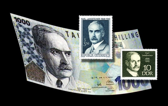
**Imaging Modality:** Medical History Graphic/Collage. **Subject Matter:** Commemorative philatelic and numismatic items honoring Karl Landsteiner (1868–1943). **Key Features:** - **Central Elements:** A curved Austrian 1000-schilling banknote (Schilling note) featuring a portrait of Karl Landsteiner. - **Secondary Elements:** Two commemorative postage stamps superimposed on the banknote. One stamp is blue, issued by the Republic of Austria (*Republik Österreich*), and the other is green, issued by the German Democratic Republic (*DDR*). - **Textual Markers:** The banknote and stamps contain the name "Karl Landsteiner," his birth and death dates (1868–1943), and references to his Nobel Prize in Physiology or Medicine (1930). **Medical Historical Context:** Landsteiner is the pathologist and immunologist credited with the discovery of the major human ABO blood group system and the co-discovery of the Rh factor. These findings are foundational to the fields of hematology, transfusion medicine, and serology. **Clinical Significance:** This image documents the historical recognition of the development of blood typing and cross-matching, which enabled safe blood transfusions and advanced the understanding of immunohematology.
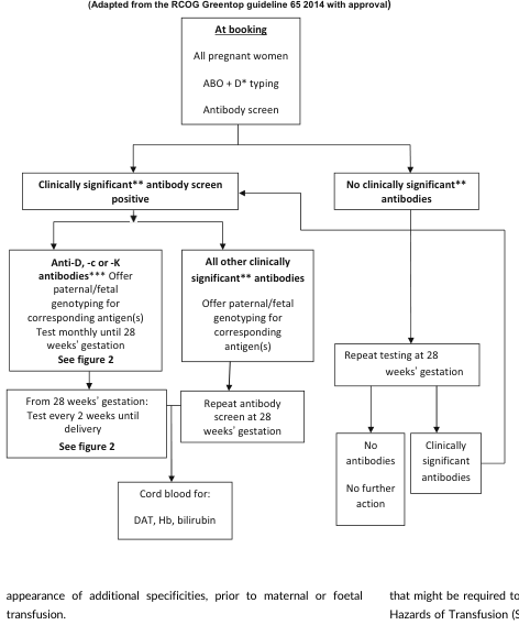
Summary : This flowchart outlines the recommended antenatal blood group and antibody screening process for pregnant women, adapted from the RCOG Greentop guideline 65 (2014). It details the steps for initial screening, follow-up testing, and management based on the presence or absence of clinically significant antibodies. flowchart: # Nodes : • At booking (rectangle): All pregnant women; ABO + D* typing; Antibody screen. • Clinically significant** antibody screen positive (rectangle) • No clinically significant** antibodies (rectangle) • Anti-D, -c or -K antibodies*** (rectangle): Offer paternal/fetal genotyping for corresponding antigen(s); Test monthly until 28 weeks’ gestation; See figure 2. • All other clinically significant** antibodies (rectangle): Offer paternal/fetal genotyping for corresponding antigen(s). • From 28 weeks’ gestation (rectangle): Test every 2 weeks until delivery; See figure 2. • Cord blood for: DAT, Hb, bilirubin (rectangle) • Repeat antibody screen at 28 weeks’ gestation (rectangle) • Repeat testing at 28 weeks’ gestation (rectangle) • No antibodies (rectangle) • No further action (rectangle) • Clinically significant antibodies (rectangle) # Connectors : • At booking splits into two branches: "Clinically significant** antibody screen positive" and "No clinically significant** antibodies". • "Clinically significant** antibody screen positive" splits into two branches: "Anti-D, -c or -K antibodies***" and "All other clinically significant** antibodies". • "Anti-D, -c or -K antibodies***" leads to "From 28 weeks’ gestation", which leads to "Cord blood for: DAT, Hb, bilirubin". • "All other clinically significant** antibodies" leads to "Repeat antibody screen at 28 weeks’ gestation". • "No clinically significant** antibodies" leads to "Repeat testing at 28 weeks’ gestation", which splits into "No antibodies" (leading to "No further action") and "Clinically significant antibodies". # Layout : • The flowchart is arranged in a top-down manner, starting with initial booking at the top, branching into two main pathways based on antibody screen results, and further subdividing based on antibody type and follow-up actions. • The left branch details management for clinically significant antibodies, with further differentiation for specific antibody types and testing intervals. • The right branch covers cases with no clinically significant antibodies, with a simple repeat testing protocol. # Analysis : • The flowchart provides a clear, stepwise approach for antenatal blood group and antibody screening, emphasizing regular monitoring for women with clinically significant antibodies, especially anti-D, -c, or -K. • It highlights the importance of paternal/fetal genotyping and increased testing frequency for higher-risk cases. • The process ensures that women without significant antibodies receive minimal intervention, while those with antibodies are closely monitored to prevent complications.
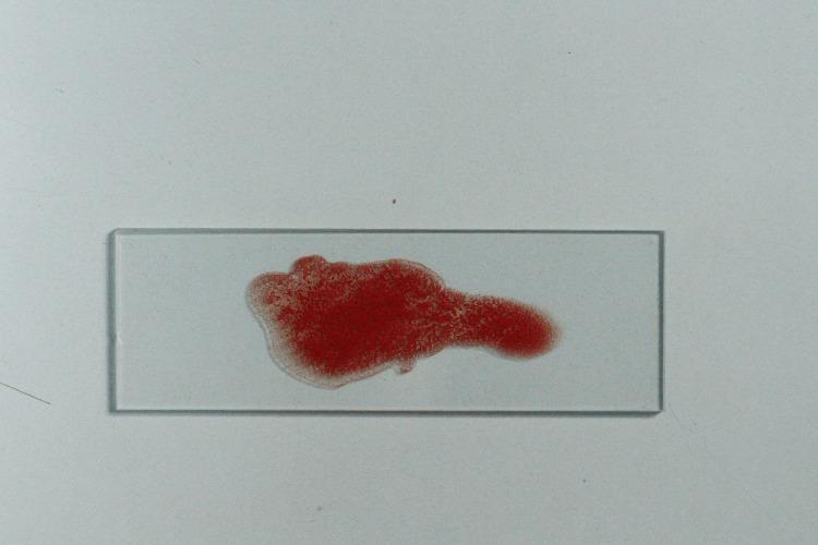
This clinical photograph displays a macro-level view of a laboratory specimen on a clear glass microscope slide, demonstrating a positive agglutination reaction. The sample consists of erythrocytes suspended in a liquid medium, which has formed distinct, granular clumps of red cellular material. This macro-clumping is a hallmark of a positive hemagglutination test, where antibodies in the antiserum have cross-linked with antigens on the red blood cell surfaces. The distribution of the red sample is non-uniform, showing a dense, opaque central cluster with irregular, diffuse margins and a lighter peripheral halo where cells are less concentrated. This procedure is commonly used in immunohematology for ABO blood group determination and secretor status analysis via the absorption-inhibition method. The presence of visible clumping in this context signifies a lack of neutralizing antigens in the tested saliva, indicative of a non-secretor phenotype or a positive control result.
erythroblastosis fetalis Rh incompatibility hemolytic disease newborn mechanism
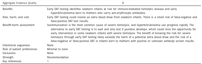
<table> <tr> <td>Aggregate Evidence Quality</td> <td>B</td> </tr> <tr> <td>Benefits</td> <td>Early DAT testing identifies newborn infants at risk for immune-mediated hemolytic disease and early hyperbilirubinemia born to mothers who carry anti-erythrocyte antibodies.</td> </tr> <tr> <td>Risk, harm, and cost</td> <td>Early DAT testing could involve an extra blood draw from newborn infants. There is a small risk of false-negative and false-positive DAT test results.</td> </tr> <tr> <td>Benefit-harm assessment</td> <td>Isoimmunization is the most common cause of severe hemolysis, and hyperbilirubinemia can progress rapidly. The alternative to early DAT testing is to wait and only test if jaundice develops, which could miss the opportunity for early intervention in some newborn infants with severe hemolysis. The benefit of knowing the risk for severe hemolysis through early DAT testing likely exceeds the harm of a potential extra blood draw and the risk of a false-negative or false-positive DAT in infants born to mothers with positive or unknown antibody screen results.</td> </tr> <tr> <td>Intentional vagueness</td> <td>None</td> </tr> <tr> <td>Role of patient preferences</td> <td>Minimal to none</td> </tr> <tr> <td>Exclusions</td> <td>None</td> </tr> <tr> <td>Strength</td> <td>Recommendation</td> </tr> <tr> <td>Key references</td> <td>1</td> </tr> </table>
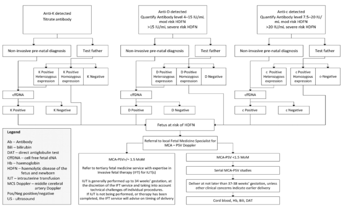
Summary : This flowchart outlines the diagnostic and management pathway for pregnancies affected by maternal alloimmunization to Anti-K, Anti-D, or Anti-c antibodies, focusing on the risk assessment and monitoring for hemolytic disease of the fetus and newborn (HDFN). flowchart: # Nodes : • Anti-K detected (rectangle) • Titrate antibody (rectangle) • Non-invasive pre-natal diagnosis (rectangle) • Test father (rectangle) • K Positive Heterozygous expression (rectangle) • K Positive Homozygous expression (rectangle) • K Negative (rectangle) • cffDNA (rectangle) • K Positive (rectangle) • K Negative (rectangle) • Anti-D detected (rectangle) • Quantify Antibody level 4–15 IU/mL mod risk HDFN >15 IU/mL severe risk HDFN (rectangle) • Non-invasive pre-natal diagnosis (rectangle) • Test father (rectangle) • D Positive Heterozygous expression (rectangle) • D Positive Homozygous expression (rectangle) • D Negative (rectangle) • cffDNA (rectangle) • D Positive (rectangle) • D Negative (rectangle) • Fetus at risk of HDFN (rectangle) • Referral to local Fetal Medicine Specialist for MCA – PSV Doppler (rectangle) • MCA-PSV > 1.5 MoM (rectangle) • Refer to tertiary fetal medicine service with expertise in invasive fetal therapy (IFT) for IUT(s) (rectangle) • MCA-PSV < 1.5 MoM (rectangle) • Serial MCA-PSV studies (rectangle) • Deliver at not later than 37–38 weeks’ gestation, unless other clinical concerns indicate earlier delivery (rectangle) • Cord blood, Hb, Bili, DAT (rectangle) • Anti-c detected (rectangle) • Quantify Antibody level 7.5–20 IU/mL mod risk HDFN >20 IU/mL severe risk HDFN (rectangle) • Non-invasive pre-natal diagnosis (rectangle) • Test father (rectangle) • c Positive Heterozygous expression (rectangle) • c Positive Homozygous expression (rectangle) • c-Negative (rectangle) • cffDNA (rectangle) • c Positive (rectangle) • c Negative (rectangle) • Legend (rectangle) – defines abbreviations used in the chart # Connectors : • Arrows indicate the flow from antibody detection to titration, then to non-invasive diagnosis or paternal testing. • Branches split based on paternal genotype (heterozygous, homozygous, negative). • If the father is negative, the pathway ends (no risk). • If the father is positive (heterozygous or homozygous), cffDNA is used to determine fetal antigen status. • If the fetus is antigen negative, the pathway ends (no risk). • If the fetus is antigen positive, the fetus is at risk of HDFN and referred for further monitoring. • For at-risk fetuses, referral to fetal medicine for MCA-PSV Doppler is indicated. • If MCA-PSV > 1.5 MoM, refer for invasive fetal therapy (IUT). • If MCA-PSV < 1.5 MoM, continue serial monitoring. • Delivery is recommended at 37–38 weeks unless earlier delivery is clinically indicated. # Layout : • The chart is organized into three parallel vertical pathways for Anti-K, Anti-D, and Anti-c, each with similar diagnostic and management steps. • Each pathway splits into non-invasive diagnosis and paternal testing, then converges on fetal risk assessment and management. • The bottom section merges all pathways for final fetal monitoring and delivery planning. • A legend box is present at the bottom left, defining abbreviations. # Analysis : • The flowchart provides a clear, stepwise approach for managing pregnancies at risk of HDFN due to Anti-K, Anti-D, or Anti-c alloimmunization. • The process emphasizes non-invasive testing first, with paternal testing to stratify risk. • Only fetuses at risk (antigen positive) are referred for intensive monitoring and possible intervention. • The use of MCA-PSV Doppler is central for ongoing fetal surveillance, with invasive therapy reserved for those with evidence of fetal anemia. • The chart standardizes care and minimizes unnecessary interventions for low-risk pregnancies.
BLOOD GROUPS - Comprehensive 15-Mark Answer
1. Introduction
2. ABO Blood Group System
Biochemical Basis
- A common precursor glycan (core glycan) is present on all RBCs
- Most individuals possess a fucosyltransferase (FUT1 gene) that adds fucose to create the H antigen - the structural precursor of all ABO antigens
- The ABO gene then modifies the H antigen:
- A allele → enzyme adds N-acetylgalactosamine → forms A antigen
- B allele → enzyme adds galactose → forms B antigen
- O allele → encodes a non-functional enzyme → H antigen remains unmodified
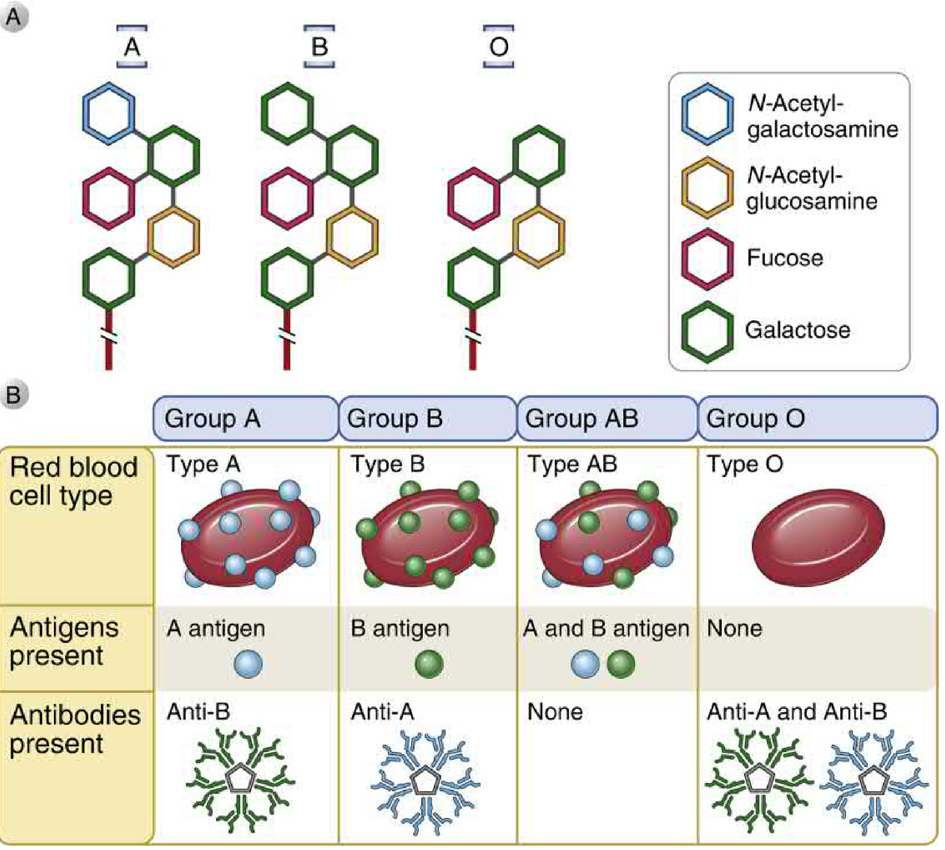
ABO Groups - Antigens and Antibodies
| Blood Group | Genotype | Antigen on RBC (Agglutinogen) | Antibody in Serum (Agglutinin) | Frequency (approx.) |
|---|---|---|---|---|
| A | AA or AO | A antigen | Anti-B (IgM) | 28% |
| B | BB or BO | B antigen | Anti-A (IgM) | 29% |
| AB | AB | A and B antigens | None | 4% (universal recipient) |
| O | OO | None (only H antigen) | Anti-A and Anti-B (IgM) | 38% (universal donor) |
Why Do Natural Antibodies Exist?
3. The Bombay Blood Group (Oh Phenotype)
- A rare phenotype where the FUT1 gene (H gene) is mutated/non-functional
- These individuals cannot produce the H antigen
- Without H antigen, neither A nor B antigen can be formed, regardless of the ABO genotype
- Their RBCs appear to be blood group O but are not true O
- They produce anti-H, anti-A, and anti-B antibodies
- Can only receive blood from other Bombay phenotype donors
- First described in Mumbai (Bombay), India - rare in general population (~1 in 10,000 in India; rarer elsewhere)
4. Genetics of ABO Blood Group
| Parents' Blood Groups | Possible Children's Blood Groups |
|---|---|
| O × O | O only |
| A × O | A or O |
| B × O | B or O |
| A × B | A, B, AB, or O |
| AB × O | A or B only |
| AB × AB | A, B, or AB (NOT O) |
- ABO locus is codominant - both A and B alleles are expressed if present
- O is recessive to both A and B
- Medico-legal importance: blood grouping can be used in paternity disputes and identification of blood stains
5. Rh Blood Group System
Discovery
Antigens
- Rh antigens are non-glycosylated, hydrophobic proteins (unlike ABO carbohydrates) on RBC membranes
- Encoded by two tightly linked, highly homologous genes: RhD and RhCE
- Six main antigens: C, c, D, d, E, e (note: 'd' is amorphic - there is no 'd' antigen, the symbol denotes absence of D)
- The D antigen is the most clinically important (most immunogenic)
- Rh positive: D antigen present on RBCs (~85% of Caucasians; ~90% of Indians)
- Rh negative: D antigen absent (~15% of Caucasians)
Key Difference from ABO
- Unlike ABO, no natural antibodies exist for Rh
- Anti-Rh antibodies are produced only after sensitization (exposure to Rh-positive blood via transfusion or pregnancy)
- Rh antibodies are IgG (not IgM), so they CAN cross the placenta
6. Erythroblastosis Fetalis (Hemolytic Disease of the Newborn - HDN)
Mechanism
- Rh-negative mother + Rh-positive father → Rh-positive fetus
- At delivery, small amounts of fetal Rh-positive blood enter maternal circulation (fetomaternal hemorrhage)
- Mother becomes sensitized → produces anti-Rh IgG antibodies
- First baby usually unaffected (sensitization takes time)
- In the next Rh-positive pregnancy, pre-formed maternal anti-Rh IgG crosses the placenta
- IgG binds to fetal Rh-positive RBCs → complement activation → agglutination and hemolysis of fetal RBCs
- ~3% of second babies affected; ~10% of third; incidence rises with each pregnancy
Clinical Features of Affected Fetus/Neonate
| Feature | Mechanism |
|---|---|
| Hemolytic anemia | Destruction of RBCs by maternal anti-D IgG |
| Jaundice | Excess bilirubin from hemoglobin breakdown; macrophages convert Hb → bilirubin |
| Hepatosplenomegaly | Extramedullary hematopoiesis (liver + spleen try to compensate) |
| Erythroblastosis | Nucleated blast RBC forms in circulation (compensatory bone marrow response) |
| Hydrops fetalis | Severe anemia → heart failure → generalised edema |
| Kernicterus | Bilirubin deposits in basal ganglia and brain → permanent neurological damage / death |
Prevention
- Anti-D immunoglobulin (Rho-GAM) given to Rh-negative mother within 72 hours of delivery of first Rh-positive baby
- Also given at 28 weeks gestation and after any sensitizing event (miscarriage, amniocentesis, antepartum hemorrhage)
- Mechanism: anti-D passively clears fetal Rh-positive cells from maternal circulation before they trigger an immune response (possible Fc receptor-mediated feedback inhibition of B cells)
Note on ABO and HDN
- ABO incompatibility between mother and fetus rarely causes severe HDN because anti-ABO antibodies are predominantly IgM and cannot cross the placenta
7. Cross-Matching and Blood Transfusion
Principles
| Test | Purpose |
|---|---|
| ABO grouping | Identify A/B antigens on patient's RBCs |
| Rh (D) typing | Identify presence or absence of D antigen |
| Antibody screen | Detect unexpected antibodies in patient's serum |
| Cross-match (major) | Mix donor RBCs with recipient serum - confirms compatibility |
- Full cross-matching takes up to 45 minutes
- In emergencies: O Rh-negative blood (universal donor) is used as it lacks A, B, and D antigens
Universal Donor and Recipient
| Concept | Blood Group | Reason |
|---|---|---|
| Universal Donor (for RBCs) | O Rh-negative | No A, B, or D antigens on cells |
| Universal Recipient | AB Rh-positive | Has A, B, D antigens - tolerant to all; no anti-A, anti-B antibodies |
Transfusion Reactions
- Pre-existing IgM anti-A or anti-B binds transfused RBCs
- Complement activation → intravascular hemolysis
- Massive hemoglobin release → acute renal tubular necrosis
- Cytokine storm (TNF, IL-1) → high fever, hypotension, shock
- Disseminated intravascular coagulation (DIC) → paradoxical bleeding
- Can be life-threatening
- First exposure to Rh-positive blood → mild delayed reaction (2-4 weeks later as antibodies develop)
- Second exposure → severe immediate hemolytic reaction
8. Other Blood Group Systems
| System | Antigens | Clinical Significance |
|---|---|---|
| MNSs | M, N, S, s antigens | Weak antigens; anti-M and anti-N rarely cause problems; rarely cause HDN |
| Lewis | Lea, Leb | Carbohydrate antigens; serve as ligands for E-selectin and P-selectin; rarely cause transfusion reactions |
| Kell | K (Kell antigen) | Highly immunogenic; can cause severe HDN and transfusion reactions |
| Duffy | Fya, Fyb | Duffy null (Fy null) protects against Plasmodium vivax malaria |
| Kidd | Jka, Jkb | Can cause delayed hemolytic transfusion reactions |
| P | P1 antigen | Receptor for parvovirus B19 on RBCs |
9. Medicolegal Importance of Blood Groups
- Paternity disputes - blood grouping can exclude a man as father (cannot confirm paternity)
- Identification of blood stains in forensic cases (ABO antigens retained in dried blood stains; ABO retains specificity indefinitely, MNS and Rh lose specificity in 3-5 weeks)
- Methods for blood stain grouping: tube method, tile method, absorption-inhibition, mixed agglutination, absorption-elution, ELISA
- Secretor status - ~80% of people secrete ABO antigens in saliva, sweat, tears (group-specific substances); used in forensic identification
10. Summary Table
| Feature | ABO System | Rh System |
|---|---|---|
| Antigen type | Carbohydrate | Protein |
| Natural antibodies | Yes (IgM) | No |
| Immune antibodies | Yes | Yes (IgG) |
| Placental transfer | No (IgM) | Yes (IgG) |
| HDN | Mild (anti-ABO is IgM) | Severe (anti-D is IgG) |
| Transfusion reaction | Immediate, severe | Delayed (first exposure); severe (subsequent) |
| Chromosome | 9 | 1 |
Cardiac cycle 15 marks
cardiac cycle Wiggers diagram pressure volume heart sounds ECG
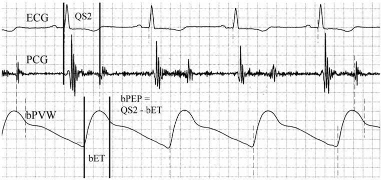
This physiological waveform diagram displays a simultaneous recording of three cardiac parameters used for assessing cardiovascular hemodynamics. The top trace is an Electrocardiogram (ECG) showing standard QRS complexes representing ventricular depolarization. The middle trace is a Phonocardiogram (PCG) capturing acoustic vibrations of heart sounds, specifically the S1 and S2 sounds. The bottom trace is a Brachial Pulse Volume Waveform (bPVW) illustrating the peripheral arterial pressure pulse. Vertical markers indicate temporal relationships between these signals to calculate systolic time intervals. The 'QS2' interval is marked from the onset of the QRS complex on the ECG to the aortic component of the second heart sound on the PCG, representing the total electromechanical systolic interval. The 'bET' (Brachial Ejection Time) is delineated on the bPVW from the waveform foot to the dicrotic notch. An annotated formula shows the calculation of the Brachial Pre-ejection Period (bPEP) as the difference between QS2 and bET (bPEP = QS2 - bET). This diagram is an educational tool for understanding the non-invasive assessment of cardiac systolic function and arterial stiffness.
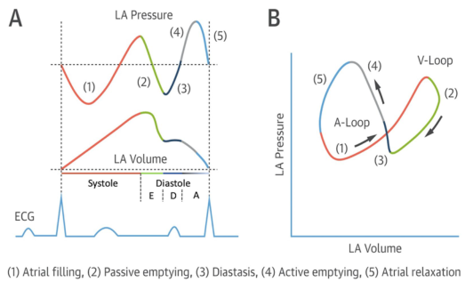
Summary : This figure illustrates the left atrial (LA) pressure-volume relationship during the cardiac cycle, showing both time-course traces and a pressure-volume loop, with key phases of atrial function annotated and correlated with the ECG. line plot and loop diagram: # Panel A: LA Pressure and Volume Traces • Top trace: LA Pressure (y-axis, arbitrary units) over time. • Middle trace: LA Volume (y-axis, arbitrary units) over time. • Bottom trace: ECG waveform for temporal reference. • X-axis: Cardiac cycle phases, with systole and diastole labeled; diastole further subdivided into E, D, and A phases. • Five phases are color-coded and numbered: – (1) Atrial filling (red) – (2) Passive emptying (green) – (3) Diastasis (black) – (4) Active emptying (blue) – (5) Atrial relaxation (gray) • Vertical dashed lines demarcate transitions between phases. # Panel B: LA Pressure-Volume Loop • X-axis: LA Volume (arbitrary units). • Y-axis: LA Pressure (arbitrary units). • The loop is traced in a counterclockwise direction, with arrows indicating the sequence. • The same five phases (1–5) are color-coded as in Panel A. • The loop is divided into two segments: A-Loop (phases 1, 3, 4, 5) and V-Loop (phase 2). # Design Encodings : • Distinct colors for each phase (red, green, black, blue, gray). • Arrows on the loop indicate the direction of the cardiac cycle. • ECG trace provides timing reference for the pressure and volume changes. # Analysis : • The LA pressure and volume traces show cyclical changes corresponding to atrial filling, emptying, and relaxation. • The pressure-volume loop visually summarizes the dynamic relationship between LA pressure and volume, with distinct segments for passive and active phases. • The figure highlights the temporal coordination between atrial events and the ECG, emphasizing the mechanical and electrical coupling in the cardiac cycle.
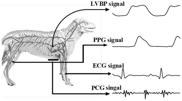
An educational anatomical and physiological diagram illustrating the synchronous collection of multiple cardiovascular biosignals in a canine model. The left side features a lateral-view anatomical illustration of a canine, highlighting the skeletal system, the heart, and major peripheral arteries. Four distinct biosignal waveforms are displayed on the right, with arrows tracing each to its anatomical point of acquisition: 1) LVBP (Left Ventricular Blood Pressure) signal, showing a rhythmic pressure waveform originating from the heart. 2) PPG (Photoplethysmogram) signal, a pulsatile volume waveform traced to the femoral artery. 3) ECG (Electrocardiogram) signal, showing characteristic P-QRS-T complexes with a prominent R-wave, traced to the forelimbs (Lead I configuration). 4) PCG (Phonocardiogram) signal, depicting high-frequency oscillations representing heart sounds, recorded from the cardiac apex. The diagram demonstrates the integration of invasive and non-invasive hemodynamic monitoring, useful for teaching comparative physiology and cardiovascular signal processing.
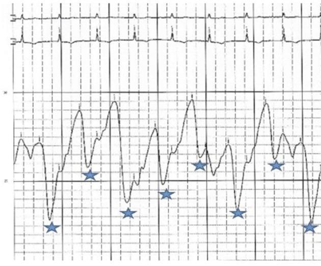
This diagnostic hemodynamic tracing displays a right atrial (RA) pressure waveform alongside a concurrent electrocardiogram (ECG) lead. The upper section shows a standard ECG rhythm with regular QRS complexes, which serve as a temporal reference for the mechanical events of the cardiac cycle. The lower section depicts the RA pressure tracing, characterized by a significantly elevated mean pressure (approximately 33 mmHg) persisting after pericardiocentesis. The most notable morphologic feature is the presence of sharp, deep 'y' descents, indicated by blue asterisks on the tracing. These descents represent rapid atrial emptying during early ventricular diastole. The combined findings of elevated RA pressure and prominent 'y' descents are visually characteristic of constrictive or effusive-constrictive pericarditis. The tracing illustrates the loss of normal pressure-volume relationships in the right heart due to external restriction, providing a classic example of hemodynamic 'tamponade-like' physiology transitioning toward constriction.
Wiggers diagram aortic left ventricular atrial pressure cardiac cycle systole diastole
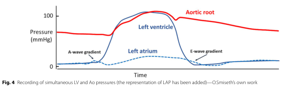
Summary : This figure shows simultaneous pressure recordings from the left ventricle, aortic root, and left atrium over time, illustrating the pressure gradients during the cardiac cycle, including the A-wave and E-wave gradients. line plot: Title & Axes : • No explicit title, but the figure records "simultaneous LV and Ao pressures (the representation of LAP has been added)". • X-axis: "Time" (no units or tick labels shown). • Y-axis: "Pressure (mmHg)" with tick marks at 0 and 100. Data Points : • Red solid line: "Aortic root" pressure. • Blue solid line: "Left ventricle" pressure. • Blue dashed line: "Left atrium" pressure. • Labeled features: "A-wave gradient" (early rise in left atrial pressure), "E-wave gradient" (later rise in left atrial pressure). Design Encodings : • Red solid line for aortic root. • Blue solid line for left ventricle. • Blue dashed line for left atrium. • Labels directly on the plot for anatomical structures and pressure gradients. Distribution & Trends : • Aortic root pressure (red) remains above left ventricular pressure during diastole, then both rise sharply and peak during systole, with the left ventricle slightly higher. • Left atrial pressure (blue dashed) remains low, with small A-wave and E-wave bumps. • The A-wave and E-wave gradients are marked at the points where left atrial pressure rises relative to the left ventricle. Analysis : • The plot demonstrates the normal pressure relationships and timing between the left atrium, left ventricle, and aortic root during the cardiac cycle. • The A-wave and E-wave gradients highlight the phases of atrial contraction and early ventricular filling, respectively. • The left ventricle and aortic root pressures closely track each other during systole, with the aortic root pressure remaining slightly lower during the rapid upstroke and slightly higher during the downstroke. • The left atrial pressure remains much lower than the other two, with characteristic small waves.
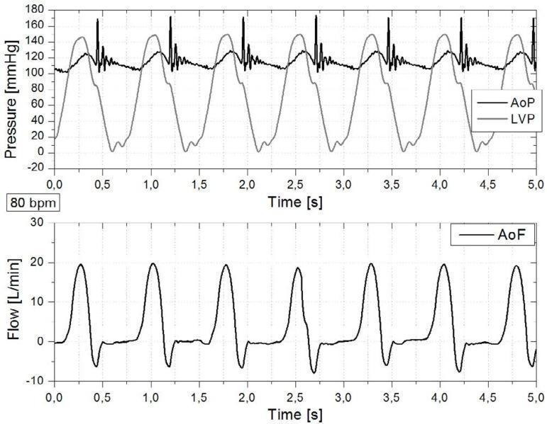
This physiological waveform graph displays cardiac simulator signals at a heart rate of 80 bpm, illustrating hemodynamic relationships across the cardiac cycle over a 5-second interval. The upper panel tracks Pressure (mmHg), comparing Left Ventricular Pressure (LVP) and Aortic Pressure (AoP). The LVP waveform shows cyclical rises to approximately 150 mmHg during systole, falling near 0 mmHg in diastole. The AoP oscillates between roughly 105 and 130 mmHg, with distinct high-frequency spikes (dicrotic notches/oscillations) occurring at the moment of mechanical aortic valve closure. The lower panel displays Aortic Root Flow (AoF) in L/min, showing pulsatile flow synchronized with pressure changes. Flow peaks at approximately 20 L/min during the rapid ejection phase and exhibits a brief negative deflection (backflow) to roughly -8 L/min, indicating closure of the aortic valve. These waveforms serve as a diagnostic algorithm illustration for understanding the relationship between chamber pressure, arterial pressure, and forward stroke volume in cardiovascular physiology.
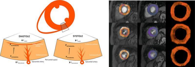
This composite educational graphic details the pathophysiology of myocardial perfusion and coronary hemodynamics. Panel A features a pathophysiology diagram illustrating the extravascular forces and intraluminal pressures affecting the myocardial layers during the cardiac cycle. It compares diastole and systole, highlighting the differences in intramural pressure (PINTRAMURAL), left ventricular lumen pressure (PLUMEN), and pericardial space pressure (PPERICARDIUM). The diagram shows the subendocardial plexus and epicardial artery, emphasizing greater subendocardial compression and reduced vascular volume during systole. Panel B presents a cardiac perfusion quantification map from a patient with aortic stenosis (AS). The map is organized in a grid: rows represent basal, mid, and apical short-axis slices of the left ventricle; columns demonstrate stress perfusion, rest perfusion, and myocardial perfusion reserve (MPR). The color-coded mapping shows regional perfusion distribution, with the MPR column specifically highlighting global limitations in perfusion reserve. This visual is designed for medical education focusing on cardiovascular hemodynamics, coronary microcirculation, and the physiological impact of valvular heart disease on myocardial blood flow.
pressure volume loop left ventricle end systolic end diastolic
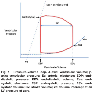
Summary : This figure presents a pressure–volume loop of the left ventricle, illustrating key cardiac parameters such as end-diastolic volume (EDV), end-systolic volume (ESV), stroke volume (SV), end-diastolic pressure (EDP), end-systolic pressure (ESP), arterial elastance (EA), and end-systolic elastance (Ees). The loop visually demonstrates the relationship between ventricular pressure and volume during a cardiac cycle. line plot: # Title & Axes : • Title: "Pressure–volume loop." • X-axis: "Ventricular Volume" (units not specified). – Tick labels: Vo (volume intercept at LV pressure of zero), ESV (end-systolic volume), EDV (end-diastolic volume). • Y-axis: "Ventricular Pressure" (units not specified). – No explicit tick labels shown. # Data & Curve : • Red closed loop traces the pressure–volume relationship during a cardiac cycle. • Horizontal arrow within the loop labeled "SV" (stroke volume) indicates the difference between EDV and ESV. • Vertical segments at EDV and ESV mark transitions between phases. • Dotted lines: – EA (arterial elastance) shown as a dashed line from Vo through ESP/SV. – Ees (end-systolic elastance) shown as a dashed line from Vo through ESP/(ESV-Vo). # Key Parameters & Annotations : • Vo: Volume intercept at LV pressure of zero (leftmost point on x-axis). • ESV: End-systolic volume (right vertical segment). • EDV: End-diastolic volume (far right on x-axis). • SV: Stroke volume (horizontal arrow between ESV and EDV). • EDP: End-diastolic pressure (arrow at bottom right of loop). • ESP: End-systolic pressure (top of loop). • EA: Arterial elastance (dashed line labeled EA (ESP/SV)). • Ees: End-systolic elastance (dashed line labeled Ees = ESP/(ESV-Vo)). # Design Encodings : • Red solid line for the pressure–volume loop. • Blue dashed lines for elastance relationships. • Arrows and labels for key parameters. • No gridlines or axis units specified. # Analysis : • The pressure–volume loop demonstrates the cardiac cycle phases, with the lower right corner representing end-diastole (high volume, low pressure) and the upper left corner representing end-systole (low volume, high pressure). • Stroke volume is visually indicated as the horizontal distance between EDV and ESV. • Elastance lines (EA and Ees) provide graphical representations of arterial and ventricular contractility. • The loop’s shape and annotations allow for assessment of cardiac function and mechanical properties.
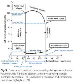
Summary : This figure shows a pressure–volume loop for the left ventricle, illustrating how ventricular volume and pressure change during the cardiac cycle, with key phases and valve events annotated. The isovolumetric relaxation and contraction periods are highlighted, and systolic/diastolic blood pressures are marked. pressure–volume loop diagram: # Title & Axes : • No explicit title on the figure, but the legend describes it as a "Pressure–volume loop demonstrating changes in ventricular volume during filling and ejection with corresponding changes in intracavity pressure." • X-axis: "Left ventricular volume (mL)" with tick marks at 0, 20, 40, 60, 80, 100, 120, 140, 160. • Y-axis: "Left ventricular pressure (mmHg)" with tick marks at 0, 20, 40, 60, 80, 100, 120, 140. • Additional axis labels: "Left ventricular end-diastolic pressure" (blue, left), "End-diastolic volume" (blue, bottom right), "Stroke volume" (black, bottom center). # Phases & Events : • Isovolumetric relaxation: vertical line at low volume, pressure drops, labeled. • Diastolic filling: horizontal line at low pressure, volume increases, labeled. • Isovolumetric contraction: vertical line at high volume, pressure rises, labeled. • Ventricular ejection: curved line, volume decreases as pressure peaks and falls, labeled. • Valve events: – Mitral valve opens (bottom left corner, low pressure/volume). – Mitral valve closes (bottom right corner, high volume/low pressure). – Aortic valve opens (top right corner, high volume/high pressure). – Aortic valve closes (top left corner, low volume/high pressure). # Blood Pressure Markers : • Systolic BP: horizontal dashed blue line at ~120 mmHg. • Diastolic BP: horizontal dashed blue line at ~80 mmHg. # Design Encodings : • Black solid lines for the loop. • Blue dashed lines for blood pressure markers. • Blue text for end-diastolic volume/pressure. • Labeled arrows for direction of phases and valve events. # Analysis : • The loop traces the cardiac cycle, starting at low pressure/volume (end-systolic), filling during diastole, rising sharply during isovolumetric contraction, ejecting blood during ventricular ejection, and dropping pressure during isovolumetric relaxation. • Systolic and diastolic blood pressures are marked, showing the pressure range during ejection. • The width of the loop (horizontal distance) represents stroke volume. • The figure clearly distinguishes the four main phases and the timing of valve openings/closings, providing a comprehensive view of ventricular mechanics during a heartbeat.
THE CARDIAC CYCLE - Comprehensive 15-Mark Answer
1. Definition
- Systole = period of ventricular contraction and ejection (~0.3 s at rest)
- Diastole = period of ventricular relaxation and filling (~0.5 s at rest)
2. The Wiggers Diagram - Complete Cardiac Cycle
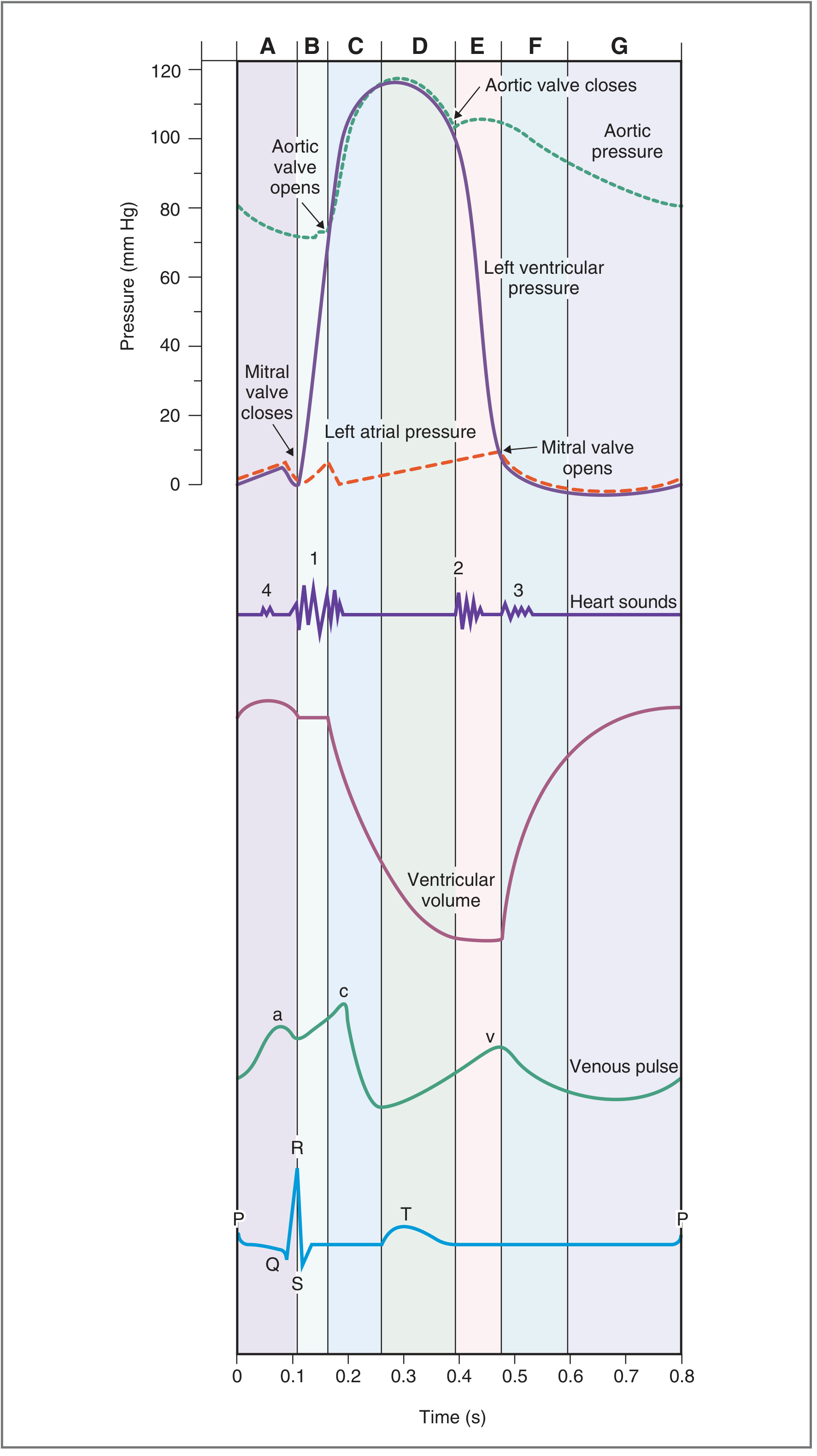
3. Phases of the Cardiac Cycle (7 Phases)
PHASE A - Atrial Systole
| Parameter | Event |
|---|---|
| ECG | P wave (atrial depolarization) |
| Mechanical event | Atrial contraction → blood actively pumped into ventricle through open mitral valve |
| Pressures | Left atrial pressure rises → "blip" in LV pressure (final filling) |
| Volume | LV volume rises to End-Diastolic Volume (EDV) = ~140 mL |
| Valves | Mitral valve open; Aortic valve closed |
| Heart sound | S4 (fourth heart sound) - not audible normally; heard in ventricular hypertrophy |
| Venous pulse | a wave - due to atrial contraction reflected back to jugular veins |
- Atrial systole contributes ~20-30% of total ventricular filling ("atrial kick")
- The remaining 70-80% of filling occurs passively before atrial systole
PHASE B - Isovolumetric Ventricular Contraction (IVC)
| Parameter | Event |
|---|---|
| ECG | QRS complex (ventricular depolarization) |
| Mechanical event | Ventricles begin contracting; LV pressure rises rapidly |
| Pressures | LV pressure rises sharply; exceeds LA pressure → mitral valve closes |
| Volume | CONSTANT - all valves are closed (no blood in or out) |
| Valves | Mitral valve CLOSES → Aortic valve still closed |
| Heart sound | S1 ("lub") - due to mitral (and tricuspid) valve closure; mitral closes slightly before tricuspid (physiological splitting possible) |
| Venous pulse | c wave - bulging of tricuspid valve into right atrium during IVC |
- This is the most energy-expensive phase (pressure work with no volume change)
- LV pressure rises from ~5 mmHg to ~80 mmHg before aortic valve opens
PHASE C - Rapid Ventricular Ejection
| Parameter | Event |
|---|---|
| ECG | ST segment |
| Mechanical event | LV pressure exceeds aortic pressure → aortic valve opens → blood rapidly ejected |
| Pressures | LV pressure reaches peak (~120 mmHg); Aortic pressure rises sharply |
| Volume | LV volume decreases rapidly (most of stroke volume ejected here) |
| Valves | Aortic valve OPENS; Mitral valve closed |
| Heart sound | None |
| Venous pulse | x descent begins |
- Most (~70%) of stroke volume is ejected in this phase
PHASE D - Reduced Ventricular Ejection
| Parameter | Event |
|---|---|
| ECG | T wave (ventricular repolarization begins) |
| Mechanical event | Ventricles begin to repolarize/relax; ejection continues but at slower rate |
| Pressures | LV pressure begins to fall; Aortic pressure also falls (blood "runs off" into arteries faster than it is being added) |
| Volume | LV volume continues to fall, reaching End-Systolic Volume (ESV) = ~70 mL |
| Valves | Aortic valve still open; Mitral valve closed |
| Heart sound | None |
| Venous pulse | LA pressure rising (venous return from pulmonary circulation) → v wave begins |
PHASE E - Isovolumetric Ventricular Relaxation (IVR)
| Parameter | Event |
|---|---|
| ECG | End of T wave (ventricular repolarization complete) |
| Mechanical event | LV pressure falls below aortic pressure → aortic valve closes |
| Pressures | LV pressure drops dramatically; Aortic pressure shows dicrotic notch/incisura at valve closure |
| Volume | CONSTANT - all valves are closed |
| Valves | Aortic valve CLOSES → Mitral valve still closed |
| Heart sound | S2 ("dub") - due to aortic (then pulmonic) valve closure; aortic closes before pulmonic; physiological splitting on inspiration |
| Venous pulse | v wave peak (maximum atrial filling) |
- Dicrotic notch: brief backflow of blood as aortic valve closes; seen on aortic pressure trace
- Inspiratory splitting of S2 occurs because decreased intrathoracic pressure → increased venous return to RV → prolonged RV ejection → delayed pulmonic valve closure
PHASE F - Rapid Ventricular Filling
| Parameter | Event |
|---|---|
| ECG | Isoelectric (between T and next P) |
| Mechanical event | LV pressure falls below LA pressure → mitral valve opens |
| Pressures | LV pressure remains low (ventricle is compliant); LA pressure falls as blood flows into LV |
| Volume | LV volume increases rapidly |
| Valves | Mitral valve OPENS; Aortic valve closed |
| Heart sound | S3 (third heart sound) - due to rapid inflow of blood causing ventricular wall vibration; normal in children; in adults >40 yrs, indicates volume overload (CHF, MR, TR) |
| Venous pulse | y descent - rapid fall in venous/atrial pressure as tricuspid valve opens and atrium empties |
PHASE G - Reduced Ventricular Filling (Diastasis)
| Parameter | Event |
|---|---|
| ECG | Isoelectric |
| Mechanical event | Passive slow filling of ventricle; equilibration between atrial and ventricular pressures |
| Pressures | LA and LV pressures equalize at low level |
| Volume | LV volume rises slowly |
| Valves | Mitral valve open; Aortic valve closed |
| Heart sound | None |
- Diastasis is the longest phase of the cardiac cycle
- First phase to be compromised when heart rate increases
- Reduced diastasis → reduced EDV → reduced stroke volume (Frank-Starling relationship)
4. Summary Table - All 7 Phases
| Phase | ECG | Valve Event | Heart Sound | LV Volume | LV Pressure |
|---|---|---|---|---|---|
| A - Atrial systole | P wave | - | S4 | ↑ to EDV | Small ↑ |
| B - Isovolumetric contraction | QRS | Mitral CLOSES | S1 | Constant | ↑↑ |
| C - Rapid ejection | ST segment | Aortic OPENS | - | ↓↓ | Peak (~120 mmHg) |
| D - Reduced ejection | T wave | - | - | ↓ to ESV | ↓ |
| E - Isovolumetric relaxation | End T | Aortic CLOSES | S2 | Constant | ↓↓ |
| F - Rapid filling | Isoelectric | Mitral OPENS | S3 | ↑↑ | Low |
| G - Diastasis | Isoelectric | - | - | ↑ slowly | Low |
5. Heart Sounds
| Sound | Timing | Cause | Clinical Notes |
|---|---|---|---|
| S1 (lub) | Start of systole | Mitral + tricuspid valve closure | Loud in mitral stenosis; soft in MR |
| S2 (dub) | End of systole | Aortic + pulmonic valve closure | Split normally on inspiration; fixed split in ASD |
| S3 | Early diastole (rapid filling) | Rapid inflow causes ventricular wall vibration | Normal in children; pathological in adults = ventricular gallop (CHF) |
| S4 | Late diastole / presystole | Atrial contraction into non-compliant ventricle | Always pathological; seen in ventricular hypertrophy, MI = atrial gallop |
6. Venous Pulse (JVP) Waves
| Wave | Timing | Cause |
|---|---|---|
| a wave | Late diastole | Atrial contraction (Phase A) |
| c wave | Early systole | Tricuspid valve bulging into atrium during IVC (Phase B) |
| x descent | Mid systole | Atrial relaxation + downward displacement of tricuspid valve |
| v wave | Late systole - early diastole | Venous filling of atrium while tricuspid valve closed (Phases D-E) |
| y descent | Early diastole | Rapid atrial emptying when tricuspid valve opens (Phase F) |
7. Pressure-Volume (P-V) Loop
- Diastolic filling - bottom horizontal limb (low pressure, volume increases from ESV to EDV)
- Isovolumetric contraction - left vertical limb (volume constant, pressure rises sharply)
- Ventricular ejection - top horizontal limb (pressure peaks then falls, volume decreases)
- Isovolumetric relaxation - right vertical limb (volume constant, pressure falls sharply)
- EDV = ~140 mL (end of diastole)
- ESV = ~70 mL (end of systole)
- Stroke Volume (SV) = EDV - ESV = ~70 mL (width of loop)
- Ejection Fraction (EF) = SV/EDV = 70/140 = 50% (normal ≥55%)
- Cardiac Output = SV × HR = 70 mL × 72 = ~5040 mL/min (~5 L/min)
8. Important Relationships
Effect of Heart Rate on Cardiac Cycle
- Increased HR → diastole shortens more than systole
- At very high HR, diastasis is eliminated → ventricular filling compromised → ↓ EDV → ↓ SV
- This is why very fast heart rates (>180/min) reduce cardiac output
Frank-Starling Relationship
- ↑ Venous return → ↑ EDV → ↑ sarcomere stretch → ↑ force of contraction → ↑ SV
- The heart automatically adjusts its output to match venous return
Dicrotic Notch
- The brief notch seen on the aortic pressure tracing at the moment of aortic valve closure (Phase E)
- Due to slight backflow of blood before valve fully closes
- Clinical importance: used as a marker of end of systole in arterial pressure monitoring
Mensural cycle 15 mark
menstrual cycle hormones FSH LH estrogen progesterone ovarian uterine phases
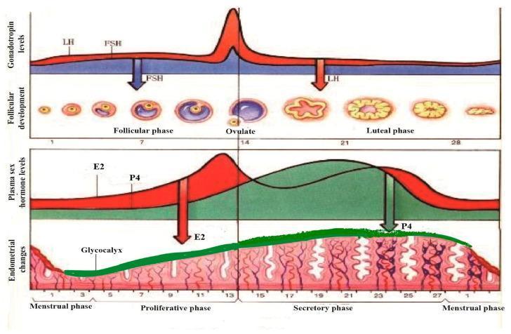
A multi-panel pathophysiology diagram illustrating the synchronous physiological changes during a standard 28-day human menstrual cycle. The top panel graphs gonadotropin levels, showing a sharp surge in Luteinizing Hormone (LH) and a moderate rise in Follicle-Stimulating Hormone (FSH) at day 14, correlating with the follicular phase, ovulation, and luteal phase stages. The corresponding follicular development shows the maturation of a primary follicle into a Graafian follicle, ovulation, and the formation of the corpus luteum and corpus albicans. The middle panel tracks plasma sex hormone levels, highlighting the mid-cycle peak of Estradiol (E2) and the post-ovulatory rise of Progesterone (P4). The bottom panel depicts endometrial morphology, transitioning from the menstrual phase to the proliferative and secretory phases. A green-shaded layer highlights the glycocalyx development, which thickens and becomes most prominent during the secretory phase under the influence of P4, before thinning during menstruation. The diagram demonstrates the hormonal regulation of the ovary and uterine lining for medical educational purposes.
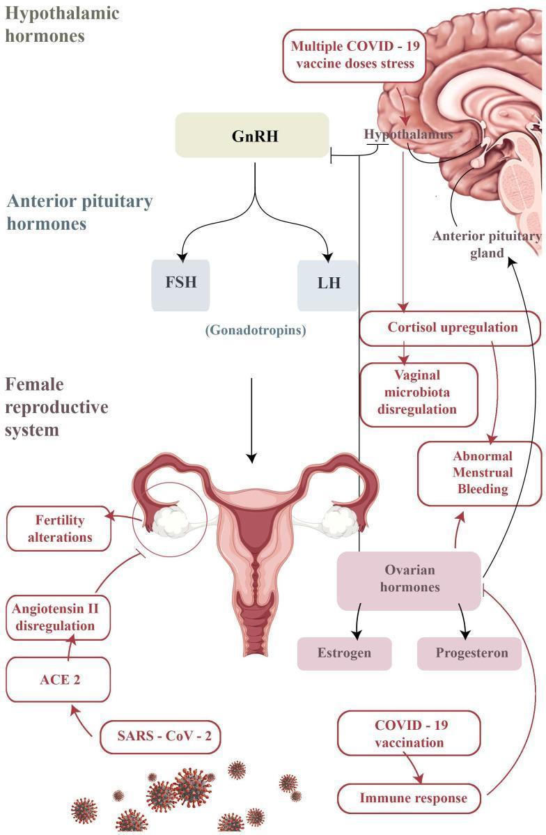
A pathophysiology diagram illustrating the hypothalamic-pituitary-gonadal (HPG) axis and potential mechanisms for gynecological changes following COVID-19 vaccination or infection. The central axis shows the Hypothalamus releasing GnRH, which stimulates the Anterior Pituitary Gland to release the gonadotropins FSH and LH, acting upon the female reproductive system (uterus and ovaries). A secondary pathway details the 'Multiple COVID-19 vaccine doses stress' response, which is shown to inhibit pulsatile GnRH secretion and promote 'Cortisol upregulation.' This cortisol increase is linked to 'Vaginal microbiota dysregulation' and 'Abnormal Menstrual Bleeding.' Simultaneously, an 'Immune response' from vaccination is depicted affecting 'Ovarian hormones' (Estrogen and Progesterone), also contributing to menstrual irregularities. Finally, the diagram indicates that SARS-CoV-2 infection can lead to 'Angiotensin II dysregulation' via the ACE2 receptor on ovarian tissue, potentially resulting in 'Fertility alterations.' This medical illustration serves to visualize the complex neuroendocrine and immunological interactions impacting reproductive health in the context of viral stress and immune activation.
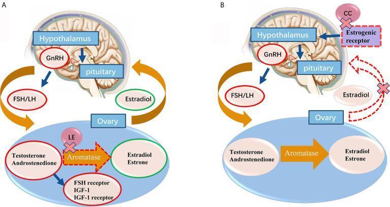
A comparative medical illustration detailing the mechanisms of action for ovulation induction agents on the hypothalamic-pituitary-ovarian (HPO) axis. Section A depicts the mechanism of Letrozole (LE), showing its inhibitory effect on the aromatase enzyme within the ovary. This blockade prevents the conversion of testosterone and androstenedione to estradiol and estrone, leading to intraovarian androgen accumulation and increased FSH receptor and IGF-1 expression. This process releases the HPO axis from estrogen's negative feedback while maintaining normal central feedback loops. Section B illustrates the mechanism of Clomiphene Citrate (CC), which acts centrally by binding to and blocking estrogenic receptors in the hypothalamus. This inhibits the negative feedback loop of estradiol (marked by red dashed lines and 'X' symbols), thereby stimulating the release of GnRH from the hypothalamus and FSH/LH from the pituitary to promote follicular development. Both diagrams use anatomical icons of the brain and ovary with labeled pathways for GnRH, FSH/LH, and steroid hormones to contrast peripheral enzymatic inhibition versus central receptor antagonism.
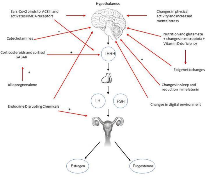
This pathophysiology diagram illustrates the hypothalamic-pituitary-gonadal (HPG) axis and various external factors contributing to precocious or rapidly progressive puberty. The central vertical axis displays a downward cascade starting from the hypothalamus, leading to LHRH (GnRH), then the pituitary gland, which secretes LH and FSH. These hormones act on the uterus and ovaries to produce estrogen and progesterone. Surrounding this central axis are several environmental and physiological stressors linked by red arrows. Factors influencing the hypothalamus include SARS-CoV-2 binding to ACE II/NMDA receptors, catecholamines, physical activity changes, mental stress, nutrition, and microbiota alterations. Direct influences on LHRH involve corticosteroids, cortisol, and allopregnanolone. Endocrine-disrupting chemicals are shown targeting the reproductive organs. Positive symbols (+) indicate stimulatory pathways. The diagram serves as an educational tool for endocrinology and pediatrics, highlighting how modern lifestyle factors, infections, and environmental toxins can disrupt normal pubertal timing via neuroendocrine pathways.
THE MENSTRUAL CYCLE - Comprehensive 15-Mark Answer
1. Definition and Overview
- Normal cycle length: 21-35 days (average 28 days)
- Duration of flow: 2-6 days (average 4-5 days)
- Average blood loss: 20-60 mL (average 30 mL)
- Day 1 = first day of menstrual bleeding
2. Diagram of the Menstrual Cycle
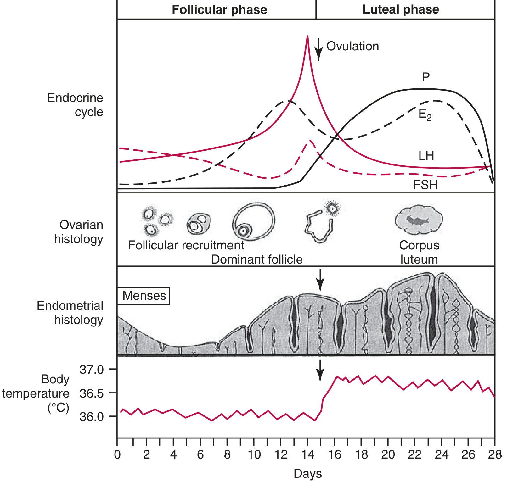
3. Control Axis - Hypothalamo-Pituitary-Ovarian (HPO) Axis
Hypothalamus → GnRH (pulsatile)
     ↓
Anterior Pituitary → FSH + LH
     ↓
Ovary → Estradiol (E2) + Progesterone (P4) + Inhibin
     ↓
Uterus (endometrium) + Cervix + Vagina
Key Principles of Regulation
| Feedback | Mechanism |
|---|---|
| Low estrogen → negative feedback | Suppresses FSH and LH (keeps gonadotropins low during follicular phase) |
| High estrogen → positive feedback | Triggers LH surge (ovulation) - biphasic response of E2 on LH |
| Progesterone + estrogen (luteal phase) → negative feedback | Suppresses FSH and LH during luteal phase |
| Inhibin B | Secreted by growing follicles; specifically suppresses FSH |
| Inhibin A | Secreted by corpus luteum; suppresses FSH in luteal phase |
- GnRH is released pulsatily from the arcuate nucleus of the hypothalamus
- Pulse frequency of GnRH determines relative amounts of LH vs. FSH
- Fast pulses → more LH; slow pulses → more FSH
4. The Ovarian Cycle
A. Follicular Phase (Days 1-14)
- Fall of estrogen and progesterone from previous cycle removes negative feedback
- FSH rises → cohort of primordial follicles recruited (5-15 follicles)
- Each follicle begins secreting estrogen as it grows
- Rising estrogen from growing follicles suppresses FSH (negative feedback)
- Only the follicle with most FSH receptors (most sensitive) survives → dominant follicle (Graafian follicle) selected by day 5-7
- Estradiol levels rise sharply
- LH initially suppressed by negative feedback from estradiol but later shows biphasic switch to positive feedback
- Outer theca interna cells (LH-responsive): produce androgens (androstenedione, testosterone)
- Inner granulosa cells (FSH-responsive): aromatize androgens → estradiol (E2)
- This is the two-cell, two-gonadotropin theory of estrogen synthesis
B. Ovulation (Day 14)
- Rising E2 reaches a critical threshold (>200 pg/mL for >50 hours)
- Positive feedback on hypothalamus and pituitary → massive LH surge (and smaller FSH surge)
- LH surge triggers resumption of meiosis in the oocyte (completion of meiosis I)
- LH surge → prostaglandin synthesis, proteolytic enzyme release → follicular wall ruptures
- Ovulation occurs 36 hours after onset of LH surge (24-36 hrs); 10-12 hours after peak LH
- Secondary oocyte released with first polar body, arrested in metaphase II
- Reliable predictor of ovulation
- Onset of LH surge: 16-58 hours before ovulation in 90% of women
- Basis of LH predictor kits for detecting ovulation
C. Luteal Phase (Days 14-28)
- Granulosa and theca cells luteinize (fill with lipid-rich luteal cells)
- Clotted blood in follicle → corpus hemorrhagicum
- Then replaced by yellowish cells → corpus luteum (yellow body)
- Corpus luteum requires LH for maintenance and VEGF for its blood supply
- Large amounts of progesterone (peaks at day 21, ~8 days after ovulation)
- Significant estradiol (second peak during luteal phase)
- Inhibin A
- Corpus luteum degenerates after 14 days → corpus albicans (white scar)
- Progesterone and estrogen fall → menstruation begins
- hCG (human chorionic gonadotropin) from the trophoblast maintains the corpus luteum
- Progesterone secretion continues to rise
- Corpus luteum persists until the placenta takes over at 8-10 weeks ("luteal-placental shift")
5. The Uterine (Endometrial) Cycle
A. Menstrual Phase (Days 1-5)
- Withdrawal of estrogen and progesterone due to corpus luteum demise
- Spiral artery vasospasm → endometrial ischemia
- Lysosomal breakdown → release of proteolytic enzymes
- Shedding of the decidua functionalis (upper 2/3 of endometrium)
- Prostaglandins (especially PGF2α) highest during menses → cause uterine contractions and vasoconstriction; responsible for dysmenorrhea
- Decidua basalis (deepest layer) is preserved and serves as source of regeneration
B. Proliferative Phase (Days 5-14) - Estrogen-Dominated
| Feature | Change |
|---|---|
| Endometrial thickness | 1-2 mm → up to 10-12 mm at ovulation |
| Glands | Initially straight and short → elongate and become tortuous |
| Glandular epithelium | Low columnar → pseudostratified before ovulation; multiple mitoses |
| Stroma | Dense and compact |
| Spiral arteries | Elongate |
| Cervical mucus | Copious, watery, elastic, transparent; shows ferning pattern (allows sperm penetration) |
| Spinnbarkeit | High elasticity of cervical mucus at ovulation |
- The stratum compactum (surface) and stratum spongiosum (deeper) together form the decidua functionalis that is shed each cycle
C. Secretory Phase (Days 14-28) - Progesterone-Dominated
| Feature | Change |
|---|---|
| Glands | Tortuous, "saw-toothed"; glycogen vacuoles appear (initially subnuclear → supranucluar → secreted into lumen) |
| Stroma | Becomes edematous by day 22-23 |
| Spiral arteries | Maximally coiled and lengthened; clearly visible |
| "Window of implantation" | Days 20-24 (6-7 days post-ovulation); maximal secretory activity - optimal for blastocyst implantation |
| Pseudodecidual reaction | Perivascular stromal eosinophilia; stroma resembles decidua of pregnancy |
| Cervical mucus | Thick, non-elastic, non-ferning; sperm-impenetrable |
| Pre-menstrual (Day 26-28) | PMN leukocyte infiltration → heralds collapse of stroma and onset of menses |
6. Hormonal Changes - Day-by-Day Summary
| Day | Phase | FSH | LH | Estradiol (E2) | Progesterone |
|---|---|---|---|---|---|
| 1-5 | Menstruation | ↑ rising | Low | Low | Low |
| 5-13 | Proliferative/follicular | ↓ falling | Low → ↑ | ↑↑ rising | Low |
| 13-14 | Pre-ovulation | Small ↑ (FSH surge) | LH surge | Peak (~250-500 pg/mL) | Slight ↑ |
| 14 | Ovulation | Falls | Begins rising | ||
| 15-22 | Secretory/luteal | Suppressed | Suppressed | Second ↑ (~125 pg/mL) | Peak (~8 days post-ov) |
| 23-28 | Late luteal | ↑ (for next cycle) | Low | ↓ falling | ↓ falling |
7. Cervical and Vaginal Changes
| Phase | Cervical Mucus | Vagina |
|---|---|---|
| Follicular (Estrogen) | Copious, watery, transparent; ferning; high Spinnbarkeit (>6 cm stretch) | Cornified epithelium; vaginal pH acidic |
| Luteal (Progesterone) | Scant, thick, opaque; no ferning; Spinnbarkeit decreased | Less cornification; intermediate cells predominate |
8. Basal Body Temperature (BBT)
- Rises 0.2-0.5°C after ovulation and remains elevated throughout the luteal phase
- Due to thermogenic effect of progesterone on the hypothalamus
- BBT lowest just before ovulation (estrogen nadir)
- Clinical use: Rhythm method of contraception; retrospective confirmation of ovulation
9. Ovarian Follicle Development in Detail
| Stage | Structure | Gonadotropin Driver |
|---|---|---|
| Primordial follicle | Oocyte + flattened granulosa cells | FSH-independent (constitutive) |
| Primary follicle | Cuboidal granulosa cells; zona pellucida forms | FSH |
| Secondary follicle | Multilayered granulosa; theca differentiates | FSH + LH |
| Antral (Graafian) follicle | Antrum filled with follicular fluid; ~20 mm at ovulation | FSH + LH |
| Corpus luteum | Post-ovulation; progesterone + estrogen | LH |
| Corpus albicans | Involuted CL (if no pregnancy) | - |
10. Clinical Applications
| Concept | Application |
|---|---|
| LH surge detection | Ovulation predictor kits (fertility awareness) |
| BBT monitoring | Rhythm method; confirm ovulation occurred |
| Ferning of cervical mucus | Predict and confirm ovulation |
| Prostaglandins in menses | NSAIDs (e.g., ibuprofen) → treat primary dysmenorrhea |
| Cycle variability | Follicular phase varies (10-21 days); luteal phase is relatively constant (14 ± 2 days) |
| Anovulatory cycles | No corpus luteum → no progesterone → no secretory phase; common in perimenopause and adolescence |
| OCP mechanism | Suppress FSH/LH → prevent follicular development and LH surge → prevent ovulation |
11. Summary
| Cycle | Phase | Days | Dominant Hormone | Key Event |
|---|---|---|---|---|
| Ovarian | Follicular | 1-14 | Estradiol | Follicle growth; dominant follicle selection |
| Ovarian | Ovulation | 14 | LH surge | Follicle rupture; oocyte released |
| Ovarian | Luteal | 14-28 | Progesterone | Corpus luteum; secretory preparation |
| Uterine | Menstrual | 1-5 | Both low | Endometrial shedding |
| Uterine | Proliferative | 5-14 | Estradiol | Endometrial growth |
| Uterine | Secretory | 14-28 | Progesterone | Implantation preparation; glandular secretion |