

1000425962.jpg
What is this ecg findings
analyse_media
Reading File
ECG Findings: Hypokalaemia
The ECG shown displays the classic triad of hypokalaemia (low potassium). Here is a breakdown of the findings:
Key ECG Abnormalities
| Finding | Description |
|---|---|
| Flattened / inverted T waves | T wave amplitude is reduced or flattened after each QRS complex |
| Prominent U waves | A distinct second positive deflection appears after the T wave - this is the hallmark finding |
| Apparent QT prolongation | What looks like a long QT is actually a QU interval - the T and U waves merge, mimicking a prolonged QT |
| P waves and QRS | Normal in morphology - sinus rhythm is maintained |
The Answer is A - Hypokalaemia
Why? Hypokalaemia prolongs ventricular repolarization, which manifests as:
- T wave flattening - reduced potassium gradient slows phase 3 repolarization
- U wave prominence - most characteristic sign; U waves are always present normally but become tall and visible when K⁺ < 3.0 mEq/L
- T-U fusion - at K⁺ < 2.5 mEq/L, T and U waves merge, creating the false appearance of QT prolongation
Why not Hyperkalaemia (B)? Hyperkalaemia produces the opposite pattern: tall, peaked ("tented") T waves, wide QRS, flattened P waves, and eventually a sine-wave pattern.
Clinical Pearl
The severity of ECG changes roughly correlates with K⁺ levels:
- K⁺ 3.0-3.5: subtle T flattening
- K⁺ 2.5-3.0: prominent U waves
- K⁺ < 2.5: T-U fusion, ST depression, risk of arrhythmias (PVCs, VT/VF)
Hypokalaemia also sensitizes the heart to digoxin toxicity, making ECG monitoring even more important in patients on digoxin.
Explain screening in that precision in detail
Finding Sources
Finding Sources
Finding Sources
Finding Sources
Reading File
Reading File
Reading File
Reading File
Loading Image
Loading Image
Here is a detailed breakdown of the ECG findings in hypokalaemia, with progressive changes mapped to serum potassium levels.
ECG Findings in Hypokalaemia - A Detailed Guide
Visual Reference
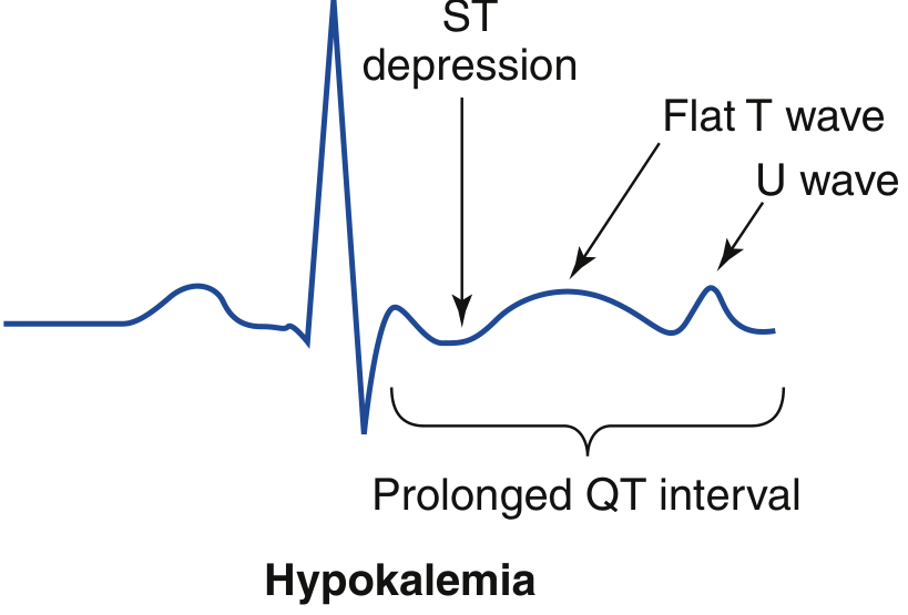
The diagram below (from Rosen's Emergency Medicine) labels every key abnormality on a single beat:
Progressive ECG Changes by Potassium Level
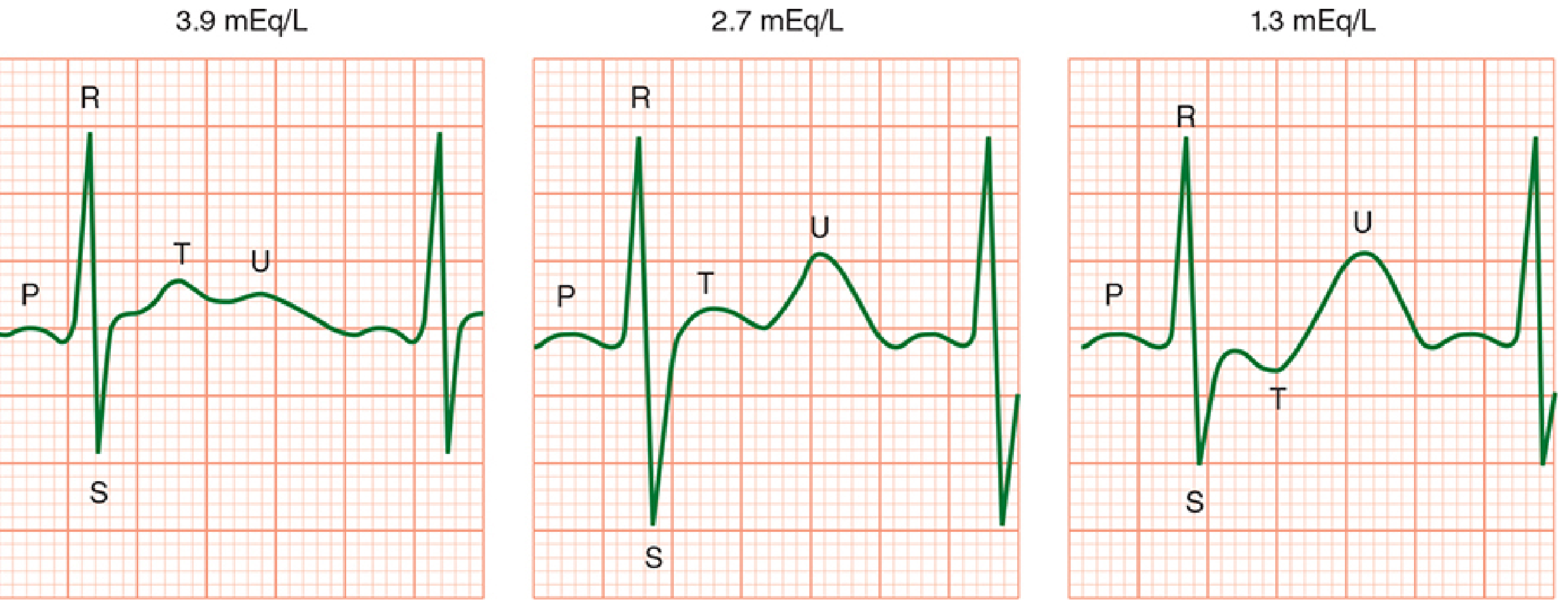
The image below (from Morgan & Mikhail's Clinical Anaesthesiology) shows the progression from normal (3.9 mEq/L) to moderate (2.7) to severe (1.3):
Finding-by-Finding Breakdown
1. T Wave Flattening
- What it is: The T wave (ventricular repolarisation) becomes progressively smaller and flatter
- Why it happens: Low extracellular K⁺ increases the potassium equilibrium potential, slowing phase 3 repolarisation of the action potential
- When it appears: Starts as early as K⁺ < 3.5 mEq/L
- Clinical significance: The first and most sensitive sign; often subtle and easy to miss
2. Prominent U Wave (Most Characteristic Finding)
- What it is: A positive deflection appearing after the T wave, best seen in leads V2-V3
- Why it happens: The U wave likely represents late repolarisation of the Purkinje fibres or mid-myocardial (M) cells. With hypokalaemia, this delayed repolarisation is exaggerated and becomes clearly visible
- When it appears: Becomes prominent at K⁺ < 3.0 mEq/L
- Rule of thumb: A U wave is "abnormally prominent" when its amplitude exceeds the T wave in the same lead
3. T-U Fusion and Apparent QT Prolongation
- What it is: The T wave and U wave merge into a single broad, biphasic hump - this is actually a QU interval, not true QT prolongation
- Why it matters: This is frequently misread as QT prolongation. The real QT interval (ending at the T wave) may be normal, but the fusion gives a falsely long measurement
- When it appears: K⁺ < 2.5 mEq/L
- Critical threshold: Once the actual QU/QT interval exceeds 500 ms, risk of torsades de pointes (TdP) increases 2-3 fold - this mandates continuous cardiac monitoring and IV potassium replacement
4. ST Segment Depression
- What it is: The ST segment dips below the isoelectric baseline
- Why it happens: Altered ventricular repolarisation shifts the ST segment down
- Clinical note: This is a non-specific finding but when combined with T flattening and U waves, it strongly points to hypokalaemia
5. Increased P Wave Amplitude / Prolonged PR Interval
- What it is: P waves become taller and broader; the PR interval may lengthen slightly
- Why it happens: Hypokalaemia alters atrial repolarisation and slows conduction through the AV node
- When it appears: More prominent with severe depletion (K⁺ < 2.5 mEq/L)
Summary Table
| K⁺ Level | ECG Finding |
|---|---|
| 3.0-3.5 mEq/L | Subtle T wave flattening |
| 2.5-3.0 mEq/L | Prominent U waves, ST depression |
| < 2.5 mEq/L | T-U fusion, prolonged QU interval, tall P waves |
| < 2.0 mEq/L | Severe arrhythmias (PVCs, VT, VF), risk of cardiac arrest |
Arrhythmia Risk
Hypokalaemia is pro-arrhythmic because low extracellular K⁺:
- Prolongs the action potential duration (hyperpolarised resting membrane)
- Increases automaticity - ectopic pacemakers become more active
- Facilitates re-entry - heterogeneous repolarisation across the myocardium
- Sensitises to digoxin toxicity - digoxin inhibits Na⁺/K⁺-ATPase, and hypokalaemia potentiates this block dramatically
Common arrhythmias: Premature ventricular contractions (PVCs), ventricular tachycardia, and in severe cases, ventricular fibrillation.
Clinical Pearl: The "0.3 Rule"
Each 0.3 mEq/L drop in serum K⁺ below normal reflects approximately 100 mEq total body potassium deficit. So a serum K⁺ of 2.5 (which is 1.0 below the lower limit of 3.5) = roughly 300 mEq total body deficit - a significant amount requiring careful, monitored replacement.
Morgan & Mikhail's Clinical Anaesthesiology, 7e | Rosen's Emergency Medicine, 10e
Explain screening in that precision in detailalso predictive value validity multiple testing likelihood ratio Roc curve cutoff for screening lead time types of screening with easy understanding way with examples of each to ake it easier to remember for exam and some tips in Aste to preventconfusion
Finding Sources
Finding Sources
Finding Sources
Finding Sources
Reading File
Reading File
Reading File
Finding Sources
Reading File
Reading File
Loading Image
Reading File
Now I have everything needed to write a thorough, exam-focused guide. Let me compile it all.
Screening - Complete Exam Guide
Sources: Park's Textbook of Preventive & Social Medicine | Henry's Clinical Diagnosis & Management by Laboratory Methods | Rosen's Emergency Medicine | Symptom to Diagnosis, 4e
PART 1: THE 2×2 CONTINGENCY TABLE (Foundation of Everything)
Every screening concept flows from this one table. Memorise it first.
                    DISEASE +        DISEASE -
TEST POSITIVE    a (True Pos)    b (False Pos)    → a+b (all positives)
TEST NEGATIVE    c (False Neg)   d (True Neg)     → c+d (all negatives)
                    a+c              b+d              N (total)
Memory trick - ABCD:
- a = sick AND test positive ✓ (TRUE POSITIVE)
- b = healthy BUT test positive ✗ (FALSE POSITIVE - "Boy cried wolf")
- c = sick BUT test negative ✗ (FALSE NEGATIVE - "Cancer missed")
- d = healthy AND test negative ✓ (TRUE NEGATIVE)
PART 2: VALIDITY (Sensitivity & Specificity)
These are fixed properties of the test itself - they do NOT change with prevalence.
Sensitivity = a / (a+c)
- "Of all the sick people, how many did the test catch?"
- = True Positive Rate
- Low sensitivity = many false negatives (misses disease)
Specificity = d / (b+d)
- "Of all the healthy people, how many did the test correctly label as healthy?"
- = True Negative Rate
- Low specificity = many false positives (over-diagnoses)
Memory Mnemonics
| Mnemonic | Meaning |
|---|---|
| SnNout | High Snsitivity - Negative result rules disease OUT |
| SpPin | High Specificity - Positive result rules disease IN |
Example: HIV ELISA (high sensitivity) - a negative result rules out HIV. HIV Western Blot (high specificity) - a positive result confirms HIV.
The Trade-off (Critical Exam Point)
- Lowering the cutoff → sensitivity ↑, specificity ↓ (more people test positive, catch more disease, but more false alarms)
- Raising the cutoff → sensitivity ↓, specificity ↑ (fewer false alarms, but miss more cases)
Blood sugar for diabetes screening:
- Cut-off at 120 mg/dL → high sensitivity (catches all diabetics) but low specificity (many false positives)
- Cut-off at 180 mg/dL → high specificity but misses early cases
PART 3: PREDICTIVE VALUES
These DO change with prevalence - this is the most tested concept.
Positive Predictive Value (PPV) = a / (a+b)
- "If a test is positive, what is the chance the person actually has the disease?"
- Rises with increasing prevalence
Negative Predictive Value (NPV) = d / (c+d)
- "If a test is negative, what is the chance the person truly does not have the disease?"
- Rises with decreasing prevalence
Classic Example from Park's Textbook
Gonorrhoea screening (sensitivity 50%, specificity 90%):
| Prevalence | PPV |
|---|---|
| 5% | 21% - 79% of positives are false! |
| 15% | 47% |
| 25% | 63% |
Key exam tip: In a low-prevalence population, even an excellent test has terrible PPV. This is why screening the wrong population is harmful - most "positives" are false alarms.
PART 4: LIKELIHOOD RATIOS (LR)
LR gives you the power of a test result independent of prevalence - it tells you how much a result changes the odds of disease.
Positive Likelihood Ratio (LR+)
LR+ = Sensitivity / (1 - Specificity)
= True positive rate / False positive rate
- "How much more likely is a positive test in a sick person vs a healthy person?"
Negative Likelihood Ratio (LR-)
LR- = (1 - Sensitivity) / Specificity
= False negative rate / True negative rate
- "How much more likely is a negative test in a sick person vs a healthy person?"
Interpretation Guide
| LR+ Value | Meaning |
|---|---|
| > 10 | Strong evidence for disease |
| 5-10 | Moderate evidence |
| 2-5 | Small evidence |
| 1 | Test is useless |
| LR- Value | Meaning |
|---|---|
| < 0.1 | Strong evidence against disease |
| 0.1-0.2 | Moderate evidence against |
| 0.5-1 | Test not helpful |
Memory hook: LR+ should be BIG (>10 = great). LR- should be SMALL (<0.1 = great). Think "big positive, small negative."
PART 5: ROC CURVE & CUTOFF
![ROC curve concept - sensitivity vs 1-specificity at all possible cutoffs. The ideal test hugs the upper-left corner.]
The ROC curve plots:
- Y-axis = Sensitivity (True Positive Rate)
- X-axis = 1 - Specificity (False Positive Rate)
At every point on the curve, one specific cutoff value is represented.
Key Rules
| Concept | Rule |
|---|---|
| Perfect test | Curve hugs the top-left corner (sensitivity = 1, false positive rate = 0) |
| Useless test | Diagonal line from bottom-left to top-right (AUC = 0.5) |
| Better test | Larger area under the curve (AUC) |
| AUC interpretation | 0.9-1.0 = excellent; 0.8-0.9 = good; 0.7-0.8 = fair; 0.5-0.6 = poor |
Choosing the Cutoff
- Move left on the ROC curve (raise cutoff) → higher specificity, lower sensitivity (use for confirmatory tests)
- Move right on the ROC curve (lower cutoff) → higher sensitivity, lower specificity (use for screening)
- Optimal cutoff = the point on the curve closest to the top-left corner (balances both)
Exam visual memory: The ROC curve is like a "bow" shooting toward the top-left. The better the bow, the more it curves upward.
PART 6: MULTIPLE TESTING (Serial vs Parallel)
When you use two tests together, you can run them in two ways:
Parallel Testing (Simultaneous)
- Both tests done at the same time
- Patient is positive if either test is positive
- INCREASES sensitivity (catches more disease)
- DECREASES specificity (more false positives)
- Use when: You must not miss disease (e.g., blood bank screening for HIV - test every unit with both ELISA and another test)
Example: Screening for MI using both troponin AND CK-MB simultaneously - if either is elevated, investigate further.
Serial Testing (Sequential)
- Second test done only if first is positive
- Patient is positive only if both tests are positive
- INCREASES specificity (fewer false positives)
- DECREASES sensitivity (miss some cases)
- Use when: You want to confirm disease before expensive/invasive treatment
Example: HIV screening: ELISA first (high sensitivity) → if positive, Western Blot (high specificity) → both positive = confirmed HIV.
Memory Trick
| Type | Think | Effect |
|---|---|---|
| Parallel | "Both nets out at once" → catches more fish | ↑ Sensitivity, ↓ Specificity |
| Serial | "One after another" → finer filter | ↑ Specificity, ↓ Sensitivity |
PART 7: LEAD TIME & TYPES OF BIAS IN SCREENING
Lead Time
Lead time = the time between early detection by screening and the time the disease would have been diagnosed clinically (from symptoms).
Think of it as: The "head start" you get from screening.
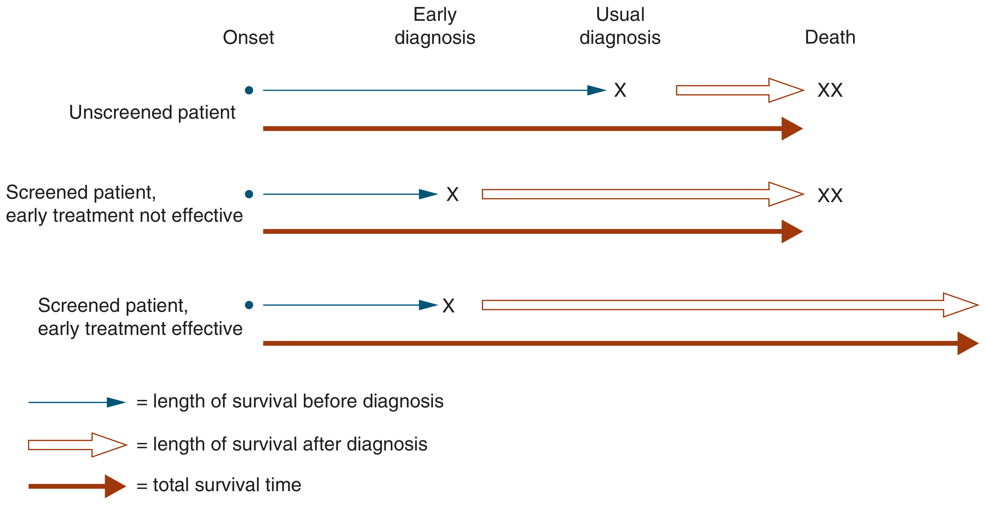
Lead Time Bias
- Screened patients appear to survive longer after diagnosis because the clock starts earlier (at screening), not at symptoms
- But the actual date of death may be the same
- Falsely makes screening look beneficial when it is not
Classic example: If a cancer would have been diagnosed at age 60 from symptoms, and screening detects it at age 55 - the patient "survives 5 extra years" after diagnosis. But they still die at 65. Lead time was 5 years - the survival gain is an illusion unless treatment actually changes the outcome.
Length Time Bias
- Screening tends to detect slow-growing, indolent tumours (because fast-growing ones progress to symptoms between screening rounds and are missed by the screen)
- These slow-growing cancers have better prognosis anyway
- Falsely makes screened cancers look better prognosis than non-screened ones
Example: Prostate cancer screening by PSA catches many slow-growing cancers that may never have caused symptoms. These patients "survive longer" - but not because of screening, because their cancer was inherently less aggressive.
Healthy Worker / Volunteer Bias
- People who come for screening are generally healthier, more health-conscious, and higher socioeconomic status
- Screened group appears healthier, making the screening programme look more effective than it is
PART 8: TYPES OF SCREENING
1. Mass Screening (Universal)
- Screen the entire population regardless of risk
- Example: Newborn blood spot screening (PKU, hypothyroidism, congenital adrenal hyperplasia) - every baby gets tested
- Use when: Disease is common, test is cheap, and benefit is universal
2. Selective / High-Risk Screening (Targeted)
- Screen only high-risk subgroups
- Example: Colonoscopy screening for colorectal cancer in patients over 45 with family history; BRCA testing only in women with family history of breast/ovarian cancer
- Use when: Disease is rare in the general population but common in a specific group; increases yield
3. Opportunistic Screening (Case Finding)
- Screening done during a routine visit for another reason - the patient presents for something unrelated and is screened incidentally
- Example: Blood pressure measurement during a consultation for sore throat; cholesterol check during diabetes review
- Advantage: No extra effort or cost; reaches people who would not attend a dedicated screening programme
4. Multiphasic Screening
- Multiple screening tests administered at the same time in one visit
- Example: A health check package including BP, blood sugar, lipids, ECG, BMI, and chest X-ray all in one visit
- Advantage: Cost-effective, convenient
- Disadvantage: Multiple testing increases false-positive rate (see below)
5. Syndromic / Sentinel Surveillance Screening
- Ongoing monitoring of a population for early warning signs of an outbreak
- Example: Influenza surveillance - monitoring emergency department visits for "flu-like illness" to detect early pandemic signal
PART 9: THE MULTIPLE TESTING PROBLEM
When you run many tests on one person (as in multiphasic screening), the chance of at least one false positive rises dramatically.
If each test has specificity 95% (false positive rate 5%):
- 1 test: 5% chance of a false positive
- 5 tests: 1 - (0.95)⁵ = 23% chance of at least one false positive
- 10 tests: 1 - (0.95)¹⁰ = 40% chance of at least one false positive
- 20 tests: 1 - (0.95)²⁰ = 64% chance of at least one false positive
Exam tip: This is why "annual full body health checks with 50 blood tests" lead to so many unnecessary referrals and patient anxiety - the more tests, the more inevitable false alarms.
QUICK REVISION SUMMARY TABLE
| Concept | Formula | Changes with Prevalence? | Use For |
|---|---|---|---|
| Sensitivity | a/(a+c) | No | Screen - don't miss disease |
| Specificity | d/(b+d) | No | Confirm - rule IN disease |
| PPV | a/(a+b) | YES - rises with prevalence | Tells patient "your positive means..." |
| NPV | d/(c+d) | YES - rises as prevalence falls | Tells patient "your negative means..." |
| LR+ | Sn/(1-Sp) | No | Quantifies how much test changes odds |
| LR- | (1-Sn)/Sp | No | Quantifies how much negative changes odds |
TOP EXAM TIPS - AVOIDING CONFUSION
1. Sensitivity vs PPV - students confuse these constantly.
- Sensitivity = fixed property of the test
- PPV = depends on who you test (prevalence)
- Tip: A 99% sensitive HIV test in a low-risk population still has terrible PPV. Prevalence is everything for PPV.
2. Lead time ≠ benefit
- More time living with the diagnosis is not the same as living longer
- Only a reduction in mortality rate (not survival time from diagnosis) proves screening works
3. Parallel = more sensitive / Serial = more specific
- Never get these backwards. Parallel = both nets out = catches more = sensitive.
4. Shifting the cutoff changes BOTH Sn and Sp in opposite directions
- You can NEVER improve both at the same time (unless you get a better test)
- This is the whole point of the ROC curve - it shows all the trade-offs
5. LR > 1 means test increases probability of disease; LR < 1 decreases it
- LR+ must be > 1 (positive test should increase disease probability)
- LR- must be < 1 (negative test should decrease disease probability)
6. ROC AUC = 0.5 = coin toss = useless test. AUC = 1.0 = perfect test.
This is a shared conversation. Sign in to Orris to start your own chat.