
/handwritten notes of stress strain curve
stress strain curve diagram engineering materials
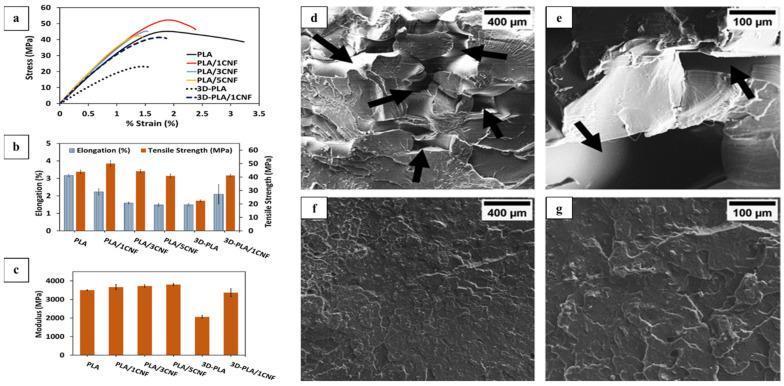
This composite educational graphic illustrates the mechanical and morphological properties of 3D-printed polylactic acid (PLA) and cellulose nanofiber (CNF) composites, materials frequently investigated for biomedical applications such as tissue engineering scaffolds and orthopedic implants. Panels (a-c) present quantitative mechanical data. A tensile stress-strain curve (a) compares compression-molded versus 3D-printed variants, highlighting differences in tensile strength and elongation. Histograms (b-c) detail elongation (%), tensile strength (MPa), and Young's modulus (MPa), demonstrating that 1% CNF reinforcement enhances the mechanical robustness of 3D-printed structures. Panels (d-g) show Scanning Electron Microscopy (SEM) micrographs of tensile fracture surfaces. Micrographs (d) and (e) (magnifications x150 and x600) show neat 3D-printed PLA, characterized by visible voids and overlapped structures (arrows) indicating lower structural integrity. In contrast, micrographs (f) and (g) display 3D-printed PLA/1% CNF composites, revealing a more uniform, densely packed morphology with fewer structural defects. These visuals demonstrate how nanocellulose integration improves the microstructural bonding and mechanical performance of biocompatible 3D-printed constructs.
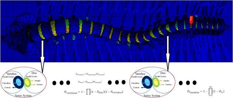
This infographic and computational diagram illustrate a 3D Finite Element Analysis (FEA) of a human vertebral column with scoliosis. The main visual features a mesh-based structural model of the spine against a blue background, displaying the characteristic lateral curvature of scoliosis. Color-coded heat mapping on the intervertebral discs and vertebrae indicates stress distribution, with green, yellow, and red zones representing increasing mechanical strain; a 'Max' tag identifies the peak stress point, typically near inflection points of the spinal curve. Below the 3D model, two circular inset diagrams provide a schematic breakdown of the 'Series System' and 'Parallel System' used for reliability modeling. These diagrams define the vertebra as a combination of cortical and cancellous bone, and the intervertebral disc as a combination of the annulus fibrosus and nucleus pulposus. Mathematical formulas for probability of failure (Pf) are interspersed, detailing sectional and total backbone reliability calculations. This visual is designed for advanced biomechanical engineering and orthopedic research contexts to assess structural integrity and system reliability in spinal disorders.
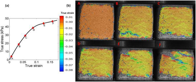
This composite educational graphic illustrates the mechanical properties and strain evolution of a mycelium-based biomaterial under uniaxial compression. Part (a) displays a true stress (kPa) versus true strain curve, identifying six specific points (A-F) that represent stages from linear elastic response to yielding and strain hardening. Part (b) presents a corresponding sequence of digital image correlation (DIC) maps for each point. These maps visualize the logarithmic normal strain distribution using a color-coded scale ranging from red (positive/low strain, ~0.01) to blue (significant negative strain, ~-0.08). The sequence demonstrates the progression from a uniform strain state (A) to the initiation of strain localization (B-C) and the final formation of distinct, diagonal 'collapse bands' (D-F). This illustrates how the stochastic, porous network structure of the mycelium fiber network leads to heterogeneous deformation and structural yielding, a key concept in biomaterial engineering and the study of biofoam mechanics for medical or structural applications.
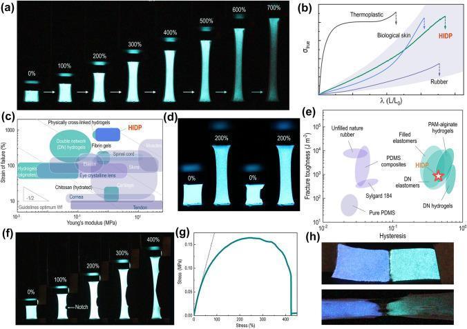
A multi-panel scientific infographic and diagram set illustrating the mechanical and luminescent performance of a Hydroscopic Induced Dual-network Polymer (HIDP), a material designed for biocompatible ionotronics and electronic skins. (a) and (f) present clinical-style photographic sequences of the HIDP and a pre-notched HIDP under tensile strain from 0% to 700%, demonstrating significant vertical elongation, central necking, and sustained blue luminescence. (b) displays a J-shaped true stress-elongation curve, comparing HIDP to biological skin, rubber, and thermoplastics. (c) is an Ashby plot comparing Young’s modulus and strain of failure, positioning HIDP near biological tissues like elastin, skin, and muscles. (d) shows photographic evidence of luminescence stability after 100 stretching cycles at 200% strain. (e) provides an Ashby plot for fracture toughness versus hysteresis, comparing HIDP to DN hydrogels and PDMS. (g) shows a tensile stress-strain curve indicating ductile fracture behavior. (h) demonstrates the material's self-healing properties through a dual-color blue and green luminescent HIDP assembly at 0% and 300% strain. This content is intended for research in biomedical engineering, prosthetics, and wearable medical sensors.
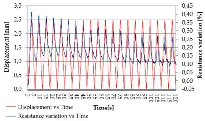
This line graph illustrates the piezoresistive behavior of a carbon nanotube (CNT) polymer composite, a material technology utilized in medical pressure sensors and bio-mechanical monitoring. The plot tracks two variables over a 120-second interval: cyclic displacement (red line) and resistance variation (blue line). The red curve depicts a regular mechanical oscillation between 0.0 and 2.5 mm, simulating repetitive stress or movement. The blue curve represents the resulting resistance variation percentage (%), demonstrating the material's sensitivity to physical deformation. A clear inverse correlation is visible: as displacement peaks (maximum strain), the resistance variation reaches a valley, indicating a decrease in electrical resistance. The data shows high reproducibility with a slight attenuation in resistance amplitude over time, reaching a stable cyclical state. This relationship is critical for biomedical engineering applications where such materials serve as strain gauges for monitoring physiological signals like gait, respiration, or joint mobility.
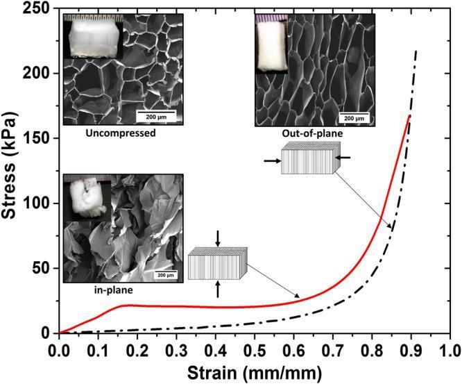
A scientific infographic and plot illustrating the biomechanical properties and morphology of a 0.9A cellulose acetate aerogel, a material studied for tissue engineering and medical scaffolding applications. The primary graph displays compressive Stress (kPa) vs. Strain (mm/mm) comparing in-plane (solid red line) and out-of-plane (dashed black line) compression. The in-plane curve exhibits a distinct linear elastic region, yielding at approximately 15% strain, followed by a plateau and sharp densification after 74% strain. The out-of-plane curve shows lower initial stress with densification occurring at 86% strain. Insets provide Scanning Electron Microscopy (SEM) micrographs (200 µm scale) and clinical-style macro photographs of the samples. The 'Uncompressed' SEM shows a regular honeycomb-like pore structure; 'Out-of-plane' compression results in pore wall bending and minor cracking; 'In-plane' compression leads to total structural collapse and loss of pore morphology. Schematic diagrams illustrate the directional force applied relative to the longitudinal pore alignment, highlighting the material's anisotropic mechanical behavior relevant to structural biomaterials.
stress strain curve handwritten notes engineering materials science
Handwritten-style engineering notes of a stress-strain curve for mild steel (low carbon steel), showing all key labeled regions: Proportional Limit, Elastic Limit, Upper Yield Point, Lower Yield Point, Ultimate Tensile Strength (UTS), Fracture Point. Include the following zones clearly labeled: Elastic Region, Plastic Region, Strain Hardening, Necking. Show axes labeled Stress (σ) on Y-axis and Strain (ε) on X-axis. Add handwritten annotation notes beside each point explaining what it means. Also include a smaller inset sketch comparing ductile vs brittle material curves. Style should look like neat hand-drawn pencil notes on white paper with annotations, like a student's engineering study notes.
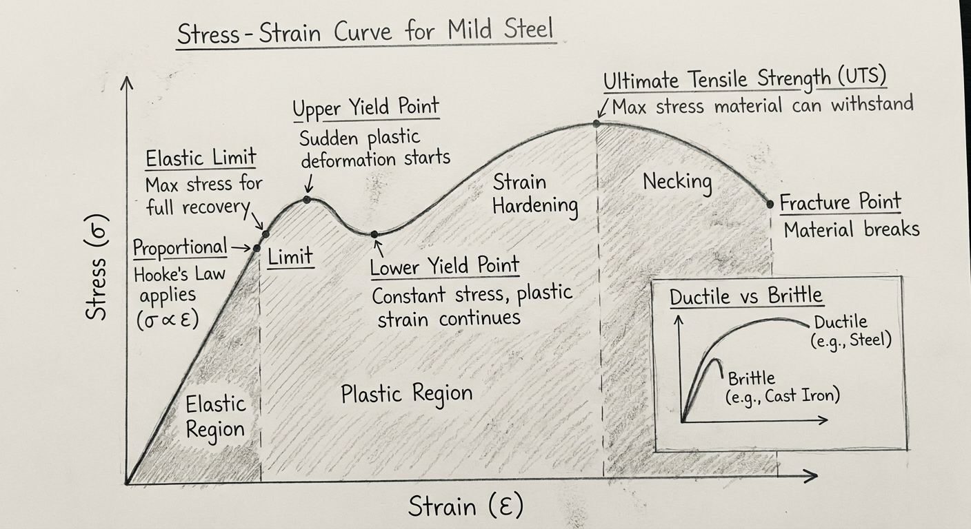
Stress-Strain Curve - Complete Notes
What is it?
- Stress (σ) = Force / Original Cross-sectional Area (Pa or MPa)
- Strain (ε) = Change in Length / Original Length (dimensionless)
Key Points on the Curve (Mild Steel / Ductile Metal)
| Point | Name | Description |
|---|---|---|
| O-A | Proportional Limit | Stress ∝ Strain (Hooke's Law holds). The curve is a straight line. |
| A | Elastic Limit | Maximum stress up to which material returns to original shape on load removal. |
| B | Upper Yield Point | Sudden drop in stress; dislocations begin to move. |
| C | Lower Yield Point | Stress at which yielding continues at constant (or lower) stress. |
| D | Ultimate Tensile Strength (UTS) | Maximum stress the material can withstand before necking begins. |
| E | Fracture / Breaking Point | Material breaks. |
Zones on the Curve
- Elastic Region (O to A): Deformation is reversible. Young's modulus (E) = slope of this line.
- Yield Zone (B-C): Plastic deformation begins. Upper and lower yield points visible in mild steel.
- Strain Hardening (C to D): Material strengthens due to dislocation pile-up; stress increases again.
- Necking (D to E): Cross-sectional area reduces locally; engineering stress appears to drop, but true stress keeps rising.
Important Formulae
- Young's Modulus: E = σ / ε (slope of elastic region)
- Resilience: Area under elastic region = energy stored per unit volume
- Toughness: Total area under the curve = energy absorbed before fracture
Ductile vs Brittle Materials
| Property | Ductile (e.g., Steel, Aluminium) | Brittle (e.g., Cast iron, Glass) |
|---|---|---|
| Plastic deformation | Large | Very small / none |
| Fracture | After necking | Sudden, without warning |
| Curve shape | Long curve with yield + UTS regions | Short, nearly linear until fracture |
| Example use | Structural beams, car bodies | Engine blocks, ceramics |
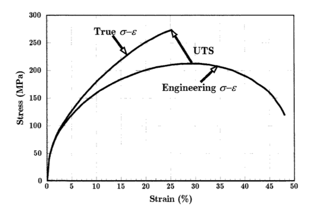
Engineering vs True Stress-Strain
- Engineering stress/strain uses the original dimensions - easier to measure.
- True stress/strain uses instantaneous dimensions - more accurate, especially post-necking.
- True stress is always higher than engineering stress after yielding begins.
Create a PDF quick reference guide for stress-strain curves
ls -la /tmp/workspace/ 2>/dev/null || echo "workspace does not exist"
mkdir -p /tmp/workspace/stress-strain-pdf
~/stress-strain-pdf/build_pdf.py
"""
Stress-Strain Curve Quick Reference Guide PDF
Using reportlab with matplotlib for the curve diagrams
"""
import os
import math
import matplotlib
matplotlib.use('Agg')
import matplotlib.pyplot as plt
import matplotlib.patches as mpatches
import numpy as np
from reportlab.lib.pagesizes import A4
from reportlab.lib import colors
from reportlab.lib.units import mm, cm
from reportlab.lib.styles import getSampleStyleSheet, ParagraphStyle
from reportlab.lib.enums import TA_CENTER, TA_LEFT, TA_JUSTIFY
from reportlab.platypus import (
SimpleDocTemplate, Paragraph, Spacer, Table, TableStyle,
HRFlowable, Image, KeepTogether
)
from reportlab.lib.colors import HexColor
OUTPUT_DIR = "/tmp/workspace/stress-strain-pdf"
PDF_PATH = os.path.join(OUTPUT_DIR, "Stress_Strain_Quick_Reference.pdf")
IMG_DIR = os.path.join(OUTPUT_DIR, "imgs")
os.makedirs(IMG_DIR, exist_ok=True)
# ─── COLORS ────────────────────────────────────────────────────────────────────
C_NAVY = HexColor("#1a2d5a")
C_BLUE = HexColor("#2563eb")
C_LIGHT = HexColor("#dbeafe")
C_ACCENT = HexColor("#f59e0b")
C_RED = HexColor("#dc2626")
C_GREEN = HexColor("#16a34a")
C_PURPLE = HexColor("#7c3aed")
C_GRAY = HexColor("#6b7280")
C_LGRAY = HexColor("#f3f4f6")
C_WHITE = colors.white
C_BLACK = colors.black
# ─── FIGURE 1: Mild Steel Stress-Strain Curve ─────────────────────────────────
def plot_mild_steel():
fig, ax = plt.subplots(figsize=(8, 5))
fig.patch.set_facecolor('#f8fafc')
ax.set_facecolor('#f8fafc')
# Build the curve piecewise
# O -> A (elastic, linear)
e1 = np.linspace(0, 0.002, 50)
s1 = e1 * 200000 # MPa, slope = E = 200 GPa
# A -> B (upper yield)
e2 = np.linspace(0.002, 0.0022, 10)
s2 = np.linspace(400, 420, 10)
# B -> C (drop to lower yield)
e3 = np.linspace(0.0022, 0.0025, 10)
s3 = np.linspace(420, 360, 10)
# C -> D (yield plateau / Luders band)
e4 = np.linspace(0.0025, 0.012, 20)
s4 = np.linspace(360, 360, 20)
# D -> E (strain hardening, smooth rise)
e5 = np.linspace(0.012, 0.20, 60)
s5 = 360 + 220 * (1 - np.exp(-12 * (e5 - 0.012)))
# E -> F (necking, UTS -> fracture)
e6 = np.linspace(0.20, 0.28, 30)
s6 = s5[-1] - 120 * ((e6 - 0.20) / 0.08) ** 0.7
# Full arrays
e_all = np.concatenate([e1, e2, e3, e4, e5, e6])
s_all = np.concatenate([s1, s2, s3, s4, s5, s6])
ax.plot(e_all * 100, s_all, color='#1a2d5a', lw=2.5, zorder=3)
# Key points
pts = {
'O': (0, 0, 'Origin'),
'A': (0.2, 400, 'Proportional\nLimit'),
'B': (0.22, 420, 'Upper Yield\nPoint'),
'C': (0.25, 360, 'Lower Yield\nPoint'),
'D': (1.2, 360, 'End of Yield\nPlateau'),
'E': (20.0, s5[-1],'UTS'),
'F': (28.0, s6[-1],'Fracture'),
}
label_offsets = {
'O': (-0.5, 20),
'A': (-1.5, 18),
'B': (0.3, 15),
'C': (0.3, -25),
'D': (0.3, -25),
'E': (-2, 15),
'F': (0.3, 10),
}
dot_colors = {
'O': '#6b7280', 'A': '#2563eb', 'B': '#f59e0b',
'C': '#f59e0b', 'D': '#16a34a', 'E': '#dc2626', 'F': '#7c3aed'
}
for key, (ex, sy, lbl) in pts.items():
ax.scatter(ex, sy, color=dot_colors[key], s=60, zorder=5)
dx, dy = label_offsets[key]
ax.annotate(key, (ex, sy), xytext=(ex + dx, sy + dy),
fontsize=9, fontweight='bold', color=dot_colors[key],
ha='center')
# Zone shading
# Elastic region
mask_e = e_all <= 0.002
ax.fill_between(e_all[mask_e]*100, s_all[mask_e], alpha=0.15, color='#2563eb')
ax.text(0.1, 150, 'ELASTIC\nREGION', fontsize=7, color='#2563eb',
ha='center', va='center', style='italic')
# Yield plateau
mask_y = (e_all >= 0.0022) & (e_all <= 0.012)
ax.fill_between(e_all[mask_y]*100, s_all[mask_y], alpha=0.15, color='#f59e0b')
ax.text(0.7, 200, 'YIELD\nPLATEAU', fontsize=7, color='#b45309',
ha='center', va='center', style='italic')
# Strain hardening
mask_sh = (e_all >= 0.012) & (e_all <= 0.20)
ax.fill_between(e_all[mask_sh]*100, s_all[mask_sh], alpha=0.12, color='#16a34a')
ax.text(10, 250, 'STRAIN\nHARDENING', fontsize=7, color='#16a34a',
ha='center', va='center', style='italic')
# Necking
mask_n = e_all >= 0.20
ax.fill_between(e_all[mask_n]*100, s_all[mask_n], alpha=0.15, color='#dc2626')
ax.text(24, 350, 'NECKING', fontsize=7, color='#dc2626',
ha='center', va='center', style='italic')
ax.set_xlabel('Strain ε (%)', fontsize=11, labelpad=6)
ax.set_ylabel('Stress σ (MPa)', fontsize=11, labelpad=6)
ax.set_title('Stress-Strain Curve — Mild Steel (Low Carbon)', fontsize=12,
fontweight='bold', color='#1a2d5a', pad=10)
ax.set_xlim(-0.5, 30)
ax.set_ylim(-20, 620)
ax.spines[['top', 'right']].set_visible(False)
ax.grid(True, linestyle='--', alpha=0.4, color='#cbd5e1')
# Legend patches
patches = [
mpatches.Patch(color='#2563eb', alpha=0.4, label='Elastic Region'),
mpatches.Patch(color='#f59e0b', alpha=0.4, label='Yield Plateau'),
mpatches.Patch(color='#16a34a', alpha=0.4, label='Strain Hardening'),
mpatches.Patch(color='#dc2626', alpha=0.4, label='Necking'),
]
ax.legend(handles=patches, loc='upper left', fontsize=8, framealpha=0.8)
plt.tight_layout()
path = os.path.join(IMG_DIR, "mild_steel_curve.png")
fig.savefig(path, dpi=150, bbox_inches='tight')
plt.close()
return path
# ─── FIGURE 2: Ductile vs Brittle Comparison ──────────────────────────────────
def plot_ductile_brittle():
fig, ax = plt.subplots(figsize=(7, 4))
fig.patch.set_facecolor('#f8fafc')
ax.set_facecolor('#f8fafc')
# Ductile (steel-like)
e_d = np.linspace(0, 0.35, 300)
s_d = np.where(e_d < 0.002,
e_d * 200000,
np.where(e_d < 0.012, 400,
400 + 200 * (1 - np.exp(-10*(e_d - 0.012)))))
# drop after UTS
uts_idx = np.argmax(s_d)
s_d[uts_idx:] = s_d[uts_idx] * (1 - 0.6 * ((e_d[uts_idx:] - e_d[uts_idx]) / (0.35 - e_d[uts_idx]))**0.5)
ax.plot(e_d*100, s_d, color='#2563eb', lw=2.5, label='Ductile (e.g. Steel)')
ax.scatter([e_d[-1]*100], [s_d[-1]], color='#2563eb', s=60, zorder=5)
# Brittle (cast iron-like)
e_b = np.linspace(0, 0.008, 100)
s_b = 300 * np.sin(e_b / 0.008 * math.pi / 2) ** 0.6
ax.plot(e_b*100, s_b, color='#dc2626', lw=2.5, label='Brittle (e.g. Cast Iron)', linestyle='--')
ax.scatter([e_b[-1]*100], [s_b[-1]], color='#dc2626', s=60, zorder=5,
marker='X')
# Rubber/elastomer
e_r = np.linspace(0, 5.0, 200)
s_r = 5 * (e_r / 5)**0.3 * 30
ax.plot(e_r, s_r, color='#16a34a', lw=2, label='Elastomer (e.g. Rubber)', linestyle=':')
ax.annotate('Fracture\n(brittle)', xy=(0.8, s_b[-1]), xytext=(2.5, 200),
arrowprops=dict(arrowstyle='->', color='#dc2626'),
fontsize=8, color='#dc2626', ha='center')
ax.annotate('Fracture\n(ductile)', xy=(35, s_d[-1]), xytext=(27, 180),
arrowprops=dict(arrowstyle='->', color='#2563eb'),
fontsize=8, color='#2563eb', ha='center')
ax.set_xlabel('Strain ε (%)', fontsize=10)
ax.set_ylabel('Stress σ (MPa)', fontsize=10)
ax.set_title('Ductile vs Brittle vs Elastomer', fontsize=11,
fontweight='bold', color='#1a2d5a')
ax.set_xlim(-0.2, 38)
ax.set_ylim(-10, 650)
ax.legend(fontsize=8, framealpha=0.85)
ax.spines[['top','right']].set_visible(False)
ax.grid(True, linestyle='--', alpha=0.4, color='#cbd5e1')
plt.tight_layout()
path = os.path.join(IMG_DIR, "ductile_brittle.png")
fig.savefig(path, dpi=150, bbox_inches='tight')
plt.close()
return path
# ─── FIGURE 3: Engineering vs True Stress-Strain ──────────────────────────────
def plot_eng_vs_true():
fig, ax = plt.subplots(figsize=(6, 4))
fig.patch.set_facecolor('#f8fafc')
ax.set_facecolor('#f8fafc')
e_eng = np.linspace(0, 0.5, 300)
# Engineering
s_eng = np.where(e_eng < 0.002,
e_eng * 200000,
np.where(e_eng < 0.015, 400,
400 + 150*(1 - np.exp(-8*(e_eng - 0.015)))))
uts_i = np.argmax(s_eng)
s_eng[uts_i:] = s_eng[uts_i] * (1 - 0.7*((e_eng[uts_i:]-e_eng[uts_i])/(0.5-e_eng[uts_i]))**0.6)
# True sigma_true = sigma_eng * (1 + e_eng)
s_true = s_eng * (1 + e_eng)
ax.plot(e_eng*100, s_eng, color='#2563eb', lw=2.5, label='Engineering σ-ε')
ax.plot(e_eng*100, s_true, color='#dc2626', lw=2.5, linestyle='--', label='True σ-ε')
ax.axvline(x=e_eng[uts_i]*100, color='#6b7280', lw=1, linestyle=':')
ax.text(e_eng[uts_i]*100 + 0.5, 200, 'UTS /\nNecking\nstarts', fontsize=7,
color='#6b7280')
ax.fill_between(e_eng*100, s_eng, s_true, alpha=0.1, color='#7c3aed',
label='Divergence zone')
ax.set_xlabel('Strain ε (%)', fontsize=10)
ax.set_ylabel('Stress σ (MPa)', fontsize=10)
ax.set_title('Engineering vs True Stress-Strain', fontsize=11,
fontweight='bold', color='#1a2d5a')
ax.legend(fontsize=8, framealpha=0.85)
ax.spines[['top','right']].set_visible(False)
ax.grid(True, linestyle='--', alpha=0.4, color='#cbd5e1')
plt.tight_layout()
path = os.path.join(IMG_DIR, "eng_vs_true.png")
fig.savefig(path, dpi=150, bbox_inches='tight')
plt.close()
return path
# ─── BUILD PDF ─────────────────────────────────────────────────────────────────
def build_pdf(img1, img2, img3):
doc = SimpleDocTemplate(
PDF_PATH,
pagesize=A4,
leftMargin=18*mm, rightMargin=18*mm,
topMargin=15*mm, bottomMargin=15*mm,
title="Stress-Strain Curve Quick Reference",
author="Orris Engineering Notes",
)
W, H = A4
CW = W - 36*mm # content width
styles = getSampleStyleSheet()
# Custom styles
def S(name, **kw):
base = kw.pop('base', 'Normal')
s = ParagraphStyle(name, parent=styles[base], **kw)
return s
sTitle = S('sTitle', base='Title',
fontSize=22, textColor=C_NAVY, leading=28,
alignment=TA_CENTER, spaceAfter=4)
sSub = S('sSub', fontSize=11, textColor=C_GRAY, alignment=TA_CENTER,
spaceAfter=12, leading=15)
sH1 = S('sH1', fontSize=13, textColor=C_WHITE, leading=18,
backColor=C_NAVY, leftPadding=8, rightPadding=8,
spaceBefore=12, spaceAfter=6, borderPadding=(4,8,4,8))
sH2 = S('sH2', fontSize=11, textColor=C_NAVY, leading=14,
spaceBefore=8, spaceAfter=4, fontName='Helvetica-Bold')
sBody = S('sBody', fontSize=9.5, leading=14, textColor=C_BLACK,
spaceAfter=4, alignment=TA_JUSTIFY)
sFormula = S('sFormula', fontSize=10, leading=16, textColor=C_NAVY,
backColor=C_LGRAY, leftPadding=10, borderPadding=(5,10,5,10),
fontName='Courier', spaceAfter=4)
sBullet = S('sBullet', fontSize=9.5, leading=13, textColor=C_BLACK,
leftIndent=12, bulletIndent=0, spaceAfter=2)
sCaption = S('sCaption', fontSize=8.5, textColor=C_GRAY, alignment=TA_CENTER,
spaceAfter=6, leading=11)
sFooter = S('sFooter', fontSize=8, textColor=C_GRAY, alignment=TA_CENTER)
story = []
# ── HEADER BANNER ──────────────────────────────────────────────────────────
header_data = [[
Paragraph('<font color="white"><b>STRESS-STRAIN CURVE</b></font>', S('hb', fontSize=22, textColor=C_WHITE, alignment=TA_CENTER, leading=28)),
Paragraph('<font color="#dbeafe">Quick Reference Guide | Engineering Materials</font>',
S('hs', fontSize=10, textColor=HexColor('#dbeafe'), alignment=TA_CENTER, leading=14)),
]]
header_table = Table([[
Paragraph('<font color="white"><b>STRESS-STRAIN CURVE</b><br/>'
'<font size="10" color="#dbeafe">Quick Reference Guide | Engineering Materials</font></font>',
S('ht', fontSize=20, textColor=C_WHITE, alignment=TA_CENTER, leading=26))
]], colWidths=[CW])
header_table.setStyle(TableStyle([
('BACKGROUND', (0,0), (-1,-1), C_NAVY),
('TOPPADDING', (0,0), (-1,-1), 14),
('BOTTOMPADDING', (0,0), (-1,-1), 14),
('LEFTPADDING', (0,0), (-1,-1), 16),
('RIGHTPADDING', (0,0), (-1,-1), 16),
('ROUNDEDCORNERS', [6]),
]))
story.append(header_table)
story.append(Spacer(1, 8))
# ── SECTION 1: DEFINITIONS ──────────────────────────────────────────────────
story.append(Paragraph('1. FUNDAMENTAL DEFINITIONS', sH1))
def_data = [
['Term', 'Formula', 'Description'],
['Stress (σ)', 'σ = F / A₀', 'Force per unit original cross-sectional area (Pa, MPa, GPa)'],
['Strain (ε)', 'ε = ΔL / L₀', 'Fractional change in length (dimensionless or %)'],
["Young's Modulus (E)", 'E = σ / ε', 'Slope of elastic region; measure of stiffness'],
['True Stress (σ_t)', 'σ_t = σ_e (1 + ε_e)', 'Stress based on instantaneous cross-section'],
['True Strain (ε_t)', 'ε_t = ln(1 + ε_e)', 'Natural log of instantaneous strain'],
['Resilience (U_r)', 'U_r = σ_y² / 2E', 'Energy stored per unit volume up to yield point'],
['Toughness (U_t)', 'Area under curve', 'Total energy absorbed per unit volume to fracture'],
]
def_table = Table(def_data, colWidths=[38*mm, 42*mm, CW - 80*mm])
def_table.setStyle(TableStyle([
('BACKGROUND', (0,0), (-1,0), C_NAVY),
('TEXTCOLOR', (0,0), (-1,0), C_WHITE),
('FONTNAME', (0,0), (-1,0), 'Helvetica-Bold'),
('FONTSIZE', (0,0), (-1,0), 9),
('FONTSIZE', (0,1), (-1,-1), 8.5),
('ROWBACKGROUNDS', (0,1), (-1,-1), [C_WHITE, C_LGRAY]),
('ALIGN', (0,0), (-1,-1), 'LEFT'),
('VALIGN', (0,0), (-1,-1), 'MIDDLE'),
('TOPPADDING', (0,0), (-1,-1), 5),
('BOTTOMPADDING', (0,0), (-1,-1), 5),
('LEFTPADDING', (0,0), (-1,-1), 6),
('RIGHTPADDING', (0,0), (-1,-1), 6),
('GRID', (0,0), (-1,-1), 0.4, HexColor('#d1d5db')),
('FONTNAME', (1,1), (1,-1), 'Courier'),
('TEXTCOLOR', (1,1), (1,-1), C_BLUE),
]))
story.append(def_table)
story.append(Spacer(1, 8))
# ── SECTION 2: THE CURVE (MILD STEEL) ──────────────────────────────────────
story.append(Paragraph('2. STRESS-STRAIN CURVE — MILD STEEL (DUCTILE METAL)', sH1))
story.append(Image(img1, width=CW, height=CW * 0.62))
story.append(Paragraph(
'Figure 1: Engineering stress-strain curve for low-carbon (mild) steel showing all characteristic regions.',
sCaption))
# Key points table
story.append(Paragraph('Key Points on the Curve', sH2))
kp_data = [
['Point', 'Name', 'Stress Level', 'What Happens'],
['O', 'Origin', '0 MPa', 'No load applied; zero stress and strain'],
['A', 'Proportional Limit', '~200-250 MPa', 'Hooke\'s Law holds; stress ∝ strain exactly'],
['A\'', 'Elastic Limit', '~250 MPa', 'Last point of full elastic recovery on unloading'],
['B', 'Upper Yield Point', '~250-420 MPa', 'First slip of dislocations; stress suddenly drops'],
['C', 'Lower Yield Point', '~200-360 MPa', 'Stable yielding continues at reduced stress'],
['C→D', 'Yield Plateau', '~360 MPa', 'Lüders band propagation; no stress increase needed'],
['D→E', 'Strain Hardening', '360→580 MPa', 'Dislocation pile-up strengthens material'],
['E', 'UTS (Ultimate Tensile Strength)', 'Max stress', 'Necking begins; maximum load-bearing capacity'],
['F', 'Fracture Point', 'Drops to ~0', 'Material separates; cup-and-cone fracture in steel'],
]
kp_table = Table(kp_data, colWidths=[12*mm, 38*mm, 30*mm, CW - 80*mm])
kp_table.setStyle(TableStyle([
('BACKGROUND', (0,0), (-1,0), C_BLUE),
('TEXTCOLOR', (0,0), (-1,0), C_WHITE),
('FONTNAME', (0,0), (-1,0), 'Helvetica-Bold'),
('FONTSIZE', (0,0), (-1,0), 8.5),
('FONTSIZE', (0,1), (-1,-1), 8),
('ROWBACKGROUNDS', (0,1), (-1,-1), [C_WHITE, C_LIGHT]),
('ALIGN', (0,0), (2,-1), 'CENTER'),
('ALIGN', (3,0), (3,-1), 'LEFT'),
('VALIGN', (0,0), (-1,-1), 'MIDDLE'),
('TOPPADDING', (0,0), (-1,-1), 4),
('BOTTOMPADDING', (0,0), (-1,-1), 4),
('LEFTPADDING', (0,0), (-1,-1), 5),
('RIGHTPADDING', (0,0), (-1,-1), 5),
('GRID', (0,0), (-1,-1), 0.4, HexColor('#bfdbfe')),
('FONTNAME', (0,1), (0,-1), 'Helvetica-Bold'),
('TEXTCOLOR', (0,1), (0,-1), C_BLUE),
]))
story.append(kp_table)
story.append(Spacer(1, 6))
# ── SECTION 3: DUCTILE vs BRITTLE ──────────────────────────────────────────
story.append(Paragraph('3. MATERIAL COMPARISON: DUCTILE vs BRITTLE vs ELASTOMER', sH1))
story.append(Image(img2, width=CW, height=CW * 0.55))
story.append(Paragraph(
'Figure 2: Comparison of stress-strain behaviour across material classes.',
sCaption))
comp_data = [
['Property', 'Ductile (e.g. Steel)', 'Brittle (e.g. Cast Iron)', 'Elastomer (e.g. Rubber)'],
['Elastic Region', 'Clearly defined', 'Entire curve is near-linear', 'Very large elastic range'],
['Yield Point', 'Prominent', 'Absent or negligible', 'Not applicable'],
['Plastic Deformation', 'Large (>5%)', 'Very small (<1%)', 'Recoverable (non-linear)'],
['Fracture Type', 'Cup-and-cone (shear)', 'Sudden, flat surface', 'Tearing'],
['Elongation at Break', '10–40%', '<2%', '>100%'],
["Young's Modulus", 'High (~200 GPa)', 'Moderate (~120 GPa)', 'Very low (~0.01–0.1 GPa)'],
['Toughness', 'High', 'Low', 'Moderate'],
['Warning before fail?', 'Yes (visible necking)', 'No (sudden fracture)', 'Sometimes'],
['Examples', 'Mild steel, Al, Cu', 'Cast iron, glass, ceramics', 'Rubber, silicone, polymers'],
]
comp_table = Table(comp_data, colWidths=[35*mm, 41*mm, 41*mm, CW - 117*mm])
comp_table.setStyle(TableStyle([
('BACKGROUND', (0,0), (-1,0), C_NAVY),
('TEXTCOLOR', (0,0), (-1,0), C_WHITE),
('FONTNAME', (0,0), (-1,0), 'Helvetica-Bold'),
('FONTSIZE', (0,0), (-1,0), 8.5),
('FONTSIZE', (0,1), (-1,-1), 8),
('ROWBACKGROUNDS', (0,1), (-1,-1), [C_WHITE, C_LGRAY]),
('BACKGROUND', (1,1), (1,-1), HexColor('#eff6ff')),
('BACKGROUND', (2,1), (2,-1), HexColor('#fff1f2')),
('BACKGROUND', (3,1), (3,-1), HexColor('#f0fdf4')),
('ALIGN', (0,0), (-1,-1), 'LEFT'),
('VALIGN', (0,0), (-1,-1), 'MIDDLE'),
('TOPPADDING', (0,0), (-1,-1), 4),
('BOTTOMPADDING', (0,0), (-1,-1), 4),
('LEFTPADDING', (0,0), (-1,-1), 5),
('RIGHTPADDING', (0,0), (-1,-1), 5),
('GRID', (0,0), (-1,-1), 0.4, HexColor('#d1d5db')),
('FONTNAME', (0,1), (0,-1), 'Helvetica-Bold'),
]))
story.append(comp_table)
story.append(Spacer(1, 6))
# ── SECTION 4: ENGINEERING vs TRUE ─────────────────────────────────────────
story.append(Paragraph('4. ENGINEERING vs TRUE STRESS-STRAIN', sH1))
# Side by side: image + text
etxt = [
Paragraph('<b>Engineering (Nominal)</b>', sH2),
Paragraph('Uses the <b>original</b> dimensions (A₀, L₀) throughout the test.', sBody),
Paragraph('• Easy to measure experimentally', sBullet),
Paragraph('• Stress appears to drop after UTS (artifact of necking)', sBullet),
Paragraph('• Standard for material datasheets', sBullet),
Spacer(1, 6),
Paragraph('<b>True (Cauchy)</b>', sH2),
Paragraph('Uses <b>instantaneous</b> dimensions at each point.', sBody),
Paragraph('• More physically accurate post-yield', sBullet),
Paragraph('• True stress always ≥ engineering stress after yielding', sBullet),
Paragraph('• Used in FEA and forming simulations', sBullet),
Spacer(1, 6),
Paragraph('<b>Conversion Formulae</b>', sH2),
Paragraph('σ<sub>true</sub> = σ<sub>eng</sub> × (1 + ε<sub>eng</sub>)', sFormula),
Paragraph('ε<sub>true</sub> = ln(1 + ε<sub>eng</sub>)', sFormula),
Paragraph('<i>* Valid only up to the onset of necking (UTS point)</i>',
S('si', fontSize=8, textColor=C_GRAY, leading=11)),
]
et_inner = Table([[Image(img3, width=95*mm, height=65*mm), etxt]],
colWidths=[96*mm, CW - 96*mm])
et_inner.setStyle(TableStyle([
('VALIGN', (0,0), (-1,-1), 'TOP'),
('LEFTPADDING', (1,0), (1,0), 10),
]))
story.append(et_inner)
story.append(Spacer(1, 6))
# ── SECTION 5: MECHANICAL PROPERTIES SUMMARY ───────────────────────────────
story.append(Paragraph('5. MECHANICAL PROPERTIES — QUICK LOOKUP', sH1))
prop_data = [
['Property', 'Symbol', 'Unit', 'From Curve', 'Typical Steel Value'],
["Young's Modulus", 'E', 'GPa', 'Slope of elastic region', '~200 GPa'],
['Yield Strength', 'σ_y', 'MPa', 'Stress at yield point (0.2% offset)', '250–500 MPa'],
['UTS', 'σ_u', 'MPa', 'Peak stress on curve', '400–800 MPa'],
['Fracture Strength', 'σ_f', 'MPa', 'Stress at fracture point', '< UTS (eng.)'],
['% Elongation', '-', '%', '(L_f - L₀)/L₀ × 100', '15–40%'],
['% Area Reduction', '-', '%', '(A₀ - A_f)/A₀ × 100', '40–70%'],
['Resilience', 'U_r', 'J/m³', 'Area under elastic region', 'σ_y²/2E'],
['Toughness', 'U_t', 'J/m³', 'Total area under curve', 'Higher = tougher'],
['Proof Stress (0.2%)', 'σ_p', 'MPa', '0.2% offset yield method', 'Used for non-ferrous'],
]
prop_table = Table(prop_data, colWidths=[36*mm, 16*mm, 14*mm, 52*mm, CW - 118*mm])
prop_table.setStyle(TableStyle([
('BACKGROUND', (0,0), (-1,0), C_PURPLE),
('TEXTCOLOR', (0,0), (-1,0), C_WHITE),
('FONTNAME', (0,0), (-1,0), 'Helvetica-Bold'),
('FONTSIZE', (0,0), (-1,0), 8.5),
('FONTSIZE', (0,1), (-1,-1), 8),
('ROWBACKGROUNDS', (0,1), (-1,-1), [C_WHITE, HexColor('#f5f3ff')]),
('ALIGN', (1,0), (2,-1), 'CENTER'),
('ALIGN', (0,0), (0,-1), 'LEFT'),
('ALIGN', (3,0), (-1,-1), 'LEFT'),
('VALIGN', (0,0), (-1,-1), 'MIDDLE'),
('TOPPADDING', (0,0), (-1,-1), 4),
('BOTTOMPADDING', (0,0), (-1,-1), 4),
('LEFTPADDING', (0,0), (-1,-1), 5),
('RIGHTPADDING', (0,0), (-1,-1), 5),
('GRID', (0,0), (-1,-1), 0.4, HexColor('#ddd6fe')),
('FONTNAME', (1,1), (2,-1), 'Courier'),
('TEXTCOLOR', (1,1), (2,-1), C_PURPLE),
]))
story.append(prop_table)
story.append(Spacer(1, 6))
# ── SECTION 6: HOOKE'S LAW & POISSON'S RATIO ────────────────────────────────
story.append(Paragraph("6. HOOKE'S LAW & POISSON'S RATIO", sH1))
hooke_data = [
[
[
Paragraph("<b>Hooke's Law</b>", S('h', fontSize=10, textColor=C_NAVY, leading=14)),
Paragraph("In the elastic region, stress is directly proportional to strain:", sBody),
Paragraph("σ = E × ε", sFormula),
Paragraph("where E = Young's Modulus (stiffness)", sBody),
Spacer(1,4),
Paragraph("For shear: τ = G × γ", sFormula),
Paragraph("where G = Shear Modulus", sBody),
],
[
Paragraph("<b>Poisson's Ratio (ν)</b>", S('h', fontSize=10, textColor=C_NAVY, leading=14)),
Paragraph("Ratio of lateral strain to axial strain:", sBody),
Paragraph("ν = - ε_lateral / ε_axial", sFormula),
Paragraph("• Typical metals: ν ≈ 0.25–0.35", sBullet),
Paragraph("• Rubber: ν ≈ 0.5 (incompressible)", sBullet),
Paragraph("• Cork: ν ≈ 0 (why it seals bottles)", sBullet),
Paragraph("• Auxetic materials: ν < 0", sBullet),
],
[
Paragraph("<b>Modulus Relations</b>", S('h', fontSize=10, textColor=C_NAVY, leading=14)),
Paragraph("E, G, K and ν are related:", sBody),
Paragraph("G = E / 2(1 + ν)", sFormula),
Paragraph("K = E / 3(1 - 2ν)", sFormula),
Paragraph("where K = Bulk Modulus", sBody),
Spacer(1, 4),
Paragraph("For steel: E≈200, G≈77, K≈167 GPa", sBody),
]
]
]
hooke_cols = [CW/3 - 2*mm] * 3
inner_tables = []
for cell_items in hooke_data[0]:
t = Table([[item] for item in cell_items], colWidths=[CW/3 - 4*mm])
t.setStyle(TableStyle([
('TOPPADDING', (0,0), (-1,-1), 1),
('BOTTOMPADDING', (0,0), (-1,-1), 1),
]))
inner_tables.append(t)
outer = Table([inner_tables], colWidths=hooke_cols)
outer.setStyle(TableStyle([
('BOX', (0,0), (0,0), 0.5, C_BLUE),
('BOX', (1,0), (1,0), 0.5, C_ACCENT),
('BOX', (2,0), (2,0), 0.5, C_GREEN),
('BACKGROUND', (0,0), (0,0), HexColor('#eff6ff')),
('BACKGROUND', (1,0), (1,0), HexColor('#fffbeb')),
('BACKGROUND', (2,0), (2,0), HexColor('#f0fdf4')),
('TOPPADDING', (0,0), (-1,-1), 8),
('BOTTOMPADDING', (0,0), (-1,-1), 8),
('LEFTPADDING', (0,0), (-1,-1), 8),
('RIGHTPADDING', (0,0), (-1,-1), 8),
('VALIGN', (0,0), (-1,-1), 'TOP'),
]))
story.append(outer)
story.append(Spacer(1, 6))
# ── SECTION 7: TESTING METHODS ──────────────────────────────────────────────
story.append(Paragraph('7. HOW IS THE CURVE OBTAINED? — TENSILE TESTING', sH1))
test_text = [
Paragraph("<b>Standard Test Method:</b> ASTM E8 / ISO 6892", sBody),
Paragraph("1. <b>Specimen preparation:</b> Standard dog-bone shaped sample machined to precise dimensions (gauge length L₀ = 50 mm, diameter d₀ = 12.5 mm typically).", sBullet),
Paragraph("2. <b>Gripping:</b> Sample clamped in a Universal Testing Machine (UTM). One end fixed, other end pulled at a constant crosshead speed.", sBullet),
Paragraph("3. <b>Load measurement:</b> A load cell records force (F) continuously.", sBullet),
Paragraph("4. <b>Strain measurement:</b> Extensometer or strain gauge measures elongation (ΔL). Modern machines use video extensometry.", sBullet),
Paragraph("5. <b>Plot:</b> Machine software plots σ = F/A₀ vs ε = ΔL/L₀ in real time.", sBullet),
Paragraph("6. <b>Post-test:</b> Measure final gauge length (L_f) and neck diameter (d_f) to calculate % elongation and % reduction in area.", sBullet),
]
for t in test_text:
story.append(t)
story.append(Spacer(1, 4))
# ── SECTION 8: IMPORTANT NOTES / EXAM TIPS ──────────────────────────────────
story.append(Paragraph('8. IMPORTANT NOTES & EXAM TIPS', sH1))
tips_data = [
['!', 'Upper yield point is seen only in mild steel and a few other materials. Most metals show a smooth yield transition and require the 0.2% offset method.'],
['!', 'The curve drops AFTER UTS in engineering terms because necking reduces the load-bearing area — but TRUE stress keeps rising throughout.'],
['!', 'Resilience = toughness of elastic region only. A hard spring steel may have higher resilience but lower toughness than a softer structural steel.'],
['!', "Poisson's ratio for most metals is ~0.3. For rubber ν → 0.5 (nearly incompressible volume). Never assume ν = 0 unless told."],
['✓', 'Slope of elastic region = Young\'s Modulus E. Steeper slope = stiffer material (e.g. Diamond > Steel > Aluminium > Polymer).'],
['✓', 'Toughness = area under entire curve. A TOUGH material needs to be both STRONG and DUCTILE (high UTS AND large elongation).'],
['✓', 'Brittle materials fracture at strains < 2% with little or no plastic deformation. No necking is observed.'],
['✓', 'Factor of Safety (FoS) is typically applied to yield strength (not UTS) in ductile design; to fracture strength in brittle design.'],
]
tips_table = Table(tips_data, colWidths=[8*mm, CW - 8*mm])
tips_table.setStyle(TableStyle([
('FONTSIZE', (0,0), (-1,-1), 8.5),
('LEADING', (0,0), (-1,-1), 13),
('TOPPADDING', (0,0), (-1,-1), 4),
('BOTTOMPADDING', (0,0), (-1,-1), 4),
('LEFTPADDING', (0,0), (-1,-1), 6),
('RIGHTPADDING', (0,0), (-1,-1), 6),
('BACKGROUND', (0,0), (0,-1), C_ACCENT),
('TEXTCOLOR', (0,0), (0,-1), C_WHITE),
('FONTNAME', (0,0), (0,-1), 'Helvetica-Bold'),
('ALIGN', (0,0), (0,-1), 'CENTER'),
('VALIGN', (0,0), (-1,-1), 'MIDDLE'),
('ROWBACKGROUNDS', (1,0), (1,-1), [HexColor('#fffbeb'), HexColor('#ffffff')]),
('GRID', (0,0), (-1,-1), 0.3, HexColor('#fde68a')),
]))
story.append(tips_table)
story.append(Spacer(1, 8))
# ── FOOTER ─────────────────────────────────────────────────────────────────
story.append(HRFlowable(width=CW, thickness=0.5, color=C_GRAY))
story.append(Spacer(1, 4))
story.append(Paragraph(
'Stress-Strain Curve Quick Reference Guide | Generated by Orris | Engineering Materials Science',
sFooter))
doc.build(story)
print(f"PDF saved to: {PDF_PATH}")
return PDF_PATH
if __name__ == '__main__':
print("Generating figures...")
img1 = plot_mild_steel()
img2 = plot_ductile_brittle()
img3 = plot_eng_vs_true()
print(f" Fig 1: {img1}")
print(f" Fig 2: {img2}")
print(f" Fig 3: {img3}")
print("Building PDF...")
build_pdf(img1, img2, img3)
cd /tmp/workspace/stress-strain-pdf && python build_pdf.py 2>&1
ls -lh /tmp/workspace/stress-strain-pdf/Stress_Strain_Quick_Reference.pdf && ls -lh /tmp/workspace/stress-strain-pdf/imgs/
Stress Strain Quick Reference
PDF Document · PDF
| Section | Content |
|---|---|
| 1. Fundamental Definitions | Table of σ, ε, E, true stress/strain, resilience, toughness with formulae |
| 2. Mild Steel Curve | Full annotated matplotlib chart (O→A→B→C→D→E→F) with colour-coded zones (elastic, yield plateau, strain hardening, necking) |
| 3. Material Comparison | Chart + table comparing Ductile / Brittle / Elastomer across 9 properties |
| 4. Engineering vs True | Side-by-side chart with conversion formulae |
| 5. Mechanical Properties Lookup | Quick-reference table with symbols, units, how to read from curve, and typical steel values |
| 6. Hooke's Law & Poisson's Ratio | Three-column card: Hooke's Law, Poisson's ratio, modulus relations (E, G, K) |
| 7. Tensile Testing Method | Step-by-step ASTM E8/ISO 6892 procedure |
| 8. Exam Tips | 8 highlighted points covering common mistakes and key concepts |
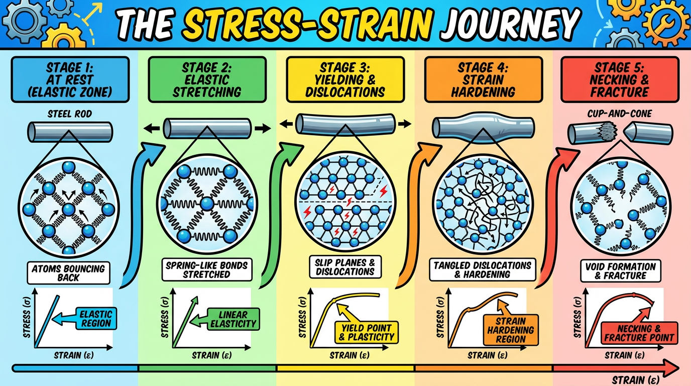
/visualiselearning of stress strain curve
A vibrant educational infographic poster titled "THE STRESS-STRAIN JOURNEY" showing a steel rod being pulled apart step by step. Show 5 stages from left to right: Stage 1 - rod at rest (elastic zone, atoms bouncing back), Stage 2 - rod stretching elastically with spring-like atomic bonds shown, Stage 3 - yielding with slip planes and dislocations shown in the crystal, Stage 4 - strain hardening with tangled dislocations and wider rod, Stage 5 - necking and fracture with cup-and-cone break pattern. Each stage has a mini stress-strain graph highlight showing which zone is active. Use bright colors, bold labels, arrows, and comic-style atom diagrams. Educational poster style for engineering students.
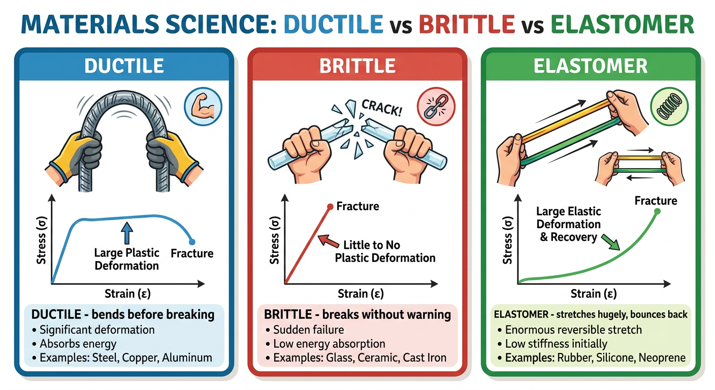
A clean colorful visual learning flashcard set showing "Ductile vs Brittle vs Elastomer" materials with real-world examples. Left panel: ductile steel rebar bending with a smooth stress-strain curve, labeled "DUCTILE - bends before breaking". Middle panel: glass rod snapping suddenly with a short steep curve, labeled "BRITTLE - breaks without warning". Right panel: rubber band stretching far with a J-shaped curve, labeled "ELASTOMER - stretches hugely, bounces back". Show the characteristic stress-strain curve shape for each below the illustration. Bright colors, bold text, educational visual style with icons and annotations.
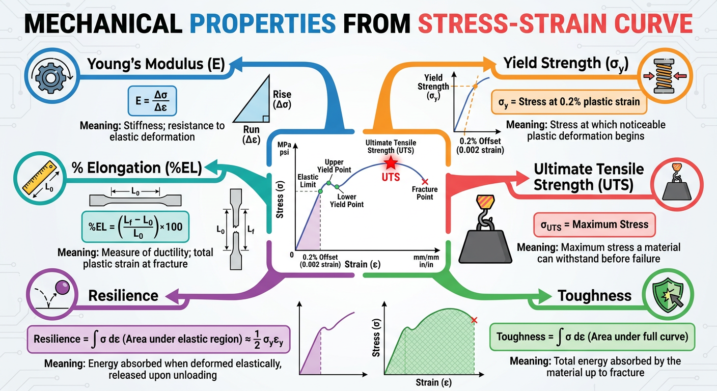
An educational mind map visual for "Mechanical Properties from Stress-Strain Curve" centered around a labeled stress-strain curve diagram. Branches radiating out to: Young's Modulus (slope of elastic line, shown with rise/run annotation), Yield Strength (with 0.2% offset method illustrated), Ultimate Tensile Strength (peak of curve highlighted), Toughness (area under full curve shaded green), Resilience (area under elastic region shaded blue), % Elongation (measuring gauge length change). Each branch has a formula, a colorful icon, and a one-line meaning. Colorful, clean, mind-map visual learning poster style.
~/stress-strain-pdf/visualise_learning.py
"""
Visual Learning: Stress-Strain Curve
Multi-panel educational figure with annotations
"""
import numpy as np
import matplotlib
matplotlib.use('Agg')
import matplotlib.pyplot as plt
import matplotlib.patches as mpatches
import matplotlib.patheffects as pe
from matplotlib.patches import FancyBboxPatch, FancyArrowPatch
from matplotlib.gridspec import GridSpec
import warnings
warnings.filterwarnings('ignore')

OUT = "/tmp/workspace/stress-strain-pdf/visual_learning_stress_strain.png"

# ── Color palette ────────────────────────────────────────────────────────────
BG     = "#0f172a"   # dark navy background
CARD   = "#1e293b"   # card bg
NAVY   = "#1a2d5a"
BLUE   = "#3b82f6"
LBLUE  = "#93c5fd"
CYAN   = "#06b6d4"
GREEN  = "#22c55e"
YELLOW = "#f59e0b"
ORANGE = "#f97316"
RED    = "#ef4444"
PURPLE = "#a855f7"
PINK   = "#ec4899"
WHITE  = "#f8fafc"
LGRAY  = "#94a3b8"
DKGRAY = "#334155"

fig = plt.figure(figsize=(20, 26), facecolor=BG)
fig.patch.set_facecolor(BG)

gs = GridSpec(4, 3, figure=fig,
              hspace=0.55, wspace=0.38,
              top=0.95, bottom=0.04,
              left=0.05, right=0.97)

# ════════════════════════════════════════════════════════════════════════════════
# TITLE
# ════════════════════════════════════════════════════════════════════════════════
fig.text(0.5, 0.975, "STRESS-STRAIN CURVE", ha='center', va='top',
         fontsize=34, fontweight='bold', color=WHITE,
         path_effects=[pe.withStroke(linewidth=4, foreground=BLUE)])
fig.text(0.5, 0.962, "Visual Learning Guide  •  Engineering Materials Science",
         ha='center', va='top', fontsize=14, color=LGRAY, style='italic')


def card_bg(ax, color=CARD, radius=0.04):
    ax.set_facecolor(color)
    for spine in ax.spines.values():
        spine.set_visible(False)


def label_box(ax, x, y, text, fc=BLUE, tc=WHITE, fontsize=8.5, pad=3):
    ax.annotate(text, (x, y),
                fontsize=fontsize, color=tc, fontweight='bold',
                bbox=dict(boxstyle='round,pad=0.3', fc=fc, ec='none', alpha=0.9),
                ha='center', va='center', zorder=10)


# ════════════════════════════════════════════════════════════════════════════════
# PANEL 1: Full annotated mild steel curve (spans 2 columns)
# ════════════════════════════════════════════════════════════════════════════════
ax1 = fig.add_subplot(gs[0, :2])
card_bg(ax1)

# Build curve
e1 = np.linspace(0, 0.002, 60);    s1 = e1 * 200000
e2 = np.linspace(0.002, 0.0022, 15); s2 = np.linspace(400, 430, 15)
e3 = np.linspace(0.0022, 0.0026, 15); s3 = np.linspace(430, 360, 15)
e4 = np.linspace(0.0026, 0.014, 25); s4 = np.full(25, 360.0)
e5 = np.linspace(0.014, 0.22, 80)
s5 = 360 + 230 * (1 - np.exp(-11 * (e5 - 0.014)))
e6 = np.linspace(0.22, 0.30, 40)
top = s5[-1]
e6_idx = np.linspace(0, 1, 40)
s6 = top * (1 - 0.55 * e6_idx ** 0.65)

e_all = np.concatenate([e1,e2,e3,e4,e5,e6])
s_all = np.concatenate([s1,s2,s3,s4,s5,s6])
ex = e_all * 100  # convert to %

# Zone fills
m_el  = e_all <= 0.002
m_yp  = (e_all > 0.002) & (e_all <= 0.014)
m_sh  = (e_all > 0.014) & (e_all <= 0.22)
m_nk  = e_all > 0.22

ax1.fill_between(ex[m_el],  s_all[m_el],  alpha=0.25, color=BLUE,   label='Elastic')
ax1.fill_between(ex[m_yp],  s_all[m_yp],  alpha=0.25, color=YELLOW, label='Yield')
ax1.fill_between(ex[m_sh],  s_all[m_sh],  alpha=0.22, color=GREEN,  label='Strain Hardening')
ax1.fill_between(ex[m_nk],  s_all[m_nk],  alpha=0.25, color=RED,    label='Necking')

# Main curve
ax1.plot(ex, s_all, color=WHITE, lw=3.5, zorder=5)

# Key points
kpts = {
    'O':(0, 0),
    'A':(0.2, 400),
    'B':(0.22, 430),
    'C':(0.26, 360),
    'D':(1.4, 360),
    'E':(22, top),
    'F':(30, s6[-1]),
}
pt_colors = {'O':LGRAY,'A':BLUE,'B':YELLOW,'C':ORANGE,'D':GREEN,'E':RED,'F':PURPLE}
annot_offsets = {
    'O':(-0.4, 30),'A':(-1, 35),'B':(0.5, 30),'C':(0.6,-35),
    'D':(0.8,-35),'E':(-2,35),'F':(1, 25)
}
for k,(ex_,sy_) in kpts.items():
    ax1.scatter(ex_, sy_, color=pt_colors[k], s=100, zorder=8, edgecolors=WHITE, lw=1.2)
    dx,dy = annot_offsets[k]
    ax1.annotate(k, (ex_,sy_), xytext=(ex_+dx, sy_+dy),
                 fontsize=11, fontweight='bold', color=pt_colors[k],
                 arrowprops=dict(arrowstyle='->', color=pt_colors[k], lw=1.3),
                 ha='center', zorder=9)

# Zone labels
for txt, xe, ye, col in [
    ('ELASTIC\nREGION', 0.09, 150, BLUE),
    ('UPPER YIELD\nPOINT', 0.24, 490, YELLOW),
    ('YIELD\nPLATEAU', 0.8,  220, YELLOW),
    ('STRAIN\nHARDENING', 12,  310, GREEN),
    ('NECKING', 26, 430, RED),
]:
    ax1.text(xe, ye, txt, fontsize=7.5, color=col, ha='center', va='center',
             fontweight='bold', style='italic', alpha=0.9,
             bbox=dict(boxstyle='round,pad=0.2', fc=BG, ec=col, alpha=0.7, lw=0.8))

# Hooke's law annotation
ax1.annotate('', xy=(0.18, 360), xytext=(0, 0),
             arrowprops=dict(arrowstyle='-', color=CYAN, lw=1.5, linestyle='dashed'))
ax1.text(0.06, 250, "E = σ/ε\n(Young's\nModulus)", fontsize=7.5, color=CYAN,
         ha='center', va='center',
         bbox=dict(boxstyle='round,pad=0.3', fc=DKGRAY, ec=CYAN, alpha=0.9))

ax1.set_xlim(-0.5, 32)
ax1.set_ylim(-30, 620)
ax1.set_xlabel('Strain  ε  (%)', fontsize=11, color=LGRAY, labelpad=6)
ax1.set_ylabel('Stress  σ  (MPa)', fontsize=11, color=LGRAY, labelpad=6)
ax1.set_title('Complete Stress-Strain Curve — Mild Steel', fontsize=13,
              fontweight='bold', color=WHITE, pad=10)
ax1.tick_params(colors=LGRAY, labelsize=9)
ax1.grid(True, linestyle='--', alpha=0.2, color=LGRAY)
legend = ax1.legend(loc='upper left', fontsize=8, fancybox=True,
                    framealpha=0.2, labelcolor=WHITE,
                    facecolor=DKGRAY, edgecolor=LGRAY)


# ════════════════════════════════════════════════════════════════════════════════
# PANEL 2: Hooke's Law zoom (elastic region only)
# ════════════════════════════════════════════════════════════════════════════════
ax2 = fig.add_subplot(gs[0, 2])
card_bg(ax2)

e_zoom = np.linspace(0, 0.002, 100)
s_zoom = e_zoom * 200000

ax2.plot(e_zoom*100, s_zoom, color=BLUE, lw=3)
ax2.fill_between(e_zoom*100, s_zoom, alpha=0.2, color=BLUE)

# Resilience area
ax2.fill_between(e_zoom*100, s_zoom, alpha=0.5, color=CYAN,
                 label=f'Resilience = σ²/2E')

# Slope triangle
ax2.annotate('', xy=(0.18, 360), xytext=(0.18, 0),
             arrowprops=dict(arrowstyle='<->', color=GREEN, lw=1.8))
ax2.annotate('', xy=(0.18, 0), xytext=(0, 0),
             arrowprops=dict(arrowstyle='<->', color=RED, lw=1.8))
ax2.text(0.195, 180, 'σ\n(rise)', fontsize=8, color=GREEN, ha='left')
ax2.text(0.09, -28, 'ε (run)', fontsize=8, color=RED, ha='center')

ax2.text(0.08, 280, 'E = rise/run\n= σ/ε\n≈ 200 GPa\nfor steel',
         fontsize=9, color=WHITE, ha='center',
         bbox=dict(boxstyle='round,pad=0.5', fc=DKGRAY, ec=CYAN, lw=1.2))

ax2.scatter([0.2], [400], color=YELLOW, s=80, zorder=8, edgecolors=WHITE)
ax2.text(0.19, 420, 'Proportional\nLimit (A)', fontsize=7.5, color=YELLOW,
         ha='right')

ax2.set_xlim(-0.02, 0.25)
ax2.set_ylim(-50, 500)
ax2.set_xlabel("Strain ε (%)", fontsize=9, color=LGRAY)
ax2.set_ylabel("Stress σ (MPa)", fontsize=9, color=LGRAY)
ax2.set_title("🔍 Elastic Region Zoom\nHooke's Law & Resilience", fontsize=10,
              fontweight='bold', color=WHITE, pad=8)
ax2.tick_params(colors=LGRAY, labelsize=8)
ax2.grid(True, linestyle='--', alpha=0.2, color=LGRAY)


# ════════════════════════════════════════════════════════════════════════════════
# PANEL 3: Ductile vs Brittle vs Elastomer
# ════════════════════════════════════════════════════════════════════════════════
ax3 = fig.add_subplot(gs[1, :2])
card_bg(ax3)

# Ductile
e_d = np.linspace(0, 0.30, 400)
s_d = np.where(e_d < 0.002, e_d*200000,
        np.where(e_d < 0.012, 400,
                 400 + 200*(1 - np.exp(-10*(e_d-0.012)))))
uts_i = np.argmax(s_d)
frac = s_d[uts_i] * (1 - 0.6*np.sqrt(np.clip((e_d[uts_i:]-e_d[uts_i])/(0.30-e_d[uts_i]),0,1)))
s_d[uts_i:] = frac
ax3.plot(e_d*100, s_d, color=BLUE, lw=3, label='Ductile — Steel/Aluminium', zorder=4)
ax3.scatter([e_d[-1]*100],[s_d[-1]], color=BLUE, s=90, zorder=6, marker='o')
ax3.annotate('Fracture\n(after necking)', xy=(30, s_d[-1]),
             xytext=(25, 200), fontsize=8, color=BLUE,
             arrowprops=dict(arrowstyle='->', color=BLUE, lw=1.2), ha='center')

# Brittle
e_b = np.linspace(0, 0.006, 150)
s_b = 8000 * e_b * np.exp(-3*e_b/0.006)
ax3.plot(e_b*100, s_b, color=RED, lw=3, label='Brittle — Cast Iron/Glass', zorder=4, linestyle='--')
ax3.scatter([e_b[-1]*100],[s_b[-1]], color=RED, s=90, zorder=6, marker='X')
ax3.annotate('Sudden fracture!', xy=(0.6, s_b[-1]),
             xytext=(3, 440), fontsize=8, color=RED,
             arrowprops=dict(arrowstyle='->', color=RED, lw=1.2), ha='center')

# Elastomer
e_r = np.linspace(0, 0.65, 300)
s_r = 2.5 * (np.exp(3.5*e_r) - 1)
ax3.plot(e_r*100, s_r, color=GREEN, lw=3, label='Elastomer — Rubber/Silicone', zorder=4, linestyle=':')
ax3.scatter([e_r[-1]*100],[s_r[-1]], color=GREEN, s=90, zorder=6)
ax3.annotate('Tears at large\nstrain', xy=(65, s_r[-1]),
             xytext=(50, 420), fontsize=8, color=GREEN,
             arrowprops=dict(arrowstyle='->', color=GREEN, lw=1.2), ha='center')

# Property callout boxes
for txt, xe, ye, col in [
    ("DUCTILE\nHigh toughness\nLarge elongation", 14, 320, BLUE),
    ("BRITTLE\nLow toughness\nNo plastic zone",    4,  130, RED),
    ("ELASTOMER\nVery low E\nHuge elastic range",  45, 120, GREEN),
]:
    ax3.text(xe, ye, txt, fontsize=8, color=col, ha='center',
             bbox=dict(boxstyle='round,pad=0.4', fc=BG, ec=col, alpha=0.85, lw=1.3))

ax3.set_xlim(-1, 70)
ax3.set_ylim(-15, 640)
ax3.set_xlabel("Strain  ε  (%)", fontsize=11, color=LGRAY, labelpad=6)
ax3.set_ylabel("Stress  σ  (MPa)", fontsize=11, color=LGRAY, labelpad=6)
ax3.set_title("Material Comparison: Ductile  vs  Brittle  vs  Elastomer", fontsize=13,
              fontweight='bold', color=WHITE, pad=10)
ax3.tick_params(colors=LGRAY, labelsize=9)
ax3.grid(True, linestyle='--', alpha=0.2, color=LGRAY)
ax3.legend(loc='upper left', fontsize=9, fancybox=True, framealpha=0.2,
           labelcolor=WHITE, facecolor=DKGRAY, edgecolor=LGRAY)


# ════════════════════════════════════════════════════════════════════════════════
# PANEL 4: Toughness vs Resilience visual
# ════════════════════════════════════════════════════════════════════════════════
ax4 = fig.add_subplot(gs[1, 2])
card_bg(ax4)

e_t = np.concatenate([e1, e2, e3, e4, e5, e6])
s_t = np.concatenate([s1, s2, s3, s4, s5, s6])
ex_t = e_t * 100

# Full toughness area
ax4.fill_between(ex_t, s_t, alpha=0.35, color=GREEN, label='Toughness (total area)')
# Resilience area
mask_r = e_t <= 0.002
ax4.fill_between(ex_t[mask_r], s_t[mask_r], alpha=0.9, color=CYAN, label='Resilience (elastic area)')

ax4.plot(ex_t, s_t, color=WHITE, lw=2.5, zorder=5)

ax4.text(13, 150, 'TOUGHNESS\n= Total Area\nunder curve\n(J/m³)',
         fontsize=8, color=GREEN, ha='center',
         bbox=dict(boxstyle='round,pad=0.4', fc=BG, ec=GREEN, alpha=0.9))
ax4.text(0.08, 220, 'RESILIENCE\n= Elastic\narea only',
         fontsize=8, color=CYAN, ha='center',
         bbox=dict(boxstyle='round,pad=0.4', fc=BG, ec=CYAN, alpha=0.9))

ax4.set_xlim(-0.5, 32)
ax4.set_ylim(-30, 680)
ax4.set_xlabel("Strain ε (%)", fontsize=9, color=LGRAY)
ax4.set_ylabel("Stress σ (MPa)", fontsize=9, color=LGRAY)
ax4.set_title("Toughness vs Resilience\n(Areas under the curve)", fontsize=10,
              fontweight='bold', color=WHITE, pad=8)
ax4.tick_params(colors=LGRAY, labelsize=8)
ax4.grid(True, linestyle='--', alpha=0.2, color=LGRAY)
ax4.legend(loc='upper left', fontsize=7.5, fancybox=True, framealpha=0.2,
           labelcolor=WHITE, facecolor=DKGRAY, edgecolor=LGRAY)


# ════════════════════════════════════════════════════════════════════════════════
# PANEL 5: Engineering vs True Stress-Strain
# ════════════════════════════════════════════════════════════════════════════════
ax5 = fig.add_subplot(gs[2, :2])
card_bg(ax5)

e_eng = np.concatenate([e1, e2, e3, e4, e5, e6])
s_eng_arr = np.concatenate([s1, s2, s3, s4, s5, s6])

# True stress/strain (valid up to UTS, approximate after)
s_true_arr = s_eng_arr * (1 + e_eng)
e_true_arr = np.log1p(e_eng)

ax5.plot(e_eng*100, s_eng_arr, color=BLUE, lw=3, label='Engineering σ-ε', zorder=5)
ax5.plot(e_true_arr*100, s_true_arr, color=ORANGE, lw=3, linestyle='--',
         label='True σ-ε (approx)', zorder=5)
ax5.fill_between(e_eng*100, s_eng_arr, s_true_arr,
                 alpha=0.15, color=PURPLE, label='Divergence region')

# UTS marker
uts_idx2 = np.argmax(s_eng_arr)
ax5.axvline(x=e_eng[uts_idx2]*100, color=YELLOW, lw=1.5, linestyle=':', alpha=0.7)
ax5.text(e_eng[uts_idx2]*100+0.3, 120,
         'UTS / Necking\nstarts here\n→ curves diverge', fontsize=8,
         color=YELLOW, va='bottom',
         bbox=dict(boxstyle='round,pad=0.3', fc=BG, ec=YELLOW, alpha=0.85))

# Formulae
ax5.text(8, 480,
         'Conversions (valid up to UTS):\n'
         'σ_true = σ_eng × (1 + ε_eng)\n'
         'ε_true = ln(1 + ε_eng)',
         fontsize=9.5, color=WHITE, family='monospace',
         bbox=dict(boxstyle='round,pad=0.6', fc=DKGRAY, ec=CYAN, lw=1.5))

ax5.set_xlim(-0.5, 32)
ax5.set_ylim(-30, 680)
ax5.set_xlabel("Strain  ε  (%)", fontsize=11, color=LGRAY, labelpad=6)
ax5.set_ylabel("Stress  σ  (MPa)", fontsize=11, color=LGRAY, labelpad=6)
ax5.set_title("Engineering  vs  True  Stress-Strain", fontsize=13,
              fontweight='bold', color=WHITE, pad=10)
ax5.tick_params(colors=LGRAY, labelsize=9)
ax5.grid(True, linestyle='--', alpha=0.2, color=LGRAY)
ax5.legend(loc='upper left', fontsize=9, fancybox=True, framealpha=0.2,
           labelcolor=WHITE, facecolor=DKGRAY, edgecolor=LGRAY)


# ════════════════════════════════════════════════════════════════════════════════
# PANEL 6: 0.2% Offset Yield Method
# ════════════════════════════════════════════════════════════════════════════════
ax6 = fig.add_subplot(gs[2, 2])
card_bg(ax6)

# Material with gradual yielding (aluminum-like)
e_al = np.linspace(0, 0.08, 300)
s_al = 1000 * e_al / np.sqrt(1 + (e_al/0.005)**2)
ax6.plot(e_al*100, s_al, color=CYAN, lw=3, label='Aluminium (no clear yield)', zorder=5)

# 0.2% offset line
E_al = 70000  # MPa
offset = 0.002
e_off = np.linspace(0, 0.08, 100)
s_off = E_al * (e_off - offset)
s_off = np.where(s_off < 0, 0, s_off)
ax6.plot(e_off*100, s_off, color=YELLOW, lw=2, linestyle='--',
         label='0.2% offset line', zorder=4)

# Find intersection
diff = s_al - E_al * (e_al - offset)
idx_cross = np.where(np.diff(np.sign(diff)))[0]
if len(idx_cross) > 0:
    ic = idx_cross[0]
    ex_proof = e_al[ic]*100
    sy_proof = s_al[ic]
    ax6.scatter([ex_proof], [sy_proof], color=RED, s=120, zorder=8, edgecolors=WHITE, lw=1.5)
    ax6.annotate(f'0.2% Proof\nStress ≈ {sy_proof:.0f} MPa',
                 xy=(ex_proof, sy_proof),
                 xytext=(ex_proof+1.5, sy_proof-100),
                 fontsize=8.5, color=RED,
                 arrowprops=dict(arrowstyle='->', color=RED, lw=1.3),
                 bbox=dict(boxstyle='round,pad=0.3', fc=BG, ec=RED, alpha=0.9))

ax6.axvline(x=0.2, color=PURPLE, lw=1, linestyle=':', alpha=0.8)
ax6.text(0.25, 50, '0.2%\noffset', fontsize=7.5, color=PURPLE)

ax6.set_xlim(-0.1, 8.5)
ax6.set_ylim(-30, 600)
ax6.set_xlabel("Strain ε (%)", fontsize=9, color=LGRAY)
ax6.set_ylabel("Stress σ (MPa)", fontsize=9, color=LGRAY)
ax6.set_title("0.2% Offset Yield Method\n(For Non-Ferrous Metals)", fontsize=10,
              fontweight='bold', color=WHITE, pad=8)
ax6.tick_params(colors=LGRAY, labelsize=8)
ax6.grid(True, linestyle='--', alpha=0.2, color=LGRAY)
ax6.legend(loc='upper left', fontsize=7.5, fancybox=True, framealpha=0.2,
           labelcolor=WHITE, facecolor=DKGRAY, edgecolor=LGRAY)


# ════════════════════════════════════════════════════════════════════════════════
# PANEL 7: Stiffness comparison (E values bar chart)
# ════════════════════════════════════════════════════════════════════════════════
ax7 = fig.add_subplot(gs[3, 0])
card_bg(ax7)

materials = ["Diamond", "Steel", "Titanium", "Aluminium", "Glass", "Concrete", "Bone", "Rubber"]
E_vals    = [1200, 200, 116, 70, 70, 30, 20, 0.05]
bar_colors= [CYAN, BLUE, PURPLE, LBLUE, LGRAY, ORANGE, GREEN, RED]

bars = ax7.barh(materials, E_vals, color=bar_colors, edgecolor='none', height=0.65)
for bar, val in zip(bars, E_vals):
    label = f"{val} GPa"
    ax7.text(val + 12, bar.get_y() + bar.get_height()/2,
             label, va='center', ha='left', fontsize=8, color=WHITE)

ax7.set_xlim(0, 1500)
ax7.set_xlabel("Young's Modulus E (GPa)", fontsize=9, color=LGRAY)
ax7.set_title("Stiffness Comparison\n(Young's Modulus)", fontsize=10,
              fontweight='bold', color=WHITE, pad=8)
ax7.tick_params(colors=LGRAY, labelsize=8.5)
ax7.grid(True, axis='x', linestyle='--', alpha=0.2, color=LGRAY)


# ════════════════════════════════════════════════════════════════════════════════
# PANEL 8: Strength vs Toughness Ashby-style
# ════════════════════════════════════════════════════════════════════════════════
ax8 = fig.add_subplot(gs[3, 1])
card_bg(ax8)

mat_groups = {
    'Metals':       {'UTS':[400,800,250,950,1400], 'T':[100,80,50,60,40],
                     'names':['Mild Steel','Stainless','Al 6061','Ti-6Al-4V','Spring Steel'],
                     'color': BLUE},
    'Ceramics':     {'UTS':[200,400,600], 'T':[3,5,4],
                     'names':['Concrete','Al₂O₃','SiC'],
                     'color': ORANGE},
    'Polymers':     {'UTS':[30,60,80], 'T':[15,25,30],
                     'names':['PE','Nylon','PEEK'],
                     'color': GREEN},
    'Composites':   {'UTS':[600,900,1200], 'T':[40,55,70],
                     'names':['GFRP','CFRP','Kevlar'],
                     'color': PURPLE},
}

for grp, data in mat_groups.items():
    ax8.scatter(data['UTS'], data['T'], label=grp,
                color=data['color'], s=70, alpha=0.9, zorder=5, edgecolors=WHITE, lw=0.5)
    for x,y,n in zip(data['UTS'], data['T'], data['names']):
        ax8.annotate(n, (x,y), fontsize=6, color=data['color'],
                     xytext=(4, 2), textcoords='offset points')

ax8.set_xlabel("Tensile Strength (MPa)", fontsize=9, color=LGRAY)
ax8.set_ylabel("Toughness index (MJ/m³)", fontsize=9, color=LGRAY)
ax8.set_title("Strength vs Toughness\n(Ashby-style Map)", fontsize=10,
              fontweight='bold', color=WHITE, pad=8)
ax8.legend(fontsize=7, fancybox=True, framealpha=0.2, labelcolor=WHITE,
           facecolor=DKGRAY, edgecolor=LGRAY, loc='upper left')
ax8.tick_params(colors=LGRAY, labelsize=8)
ax8.grid(True, linestyle='--', alpha=0.2, color=LGRAY)


# ════════════════════════════════════════════════════════════════════════════════
# PANEL 9: Formula & Concept Summary Card
# ════════════════════════════════════════════════════════════════════════════════
ax9 = fig.add_subplot(gs[3, 2])
card_bg(ax9, color=DKGRAY)
ax9.set_xlim(0, 10)
ax9.set_ylim(0, 10)
ax9.tick_params(left=False, bottom=False, labelleft=False, labelbottom=False)
ax9.set_title("Key Formulae", fontsize=11, fontweight='bold', color=WHITE, pad=8)

formulas = [
    ("σ = F / A₀",               "Engineering Stress",       BLUE),
    ("ε = ΔL / L₀",              "Engineering Strain",       BLUE),
    ("E = σ / ε",                 "Young's Modulus",          CYAN),
    ("σ_t = σ_e (1+ε_e)",        "True Stress",              ORANGE),
    ("ε_t = ln(1+ε_e)",          "True Strain",              ORANGE),
    ("ν = −ε_lat / ε_ax",        "Poisson's Ratio",          PURPLE),
    ("G = E / 2(1+ν)",           "Shear Modulus",            GREEN),
    ("U_r = σ_y² / 2E",          "Resilience",               CYAN),
    ("U_t = ∫σ dε",              "Toughness",                GREEN),
    ("τ = G × γ",                "Shear Stress",             YELLOW),
]

y_pos = 9.5
for formula, meaning, col in formulas:
    ax9.text(0.3, y_pos, formula, fontsize=8.5, color=col,
             fontfamily='monospace', fontweight='bold', va='center')
    ax9.text(5.2, y_pos, f"← {meaning}", fontsize=7.5, color=LGRAY, va='center')
    y_pos -= 0.92


plt.savefig(OUT, dpi=150, bbox_inches='tight', facecolor=BG)
plt.close()
print(f"Saved: {OUT}")
cd /tmp/workspace/stress-strain-pdf && python visualise_learning.py 2>&1
ls -lh /tmp/workspace/stress-strain-pdf/visual_learning_stress_strain.png
🎓 Visual Learning — Concept Card 1: The Journey of a Steel Rod
🎓 Visual Learning — Concept Card 2: Ductile vs Brittle vs Elastomer
🎓 Visual Learning — Concept Card 3: Properties Mind Map
📊 Full 9-Panel Visual Learning Chart

visual learning stress strain
Image · PNG
What's in the 9-panel chart:
| Panel | What you learn |
|---|---|
| 1. Full annotated curve | All 6 key points (O→F), 4 colour-coded zones, E-modulus slope shown |
| 2. Elastic region zoom | Hooke's Law slope triangle, resilience area, proportional limit |
| 3. Ductile vs Brittle vs Elastomer | 3 curves overlaid with fracture markers and callout boxes |
| 4. Toughness vs Resilience | Area-under-curve shading showing the visual difference |
| 5. Engineering vs True σ-ε | Both curves overlaid, divergence zone, conversion formulae |
| 6. 0.2% Offset method | Aluminium-style gradual yield, offset line, proof stress intersection |
| 7. Stiffness bar chart | Young's modulus of 8 materials from diamond to rubber |
| 8. Ashby-style strength map | Strength vs Toughness for metals, ceramics, polymers, composites |
| 9. Formula card | All 10 key formulae with colour coding |
/handwritten notes of Mitchell relaxation techniques
Mitchell relaxation technique physiotherapy steps method
https://thepogp.co.uk/_userfiles/pages/files/resources/21xxx…
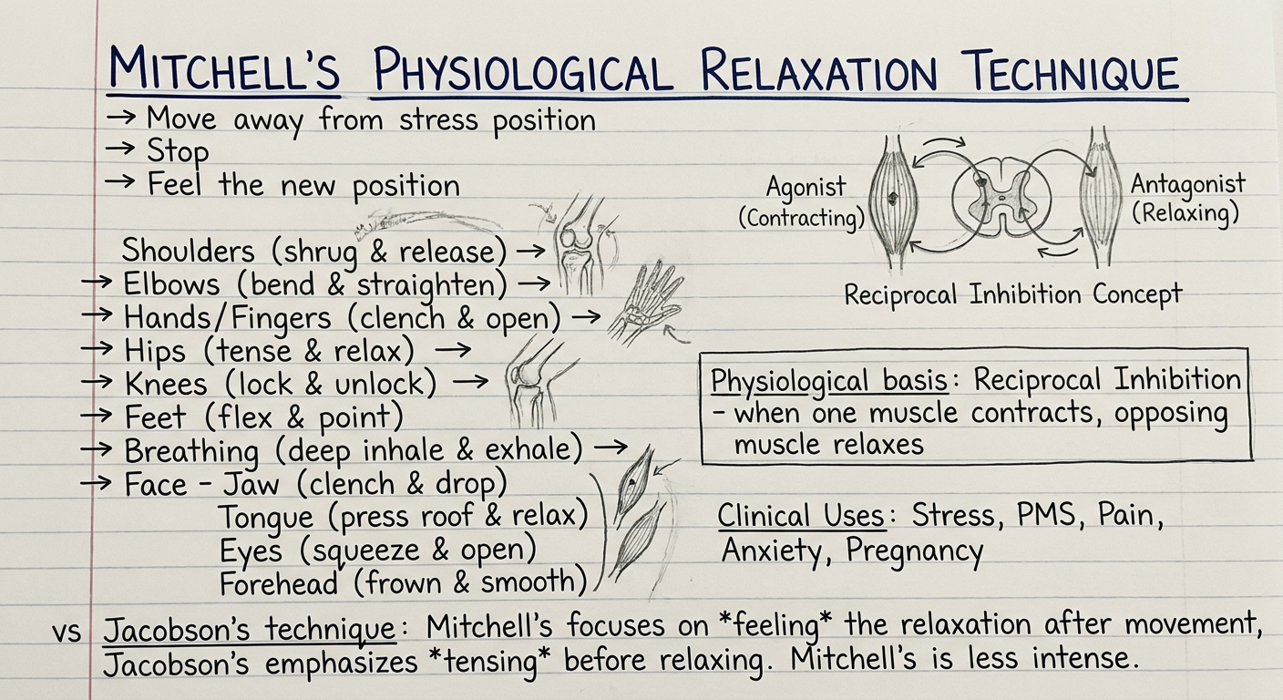
Handwritten-style nursing/physiotherapy study notes titled "MITCHELL'S PHYSIOLOGICAL RELAXATION TECHNIQUE" on lined white paper. Show neat handwritten content including: the three core orders (Move away from stress position, Stop, Feel the new position), body part sequence from top to bottom (Shoulders, Elbows, Hands/Fingers, Hips, Knees, Feet, Breathing, Face - Jaw, Tongue, Eyes, Forehead). Include a small diagram showing "reciprocal inhibition" concept with agonist and antagonist muscles. Add a box with "Physiological basis: Reciprocal Inhibition - when one muscle contracts, opposing muscle relaxes". Show clinical uses: stress, PMS, pain, anxiety, pregnancy. Include a comparison note vs Jacobson's technique. Pen and pencil handwritten style, neat student notes with underlining, arrows, small anatomical sketches.
Handwritten physiotherapy student notes on white lined paper, titled "Mitchell's Method - Step by Step Body Sequence". Show two columns of neat handwriting. Left column: ARMS section with sub-items: 1. Shoulders - pull towards feet, STOP, feel wider space. 2. Elbows - elbows out and open. STOP, feel the opening. 3. Hands - fingers and thumbs open and stretched. STOP, feel fingers long. LEGS section: 4. Hips - turn outwards. STOP, feel thighs roll out. 5. Knees - move until comfortable. STOP, feel comfort. 6. Feet - push away from face, point toes. STOP, feel soft ankles. Right column: BODY section: 7. Body - press into support. STOP, feel pressure. HEAD section: 8. Head - press into pillow. STOP, feel weight supported. BREATHING: 9. Deep breath in, tummy swells. Breathe out easily x2. FACE section: 10. Jaw - drag down, unclench. STOP, feel space between teeth. 11. Tongue - bring down to floor of mouth. STOP, feel tip touching lower teeth. 12. Eyes - close gently. STOP, feel darkness. 13. Forehead - smooth upward. STOP, feel skin smooth. Include small arrow diagram showing direction of each movement. Handwriting style with blue pen, some red underlining for key points, pencil sketches of body parts.
📝 Handwritten Notes — Mitchell's Physiological Relaxation Technique
Note Card 1: Overview, Basis & Clinical Uses
Note Card 2: Step-by-Step Body Sequence
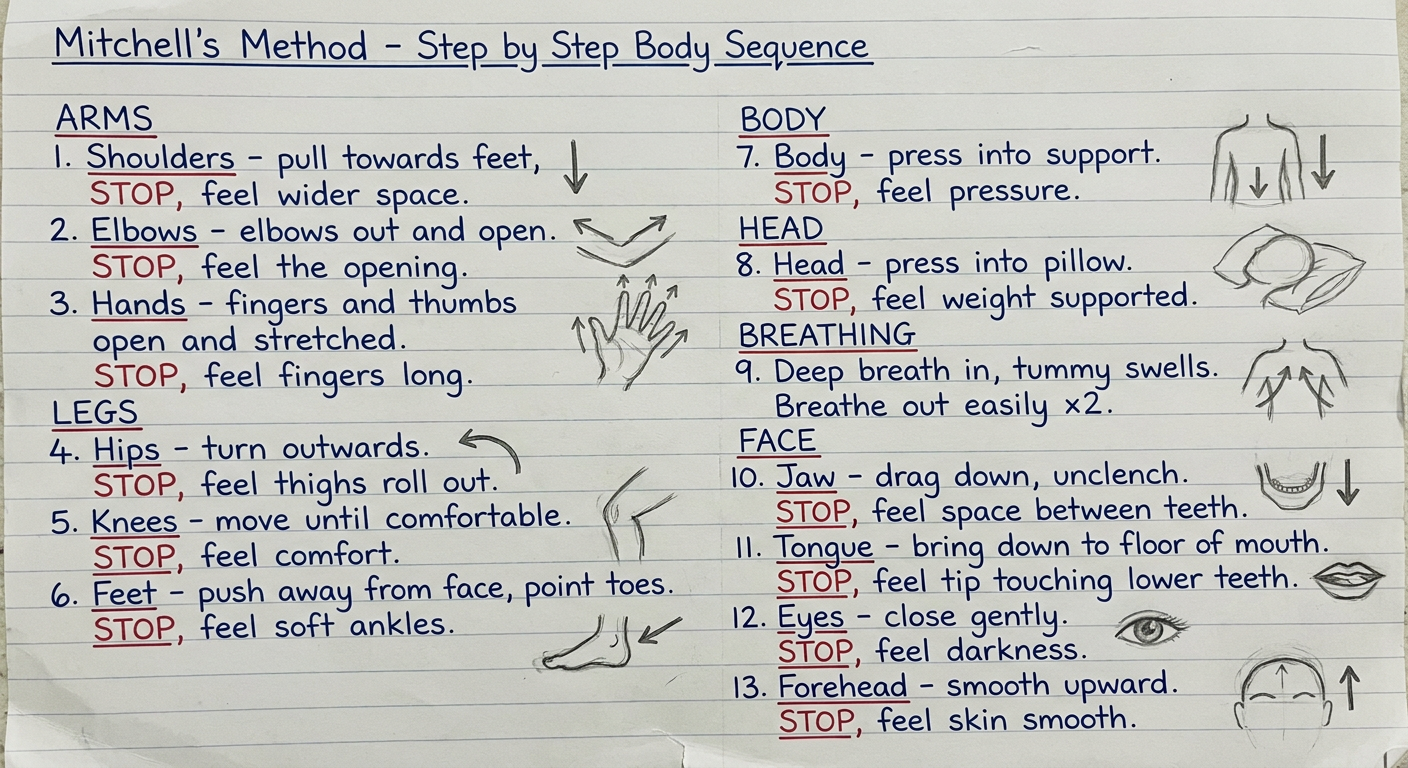
Full Notes — Mitchell's Physiological Relaxation Technique
What is it?
Physiological Basis
Reciprocal Inhibition - When one group of muscles contracts (agonist), the opposing group (antagonist) is neurologically inhibited and relaxes.
The 3 Core Orders (applied to EVERY body part)
| Step | Order | Purpose |
|---|---|---|
| 1 | Move away from the position of stress | Active isotonic contraction of opposing muscles |
| 2 | Stop | Cease the movement |
| 3 | Feel (register / be aware of) the new position | Conscious proprioceptive awareness of ease |
Full Body Sequence — Top to Bottom
🦾 ARMS
- "Pull your shoulders towards your feet" - away from ears, lengthen the neck
- STOP
- Feel: shoulders lower, wider space between shoulders and ears
- "Elbows out and open" - move slightly away from sides
- STOP
- Feel: elbows opening outward
- "Fingers and thumbs long and supported" - stretch open, let them rest
- STOP
- Feel: fingers long, palm open, hands heavy
🦵 LEGS
- "Turn your hips outwards" - feel thighs and legs roll outwards
- STOP
- Feel: legs rolled outward, hip joints at ease
- "Move your knees gently until comfortable"
- STOP
- Feel: comfort in the knee joints
- "Push your feet away from your face" - bend ankles, gently point toes
- STOP
- Feel: feet softer at ankles, lower leg muscles relaxed
🧍 BODY
- "Press your body into the support" - floor, bed or back of chair (not the seat)
- STOP
- Feel: pressure of body on support, gravity doing the work
🧠 HEAD
- "Press your head into the pillow or chair"
- STOP
- Feel: weight of head in the hollow, neck muscles releasing as the brain registers support
🫁 BREATHING
- "Take a deep breath" - feel the tummy swell outward (diaphragmatic)
- "Then breathe out easily"
- Repeat twice
- Return to a natural breathing rate; ribs move gently in and out
😌 FACE
- "Drag your jaw down" - do not open the mouth; unclench teeth inside the mouth
- STOP
- Feel: space between upper and lower teeth, cheek skin smooth, lips still gently touching
- "Bring your tongue down and let it lie in the middle of your mouth"
- STOP
- Feel: tip of tongue touching lower teeth
- "Close your eyes" - let lids fall closed, do not screw shut
- STOP
- Be aware of: darkness, eyes at rest
- "Smooth the skin from your eyebrows into your hair, over the top of your head and down the back of your neck"
- STOP
- Feel: skin of forehead smooth, scalp muscle (occipitofrontalis) slackening
Clinical Applications
| Condition | Evidence |
|---|---|
| Stress & anxiety | Reduces catecholamine (adrenaline/noradrenaline) levels |
| Premenstrual syndrome (PMS) | RCT evidence - reduces pain, improves QOL |
| Primary dysmenorrhoea | 30 min × 3/week × 4 weeks shown effective |
| Pregnancy / antenatal care | Widely used in obstetric physiotherapy |
| Hypertension | Lowers BP via sympathetic inhibition |
| Chronic pain | Reduces muscle guarding |
| Depression | Improves mood and immunological function |
Mitchell vs Jacobson — Key Differences
| Feature | Mitchell | Jacobson (PMR) |
|---|---|---|
| Mechanism | Reciprocal inhibition (move opposite to stress) | Progressive tension → release |
| Muscle action | Isotonic contraction of antagonist | Isometric tension then release |
| Instruction | "Move away, Stop, Feel" | "Tense, hold, release" |
| Fatigue risk | Very low (gentle movement) | Can tire the muscle |
| Suitable for | Frail, pregnant, pain patients | Generally healthy adults |
| Direction | Head → toe OR top → bottom | Feet → head (upward) |
| Breathing | Diaphragmatic, integrated mid-sequence | Usually at start |
Positions for Practice
- Supine (lying) - most common, pillows under knees and head
- Half-lying - back inclined at 45°, legs supported
- Sitting - arms resting on chair arms, feet flat
- Standing - arms at sides, knees soft
Can be practised anywhere once learnt - at a desk, in a queue, in bed.
Key Phrases to Memorise
- "Position of stress → Position of ease"
- "Move, Stop, Feel"
- "Joint by joint, area by area"
- "You are in complete control"
/handwritten notes of jacobson relaxation technique
Jacobson progressive muscle relaxation technique steps sequence physiotherapy
Handwritten physiotherapy student notes on white lined paper titled "JACOBSON'S PROGRESSIVE MUSCULAR RELAXATION (PMR)" with neat pen writing. Show: Developer box - Edmund Jacobson 1938, Principle box - "Tense → Hold 5-10 sec → Release → Feel 20-30 sec difference". Body sequence diagram from feet upward with arrows: Feet/toes → Calves → Thighs → Abdomen → Chest → Hands/fists → Forearms → Upper arms → Shoulders → Neck → Face (jaw, eyes, forehead). Small sketch of muscle showing tension vs relaxation state. Key points underlined in red: "Total 16 muscle groups", "Session = 20-30 mins", "Systematic head-to-toe or feet-to-head". Box showing physiological effects: decreased HR, BP, RR, muscle tension, cortisol. Clinical uses listed: anxiety, insomnia, hypertension, headache, chronic pain. Neat handwriting with blue ink, red highlights, small anatomical sketches.
Handwritten physiotherapy student notes on white lined paper, titled "JACOBSON PMR - Complete Muscle Group Sequence". Two-column layout with neat handwriting. Left column shows the full sequence numbered 1 to 16: 1. Right foot and toes - curl toes downward, 2. Right calf - tighten shin muscles, 3. Right thigh - press thigh down, 4. Left foot and toes, 5. Left calf, 6. Left thigh, 7. Abdomen - suck in tight, 8. Chest - deep breath, hold, 9. Right hand - clench fist, 10. Right forearm - bend wrist back, 11. Right upper arm (bicep) - curl arm up, 12. Left hand, 13. Left forearm, 14. Left upper arm, 15. Shoulders - shrug up to ears, 16. Face - screw face tight then release. Right column shows timing diagram: TENSE 5-10 sec → HOLD → RELEASE → FEEL 20-30 sec. Box at bottom: "Original Jacobson = 200 muscle groups over months. Wolpe's abbreviation = 16 groups, practical clinical version". Small drawings showing fist clenching and releasing, shoulder shrugging. Notes in margin: "Repeat 2x each group", "Eyes closed throughout", "Breathe normally". Blue pen handwriting with red and green highlights.
📝 Handwritten Notes — Jacobson's Progressive Muscle Relaxation (PMR)
Note Card 1: Overview, Principle & Clinical Uses
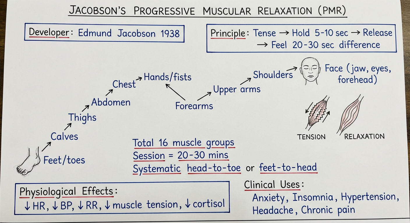
Note Card 2: Complete 16-Muscle Group Sequence
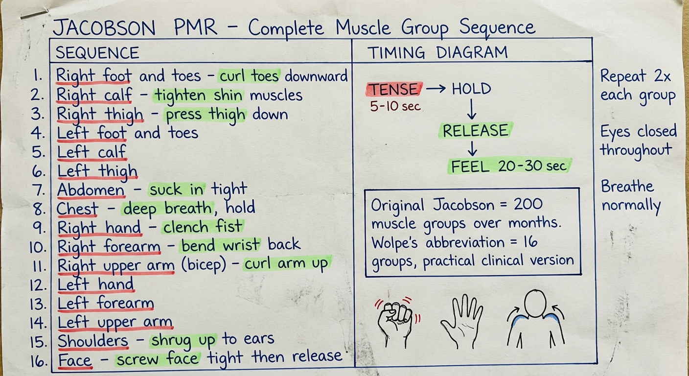
Full Notes — Jacobson's Progressive Muscular Relaxation
Developer & History
- Jacobson observed that even people who appear "relaxed" still show residual tension: irregular breathing, frowning, eye movements, restless limb shifts, and a busy mind.
- He concluded that "a faint degree of tension can be responsible for all of this"
- His original method involved over 50 sessions, working on one muscle group per session (e.g., an entire session on just the biceps)
- Later abbreviated by Joseph Wolpe into a practical 16-muscle-group version used clinically today
Core Principle
"Tense to recognise, release to relax"
- Learns to recognise what tension feels like in that muscle
- Experiences deep contrast between tension and release
- Achieves a level of relaxation deeper than resting baseline
- Gradually develops a "muscle sense" - awareness of residual tension they didn't know they were holding
The 3-Step Cycle (applied to each muscle group)
| Step | Action | Duration |
|---|---|---|
| 1. TENSE | Contract the muscle firmly (not painfully) | 5-10 seconds |
| 2. HOLD | Maintain contraction, notice the feeling | During the 5-10 sec |
| 3. RELEASE | Let go suddenly and completely | 20-30 seconds |
Complete 16-Muscle Group Sequence
LOWER BODY (feet → upward)
| # | Muscle Group | How to Tense |
|---|---|---|
| 1 | Right foot & toes | Curl toes downward, press foot |
| 2 | Right calf | Pull toes towards shin (dorsiflexion) |
| 3 | Right thigh | Press thigh firmly down into surface |
| 4 | Left foot & toes | Same as #1 |
| 5 | Left calf | Same as #2 |
| 6 | Left thigh | Same as #3 |
| 7 | Hips & buttocks | Squeeze buttocks together |
| 8 | Abdomen | Draw navel in, tighten like bracing for a punch |
UPPER BODY
| # | Muscle Group | How to Tense |
|---|---|---|
| 9 | Chest | Take a deep breath in, hold — feel the ribcage expand |
| 10 | Right hand & fingers | Clench into a tight fist |
| 11 | Right forearm | Bend wrist back, keeping fist clenched |
| 12 | Right upper arm (bicep) | Curl arm up as if lifting a weight |
| 13 | Left hand & fingers | Same as #10 |
| 14 | Left forearm | Same as #11 |
| 15 | Left upper arm | Same as #12 |
| 16 | Shoulders | Shrug both shoulders up hard towards the ears |
FACE & NECK
| # | Muscle Group | How to Tense |
|---|---|---|
| 17 | Neck | Press head back into pillow/chair |
| 18 | Jaw | Clench teeth together tightly |
| 19 | Eyes | Screw eyelids shut tightly |
| 20 | Forehead | Raise eyebrows as high as possible |
Timing Protocol
Breathe IN → TENSE (5-10 sec)
              ↓
         HOLD & NOTICE
              ↓
Breathe OUT → RELEASE (sudden)
              ↓
         FEEL RELAXATION (20-30 sec)
              ↓
         Move to next group
Physiological Effects
| System | Change during PMR |
|---|---|
| Cardiovascular | ↓ Heart rate, ↓ blood pressure |
| Respiratory | ↓ Respiratory rate, deeper breaths |
| Muscular | ↓ EMG activity (residual muscle tension) |
| Neuroendocrine | ↓ Cortisol, ↓ adrenaline/noradrenaline |
| CNS | ↑ Alpha waves (EEG) - associated with relaxed alertness |
| Skin | ↑ Skin temperature (peripheral vasodilation) |
| GI | ↓ Gastric acid, relief of tension-related symptoms |
Clinical Applications
| Condition | Evidence Base |
|---|---|
| Anxiety disorders | Strong - component of CBT, systematic desensitisation |
| Insomnia | Reduces somatic hyperarousal at bedtime |
| Hypertension | Lowers resting BP with regular practice |
| Headache (tension-type) | Reduces frontal/neck muscle tension |
| Chronic pain | Reduces muscle guarding and pain perception |
| Dysmenorrhoea | Reduces uterine and abdominal tension |
| Bruxism | Targets masseter and temporalis specifically |
| Cancer (symptom relief) | Reduces chemotherapy-related nausea, anxiety |
| Systematic desensitisation | Used as the relaxation component (Wolpe) |
Original vs Abbreviated Version
| Feature | Original Jacobson (1929) | Wolpe's Abbreviation (1958) |
|---|---|---|
| Groups | ~200 individual muscles | 16 muscle groups |
| Duration | 1 muscle per session, 50+ sessions | 1 session = all 16 groups |
| Training | Only qualified physicians | Therapists, nurses, self-taught |
| Practical? | No - too lengthy | Yes - widely used |
| Instruction style | Terse, minimal talk | Guided verbal instructions |
| Focus | Pure proprioceptive awareness | Tension-release contrast |
Key Precautions
- Do not tense to the point of pain - especially in: back injuries, cramps, sprains
- Cardiac patients: avoid excessive Valsalva-like manoeuvres; keep tension mild
- Not suitable during acute muscle spasm or inflammation
- Some patients feel paradoxical anxiety (relaxation-induced anxiety) - reduce tension intensity
Jacobson PMR vs Mitchell Method — Quick Comparison
| Jacobson PMR | Mitchell Method | |
|---|---|---|
| Action | Tense THEN release | Move to OPPOSITE position |
| Mechanism | Tension-relaxation contrast | Reciprocal inhibition |
| Direction | Feet → head | Head → feet (or any order) |
| Effort | Moderate (active tensing) | Gentle (no strain) |
| Suitable for pain/frailty | Less ideal | Better suited |
| Awareness focus | Tension vs release | New position of ease |
Source: Kaplan & Sadock's Synopsis of Psychiatry - "Edmund Jacobson developed progressive relaxation in 1929... Learning relaxation involves cultivating a muscle sense."