
Scales of measurements, data presentation classification and tabulation of data , frequency distribution
Reading File
This is a biostatistics/research methodology topic. Let me search the medical library for relevant content.
Finding Sources
Finding Sources
Finding Sources
Finding Sources
Reading File
Finding Sources
Reading File
Finding Sources
Reading File
Finding Sources
I now have enough material from Park's Textbook to compile a thorough answer. Let me also fetch the earlier section on types of data and classification.
Reading File
I now have excellent material from Park's Textbook of Preventive and Social Medicine. Let me compile a complete, well-structured answer.
Scales of Measurement, Data Presentation, Classification, Tabulation & Frequency Distribution
Source: Park's Textbook of Preventive and Social Medicine, p. 948-952
1. TYPES OF DATA (Classification of Data)
Data can be classified based on its nature and how it is measured.
A. By Source
| Type | Description | Example |
|---|---|---|
| Primary data | Collected directly from individuals by the investigator | Census surveys, patient interviews |
| Secondary data | Obtained from an existing outside source | Using census data in a hospital study |
Primary data gives precise information; secondary data may not match exactly what is needed.
B. By Nature of Variable
| Type | Description | Examples |
|---|---|---|
| Qualitative (Categorical) | Non-numerical attributes; describes categories | Blood group, sex, religion, disease presence |
| Quantitative (Numerical) | Measured numerically | Height, weight, blood pressure, age |
Quantitative data is further divided into:
- Discrete: Can only take whole number values (e.g., number of children, number of hospital admissions)
- Continuous: Can take any value within a range (e.g., blood pressure, temperature, weight)
2. SCALES OF MEASUREMENT
Variables can be measured at four levels, each with increasing mathematical sophistication:
1. Nominal Scale (Classificatory Scale)
- Data is placed into named categories with no natural order
- Categories are mutually exclusive and exhaustive
- Only equality/inequality can be determined
- Statistical operations: Mode, frequency counts, chi-square test
- Examples: Blood group (A, B, AB, O), sex (male/female), religion, eye color, presence/absence of disease
2. Ordinal Scale (Ranking Scale)
- Categories have a natural order or rank
- Differences between ranks are not equal or measurable
- Can say "greater than" or "less than" but not "how much greater"
- Statistical operations: Median, percentiles, non-parametric tests
- Examples: Socioeconomic status (low/middle/high), pain severity (mild/moderate/severe), grade of tumour, Apgar score, nutritional status grades
3. Interval Scale
- Equal intervals between values, but no true zero point
- Zero is arbitrary (does not mean complete absence)
- Addition and subtraction are valid; ratios are not meaningful
- Statistical operations: Mean, standard deviation, t-test, ANOVA
- Examples: Temperature in °C or °F (0°C does not mean "no temperature"), calendar years, IQ scores
4. Ratio Scale (Highest Level)
- Has all properties of interval scale PLUS an absolute/true zero
- True zero means complete absence of the variable
- All mathematical operations are valid (addition, subtraction, multiplication, division)
- Ratios are meaningful (e.g., 40 kg is twice 20 kg)
- Statistical operations: All parametric tests, geometric mean
- Examples: Height, weight, blood pressure, pulse rate, age, income, distance
Memory tip - NOIR: Nominal → Ordinal → Interval → Ratio (each level includes all properties of the previous level)
3. PRESENTATION OF STATISTICAL DATA
Statistical data, once collected, must be arranged purposively to bring out important points clearly. The main methods are:
A. Tabulation (Tables)
B. Diagrams and Charts
C. Graphs
D. Pictures and Special Curves
4. TABULATION
Tables are devices for presenting data simply from masses of statistical data. Tabulation is the first step before data is used for analysis or interpretation.
Principles of Good Table Construction
A well-designed table should follow these rules:
- (a) Tables should be numbered (Table 1, Table 2, etc.)
- (b) Each table must have a brief, self-explanatory title
- (c) Headings of columns and rows should be clear and concise
- (d) Data should be presented according to size, importance, chronology, alphabetical, or geographical order
- (e) Percentages or averages to be compared should be placed as close as possible
- (f) No table should be too large
- (g) A vertical arrangement is preferred over horizontal - it is easier to scan top to bottom
- (h) Footnotes may be added for explanatory notes or additional information
Types of Tables
1. Simple Table - presents data for a single variable
Example: Population of states in India (one column of values)
2. Frequency Distribution Table - data split into groups (class intervals) with corresponding frequencies
5. FREQUENCY DISTRIBUTION
A frequency distribution is a systematic arrangement of data into groups (class intervals) showing how many observations (frequency) fall into each group.
Steps to Construct a Frequency Distribution Table
- Determine the range (highest - lowest value)
- Decide the number of class intervals (usually 5-15)
- Calculate the class interval width: Range / Number of classes
- Tally the observations into each class
- Record the frequency (count) in each class
Example (from Park's)
Ages of poliomyelitis patients admitted to hospital:
| Age Group | Frequency | Cumulative Frequency | Relative Frequency (%) |
|---|---|---|---|
| 0 - 4 | 35 | 35 | 44.9% |
| 5 - 9 | 18 | 53 | 23.1% |
| 10 - 14 | 11 | 64 | 14.1% |
| 15 - 19 | 8 | 72 | 10.3% |
| 20 - 24 | 6 | 78 | 7.7% |
| Total | 78 | 100% |
Key Terms
- Class interval: The range covered by each group (e.g., 0-4 years)
- Class limits: The smallest and largest values in a class
- Class width/size: Difference between upper and lower class limits
- Frequency (f): Number of observations in each class
- Cumulative frequency: Running total of frequencies up to and including a class
- Relative frequency: Frequency expressed as a proportion or percentage of the total
6. DIAGRAMMATIC PRESENTATION
Bar Charts
Used for qualitative/discrete data:
- Simple bar chart: One bar per category
- Multiple (compound) bar chart: Two or more bars grouped together for comparison
- Component (sub-divided) bar chart: Bars divided into parts, each part proportional to a sub-category
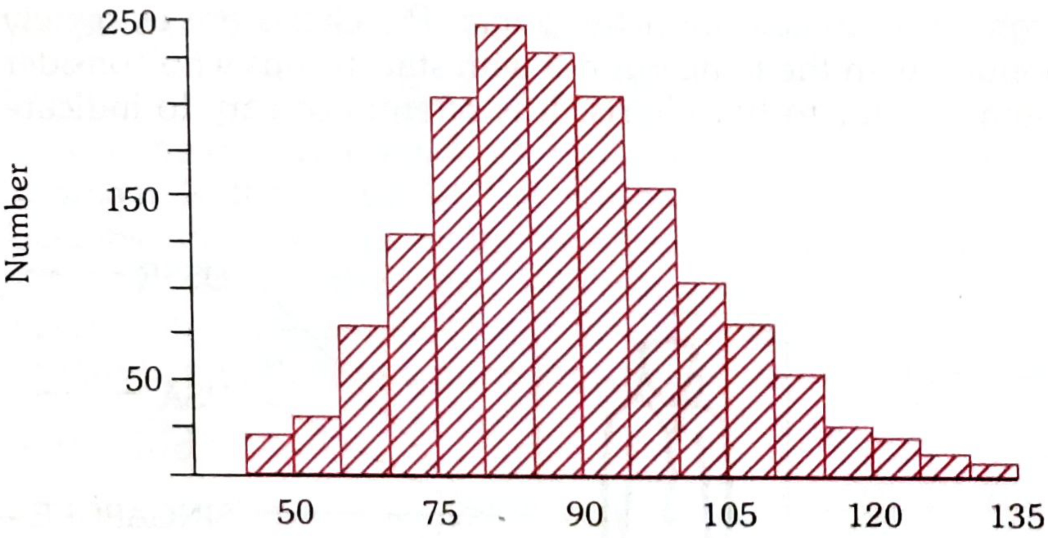
Histogram
- A pictorial diagram of frequency distribution (for continuous data)
- Consists of a series of adjacent rectangles (blocks)
- Horizontal axis: Class intervals
- Vertical axis: Frequencies
- Area of each block is proportional to the frequency
- No gaps between bars (unlike bar charts)
- Example: Frequency distribution of diastolic blood pressure in females aged 45-64 years
Frequency Polygon
- A line graph version of a frequency distribution
- Obtained by joining the mid-points of the tops of histogram bars
- Useful for comparing two or more frequency distributions on the same graph
Other Methods
| Method | Best Used For |
|---|---|
| Pie chart | Showing proportional parts of a whole |
| Line graph | Trends over time (time series data) |
| Scatter diagram | Relationship between two continuous variables |
| Pictogram | Simple pictorial representation for lay audiences |
| Map/spot map | Geographical distribution of disease |
| Ogive (cumulative frequency curve) | Cumulative frequency over a range |
Summary Table: Scales of Measurement
| Scale | Order | Equal Intervals | True Zero | Permitted Statistics | Examples |
|---|---|---|---|---|---|
| Nominal | No | No | No | Mode, %, Chi-square | Sex, blood group, religion |
| Ordinal | Yes | No | No | Median, percentile, Mann-Whitney | SES, pain grade, nutritional status |
| Interval | Yes | Yes | No | Mean, SD, t-test | Temp (°C), IQ, calendar year |
| Ratio | Yes | Yes | Yes | All, including geometric mean | Weight, height, BP, age |
Park's Textbook of Preventive and Social Medicine, pp. 948-952
This is a shared conversation. Sign in to Orris to start your own chat.