https://orris.care/shared/chat/c15ce463-e9f8-4ab5-ad65-5d73b28ae6d4
Reading Web Page
medical question chat conversation
It looks like you're sharing a previous conversation about AlphaFold — specifically a conference presentation script and slide deck on how AlphaFold works. The session covered:
- A full conference script (opening hook through closing one-liner)
- An 18-slide deck with topics like protein structure basics, the AlphaFold approach, AF2 vs AF3 comparison, the diffusion model, Nobel Prize impact, competing tools, limitations, and Q&A prep
- Audience-specific emphasis guides (general, biology/medical, CS/AI, pharma)
What would you like to do with this? For example:
- Continue building on the presentation
- Get a deeper explanation of a specific section
- Create or refine the actual PPTX file
- Prepare for specific conference questions
Search for high-quality protein structure images to add to specific slides
Asking for Preferences
Searching Images
protein 3D ribbon cartoon structure alpha helix beta sheet
Searching Images
AlphaFold predicted protein structure ribbon colored by confidence pLDDT
Searching Images
protein folding mechanism multiple sequence alignment coevolution
Searching the Web
AlphaFold high quality ribbon protein structure images free use RCSB PDB visualization
Loading Image
Loading Image
Loading Image
Loading Image
Loading Image
Loading Image
Loading Image
Here's a curated set of high-quality 3D ribbon/cartoon protein structure images matched to your specific slides:
🧬 Slide 1 — What is a Protein? (Secondary Structure Basics)
Best pick — clean, white-background ribbon showing alpha-helices + beta-sheets:
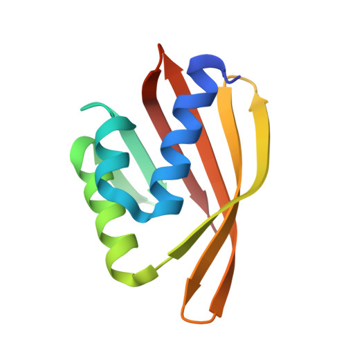
This is a textbook-quality rainbow-colored ribbon diagram (N→C: blue to red) showing both alpha-helices (coiled ribbons) and beta-sheets (flat arrows) clearly. Perfect for introducing protein structure to any audience.
- Source: RCSB PDB — free to use for educational/presentation purposes
🧬 Slide 3-5 — The AlphaFold Approach (3D Structure Representations)
Best pick — three representations side by side (stick, sphere, ribbon):

This shows the same protein in three styles — atomic stick model, space-filling spheres, and ribbon diagram — great for explaining why ribbon diagrams are used and what they represent.
- Source: RCSB PDB
🧬 Slide 6-8 — AlphaFold Mechanism (Evoformer / MSA)
Pick for MSA + pLDDT confidence concept:
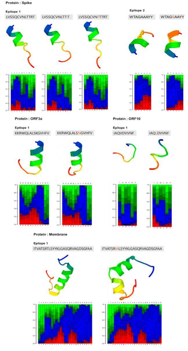
Shows ribbon structures color-coded N→C (blue to red) alongside local structure confidence profiles — directly mirrors how AlphaFold outputs work. Good visual bridge between "amino acid sequence → structure prediction."
🧬 Slide 11 — AF2 vs AF3 Comparison
Best pick — AlphaFold ribbon model colored by pLDDT confidence score:
Panel A shows an authentic AlphaFold ribbon output with the classic pLDDT color scale (red = very high confidence → blue = low confidence). This is exactly what the AlphaFold Database displays. Use this to show what AF2 outputs look like.
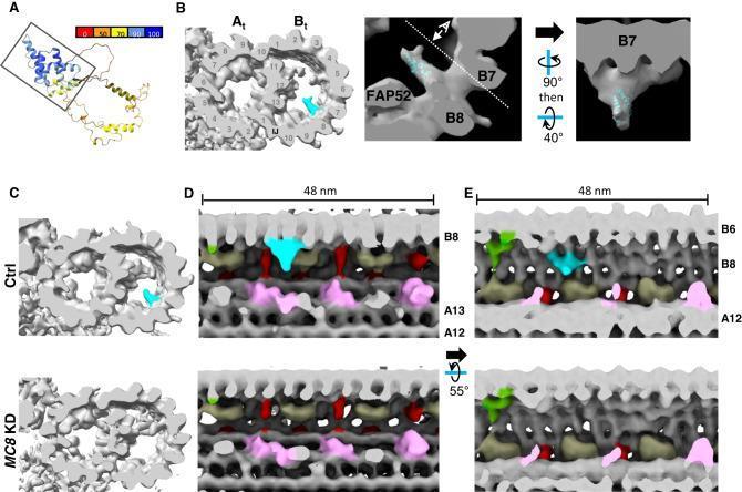
🧬 Slide 1 or 13 — Complex/Tetrameric Protein Assembly (Impact Slide)
Best pick — tetramer showing biological assembly:
A beautiful symmetric tetramer in yellow/cyan/magenta — illustrates protein complexity and why structure prediction matters for understanding real biological machines. Good for the impact/Nobel Prize slide.
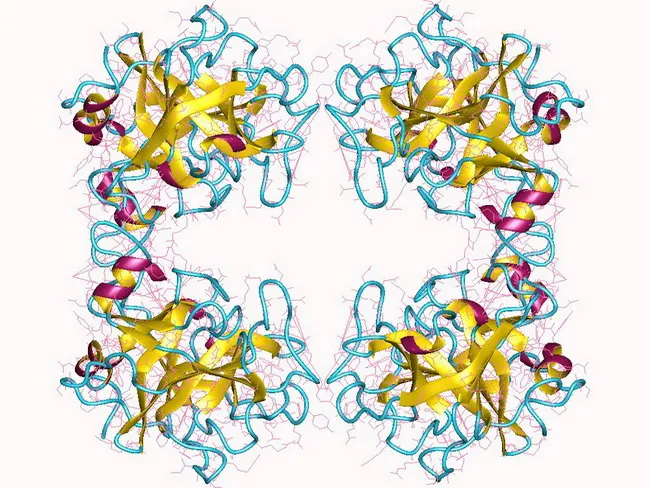
🧬 Slide 8 — BDNF Mutation / Drug Target Slide (Bonus)
Pick for showing how mutations alter structure (mutation analysis slide):
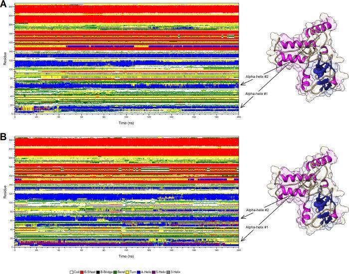
Pairs a molecular dynamics heatmap with a 3D ribbon highlighting specific alpha-helices — useful for the "disease mutations / drug targets" section (pLDDT + variant analysis).
Summary Table
| Slide | Image | Best For |
|---|---|---|
| Slide 1 (Protein basics) | 5l33_chain-A.jpeg (RCSB) | Clean ribbon, alpha-helix + beta-sheet |
| Slide 3-5 (AF approach) | 3pgk-representations.jpg (RCSB) | 3 structure representations |
| Slide 6-8 (Evoformer/MSA) | SARS-CoV-2 epitope ribbons | MSA → structure confidence |
| Slide 11 (AF2 vs AF3) | MC8 AlphaFold pLDDT ribbon | Authentic AF output colors |
| Slide 13 (Impact/Nobel) | Tryptase tetramer | Complex assembly, drug discovery |
| Slide 8 (Mutations/drugs) | BDNF variant ribbon | Mutation → structure change |
Licensing note: RCSB PDB images are free for educational and presentation use. The PMC images are from open-access publications — always good practice to credit the source paper if shown publicly.
Would you like me to insert any of these images directly into the PPTX file, or search for more specific visuals (e.g., diffusion model denoising, protein-ligand docking)?
Search for AlphaFold diffusion model visualizations
Searching Images
AlphaFold3 diffusion model denoising protein structure generation steps
Searching Images
diffusion model noisy to clean protein 3D structure visualization iterative refinement
Searching the Web
AlphaFold 3 diffusion model visualization denoising steps protein structure image
Loading Image
Loading Image
Loading Image
Loading Image
Excellent results. Here's the full curated set of AlphaFold diffusion model visualizations, mapped to your Slide 12 (Diffusion Model) and surrounding slides:
🔬 Slide 12 — Diffusion Module (AF3 Architecture Overview)
Best pick — The Illustrated AlphaFold full pipeline diagram:
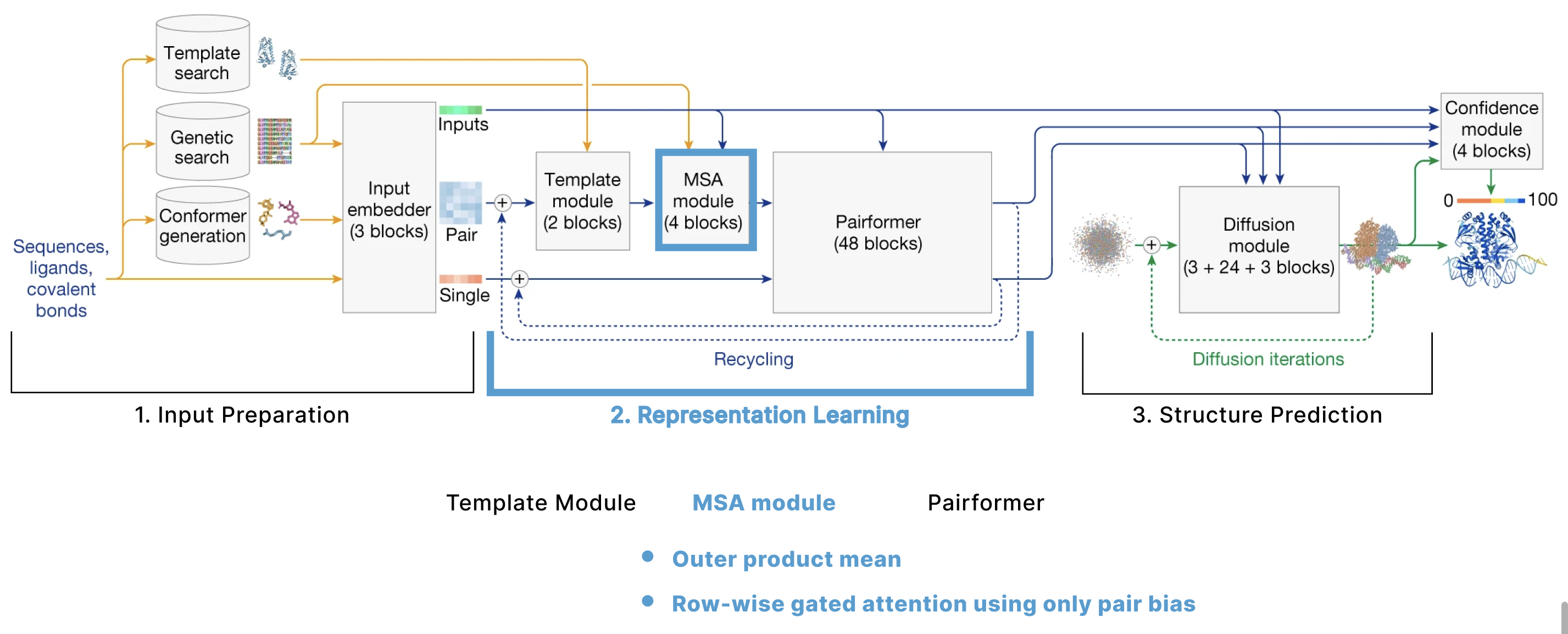
This is a gold-standard visualization from The Illustrated AlphaFold by Elana Simon. It shows the complete AF3 pipeline in 3 stages:
- Input Preparation (sequences, ligands, genetic search)
- Representation Learning (Template Module → MSA Module → Pairformer, 48 blocks)
- Structure Prediction — the Diffusion Module takes a cloud of atoms (shown as gray dots) and iteratively refines them into a final structure, outputting pLDDT confidence scores (0–100 color bar)
The "cloud of atoms → final structure" is exactly the denoising metaphor from your slide script. 🎯
🔬 Slide 12 — Forward & Reverse Diffusion Process (Concept Explainer)
Best pick — DDPM forward/reverse diffusion illustrated with medical imaging:
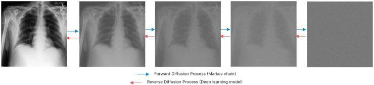
This is the clearest conceptual diagram you'll find for explaining diffusion to a non-ML audience. It shows:
- Blue arrows (→): Forward diffusion — adding noise step by step until pure noise
- Red arrows (←): Reverse diffusion — the deep learning model denoising back to structure
Perfect caption for your slide: "AF3 learns the reverse process: starting from a cloud of random atom coordinates, it iteratively denoises to predict the true molecular structure."
🔬 Slide 12 — AF3 Diffusion Trajectory (Advanced Audience)
Best pick — BLOPIG research visualization of actual AF3 denoising steps:

From the Oxford Protein Informatics Group (BLOPIG) analysis of real AF3 runs. Shows 4 quantities tracked across ~200 diffusion steps:
- (a) Constraint energy collapses after step ~160
- (b) Number of geometric violations drops sharply at the same point
- (c) Noise level t (exponential decay — the key transition happens at t ≈ 1.074)
- (d) Drift norm suddenly converges
Use for CS/AI or pharma audiences — it demonstrates the "coarse → fine" two-phase structure of AF3's denoising.
🔬 Bonus — Iterative Refinement Concept (Noise → Structure)
3D shape refinement across training epochs:
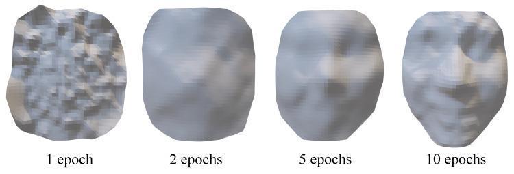
Shows how an object emerges from noise across epochs (1 → 2 → 5 → 10). While this shows a 3D face (not a protein), it's an intuitive analogy slide insert to explain diffusion to non-technical audiences before showing the protein-specific version.
Summary for Slide 12
| Purpose | Image | Audience |
|---|---|---|
| AF3 full pipeline + diffusion module location | Illustrated AlphaFold diagram | All audiences |
| Forward/reverse diffusion concept | DDPM forward/reverse arrows | General / medical |
| Real AF3 trajectory (200 steps, noise→structure) | BLOPIG trajectory plots | CS/AI / pharma |
| Intuitive denoising analogy | 3D shape emergence across epochs | General / non-scientist |
Source credits:
- BLOPIG (Oxford, April 2026) — analyzing AF3's diffusion trajectory
- Elana Simon — The Illustrated AlphaFold
- EBI Training — How does AlphaFold 3 work?
Would you like me to embed any of these into the PPTX file on Slide 12, or search for more visuals for a specific slide (e.g., competing tools, protein-ligand docking)?
This is a shared conversation. Sign in to Orris to start your own chat.