


im a medical student. answer this question for me and help me understand in simple way
antibody immunoglobulin structure heavy light chains Fab Fc
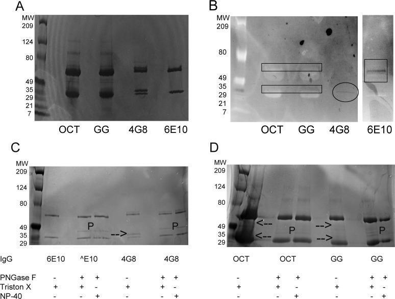
This composite diagnostic image features biochemical analysis of Intravenous Immunoglobulin (IVIG) products and monoclonal antibodies (4G8 and 6E10) using SDS-PAGE and lectin blotting to characterize protein structure and sialylation. Panel A shows an SDS-PAGE gel identifying light chain (IgGL, ~25 kD) and heavy chain (IgGH, ~50 kD) bands. IVIG samples (OCT, GG) display more complex, diffuse banding compared to the simpler patterns of 4G8 and 6E10. Panel B presents an SNA lectin blot indicating sialic acid distribution. Dark staining highlights sialylation on both chains for IVIG (rectangles), primarily on the Fab-associated light chain for 4G8 (circle), and exclusively on the Fc-associated heavy chain for 6E10 (square). Panels C and D demonstrate the effect of PNGase F treatment, which removes N-linked glycans. Arrows indicate specific bands (slower-migrating light chains in 4G8 and IVIG) that disappear or shift after deglycosylation, confirming the presence of Fab-domain glycosylation. The 'P' label marks the PNGase F enzyme at 36 kD. These findings provide insight into the differential glycosylation of therapeutic antibodies and polyclonal IgG used in clinical immunology.
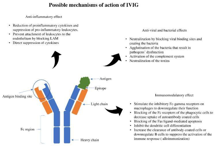
This pathophysiology diagram outlines the 'Possible mechanisms of action of IVIG' (Intravenous Immunoglobulin). A central Y-shaped antibody model illustrates standard structural components: two blue heavy chains and two orange light chains. The lower portion identifies the constant (Fc) region, while the tips of the Fab arms show the antigen-binding sites. One tip is shown binding to a green antigen at its specific epitope. Surrounding the antibody are three categorical descriptions of IVIG's therapeutic roles: 1) Anti-inflammatory effects, including the reduction of pro-inflammatory cytokines and blocking of leukocyte adhesion molecules (LAM). 2) Anti-viral and bacterial effects, highlighting neutralization of pathogens and toxins, agglutination, and complement system activation. 3) Immunomodulatory effects, emphasizing the stimulation of inhibitory Fc-gamma receptors on macrophages, suppression of B-cell activation to prevent alloimmunization, and blocking of phagocytic Fc receptors. This educational material serves as a conceptual summary for clinical immunology and pharmacology related to immunoglobulin therapy.
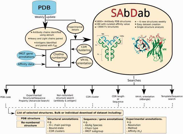
Educational infographic illustrating the workflow of the Structural Antibody Database (SAbDab). The diagram details the bioinformatics pipeline from the Protein Data Bank (PDB) through identification of antibody chains, antigen pairing, and Chothia numbering. A prominent inset features a schematic representation of an IgG antibody, highlighting its Y-shaped quaternary structure composed of two heavy and two light chains. The antibody is divided into the Fab (antigen-binding fragment) and Fc (crystallizable fragment) regions. The Fab region is further broken down into the variable domains (VH and VL), which form the Fv fragment. A detailed molecular rendering on the right demonstrates the VH (green) and VL (blue) domains, specifically annotating the Complementarity Determining Regions (CDRs) L1, L2, L3 and H1, H2, H3. The flowchart concludes by listing search parameters such as CDR clustering, VH-VL orientation (ABangle), and experimental affinity (Kd), ultimately resulting in structural and sequence annotations for medical immunology research.
adaptive immune response T cells B cells antigen presenting cell
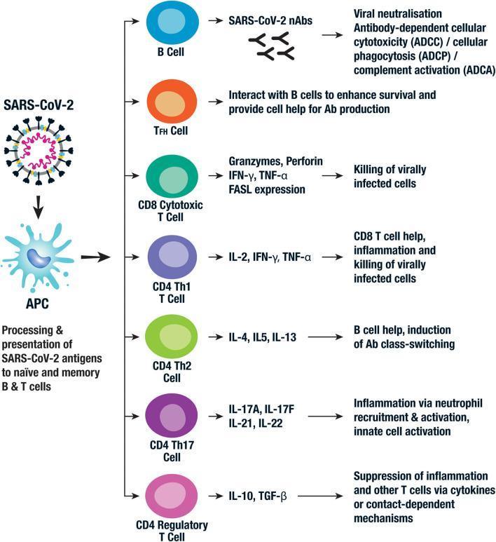
This pathophysiology diagram illustrates the adaptive immune response pathways to SARS-CoV-2. The process begins with the virus being taken up by an Antigen-Presenting Cell (APC), which processes and presents SARS-CoV-2 antigens to naïve and memory B and T cells. The diagram details seven distinct cellular responses: 1) B Cells producing neutralizing antibodies (nAbs) to facilitate viral neutralization, ADCC, ADCP, and ADCA; 2) Follicular helper T (TFH) cells interacting with B cells to enhance antibody production; 3) CD8 Cytotoxic T Cells utilizing granzymes, perforin, IFN-̳, and TNF-̱ to kill virally infected cells; 4) CD4 Th1 T cells secreting IL-2, IFN-̳, and TNF-̱ for inflammation and cytotoxic support; 5) CD4 Th2 cells producing IL-4, IL-5, and IL-13 for B cell antibody class-switching; 6) CD4 Th17 cells releasing IL-17 and IL-21/22 for neutrophil recruitment and innate activation; and 7) CD4 Regulatory T cells (Tregs) secreting IL-10 and TGF-̲ to suppress inflammation. This visual serves as an educational summary of lymphocyte differentiation and cytokine-mediated effector functions in the context of COVID-19 immunology.
![A pathophysiology diagram illustrating the adaptive immune response and the Jerne idiotypic network theory. The flow begins with an antigen presented by an Antigen-Presenting Cell (APC) via MHC, triggering clonal selection of epitope-specific B cells and carrier-specific T cells. Individual B and T cell clones are depicted as segmented hexagons representing BCR and TCR variable regions; background colors indicate paratope specificity, while CDR3 segment colors represent unique nonself-idiotopes. The diagram shows two concurrent pathways: 1) A primary antigen-induced immune response leading through activation, proliferation, and somatic hypermutation to end-stage cells (Plasma Cells [PC], Long-Lived Plasma Cells [LLPC], and Memory B cells [BM]). 2) A regulatory 'Clonal connections' cascade where the initial idiotype (Ab1) induces anti-idiotypic responses (Ab2), subsequently followed by anti-anti-idiotypic (Ab3) and anti-anti-anti-idiotypic (Ab4) interactions. This idiotypic chain, mediated by both B and T cells (T2, T3, T4), provides feedback regulation on the ongoing immune response. The visual emphasizes how somatically created CDR3 regions act as nonself-idiotopes, driving a regulatory network within the autologous immune system.](https://cdn.orris.care/cdss_images/pmc_clinical_VQA_e65f7ef0cd8677c7584455ca814e4fa78e4ff9be6efbe857219b8b436c156c3d.jpg)
A pathophysiology diagram illustrating the adaptive immune response and the Jerne idiotypic network theory. The flow begins with an antigen presented by an Antigen-Presenting Cell (APC) via MHC, triggering clonal selection of epitope-specific B cells and carrier-specific T cells. Individual B and T cell clones are depicted as segmented hexagons representing BCR and TCR variable regions; background colors indicate paratope specificity, while CDR3 segment colors represent unique nonself-idiotopes. The diagram shows two concurrent pathways: 1) A primary antigen-induced immune response leading through activation, proliferation, and somatic hypermutation to end-stage cells (Plasma Cells [PC], Long-Lived Plasma Cells [LLPC], and Memory B cells [BM]). 2) A regulatory 'Clonal connections' cascade where the initial idiotype (Ab1) induces anti-idiotypic responses (Ab2), subsequently followed by anti-anti-idiotypic (Ab3) and anti-anti-anti-idiotypic (Ab4) interactions. This idiotypic chain, mediated by both B and T cells (T2, T3, T4), provides feedback regulation on the ongoing immune response. The visual emphasizes how somatically created CDR3 regions act as nonself-idiotopes, driving a regulatory network within the autologous immune system.
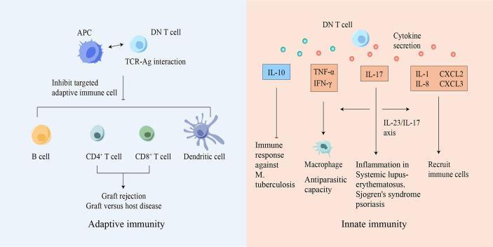
A pathophysiology diagram illustrating the dual role of double-negative (DN) T cells in adaptive and innate immunity. The left panel (Adaptive Immunity) depicts a DN T cell interacting with an Antigen-Presenting Cell (APC) via TCR-Ag recognition. This interaction leads to the inhibition of effector cells including B cells, CD4+ T cells, CD8+ T cells, and dendritic cells, with clinical implications for suppressing graft rejection and graft-versus-host disease (GVHD). The right panel (Innate Immunity) shows a DN T cell secreting various cytokines and chemokines. IL-10 is linked to the immune response against Mycobacterium tuberculosis; TNF-̑ and IFN-̓ are shown enhancing macrophage antiparasitic capacity; IL-17 is identified in the IL-23/IL-17 axis mediating inflammation in autoimmune conditions such as Systemic Lupus Erythematosus (SLE), Sjogren's syndrome, and psoriasis; and IL-1, IL-8, CXCL2, and CXCL3 are involved in immune cell recruitment. The diagram highlights the immunoregulatory and pro-inflammatory versatility of DN T cells in different pathological contexts.
immunoglobulin classes IgG IgM IgA IgE IgD comparison table
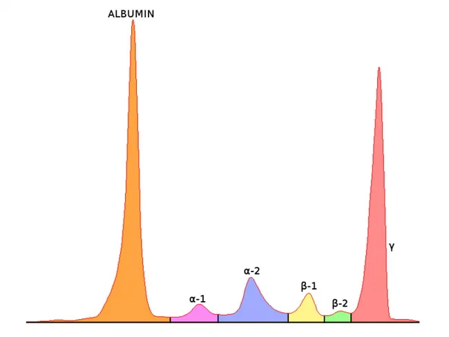
Serum Protein Electrophoresis (SPEP) with immunofixation is depicted as a schematic distribution of serum proteins into discrete zones. The illustration emphasizes the gamma region where a monoclonal M component appears as a narrow, sharp spike in patients with plasma cell disorders, contrasted with the broad, polymorphic gamma background of polyclonal immunoglobulins. In clinical practice, an M component is first detected on SPEP and then characterized by immunofixation electrophoresis (IFE), which uses specific antisera against heavy chains (IgG, IgA, IgM, IgD, IgE) and light chains (kappa, lambda) to identify the M protein type and light chain restriction. The most frequent M component is IgG (~50%), followed by IgA (~20%), light-chain only (~20%), and rare IgD/IgE/IgM or biclonal cases (~1–2%). The total immunoglobulin level rises because of the M protein, often with suppression of normal polyclonal immunoglobulins and albumin. IFE detects the M component in serum or urine in about 97% of secretory myelomas; non-secretory disease or certain heavy/light chain combinations may yield undetectable M bands. Clinically, the M component supports diagnosis of plasma cell dyscrasias (multiple myeloma, MGUS, smoldering MM), informs prognosis, guides therapy, and enables longitudinal monitoring of tumor burden and response. Educationally, this image illustrates the concept of a monoclonal spike versus a polyclonal background, the sequential use of SPEP followed by IFE, and the utility of serum and urine testing to capture secretory versus non-secretory variants.
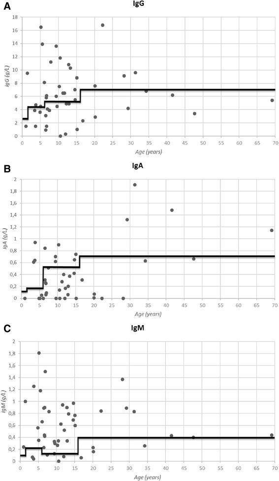
Educational infographics comprising three scatter plots (A, B, and C) illustrating serum immunoglobulin levels across different ages in a patient cohort, likely representing primary immunodeficiency. The x-axis for all graphs represents 'Age (years)' ranging from 0 to 70. The y-axes display concentrations in g/L for IgG (Graph A, 0–18 g/L), IgA (Graph B, 0–2 g/L), and IgM (Graph C, 0–2 g/L). Each data point represents an individual patient's measurement. A prominent, stepped black line is overlaid on each plot, representing the lower limit of normal (LLN) based on age-matched reference values. Graph A (IgG) shows a significant proportion of data points falling below the LLN, particularly in children and middle-aged adults. Graph B (IgA) reveals numerous patients with undetectable or very low levels (near 0 g/L), highlighting IgA deficiency. Graph C (IgM) similarly displays several patients below the age-adjusted reference line. These visualizations are designed to demonstrate the prevalence of antibody deficiencies (hypogammaglobulinemia) within a specific clinical population compared to standardized physiological ranges.
vaccine types mechanisms live attenuated inactivated subunit toxoid
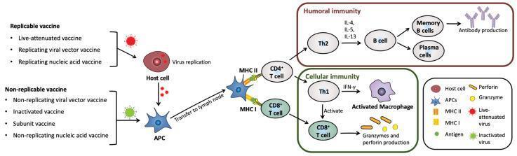
A pathophysiology diagram illustrating the immune response mechanisms triggered by replicable and non-replicable vaccines. The flowchart begins on the left, distinguishing replicable vaccines (e.g., live-attenuated) which undergo replication within a host cell before antigen uptake, from non-replicable vaccines (e.g., inactivated, subunit) which are directly processed by antigen-presenting cells (APCs). Following transfer to a lymph node, the diagram depicts APCs presenting antigens via MHC II to CD4+ T cells and via MHC I to CD8+ T cells. The CD4+ T cell pathway bifurcates into Humoral Immunity, mediated by Th2 cells, B cells, and plasma cells producing antibodies (IL-4, IL-5, IL-13 signaling), and Cellular Immunity. The cellular immunity section shows Th1 cells activating macrophages via IFN-γ and stimulating CD8+ T cells to produce granzymes and perforin for cytotoxic activity. This comprehensive illustration serves as an educational summary of vaccine-induced adaptive immunity for medical and immunology students.
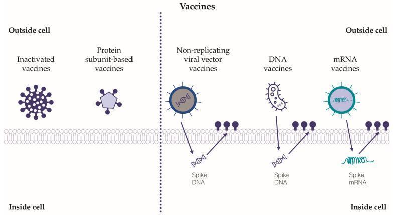
A medical illustration comparing five classes of SARS-CoV-2 vaccines based on their mechanism of cellular interaction. The diagram is bifurcated into two sections relative to the host cell membrane. On the left, 'Inactivated vaccines' and 'Protein subunit-based vaccines' are shown remaining entirely in the extracellular space ('Outside cell'). On the right, the diagram illustrates intracellular mechanisms for 'Non-replicating viral vector vaccines,' 'DNA vaccines,' and 'mRNA vaccines.' These latter three types are depicted crossing the cell membrane to deliver genetic material 'Inside cell.' Viral vector and DNA vaccines are shown delivering a double-helix 'Spike DNA' structure, while the mRNA vaccine delivers a single-stranded 'Spike mRNA' filament. Arrows indicate the flow of genetic material into the cytoplasm and subsequent interaction with membrane receptors (represented by dark purple circular icons). The diagram highlights the educational distinction between vaccines that act as external antigens versus those that utilize host cellular machinery for transcription and translation of the viral spike protein.
im a medical student. answer this question for me and help me understand in simple way
can u answer this