
Create an image on network analysis, CPM.and pert Give a short answer, question like one page, and explain the diagram of park also. From पार्क PSM textbook.
PERT CPM network analysis arrow diagram critical path
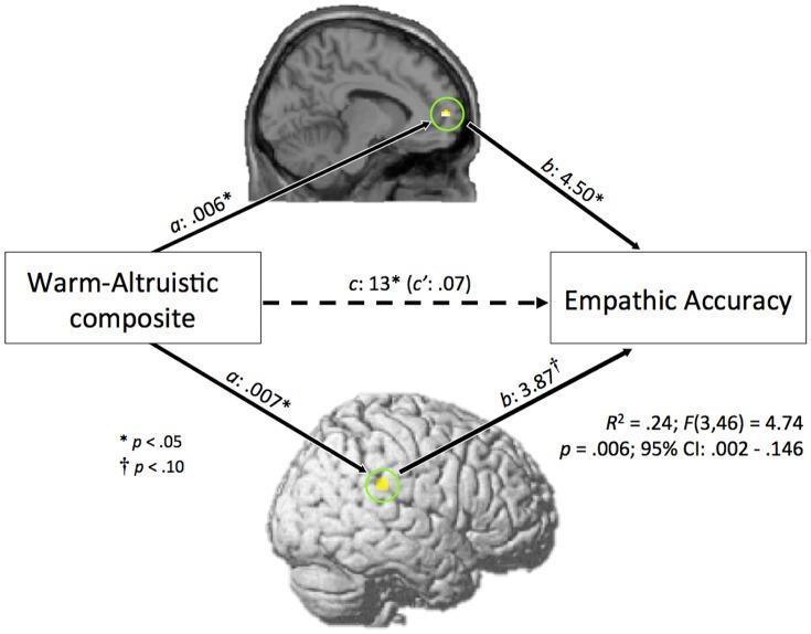
A pathophysiology diagram and statistical model illustrating a mediation analysis in neuroscience. The visual depicts the relationship between personality traits (Warm-Altruistic composite) and behavioral outcomes (Empathic Accuracy), mediated by neural activity. Two functional magnetic resonance imaging (fMRI) brain maps are featured: a sagittal view showing an activation cluster in the medial prefrontal cortex (mPFC) and a 3D rendering highlighting the right temporoparietal junction (rTPJ). Both regions are marked with yellow circles and connected via solid arrows representing path 'a' (independent variable to mediator) and path 'b' (mediator to dependent variable). Path 'a' coefficients (.006* and .007*) and path 'b' coefficients (4.50* and 3.87†) indicate the strength of these associations. A central dashed arrow represents the direct path 'c' (.13*) and the residual path 'c' (.07) after accounting for the mediators. The diagram includes statistical legends (p-values, R-squared, and confidence intervals), serving as an educational resource for understanding the neural correlates of empathy and the 'theory of mind' network.
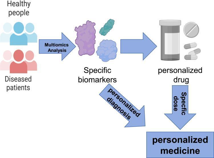
This medical flowchart illustrates the conceptual framework and diagnostic pathways of personalized medicine. The diagram progresses horizontally from left to right, beginning with two distinct populations: 'Healthy people' (depicted in blue icons) and 'Diseased patients' (depicted in red icons). A transition arrow labeled 'Multiomics Analysis' indicates the use of genomics, proteomics, and other high-throughput technologies to process data from these groups. This analysis leads to the identification of 'Specific biomarkers,' represented by irregular molecular shapes. From these biomarkers, the process bifurcates: one path leads directly to 'personalized medicine' via a 'personalized diagnosis' arrow, while the other leads to a 'personalized drug' (illustrated by a pill bottle and capsules). A final arrow labeled 'Specific dose' links the personalized drug to the final outcome of 'personalized medicine.' The illustration highlights how individual molecular profiles inform therapeutic interventions to optimize drug efficacy and minimize side effects in specific patient populations.
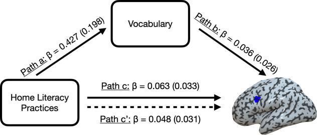
This pathophysiology diagram illustrates a statistical mediation analysis model evaluating the relationship between environmental factors and neural mechanisms of literacy. The model comprises three primary components: 'Home Literacy Practices' (independent variable), 'Vocabulary' (mediator), and a specific region within the brain (dependent variable), identified in context as the posterior inferior frontal sulcus (pIFs). A realistic 3D anatomical rendering of a human brain shows the pIFs highlighted in blue on the left cortical surface. The diagram uses labeled directional arrows to quantify pathways: Path a (HLE to Vocabulary, β=0.427) and Path b (Vocabulary to brain activity, β=0.036). A solid horizontal arrow represents Path c (Total Effect, β=0.063), while a parallel dashed arrow represents Path c' (Direct Effect, β=0.048). Standard errors are provided in parentheses for each coefficient. The visualization demonstrates the hypothesis that behavioral literacy environments influence neural word adaptation through the cognitive mediation of a child's vocabulary, relevant to developmental neurology and educational psychology research.
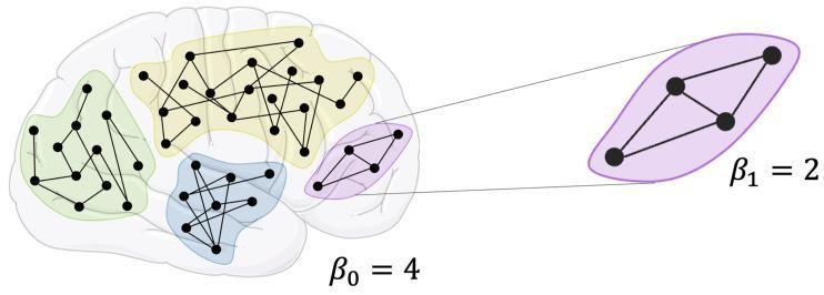
This medical illustration presents a pathophysiology diagram demonstrating topological network analysis applied to brain connectivity. A lateral-view outline of a human brain serves as the background for four distinct colored clusters (green, yellow, blue, and purple), representing different neural regions or functional networks. Each cluster contains black nodes (vertices) interconnected by black lines (edges) of varying densities, simulating a brain graph or connectome. The diagram uses homology-based topological indices, specifically Betti numbers, to characterize the network. The annotation β0 = 4 is shown for the overall graph, indicating four distinct path-connected components corresponding to the colored clusters. A callout box provides a zoomed-in view of the purple region, annotated with β1 = 2, representing the number of independent loops or cycles within that specific sub-network. This visual represents advanced neuroimaging concepts used to quantify brain structure and functional integration in network neuroscience.
A PERT/CPM network analysis arrow diagram showing nodes (events) numbered 1 through 6 connected by arrows (activities) with time durations labeled. The critical path is highlighted in red. Activities are labeled A through H. The diagram shows parallel paths converging at the final node, illustrating project planning with earliest start time and latest finish time at each node. Clean educational diagram style with clear labels for "Critical Path", "Events", and "Activities".
Network Analysis: CPM and PERT
What is Network Analysis?
(a) PERT - Programme Evaluation and Review Technique
- PERT is a management technique which makes possible more detailed planning and more comprehensive supervision.
- The essence of PERT is to construct an Arrow Diagram (see Fig. 2 below).
- The diagram represents the logical sequence in which events must take place.
- With such a diagram, it is possible to:
- Calculate the time by which each activity must be completed
- Identify those activities that are critical
Uses / Advantages of PERT:
| Function | Description |
|---|---|
| Planning | Aids in planning, scheduling and monitoring the project |
| Communication | Allows better communication between various levels of management |
| Problem identification | Identifies potential problems early |
| Progress reporting | Furnishes continuous, timely progress reports |
| Evaluation | Forms a solid foundation upon which to build an evaluation and checking system |
Analogy: Every housewife who plans a meal so that each part of the menu is completed at the same time is using the basic technique of PERT.
(b) CPM - Critical Path Method
- The longest path of the network is called the "Critical Path".
- If any activity along the critical path is delayed, the entire project will be delayed.
- CPM helps managers focus attention on the activities that are most time-sensitive.
The Arrow Diagram (Fig. 2) - Park's PSM
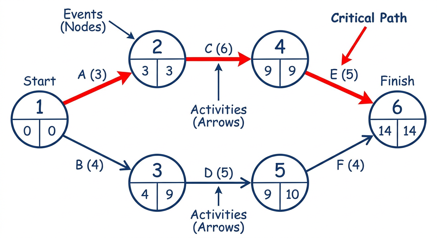
Explanation of the Diagram:
| Component | Symbol | Description |
|---|---|---|
| Event (Node) | Circle/Numbered node | A point in time marking the start or completion of an activity |
| Activity | Arrow between nodes | A task or job that consumes time and resources |
| Critical Path | Bold/Red arrows | The longest sequence of activities from start to finish |
| Duration | Number on arrow | Time required to complete each activity |
How to read the diagram:
- Nodes (circles) represent events - numbered 1, 2, 3... from start to finish
- Arrows represent activities (labeled A, B, C...) with time durations written on them
- The critical path is the longest route from the first node to the last node
- Activities NOT on the critical path have "float" or slack time - they can be delayed without delaying the project
- Activities ON the critical path have zero float - any delay = project delay
Short Answer Questions (SAQ Format)
| Feature | PERT | CPM |
|---|---|---|
| Focus | Time (probabilistic) | Time-cost trade-off |
| Time estimates | Three estimates (optimistic, pessimistic, most likely) | Single time estimate |
| Best used for | R&D, new projects | Construction, routine projects |
| Output | Arrow diagram, event times | Critical path, float times |
Create an best infographic and easy explaining image for that answer, network analysis cpm and pert above answer
A detailed, colorful, educational medical infographic titled "Network Analysis: PERT & CPM" designed for medical students (Park's PSM). Layout: Vertical infographic with multiple sections. SECTION 1 - Top banner: Bold title "NETWORK ANALYSIS" with subtitle "PERT & CPM" on a deep blue background with white text. SECTION 2 - Definition box: "A NETWORK is a graphic plan of all EVENTS and ACTIVITIES needed to reach an end objective" with a small icon of a flowchart. SECTION 3 - Two colored columns side by side: LEFT column (green): "PERT - Programme Evaluation & Review Technique" with bullet points: Arrow Diagram, Logical sequence of events, Calculates time for each activity, Identifies critical activities, 3 time estimates (Optimistic, Pessimistic, Most Likely), Used for R&D/new projects RIGHT column (orange): "CPM - Critical Path Method" with bullet points: Longest path = Critical Path, Delay in critical path = Project delay, Single time estimate, Zero float on critical path, Used for construction/routine projects SECTION 4 - Center: A clear PERT/CPM arrow network diagram showing 6 numbered circles (nodes/events) connected by labeled arrows (activities A-H) with time durations. The critical path highlighted in RED bold arrows going 1→2→4→5→6. Other paths in blue. Labels: "Event = Circle", "Activity = Arrow", "Critical Path = Red". Below diagram: "Longest Path = 1→2→4→5→6 (Total: 18 days)" SECTION 5 - Uses of PERT table with 5 colorful icon rows: Planning, Scheduling, Communication, Problem Identification, Progress Reporting SECTION 6 - Bottom comparison table "PERT vs CPM" with rows: Time estimates, Focus, Best used for SECTION 7 - Footer: "Park's Textbook of Preventive and Social Medicine" in small text. Style: Clean, modern, bright colors, easy to read fonts, medical student friendly, lots of white space, icons and visual elements throughout.
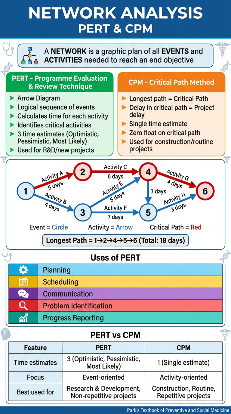
- Definition of Network Analysis (as per Park's PSM)
- PERT (green column) - arrow diagram, 3 time estimates, uses, best for R&D/new projects
- CPM (orange column) - critical path concept, zero float, best for routine projects
- Arrow Diagram in the center showing numbered nodes (events) connected by activity arrows, with the critical path highlighted in red
- 5 Uses of PERT - planning, scheduling, communication, problem identification, progress reporting
- PERT vs CPM comparison table at the bottom
- Park's PSM reference in the footer
Create an image on integrated vector management from parks PSM. It is an SAQ include all points.
A detailed, colorful, educational medical infographic titled "INTEGRATED VECTOR MANAGEMENT (IVM)" for medical students from Park's PSM textbook. Vertical layout with multiple clear sections. TOP BANNER: Dark teal/green background. Title: "INTEGRATED VECTOR MANAGEMENT (IVM)" in large bold white text. Subtitle: "Park's Textbook of Preventive and Social Medicine" in small yellow text. SECTION 1 - DEFINITION BOX (light blue background): "IVM = Appropriate biological, chemical and environmental interventions of proven efficacy, used separately or in combination, through optimal use of resources" with a mosquito icon. SECTION 2 - THREE PILLARS (3 colored boxes side by side): Box 1 (GREEN): "BIOLOGICAL" - Larvivorous fish (Gambusia), Bacillus thuringiensis Box 2 (ORANGE): "CHEMICAL" - IRS (DDT, Malathion, Synthetic Pyrethroids), ITNs/LLINs Box 3 (PURPLE): "ENVIRONMENTAL" - Source reduction, Water drainage, Minor environmental engineering SECTION 3 - THREE PRONGED STRATEGY OF NVBDCP (yellow background header, 3 columns): Prong 1: "DISEASE MANAGEMENT" - Early case detection, Complete treatment, Referral services, Epidemic preparedness Prong 2: "INTEGRATED VECTOR MANAGEMENT" - IRS in high-risk areas, Insecticide treated bed-nets (ITNs/LLINs), Larvivorous fish, Anti-larval measures, Source reduction Prong 3: "SUPPORTIVE INTERVENTIONS" - BCC (Behaviour Change Communication), Public Private Partnership, Capacity building, Operational research, Monitoring & Evaluation, JE vaccination, Mass drug administration (filariasis) SECTION 4 - KEY MEASURES TABLE (white background, blue headers): 4 rows: 1) Adult mosquito control → Indoor Residual Spray (IRS) 2) Antilarval measures → Chemical + Biological + Environmental 3) Personal protection → Bed-nets, ITNs, LLINs 4) Insecticide choices → DDT (1st choice), Malathion, Synthetic Pyrethroids SECTION 5 - IRS COVERAGE BOX (light orange): "~80 million population covered by IRS in India" "DDT = insecticide of choice; Resistance → Malathion or Synthetic Pyrethroids" "2 rounds spraying (DDT/Pyrethroids); 3 rounds (Malathion)" "API ≥5 → LLINs coverage; API ≥2 → ITNs + IRS" SECTION 6 - INTEGRATION CONCEPT (light green box): "INTEGRATION: Same vector control methods used to control MALARIA + LEISHMANIASIS (rural) and MALARIA + DENGUE (urban) → Cost-effectiveness + Synergy" SECTION 7 - DISEASES COVERED BY NVBDCP (6 colored pill badges): Malaria | Filariasis | Kala-azar | Japanese Encephalitis | Dengue | Chikungunya FOOTER: "Reference: Park's PSM - NVBDCP & Integrated Vector Management" in small gray text. Style: Clean, modern, bright medical infographic, readable fonts, icons of mosquitoes/nets/spray, plenty of color coding, easy to study from.
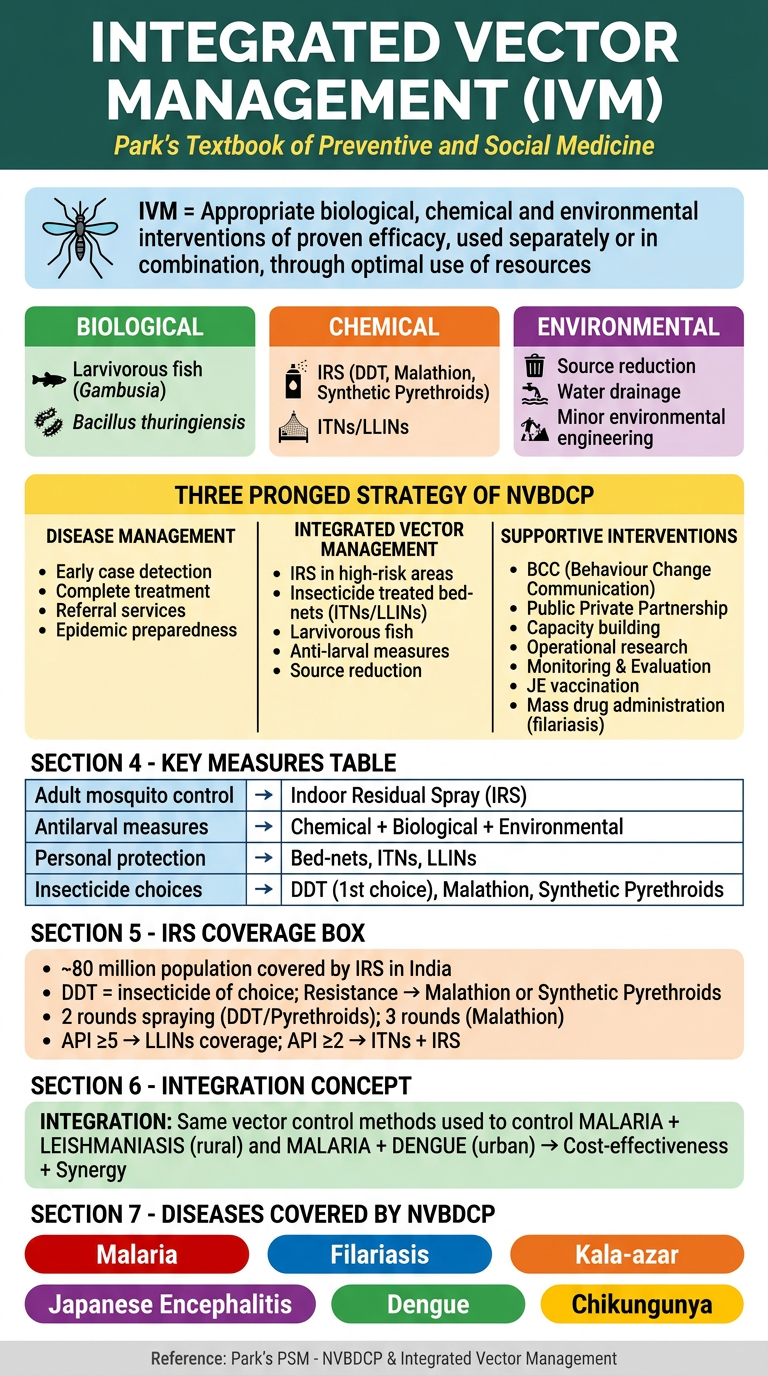
- Biological (larvivorous fish, Bacillus thuringiensis)
- Chemical (IRS, ITNs, LLINs)
- Environmental (source reduction, drainage)
- Disease management
- Integrated vector management
- Supportive interventions (BCC, PPP, capacity building)
- Adult mosquito control: IRS
- Antilarval: chemical + biological + environmental
- Personal protection: bed nets, ITNs, LLINs