
make new diagram
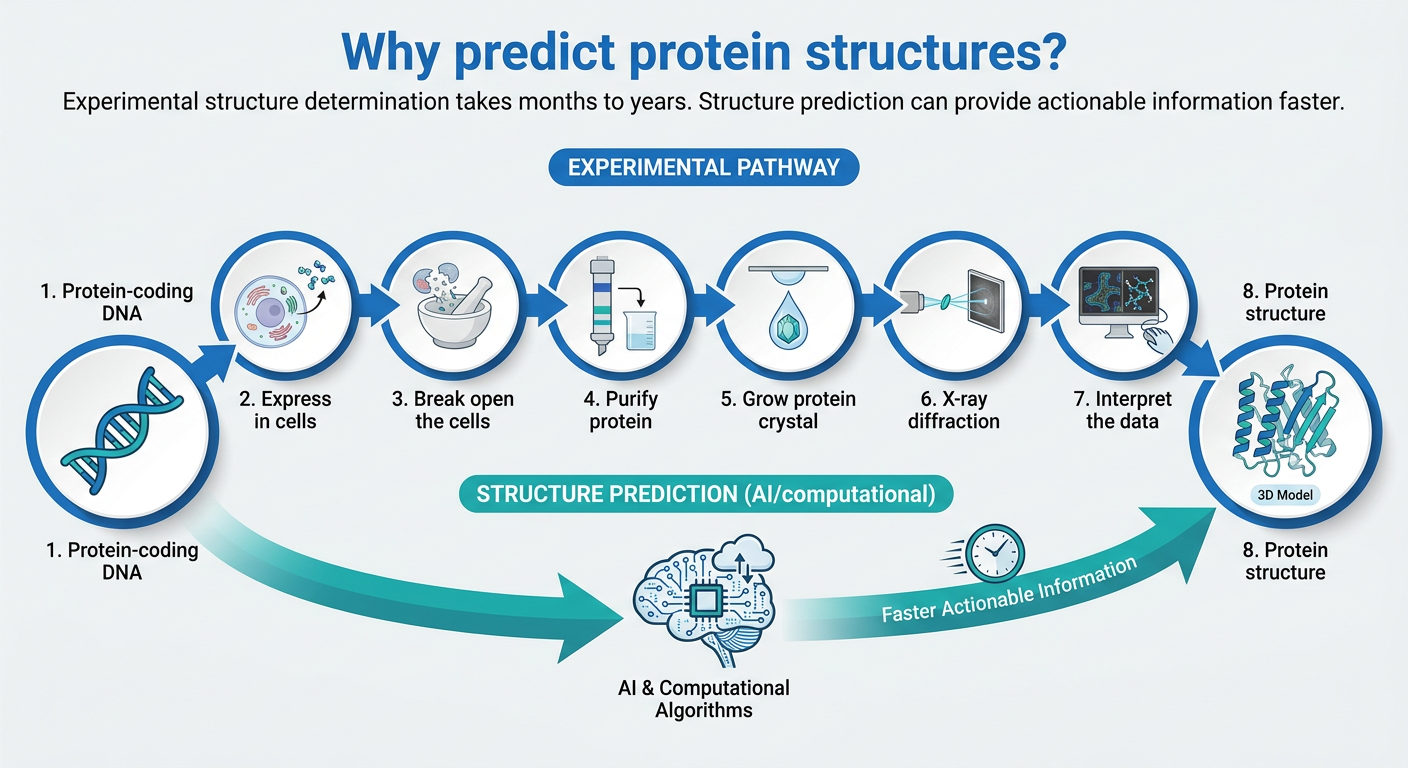
A clean scientific diagram titled "Why predict protein structures?" showing two pathways: 1) An experimental pathway with 8 numbered steps in circles connected by arrows: Protein-coding DNA → Express in cells → Break open the cells → Purify protein → Grow protein crystal → X-ray diffraction → Interpret the data → Protein structure. Each circle has a relevant science icon. 2) A shortcut pathway showing Structure Prediction (AI/computational) connecting directly from Protein-coding DNA to Protein structure, bypassing all the intermediate steps. The layout is horizontal for the main pathway with the shortcut shown as a curved arrow underneath. Title text says "Why predict protein structures?" with subtitle "Experimental structure determination takes months to years. Structure prediction can provide actionable information faster." Clean modern design with blue and teal color scheme on light gray background.

make image clear and high resolution
A high resolution, clean, professional slide infographic titled "AlphaFold at CASP" in large bold dark navy blue text on a light gray background. Left side text content: - "When working on these problems, a clear success metric is crucial" - "Fortunately, the protein structure prediction community had established CASP" - "The CASP assessment involves predicting recently solved structures that aren't yet public" - "At CASP14, AlphaFold was the top ranked method achieving consistently high accuracy" Top right: Two 3D protein structure ribbon diagrams side by side - one large complex folded protein structure showing overlaid green (Experiment) and blue (Prediction) ribbons with a legend showing "Experiment" in green and "Prediction" in blue. The second smaller protein structure also showing green and blue overlay. Bottom right: A clean professional bar chart with: - Y-axis labeled "GDT" from 0 to 100 - X-axis labeled "CASP" with bars for: CASP7 2006, CASP8 2008, CASP9 2010, CASP10 2012, CASP11 2014, CASP12 2016, CASP13 2018, CASP14 2020 - Most bars are medium gray at around 30-40 GDT height - CASP13 2018 bar is purple/lavender labeled "ALPHAFOLD" at about 58 GDT - CASP14 2020 bar is tall bright royal blue labeled "ALPHAFOLD 2" reaching about 90 GDT, clearly dominant Clean modern scientific presentation style, very sharp and high resolution.
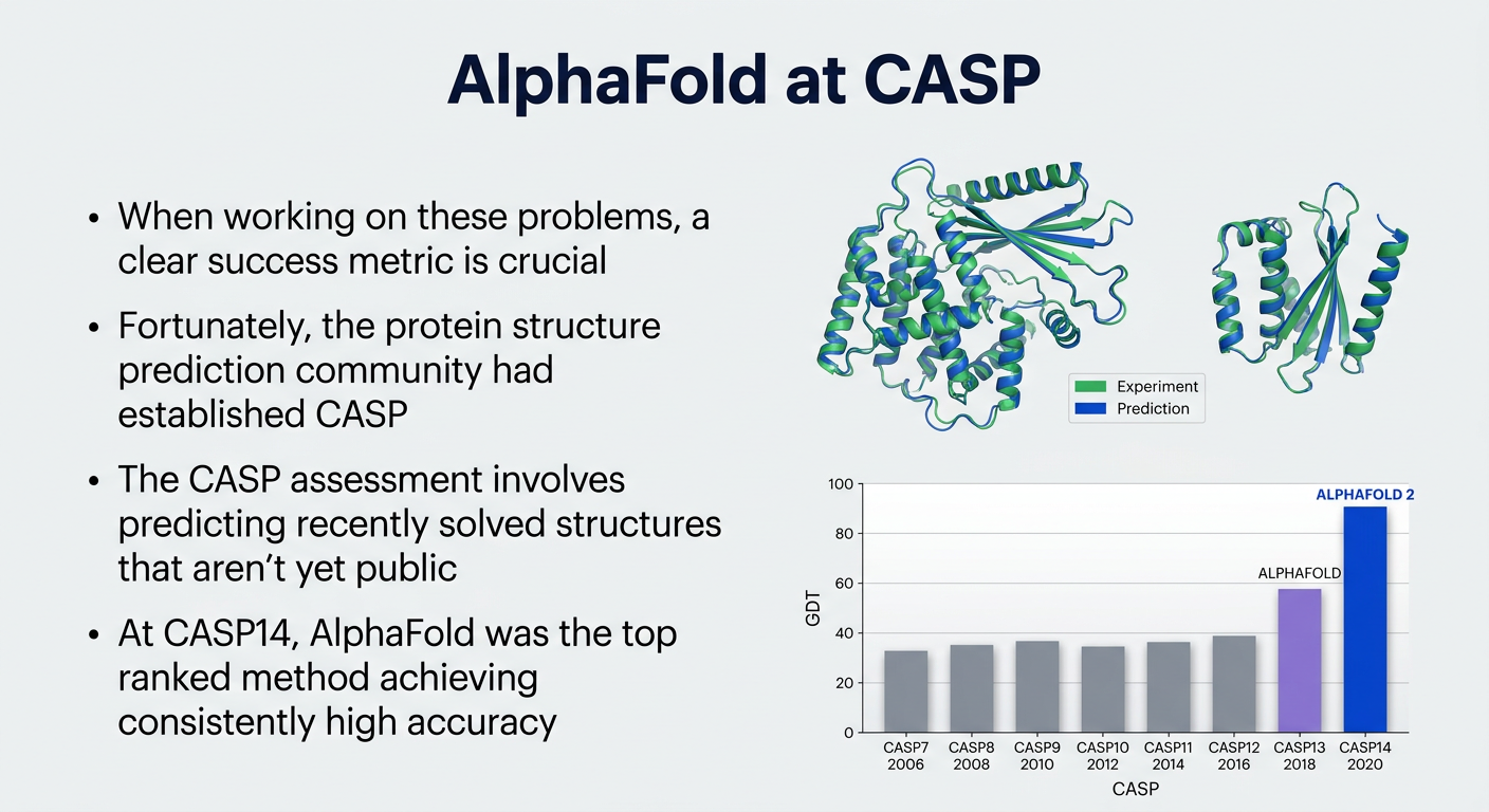
- All four text points on the left
- Two overlaid protein structure ribbon diagrams (green = Experiment, blue = Prediction) on the top right
- The bar chart showing GDT scores across CASP7 through CASP14, with the AlphaFold (CASP13, purple) and AlphaFold 2 (CASP14, royal blue) bars clearly standing out above the competition

remove written part and make image clear and do not change value of bar
A high resolution, clean, professional bar chart titled "CASP: historical perspective" in large bold dark navy blue text on a light gray background. NO bullet points or written text on the right side - only the chart. The bar chart occupies the full slide width: - Y-axis labeled "GDT_TS" from 0 to 100, with gridlines at 20, 40, 60, 80, 100 - X-axis shows CASP competition labels: - CASP1 1994 (no bar visible, just label at origin) - CASP7 2006: gray bar at exactly 34 - CASP8 2008: gray bar at exactly 40 - CASP9 2010: gray bar at exactly 33 - CASP10 2012: gray bar at exactly 29 - CASP11 2014: gray bar at exactly 29 - CASP12 2016: gray bar at exactly 40 - CASP13 2018: purple/lavender bar at exactly 58, labeled "ALPHAFOLD" above it in purple text - CASP14 2020: bright royal blue tall bar at exactly 87, labeled "ALPHAFOLD 2" above it in dark blue text All gray bars are medium steel gray. CASP13 bar is soft purple/violet. CASP14 bar is strong royal blue, clearly much taller than all others. Clean gridlines, no background clutter, sharp crisp rendering, very high resolution image.
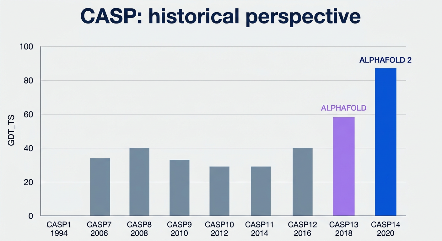
- Gray bars (CASP7-CASP12): ~29-40 GDT_TS
- CASP13 2018 (purple): 58 - labeled "ALPHAFOLD"
- CASP14 2020 (royal blue): 87 - labeled "ALPHAFOLD 2"

Make full HD image without any changes
Full HD 1920x1080 professional slide infographic titled "Inductive Bias for Deep Learning Models" in large bold dark navy blue serif font, light gray background. Four quadrants arranged in a 2x2 grid, each with a network diagram on the left and text on the right: TOP LEFT - Convolutional Networks: Diagram: Two columns of 5 teal/green circles (nodes) arranged in a grid. Lines connect from one orange/amber highlighted node in the right column to multiple nodes in the left column. Some lines are orange/thick, others thin gray/blue. Shows local connectivity pattern. Text: "Convolutional Networks (e.g. computer vision)" in bold dark navy. Bullet points: "data in regular grid", "information flow to local neighbours", "AlphaFold 1" TOP RIGHT - Recurrent Networks: Diagram: A 3-row by 4-column grid of teal circles on top and bottom rows, with teal square nodes in the middle row connected horizontally by arrows. Vertical arrows connect circles to squares. One orange highlighted node at top center. Shows sequential flow left to right. Text: "Recurrent Networks (e.g. language)" in bold dark navy. Bullet points: "data in ordered sequence", "information flow sequentially" BOTTOM LEFT - Graph Networks: Diagram: An irregular graph/network of teal circles connected by gray lines forming a tree/molecule shape. Some edges are orange/highlighted. One orange center node. Nodes connected in branching pattern. Text: "Graph Networks (e.g. recommender systems or molecules)" in bold dark navy. Bullet points: "data in fixed graph structure", "information flow along fixed edges" BOTTOM RIGHT - Attention Module: Diagram: Left side has teal circle nodes and teal diamond nodes arranged in a grid. Lines radiate from one orange highlighted node on the right to all nodes on the left - some lines orange/thick, others thin gray. Shows full connectivity with dynamic weighting. Text: "Attention Module (e.g. language)" in bold teal/dark teal. Bullet points: "data in unordered set", "information flow dynamically controlled by the network (via keys and queries)" Clean, sharp, high resolution, modern scientific presentation style. Teal color #2EC4B6, navy blue #1B2A6B, orange accent #E07B39.