

Can you make it beautiful I’m not liking it’s design
A polished vertical school student ID card design for Little Rose Convent Senior Secondary School: formal navy blue and warm ivory palette with subtle red accents, an elegant school crest area, clear hierarchy for school name, student portrait panel, student name and class, parent contact details, principal signature space, and a faint school-building watermark. Do not use readable personal names, phone numbers, or placeholder text.
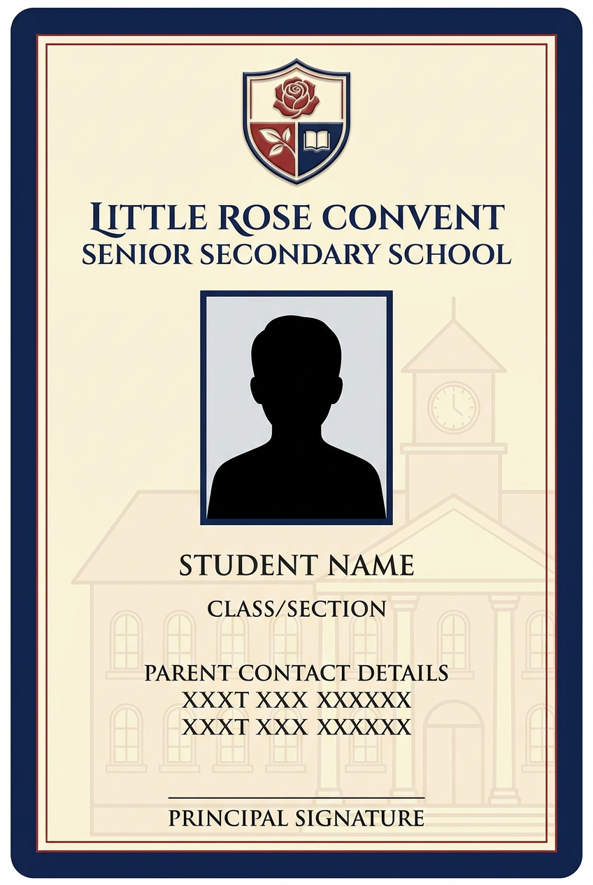
- A calmer navy, ivory, and red color palette
- Less diagonal decoration
- Stronger spacing around the student photo and name
- A faint building watermark only at the bottom
- Clear aligned fields for father, mobile, and address
- A small, tidy principal-signature area
No please make it again Or just beautify the older one
Redesign the provided vertical Little Rose Convent Senior Secondary School student ID card, retaining the same information structure and student portrait position but making it elegant, clean, and print-ready. Use a refined royal-blue header with a thin gold divider, ivory body, restrained red accent lines, a centered rectangular student photo with a crisp navy border, prominent student name below, neatly aligned class and parent-contact fields, school crest in top-left, phone in top-right, tasteful principal signature area, and a faint school-building photo watermark only along the lower edge. Remove oversized diagonal chevrons, use generous whitespace and consistent typography. Preserve the original school identity and all existing visible personal details exactly, including the student photo, name Vinod Kumar, class V B, ID card 2026-27, school name, address, father/mobile/address lines, and contact number.
- A calmer navy, ivory, and red color palette
- Less diagonal decoration
- Stronger spacing around the student photo and name
- A faint building watermark only at the bottom
- Clear aligned fields for father, mobile, and address
- A small, tidy principal-signature area
Quick answer
- The school logo, photo, name, class, ID year, contacts, and building image
- Blue and red school colors
- Remove the heavy diagonal stripes
- Use a neat blue header with clean alignment
- Add balanced spacing and a bordered photo frame
- Make “Vinod Kumar” elegant and readable
- Align the Father, Mob, and Address rows properly
- Use the building image as a very light footer watermark
- Make the principal-signature section smaller and cleaner