
all heart physiology
cardiac cycle pressure volume Wiggers diagram
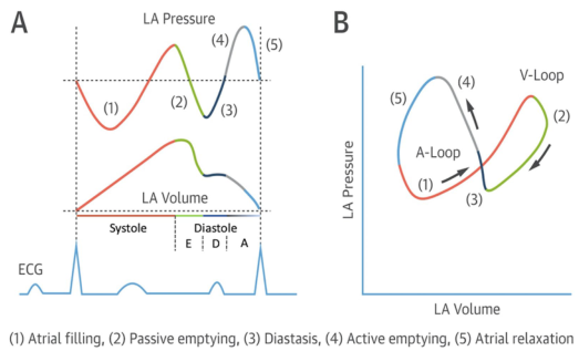
Summary : This figure illustrates the left atrial (LA) pressure-volume relationship during the cardiac cycle, showing both time-course traces and a pressure-volume loop, with key phases of atrial function annotated and correlated with the ECG. line plot and loop diagram: # Panel A: LA Pressure and Volume Traces • Top trace: LA Pressure (y-axis, arbitrary units) over time. • Middle trace: LA Volume (y-axis, arbitrary units) over time. • Bottom trace: ECG waveform for temporal reference. • X-axis: Cardiac cycle phases, with systole and diastole labeled; diastole further subdivided into E, D, and A phases. • Five phases are color-coded and numbered: – (1) Atrial filling (red) – (2) Passive emptying (green) – (3) Diastasis (black) – (4) Active emptying (blue) – (5) Atrial relaxation (gray) • Vertical dashed lines demarcate transitions between phases. # Panel B: LA Pressure-Volume Loop • X-axis: LA Volume (arbitrary units). • Y-axis: LA Pressure (arbitrary units). • The loop is traced in a counterclockwise direction, with arrows indicating the sequence. • The same five phases (1–5) are color-coded as in Panel A. • The loop is divided into two segments: A-Loop (phases 1, 3, 4, 5) and V-Loop (phase 2). # Design Encodings : • Distinct colors for each phase (red, green, black, blue, gray). • Arrows on the loop indicate the direction of the cardiac cycle. • ECG trace provides timing reference for the pressure and volume changes. # Analysis : • The LA pressure and volume traces show cyclical changes corresponding to atrial filling, emptying, and relaxation. • The pressure-volume loop visually summarizes the dynamic relationship between LA pressure and volume, with distinct segments for passive and active phases. • The figure highlights the temporal coordination between atrial events and the ECG, emphasizing the mechanical and electrical coupling in the cardiac cycle.
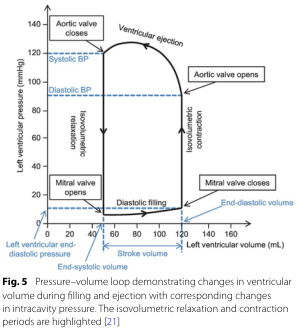
Summary : This figure shows a pressure–volume loop for the left ventricle, illustrating how ventricular volume and pressure change during the cardiac cycle, with key phases and valve events annotated. The isovolumetric relaxation and contraction periods are highlighted, and systolic/diastolic blood pressures are marked. pressure–volume loop diagram: # Title & Axes : • No explicit title on the figure, but the legend describes it as a "Pressure–volume loop demonstrating changes in ventricular volume during filling and ejection with corresponding changes in intracavity pressure." • X-axis: "Left ventricular volume (mL)" with tick marks at 0, 20, 40, 60, 80, 100, 120, 140, 160. • Y-axis: "Left ventricular pressure (mmHg)" with tick marks at 0, 20, 40, 60, 80, 100, 120, 140. • Additional axis labels: "Left ventricular end-diastolic pressure" (blue, left), "End-diastolic volume" (blue, bottom right), "Stroke volume" (black, bottom center). # Phases & Events : • Isovolumetric relaxation: vertical line at low volume, pressure drops, labeled. • Diastolic filling: horizontal line at low pressure, volume increases, labeled. • Isovolumetric contraction: vertical line at high volume, pressure rises, labeled. • Ventricular ejection: curved line, volume decreases as pressure peaks and falls, labeled. • Valve events: – Mitral valve opens (bottom left corner, low pressure/volume). – Mitral valve closes (bottom right corner, high volume/low pressure). – Aortic valve opens (top right corner, high volume/high pressure). – Aortic valve closes (top left corner, low volume/high pressure). # Blood Pressure Markers : • Systolic BP: horizontal dashed blue line at ~120 mmHg. • Diastolic BP: horizontal dashed blue line at ~80 mmHg. # Design Encodings : • Black solid lines for the loop. • Blue dashed lines for blood pressure markers. • Blue text for end-diastolic volume/pressure. • Labeled arrows for direction of phases and valve events. # Analysis : • The loop traces the cardiac cycle, starting at low pressure/volume (end-systolic), filling during diastole, rising sharply during isovolumetric contraction, ejecting blood during ventricular ejection, and dropping pressure during isovolumetric relaxation. • Systolic and diastolic blood pressures are marked, showing the pressure range during ejection. • The width of the loop (horizontal distance) represents stroke volume. • The figure clearly distinguishes the four main phases and the timing of valve openings/closings, providing a comprehensive view of ventricular mechanics during a heartbeat.
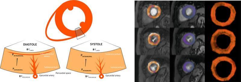
This composite educational graphic details the pathophysiology of myocardial perfusion and coronary hemodynamics. Panel A features a pathophysiology diagram illustrating the extravascular forces and intraluminal pressures affecting the myocardial layers during the cardiac cycle. It compares diastole and systole, highlighting the differences in intramural pressure (PINTRAMURAL), left ventricular lumen pressure (PLUMEN), and pericardial space pressure (PPERICARDIUM). The diagram shows the subendocardial plexus and epicardial artery, emphasizing greater subendocardial compression and reduced vascular volume during systole. Panel B presents a cardiac perfusion quantification map from a patient with aortic stenosis (AS). The map is organized in a grid: rows represent basal, mid, and apical short-axis slices of the left ventricle; columns demonstrate stress perfusion, rest perfusion, and myocardial perfusion reserve (MPR). The color-coded mapping shows regional perfusion distribution, with the MPR column specifically highlighting global limitations in perfusion reserve. This visual is designed for medical education focusing on cardiovascular hemodynamics, coronary microcirculation, and the physiological impact of valvular heart disease on myocardial blood flow.
cardiac action potential phases ventricular muscle
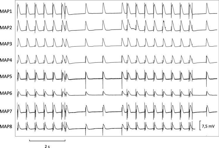
This diagnostic trace image displays eight simultaneous monophasic action potential (MAP) recordings, labeled MAP1 through MAP8, used in cardiac electrophysiology research. The primary focus is the determination of effective refractory periods (ERP) at a basic cycle length of 500 ms. The traces exhibit characteristic cardiac action potential morphology with rapid depolarization and subsequent repolarization phases. Throughout the 2-second time interval (indicated by the scale bar), regular pacing stimuli are followed by short-coupled extrastimuli (S2/S3) to test ventricular vulnerability and refractory periods. Variations in amplitude and morphology are visible across the different MAP traces, with a voltage scale of 7.5 mV provided for reference. Notable features include the presence of premature beats and varying repolarization kinetics (APD90/APD50) across different anatomical recording sites. This recording is representative of programmed electrical stimulation protocols used to assess spatial dispersion of repolarization and the propensity for arrhythmias such as ventricular tachycardia or torsade de pointes.
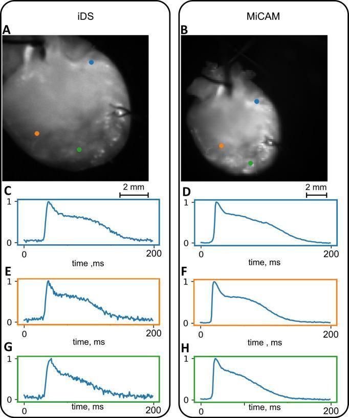
This Comparison Chart illustrates cardiac optical mapping data obtained from two different camera systems: the iDS (left column) and MiCAM (right column). Panels A and B display still frames of a Langendorff-perfused mouse heart, stained with a voltage-sensitive dye (Di-4-ANEPPS). Three color-coded pixels (blue, orange, and green) are marked on the ventricular surface of each heart image, indicating specific regions of interest. Panels C through H present the corresponding action potential (AP) waveforms recorded from these marked locations. The x-axis represents time in milliseconds (0–200 ms) and the y-axis shows normalized signal amplitude. The AP waveforms demonstrate characteristic cardiac electrophysiological phases, including rapid depolarization and subsequent repolarization. Visually, the iDS system images (A) appear brighter with a clearer anatomical outline but show higher high-frequency noise in the raw AP traces (C, E, G). In contrast, the state-of-the-art MiCAM system (B) produces traces with a higher signal-to-noise ratio (D, F, H), resulting in smoother AP curves. This comparison is used in cardiovascular research to validate the efficacy of lower-cost imaging systems for measuring cardiac activation sequences and action potential duration (APD).
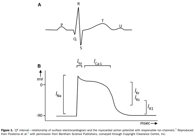
Summary : This figure illustrates the relationship between the surface electrocardiogram (ECG) waveform and the myocardial action potential, highlighting the corresponding ion channels responsible for different phases of cardiac electrical activity. line diagram: # Panel A: Surface Electrocardiogram (ECG) Waveform : • Shows a typical ECG trace with labeled points: P, Q, R, S, T, and U. • The waveform represents the electrical activity of the heart during a cardiac cycle. • P wave: atrial depolarization. • QRS complex: ventricular depolarization. • T wave: ventricular repolarization. • U wave: sometimes seen, origin not fully understood. # Panel B: Myocardial Action Potential : • Plots membrane potential (mV) on the y-axis (ranging from -90 mV to above 0 mV) against time (msec) on the x-axis. • Shows the phases of the cardiac action potential: – Rapid upstroke (depolarization) due to I_Na (sodium current). – Early repolarization (I_to, transient outward potassium current). – Plateau phase (I_Ca-L, L-type calcium current). – Repolarization phase (I_Kr and I_Ks, rapid and slow delayed rectifier potassium currents). – Resting potential maintained by I_K1 (inward rectifier potassium current). # Ion Channels & Phases : • I_Na: Responsible for the initial rapid depolarization. • I_to: Contributes to early repolarization. • I_Ca-L: Maintains the plateau phase. • I_Kr and I_Ks: Mediate repolarization. • I_K1: Maintains the resting membrane potential. # Design Encodings : • Simple black line traces for both ECG and action potential. • Ion channel names are annotated above the relevant phases of the action potential. # Analysis : • The figure visually links the phases of the ECG waveform to the underlying myocardial action potential and the specific ion channels involved. • The QRS complex corresponds to the rapid depolarization (I_Na), while the T wave aligns with repolarization (I_Kr, I_Ks). • The plateau phase (I_Ca-L) is crucial for the duration of the QT interval, which is clinically significant for arrhythmia risk. • The diagram provides a clear educational overview of how surface ECG features relate to cellular electrophysiology.
Frank-Starling curve cardiac output venous return
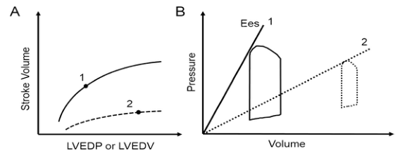
Summary : This figure compares cardiac function under two conditions using two types of plots: (A) the Frank-Starling relationship between stroke volume and left ventricular filling, and (B) pressure-volume loops with end-systolic elastance (Ees) lines. line and schematic plot: # Panel A: Frank-Starling Curve : • Y-axis: Stroke Volume (no units shown). • X-axis: LVEDP or LVEDV (Left Ventricular End-Diastolic Pressure or Volume; no units shown). • Two curves are shown: – Curve 1: Higher, solid line, labeled "1". – Curve 2: Lower, dashed line, labeled "2". • Each curve has a point marked (solid dot) on it. # Panel B: Pressure-Volume Loop and End-Systolic Elastance : • Y-axis: Pressure (no units shown). • X-axis: Volume (no units shown). • Two pressure-volume loops: – Loop 1: Solid line, larger, leftward, labeled "1". – Loop 2: Dashed line, smaller, rightward, labeled "2". • Two Ees (end-systolic elastance) lines: – Ees 1: Steeper, solid line, labeled "1". – Ees 2: Less steep, dashed line, labeled "2". # Design Encodings : • Solid lines for condition 1, dashed lines for condition 2. • Dots mark specific points on the curves in panel A. • Pressure-volume loops are outlined, with loop 2 shown as a dashed outline. # Analysis : • Panel A shows that condition 1 (solid line) has a higher stroke volume for any given LVEDP/LVEDV compared to condition 2 (dashed line), indicating better cardiac function. • Panel B shows that condition 1 has a larger, leftward pressure-volume loop and a steeper Ees line, indicating greater contractility. Condition 2 has a smaller, rightward loop and a less steep Ees line, indicating reduced contractility. • The figure visually contrasts normal/enhanced versus impaired cardiac function using both stroke volume response and pressure-volume relationships.
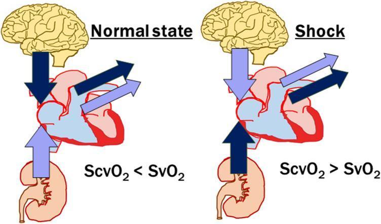
This pathophysiology diagram illustrates the differences in regional oxygen saturation and blood flow distribution between a normal physiological state and circulatory shock. The diagram features anatomical icons of the brain, heart, and kidney, with arrows representing venous return and mixed venous output. In the 'Normal state,' the venous return from the brain is shown with a dark blue arrow (high extraction), while the return from the kidney is pale purple (low extraction), resulting in the relationship ScvO2 < SvO2. Conversely, in the 'Shock' state, the centralization of circulation is depicted: the kidney return becomes dark blue (indicating increased extraction or decreased perfusion), and the brain return becomes pale purple, leading to the inversion ScvO2 > SvO2. The comparison highlights how circulatory failure and compensatory vasoconstriction in visceral organs alter the balance between central venous oxygen saturation (ScvO2) and mixed venous oxygen saturation (SvO2), serving as a critical indicator for monitoring tissue perfusion and cardiac output adequacy in critical care settings.
conduction system heart SA AV node Purkinje fibers anatomy
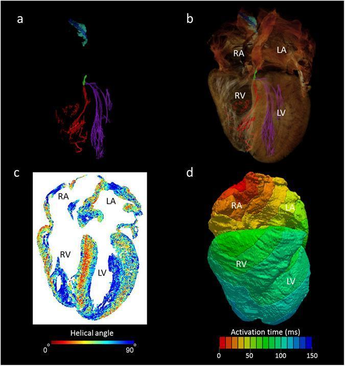
This multi-panel figure illustrates the application of high-resolution micro-CT data in mathematical modeling of human cardiac anatomy and electrophysiology. Panel (a) presents a segmented 3D reconstruction of the cardiac conduction system, color-coded to show the sinus node (blue), paranodal area (turquoise), atrioventricular (AV) conduction axis (green), and the intricate right (red) and left (purple) Purkinje networks. Panel (b) overlays these segmented structures onto a semi-transparent 'ghosted' volume rendering of the whole heart, providing anatomical context within the right and left atria (RA, LA) and ventricles (RV, LV). Panel (c) provides a four-chamber cross-sectional view of cardiomyocyte orientation, using a color map to represent absolute helical angles (0° to 90°). This reveals complex transmural patterns and longitudinal alignment in the papillary muscles. Panel (d) shows a computer-generated isochrone map of cardiac depolarization (activation time in ms) seeded from the sinus node. This visualization integrates anatomically accurate geometry with electrophysiological measurements to demonstrate physiological conduction pathways across the myocardium.
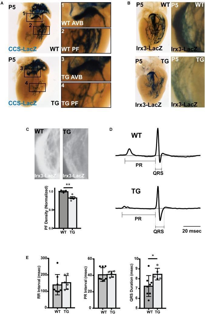
Educational medical graphic illustrating abnormal ventricular conduction system (VCS) structure and electrophysiology in a mouse model of miR-1 overexpression. Panel A shows whole-mount P5 neonatal hearts with CCS-LacZ reporter activity; magnified views compare wild-type (WT) and transgenic (TG) atrioventricular bundles (AVB) and Purkinje fibers (PF), revealing significantly reduced PF branching in TG hearts. Panel B utilizes Irx3-LacZ staining to further demonstrate diminished PF density in the left bundle branch and right ventricle of TG mice. Panel C provides quantification, with a bar graph showing a statistically significant decrease in normalized PF density (p < 0.01). Panel D displays averaged lead aVF ECG tracings, highlighting a prolonged QRS duration in TG mice compared to WT. Panel E includes bar graphs of cardiac intervals (RR, PR, and QRS), confirming that while heart rate and AV node conduction are unchanged, VCS conduction is significantly slowed, as evidenced by increased QRS duration (p < 0.05). This composite figure demonstrates that premature miR-1 upregulation leads to Purkinje fiber hypoplasia and conduction dysfunction.
Heart Physiology: Complete Overview
1. Cardiac Muscle Structure
- Cardiac muscle is striated with actin and myosin filaments arranged in sarcomeres, identical in sliding-filament mechanism to skeletal muscle
- Cells are connected in series and parallel by intercalated discs, which contain gap junctions that allow rapid ion diffusion - making the myocardium a functional syncytium
- The left ventricle is organized in complex fiber layers (subepicardial spiraling leftward, subendocardial spiraling rightward) that create a wringing/twisting motion during systole (ventricular torsion), aiding ejection and then recoiling during diastole to fill the chambers rapidly
Guyton & Hall, p. 122
2. Cardiac Action Potential
Ventricular/Atrial Muscle (Fast-Response)
| Phase | Event | Ion Current |
|---|---|---|
| Phase 0 - Upstroke | Rapid depolarization | Fast inward Na⁺ current (I_Na) |
| Phase 1 - Initial repolarization | Brief repolarization | Na⁺ inactivation + transient outward K⁺ (I_to) |
| Phase 2 - Plateau | Stable ~150-200 ms depolarization | Inward Ca²⁺ (I_Ca-L) balanced by outward K⁺ (I_K) |
| Phase 3 - Repolarization | Return to resting potential | ↓gCa + ↑gK (I_Kr, I_Ks) - outward K⁺ exceeds inward Ca²⁺ |
| Phase 4 - Resting | Stable at ~-90 mV | I_K1 (inward rectifier K⁺) maintains resting potential |
Costanzo Physiology, p. 141
SA Node (Slow-Response / Pacemaker)
- I_f ("funny current") - slow inward Na⁺ current at hyperpolarized potentials
- Decreasing I_K - progressive fall in outward K⁺ current
- SA node: 60-100 bpm
- AV node: 40-60 bpm
- Bundle of His / Purkinje: 20-40 bpm
3. Conduction System
- Atrial muscle: ~1 m/s
- AV node: ~0.05 m/s (slowest)
- Purkinje fibers: ~4 m/s (fastest)
- Ventricular muscle: ~0.5 m/s
4. Autonomic Regulation of Heart Rate and Conduction
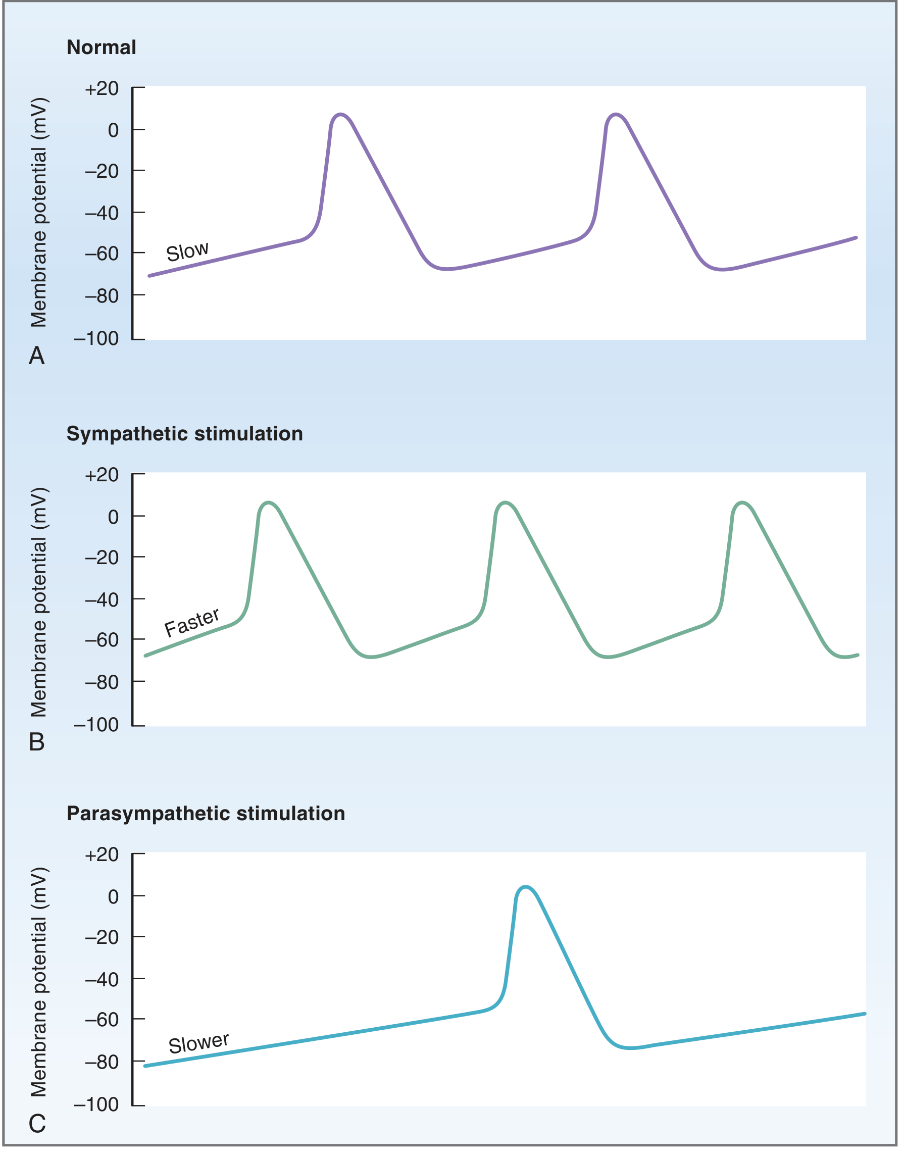
Sympathetic (via β₁ receptors, norepinephrine → Gs → ↑cAMP):
- Chronotropy (+): ↑I_f in SA node → faster Phase 4 depolarization; ↓threshold potential → fires more frequently
- Dromotropy (+): ↑AV node conduction velocity
- Inotropy (+): ↑Ca²⁺ entry → stronger contraction
- Lusitropy (+): Enhanced relaxation (faster Ca²⁺ reuptake into SR)
Parasympathetic (via M₂ receptors, acetylcholine → Gk):
- Chronotropy (-): ↓I_f + ↑I_KAch → slower Phase 4 depolarization + hyperpolarization of maximum diastolic potential; ↑threshold potential → fires less frequently
- Dromotropy (-): Slows AV node conduction (↑PR interval)
- Minimal direct effect on ventricular contractility
Costanzo Physiology, p. 146-147
5. Excitation-Contraction Coupling
- Action potential arrives at cardiomyocyte membrane
- L-type Ca²⁺ channels open during Phase 2 plateau → Ca²⁺ enters cell
- This small Ca²⁺ influx triggers massive Ca²⁺-induced Ca²⁺ release (CICR) from the SR via ryanodine receptors (RyR2)
- Cytosolic Ca²⁺ rises → Ca²⁺ binds troponin C → conformational change in troponin-tropomyosin complex → actin-myosin cross-bridge cycling → contraction
- Relaxation: Ca²⁺ removed by:
- SERCA2a pump (back into SR) - primary route
- NCX (Na⁺/Ca²⁺ exchanger) - extrudes Ca²⁺ across sarcolemma
- Minor: sarcolemmal Ca²⁺-ATPase, mitochondrial uptake
6. The Cardiac Cycle
Phases of the Left Ventricular Cycle
| Phase | Description | Key Features |
|---|---|---|
| Atrial systole ("atrial kick") | Atria contract | Contributes ~20-30% of ventricular filling |
| Isovolumic contraction | Ventricle contracts, all valves closed | Pressure rises but volume unchanged; Phase I→II of PV loop |
| Rapid ejection | Aortic valve opens (LV pressure > Ao ~80 mmHg) | ~70% of stroke volume ejected |
| Reduced ejection | Slowing phase | Remaining ~30% ejected |
| Isovolumic relaxation | Aortic valve closes, mitral still closed | Pressure drops, volume unchanged; Dicrotic notch on Ao pressure |
| Rapid ventricular filling | Mitral valve opens (LV P < LA P) | ~70% of diastolic filling; passive |
| Slow filling (diastasis) | Slow passive filling | Minimal volume change |
- LV systolic pressure: ~120 mmHg
- LV diastolic pressure: ~0-8 mmHg
- Aortic systolic pressure: ~120 mmHg; diastolic: ~80 mmHg
- End-diastolic volume (EDV): ~120-130 mL
- End-systolic volume (ESV): ~50-60 mL
- Stroke volume: ~70 mL
- S1 (lub): Mitral and tricuspid valve closure at start of systole
- S2 (dub): Aortic and pulmonary valve closure at end of systole
Guyton & Hall, p. 126-130
7. Ventricular Pressure-Volume Loop
- A→B (bottom: diastolic filling) - volume increases from ~50 to ~120 mL at low pressure
- B→C (right side: isovolumic contraction) - pressure rises, volume constant
- C→D (top: ejection) - volume decreases as aortic valve is open
- D→A (left side: isovolumic relaxation) - pressure falls, volume constant
8. Stroke Volume, Cardiac Output, Ejection Fraction
- Stroke Volume (SV) = EDV - ESV = ~70 mL
- Ejection Fraction (EF) = SV / EDV = 70/130 ≈ 55% (normal ≥55%)
- Cardiac Output (CO) = SV × Heart Rate = 70 mL × 72 bpm ≈ 5 L/min
- Cardiac Index = CO / Body Surface Area = ~3.2 L/min/m²
Costanzo Physiology, p. 155
9. Frank-Starling Law of the Heart
- Positive inotropy (↑contractility): shifts curve UP and to the LEFT (e.g., digoxin, catecholamines) - greater SV for same EDV
- Negative inotropy (↓contractility): shifts curve DOWN (e.g., beta-blockers, heart failure) - reduced SV for same EDV
Guyton & Hall, p. 132
10. Determinants of Cardiac Output
Preload
- The ventricular wall tension at end-diastole (clinically approximated by EDV or filling pressure)
- Increased by: ↑venous return, ↑blood volume, bradycardia (more filling time)
- Determines position on Frank-Starling curve
Afterload
- The resistance the ventricle must overcome to eject blood (clinically: systemic vascular resistance or aortic pressure)
- ↑Afterload → ↓SV, ↑ESV (less blood ejected per beat)
- Laplace's law: Wall stress = (Pressure × Radius) / (2 × Wall thickness)
- In heart failure, ↑afterload worsens function
Contractility (Inotropy)
- Intrinsic property of myocardial force generation independent of preload and afterload
- Increased by: sympathetic stimulation, catecholamines, digoxin, Ca²⁺
- Decreased by: heart failure, myocardial ischemia, acidosis, beta-blockers, Ca²⁺ channel blockers
Heart Rate
- CO = SV × HR; increasing HR increases CO up to a point
- Very high HR: diastole shortens disproportionately → inadequate filling → ↓SV
11. Coronary Circulation
- Left coronary artery (LAD + circumflex): supplies ~85% of LV, anterior wall, septum, lateral wall
- Right coronary artery: supplies right ventricle, inferior/posterior LV (right-dominant pattern in ~70%)
- Coronary blood flow is mostly diastolic (systolic compression of intramural vessels nearly eliminates systolic flow in the subendocardium, especially in the LV)
- Regulation: predominantly by local metabolic factors (adenosine, CO₂, O₂ tension); the coronary vasculature is nearly maximally dilated at rest - autoregulation maintains flow constant between MAP ~60-130 mmHg
- Oxygen extraction by the myocardium is already ~70-80% at rest (vs ~25% for most tissues); therefore the only way to increase O₂ delivery to meet increased demand is to increase flow
- Myocardial O₂ consumption (MVO₂) is determined by: heart rate, contractility, and wall stress (preload + afterload)
12. Cardiac Reflexes and Neural Regulation
| Reflex | Stimulus | Response |
|---|---|---|
| Baroreceptor reflex | ↑arterial pressure → stretch of aortic arch/carotid sinus | ↓HR, ↓contractility, vasodilation |
| Bainbridge reflex | ↑right atrial stretch | ↑HR via vagus, then sympathetic |
| Bezold-Jarisch reflex | Stimulation of LV chemoreceptors (inferior MI, irritants) | ↓HR, ↓BP, vasodilation |
| Cushing reflex | ↑intracranial pressure | ↑BP → reflex bradycardia (protect brain perfusion) |
| Chemoreceptor reflex | ↓PO₂, ↑PCO₂, ↓pH | ↑HR and ↑vasoconstriction |
13. Summary Table: Key Normal Values
| Parameter | Normal Value |
|---|---|
| Heart rate | 60-100 bpm |
| Stroke volume | ~70 mL |
| Cardiac output | ~5 L/min |
| Ejection fraction | ≥55% |
| End-diastolic volume | ~120-130 mL |
| End-systolic volume | ~50-60 mL |
| LV systolic pressure | ~120 mmHg |
| LV diastolic pressure | 0-8 mmHg |
| LA mean pressure | ~5-12 mmHg |
| PA systolic pressure | ~25 mmHg |
| Duration of systole (at 72 bpm) | ~0.33 s |
| Duration of diastole (at 72 bpm) | ~0.53 s |
all anatomy of cvs
heart anatomy chambers valves aorta labeled diagram
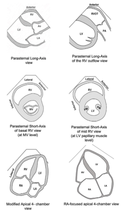
Summary : This figure presents six schematic diagrams of standard echocardiographic views used to visualize the heart chambers and valves, specifically focusing on the right ventricle (RV) and its relationship to other cardiac structures. illustration: # Views Presented : • Parasternal Long-Axis view: Shows RV, Ao (aorta), and LA (left atrium) in a longitudinal section. • Parasternal Long-Axis of the RV outflow view: Displays RVOT (right ventricular outflow tract), PA (pulmonary artery), and LV (left ventricle). • Parasternal Short-Axis of basal RV view (at MV level): Cross-sectional view at the mitral valve (MV) level, showing RV and MV. • Parasternal Short-Axis of mid RV view (at LV papillary muscle level): Cross-sectional view at the level of the LV papillary muscles, showing RV, LV, and papillary muscles (PM). • Modified Apical 4-chamber view: Displays RA (right atrium), RV, LA, and LV in a four-chamber perspective. • RA-focused apical 4-chamber view: Focuses on RA, RV, LA, and LV, emphasizing the right atrium. # Labels & Orientation : • Each diagram is labeled with anatomical structures (RV, LV, LA, RA, Ao, PA, MV, PM). • Orientation markers such as "Anterior," "Lateral," and "Septal" are provided for spatial reference. # Design Encodings : • Simple black-and-white line drawings. • Chamber walls and valves are outlined; no colour or shading. • Each view is titled below the corresponding diagram. # Analysis : • The figure systematically compares different echocardiographic views, highlighting how the right ventricle and associated structures appear in each orientation. • The progression from long-axis to short-axis and apical views demonstrates the versatility of echocardiography in assessing cardiac anatomy and function. • The inclusion of both standard and modified views allows for comprehensive visualization of the right heart.
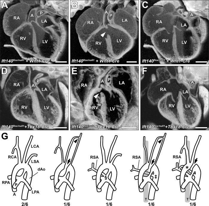
This educational image presents a series of cardiac diagnostic images and anatomical diagrams detailing congenital heart defects. Panels A–F display episcopic confocal microscopy (ECM) cross-sections of experimental hearts. The four chambers—right atrium (RA), left atrium (LA), right ventricle (RV), and left ventricle (LV)—are labeled alongside the aorta (A) and pulmonary trunk (P). Panels A, C, D, and F show normal cardiac looping and septal anatomy, while panels B and E highlight perimembranous ventricular septal defects (VSDs) indicated by white arrowheads. Panel G consists of five comparative diagrams of the aortic arch and great vessels. The first diagram illustrates normal anatomy including the right and left carotid arteries (RCA/LCA) and subclavian arteries (RSA/LSA). Subsequent diagrams depict various great artery patterning defects: an interrupted aorta (arrows), hypoplastic collateral vessels (arrowheads), and anomalous origins of the right subclavian artery (RSA). These anomalies include the RSA arising from the pulmonary trunk (§), as a retrotracheal vascular sling from the descending aorta (‡), or as a vascular ring with dual attachments (*). This content demonstrates complex cardiovascular malformations associated with ciliary gene mutations.
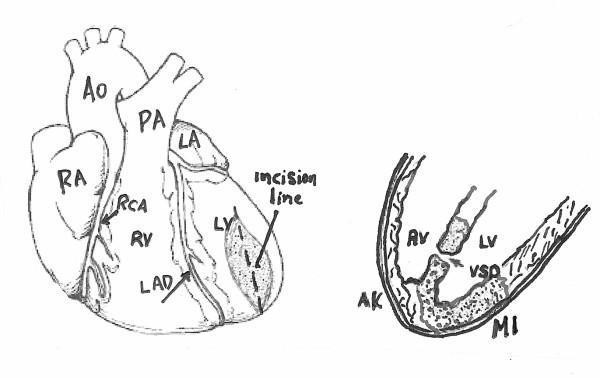
This medical illustration consists of two diagrams depicting cardiac anatomy and pathology associated with myocardial infarction and surgical intervention. The left panel shows an anterior view of the heart with major structures labeled: Right Atrium (RA), Right Ventricle (RV), Left Atrium (LA), Left Ventricle (LV), Aorta (Ao), and Pulmonary Artery (PA). The coronary vasculature is highlighted, specifically the Right Coronary Artery (RCA) and Left Anterior Descending (LAD) artery. An 'incision line' is indicated on the apex of the left ventricle over a shaded area representing infarcted tissue. The right panel is a cross-sectional diagram focusing on the ventricular chambers. It illustrates a Ventricular Septal Defect (VSD), which is a communication between the left and right ventricles. Also labeled are the Aortic Valve (AV), an area of Myocardial Infarction (MI) in the ventricular wall, and adjacent Akinetic (AK) tissue. The illustration serves to demonstrate the anatomical location for a ventriculotomy used to repair post-infarction ventricular septal rupture.
coronary artery anatomy left right dominance supply territory
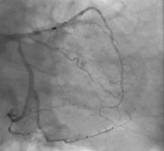
**Imaging Modality:** Invasive Coronary Angiography (ICA); Fluoroscopy. **Anatomical Region:** Left Coronary Artery (LCA) system. **Observed Anatomy & Pathology:** This fluoroscopic image demonstrates the left coronary circulation in a projection showing the Left Main Coronary Artery (LMCA) bifurcating into the Left Anterior Descending (LAD) and the Left Circumflex (LCx) arteries. The LCx appears prominent and elongated, extending into the territory typically occupied by the Right Coronary Artery. **Characteristic Visual Features:** * **Coronary Dominance:** Visual evidence of left dominance, characterized by the LCx artery supplying the posterior descending artery (PDA) and the posterolateral branches. * **Vessel Morphology:** The LAD follows the anterior interventricular groove, giving off diagonal branches. The LCx travels within the atrioventricular groove, exhibiting a large distal extension toward the inferior wall of the heart. * **Contrast Opacification:** Homogeneous opacification of the arterial tree is visible, allowing for the assessment of luminal patency. **Key Diagnostic Features:** Identification of left coronary dominance is established by the LCx crossing the crux of the heart to provide the primary blood supply to the inferior diaphragmatic surface. This anatomical variant is a critical finding for percutaneous coronary intervention (PCI) planning and surgical revascularization.
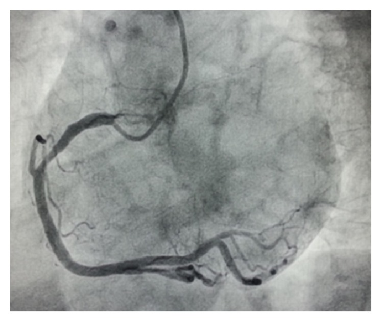
**Imaging Modality:** Invasive coronary angiography (fluoroscopy). **Anatomical Region:** Coronary arterial circulation, specifically the right coronary artery (RCA) visualized in a Left Anterior Oblique (LAO) projection. **Observed Pathology/Anatomy:** This image demonstrates a "super-dominant" right coronary artery. The vessel exhibits significant caliber and extensive distribution, originating from the right coronary sinus. **Characteristic Visual Features:** * **Course:** The RCA traverses the right atrioventricular groove, extending past the crux of the heart. * **Territory:** The vessel provides not only the posterior descending artery (PDA) and posterior left ventricular (PLV) branches but also extends further to supply a large portion of the lateral and postero-lateral walls of the left ventricle. * **Vessel Morphology:** The RCA appears large-caliber and tortuous, showing no significant stenotic lesions in the visible segments. **Key Diagnostic Features:** The diagnostic hallmark is the unusual extension of the RCA beyond the crux, crossing the diaphragmatic surface to supply territories typically served by the left circumflex (LCx) artery. This anatomical variant represents an extreme form of right-sided coronary dominance.
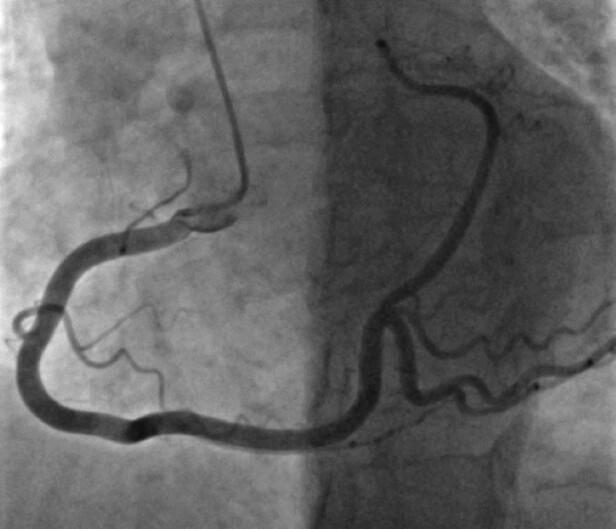
This diagnostic image is a coronary angiogram (fluoroscopic x-ray) demonstrating a right-dominant coronary circulation. The primary focus is the Right Coronary Artery (RCA), which follows a characteristic 'C-shaped' trajectory within the right atrioventricular groove. The vessel exhibits typical anatomy, bifurcating at the crux of the heart into two significant terminal branches: the Posterior Descending Artery (PDA), which travels inferiorly to supply the posterior interventricular septum, and a prominent Posterolateral (PL) branch that travels toward the lateral wall, occupying the territory usually associated with the Left Circumflex Artery (LCX). The image displays the branching pattern and vessel morphology essential for assessing coronary artery disease. A subtle luminal irregularity or darkening is visible along the horizontal segment of the main vessel before the distal bifurcation, which may indicate atherosclerotic plaque or a focal stenosis. This visual serves as an educational example of coronary dominance and normal vs. variant coronary anatomy during cardiac catheterization.
heart valves mitral tricuspid aortic pulmonary anatomy cross section
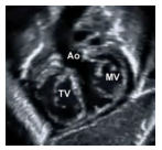
Summary : This image shows a labeled cross-sectional view of the heart, highlighting the anatomical positions of the aortic valve (Ao), mitral valve (MV), and tricuspid valve (TV). photo: Scene Overview : • Main subject is a medical imaging scan (likely MRI or CT) of the heart in cross-section. • The image is grayscale, with three key cardiac structures labeled: Ao (aortic valve), MV (mitral valve), and TV (tricuspid valve). • The perspective is from above, looking down on the heart valves. Technical Details : • No scale bar or magnification is visible. • Labels are overlaid directly on the image: "Ao", "MV", "TV". • Imaging modality appears to be high-resolution, suitable for anatomical identification. Spatial Relationships : • Ao (aortic valve) is positioned centrally and slightly superior. • MV (mitral valve) is to the right of Ao. • TV (tricuspid valve) is to the left and slightly inferior to Ao. • The valves are shown in close proximity, consistent with their anatomical arrangement in the heart. Analysis : • The image provides a clear anatomical reference for the location of the aortic, mitral, and tricuspid valves in a cross-sectional heart scan. • Useful for educational or diagnostic purposes to identify valve positions and relationships.
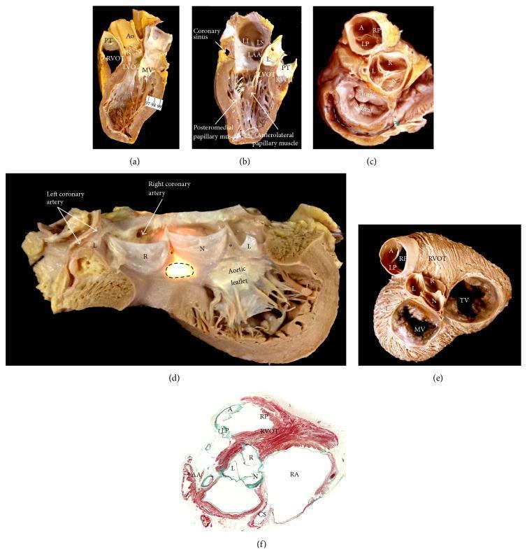
This composite figure presents gross anatomical dissections and a histological section of the human heart, focusing on the anatomy of the aortic root and its spatial relationships. (a-b) Longitudinal sections demonstrate the aortic sinuses, mitral valve papillary muscles, and the muscular subpulmonary infundibulum of the right ventricular outflow tract (RVOT) abutting the coronary sinuses. (c) Atrial view showing the kidney-shaped mitral valve vestibule and its fibrous continuity with the left coronary and noncoronary aortic sinuses. (d) Opened aortic root photographed with transillumination, highlighting the left (L), right (R), and noncoronary (N) sinuses, interleaflet fibrous triangles, and the central fibrous body (brightest area). (e) Short-axis view from the atrial side illustrates the orientation of the aortic valve (Ao), mitral valve (MV), tricuspid valve (TV), and pulmonary sinuses (A, LP, RP). (f) Masson's trichrome stained cross-section confirms that all pulmonary valve leaflets have muscular infundibular support, whereas only two aortic valve leaflets possess muscular support. The collection serves to illustrate the fibrous and muscular components critical for understanding cardiac conduction pathways and valvular relationships.
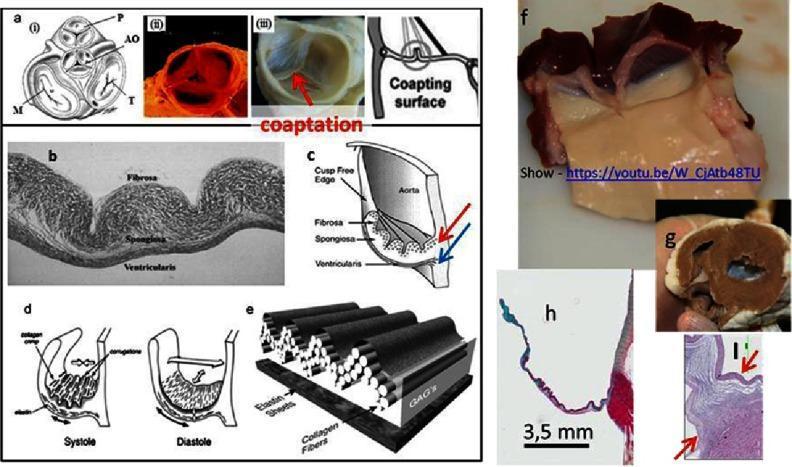
A multi-panel educational graphic illustrating the anatomy, histology, and biomechanics of heart valves. Panels a-i through a-iii show clinical and schematic views of the four cardiac valves (Pulmonary, Aortic, Mitral, Tricuspid) and a decellularized porcine valve. Histological section (b) and diagram (c) identify the three-layered structure of the valve leaflet: the fibrosa (outer layer, rich in circumferentially oriented collagen), spongiosa (middle layer, containing glycosaminoglycans/GAGs for shock absorption), and ventricularis (inner layer, rich in radially oriented elastin). Panels (d) and (e) demonstrate the mechanical behavior of these layers during the cardiac cycle, showing how collagen and elastin fibers accommodate stress during systole and diastole. Panel (f) provides a gross photograph of a sheep aortic valve from the ventricular side, while (h) presents a histological stain (likely Movat's pentachrome) highlighting GAGs in blue within the spongiosa. Panel (i) shows the hinge area histology, emphasizing the complex fiber arrangement necessary for valvular durability and function.
aorta branches arch thoracic abdominal anatomy diagram
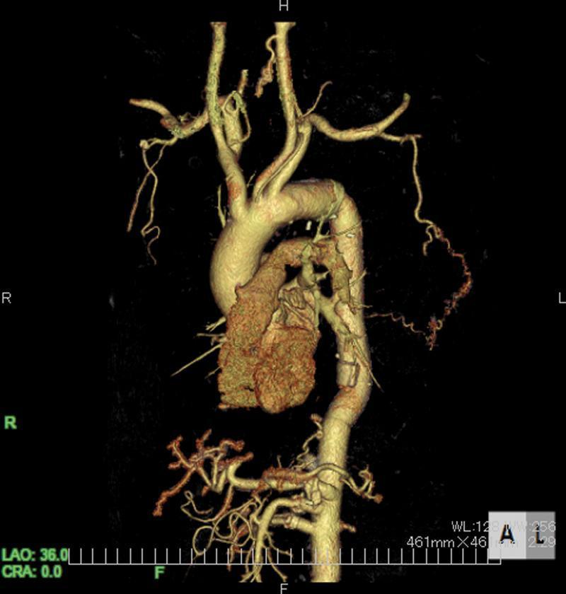
This diagnostic image is a 3D-reconstructed computed tomography angiography (CTA) showing the human thoracic and abdominal aorta in a postoperative state. The aortic arch is prominently visualized with its primary branches, including the brachiocephalic trunk, left common carotid, and left subclavian arteries. The heart is positioned anteriorly to the descending aorta. A critical finding is the presence of a tortuous collateral vessel originating from the left lateral thoracic artery. This collateral pathway extends medially and inferiorly to provide retrograde blood supply to the artery of Adamkiewicz (AKA), serving as a vital compensatory mechanism following the occlusion of reconstructed intercostal arteries. The image highlights the vascular anatomy relevant to spinal cord perfusion and the clinical significance of preserving extra-anatomical collateral circulation during complex aortic surgeries to prevent neurological complications such as paraplegia. The reconstruction demonstrates the vessel's patency and winding morphology against the surrounding vascular structures.
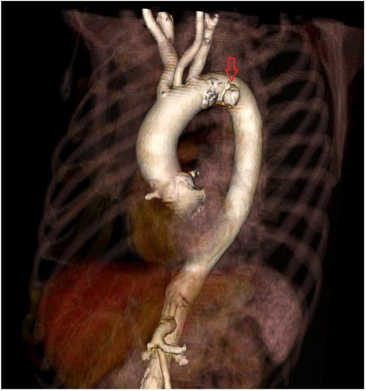
A 3D volume-rendered Computed Tomography (CT) reconstruction of the aorta and surrounding thoracic structures. The image provides a detailed view of the entire aortic path, starting from the abdominal segment and ascending through the thoracic cavity to form the aortic arch. The three major supra-aortic branches—the brachiocephalic trunk, left common carotid artery, and left subclavian artery—are visible at the superior aspect of the arch. A prominent red arrow points to a focal outpouching or intimal irregularity located on the outer curvature of the distal aortic arch, characteristic of a penetrating aortic ulcer (PAU). The surrounding bony anatomy, including the ribs and vertebrae, is rendered with semi-transparency to provide anatomical context without obscuring the vascular pathology. This diagnostic image is intended for pre-procedural planning, demonstrating the specific morphology and localization of an atherosclerotic lesion within the aortic wall that carries a clinical risk of progression to dissection or rupture.
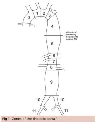
Summary : This illustration divides the thoracic aorta into anatomical zones, each labeled with a number from 0 to 11, to aid in clinical or surgical reference. diagram: # Zones of the Thoracic Aorta : • The aorta is segmented into 12 zones, numbered 0 through 11. • Zone 0: Proximal aortic arch. • Zones 1–3: Ascending aorta and arch, with zone 3 ending 2 cm distal to the left subclavian artery. • Zones 4–9: Descending thoracic aorta, with zone 4 starting after the arch and zone 9 ending before the bifurcation. • Zones 10–11: Abdominal aorta and iliac arteries. • The mid-point of the descending thoracic aorta is marked at approximately the T6 vertebral level. • Brachiocephalic, left common carotid, and left subclavian arteries branch from the arch near zones 0–3. # Annotations & Measurements : • "2 cm" is marked at the distal end of zone 3. • "Mid-point of descending thoracic aorta (approx. T6)" is labeled at zone 5. • Zones 10 and 11 correspond to the iliac arteries. # Layout : • The zones are arranged sequentially from the aortic root (top left) through the arch, descending thoracic aorta, and into the abdominal aorta and iliac arteries. • The diagram is a simplified line drawing, with each zone clearly demarcated by horizontal lines. # Analysis : • The figure provides a standardized anatomical reference for the thoracic and abdominal aorta, useful for describing the location of vascular pathology or interventions. • The segmentation highlights key anatomical landmarks, such as the arch branches and the aortic bifurcation. • The use of numbered zones facilitates precise communication in clinical and surgical contexts.
pericardium layers fibrous serous anatomy heart
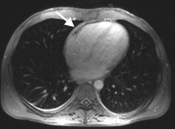
**Imaging Modality:** Cardiac Magnetic Resonance Imaging (MRI), axial plane. **Anatomical Region:** Mediastinum, specifically focusing on the heart and its surrounding serous membrane. **Observed Pathology:** The image demonstrates diffuse, significant thickening of the pericardium (indicated by the white arrow). The pericardial layers appear as a prominent, hypointense band surrounding the cardiac chambers. **Characteristic Visual Features:** - **Pericardial Thickness:** There is a measurable increase in the pericardial stripe thickness, exceeding the normal physiological limit (typically <2–3 mm). - **Morphology:** The thickening appears relatively uniform and circumferential along the anterior and lateral aspects of the heart. - **Signal Intensity:** The thickened tissue exhibits low signal intensity on this pulse sequence, consistent with fibrous or calcified tissue. **Clinical Significance:** These radiologic findings are highly suggestive of chronic pericarditis or constrictive pericarditis. The image provides a key diagnostic cue by highlighting the structural alteration of the pericardium which may lead to impaired diastolic filling. No significant pleural effusion or pulmonary parenchymal abnormalities are noted in this specific slice.
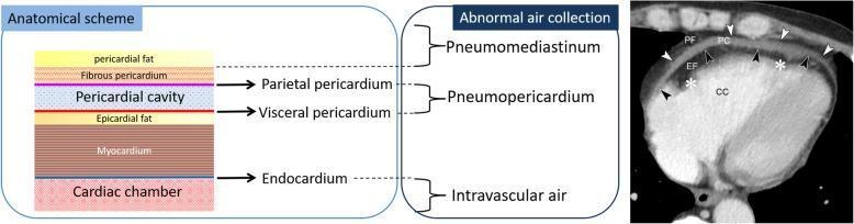
This composite educational graphic details the anatomy of the pericardium and its clinical presentation on imaging. The left side features a color-coded 'Anatomical scheme' illustrating the histological layers from external to internal: pericardial fat, fibrous pericardium, parietal pericardium, pericardial cavity, visceral pericardium (epicardium), epicardial fat, myocardium, endocardium, and cardiac chamber. A central panel correlates these anatomical spaces with specific pathologies of abnormal air collection: pneumomediastinum (superior to the parietal pericardium), pneumopericardium (within the pericardial cavity), and intravascular air (within the cardiac chamber). The right side shows a diagnostic axial chest CT image of a 47-year-old male with chronic kidney disease. Labeled features include pericardial fat (PF), parietal pericardium (white arrowheads), pericardial cavity (PC) containing a fluid collection, visceral pericardium (black arrowheads), epicardial fat (EF), myocardium (white asterisks), and cardiac chamber (CC). The image serves as a reference for distinguishing normal anatomical layers from pathological fluid or air accumulation in cardiovascular imaging.
venous system superior inferior vena cava pulmonary veins anatomy
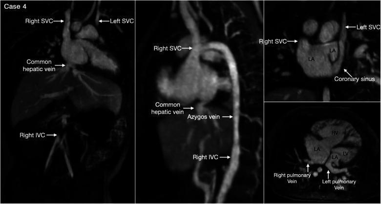
This diagnostic multi-panel image presents contrast-enhanced computerized tomography (CT) and volume-rendered reconstructions of a patient with heterotaxy syndrome and left isomerism. The vascular anatomy demonstrates bilateral superior venae cavae (SVC) without a bridging vein; the left SVC is shown draining into a coronary sinus that empties into the right-sided left atrium (LA). A significant finding is an interrupted inferior vena cava (IVC) with azygos continuation, where the right-sided IVC continues superiorly via the azygos vein to the right-sided SVC. The common hepatic vein is also visualized draining independently. Intracardiac findings include a large atrial septal defect (ASD) in the superior portion of the septum and evidence of myocardial noncompaction in the left ventricle (LV). The pulmonary venous anatomy shows right and left pulmonary veins connecting to the posterior wall of the ipsilateral left atrium. These complex cardiovascular malformations are characteristic of isomerism of the left atrial appendages, illustrating critical diagnostic markers for surgical planning and systemic-to-pulmonary venous separation.
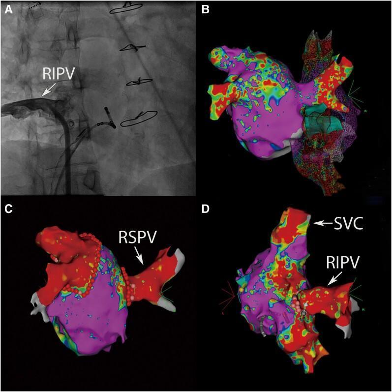
This composite figure illustrates diagnostic imaging and electroanatomical mapping related to pulmonary vein anatomy and surgical intervention. Panel A is an intracardiac angiogram showing the right inferior pulmonary vein (RIPV) opacified with contrast as it connects to the right atrium; metallic sternal wires from a prior cardiothoracic surgery are visible superiorly. Panels B, C, and D display 3D electroanatomical maps generated by the CARTO system, which use color coding to represent cardiac voltage or activation times. Purple typically indicates high voltage (healthy tissue), while red and warmer colors represent lower voltage or specific anatomical borders. Panel C depicts the isolation of normally connected pulmonary veins, including the right superior pulmonary vein (RSPV), with ablation points marked as red dots. Panel D shows an anomalous connection of the right inferior pulmonary vein (RIPV) and identifies the superior vena cava (SVC). This image set is designed for advanced medical education in cardiac electrophysiology and the management of anomalous pulmonary venous return.
cardiac conduction system SA node AV node bundle of His Purkinje anatomy labeled
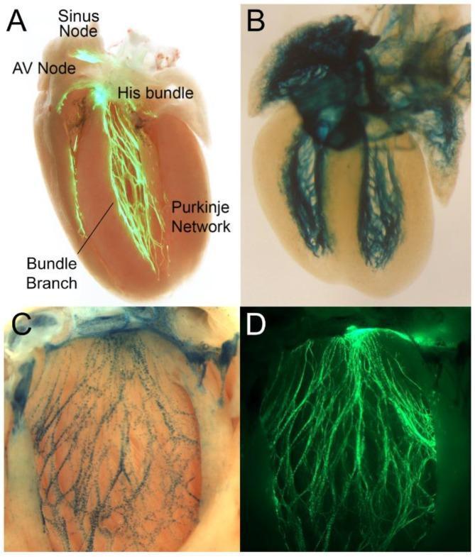
This composite of four panels visualizes the cardiac conduction system (CCS) in murine models using fluorescent and enzymatic reporters. Panel A shows a Contactin2-eGFP reporter heart where the CCS is highlighted in bright green fluorescence against a pinkish-tan myocardial background. Key labeled landmarks include the sinus node at the superior right atrium, the atrioventricular (AV) node, the penetrating His bundle, the left and right bundle branches along the interventricular septum, and the distal Purkinje network branching into the ventricular walls. Panels B and C demonstrate LacZ-reporter expression (blue stain) in embryonic (E17.5) and adult hearts. Panel B highlights the broad distribution of the conduction system in the developing heart, while Panel C provides a higher-magnification view of Etv1-nuclear LacZ expression, delineating the fine, arborized network of the ventricular conduction system. Panel D shows a corresponding fluorescent view of the dense, subendocardial Purkinje fiber network in the left ventricle. These images serve as an educational anatomical reference for the components and physiological pathways of cardiac electrical impulse generation and propagation.
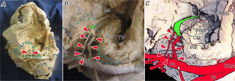
This composite educational material consists of a whole-heart specimen photograph (A), a magnified dissection view (B), and a labeled anatomical illustration (C), demonstrating the vascular supply to the atrioventricular (AV) conduction system from an inferior (diaphragmatic) perspective. The images highlight the AV node artery (red arrowheads) originating from the proximal posterolateral branch (PL) of the right coronary artery (RCA). Panel A shows the macro-anatomical relationship between the RCA, the posterior interventricular artery (PI), and the coronary sinus (CS). Panel B and C detail the inferior pyramidal space (blue dotted area) and the compact node (CN, green star). Key structures visualized include the central fibrous body (CFB), membranous septum (MS), tricuspid valve (TV), and the progression of the conduction axis from the inferior nodal extension (INE) through the penetrating bundle of His (PBH) and the branching bundle of His (BBH). This visual resource is designed for advanced medical education in cardiac anatomy and electrophysiology, specifically illustrating the dominant right coronary artery's contribution to the heart's electrical system.
Anatomy of the Cardiovascular System: Complete Overview
1. Position and External Features of the Heart
- The base (posterior/superior aspect) facing right, upward and backward - at the level of T5-T8
- The apex (inferior/anterior aspect) pointing left, downward and forward - typically in the left 5th intercostal space, midclavicular line (site of apex beat / point of maximum impulse)
- Two-thirds of its mass lies to the left of the midline
- Bordered anteriorly by the sternum and costal cartilages 3-6
- Right border: right sternal edge, 3rd-6th ribs
- Left border: 2nd left intercostal space to left 5th intercostal space (midclavicular line)
- Upper border (base): 2nd intercostal space bilaterally
- Lower border: xiphisternal joint to left apex
2. Pericardium
Layers (outer to inner):
| Layer | Description |
|---|---|
| Fibrous pericardium | Tough outer layer of dense connective tissue; fused with central tendon of diaphragm below, great vessel adventitia above |
| Parietal serous pericardium | Inner lining of fibrous layer |
| Pericardial cavity | Potential space containing ~15-50 mL serous fluid (lubricates) |
| Visceral serous pericardium (epicardium) | Directly covers myocardium; contains epicardial fat |
- Limits acute cardiac distension (prevents over-filling)
- Reduces friction around a moving heart
- Major determinant of ventricular interdependence - pressure changes in one ventricle affect the other through shared pericardial restraint
- Barrier against infection from mediastinum
- Transverse sinus: posterior to aorta and pulmonary trunk, anterior to superior vena cava - surgically important for aortic clamping
- Oblique sinus: posterior to left atrium, between pulmonary veins
Barash Clinical Anesthesia 9e, p. 842
3. Cardiac Chambers
Heart's Fibrous Skeleton
- Valve annuli (mitral, tricuspid, aortic, pulmonary)
- Central fibrous body
- Left and right fibrous trigones
Right Atrium (RA)
- Receives deoxygenated blood from superior vena cava (SVC) (enters superiorly), inferior vena cava (IVC) (enters inferiorly), and coronary sinus (drains cardiac venous blood)
- Wall thickness: ~2 mm
- Internal structures:
- Crista terminalis: muscular ridge separating smooth posterior wall (sinus venarum) from rough anterior wall (pectinate muscles)
- Fossa ovalis: oval depression in interatrial septum - remnant of foramen ovale
- Eustachian valve: remnant valve guarding IVC opening
- Thebesian valve: small valve at coronary sinus opening
- Connects to RV via tricuspid valve
- Right atrial appendage (auricle): triangular, broad-based
Left Atrium (LA)
- Receives oxygenated blood from 4 pulmonary veins (2 right, 2 left) entering the posterior wall
- Thicker-walled than RA (~3 mm)
- Posterior wall is the thickest; smooth-walled (except auricle which has pectinate muscles)
- Left atrial appendage: narrow, finger-like - common site of thrombus in atrial fibrillation
- Connects to LV via mitral valve
- The three mechanical functions of atria: reservoir (during LV systole), conduit (passive emptying during early LV diastole), and active pump (atrial "kick" contributing 20-30% of LV filling)
Right Ventricle (RV)
- Located anterior and to the right of LV in the mediastinum
- Shape: crescent/half-moon in cross-section - wraps around LV
- Wall thickness: ~5 mm
- Pumps into low-pressure, compliant pulmonary arterial tree (systolic ~25 mmHg)
- Contracts in a peristaltic, bellows-like action (moves toward septum) - embryologically distinct inflow and outflow tracts
- The LV provides a "splint" via the shared interventricular septum that aids RV contraction
- Internal structures:
- Trabeculae carneae: irregular muscular ridges
- Moderator band (septomarginal trabecula): muscular band carrying right bundle branch from septum to anterior papillary muscle
- 3 papillary muscles: anterior (largest), posterior, and septal
- Conus arteriosus / infundibulum: smooth outflow tract leading to pulmonary valve
Left Ventricle (LV)
- Ellipsoidal / bullet-shaped
- Wall thickness: ~10 mm (2x that of RV) - generates much higher systolic pressure (~120 mmHg vs ~25 mmHg)
- Three muscle fiber layers:
- Deep sinospiral fibers - longitudinal, subendocardial
- Superficial sinospiral fibers - oblique, subepicardial (spiral leftward)
- Superficial bulbospiral fibers - circumferential, midmyocardial
- The oblique subepicardial and subendocardial fibers create the torsional twist (wringing motion) during systole - apex rotates counterclockwise, base clockwise - which greatly increases ejection efficiency. Loss of this twist is an early sign of LV systolic dysfunction
- Internal structures:
- Trabeculae carneae (especially at apex)
- 2 papillary muscles: anterolateral and posteromedial - both supplied by LCA and RCA respectively
- Outflow tract (LVOT): leads to aortic valve; bounded by anterior mitral leaflet and interventricular septum
| Chamber | Wall thickness |
|---|---|
| Atria | ~2-3 mm |
| Right ventricle | ~5 mm |
| Left ventricle | ~10 mm |
4. Heart Valves

Tricuspid Valve (Right AV Valve)
- 3 leaflets: anterior (largest), posterior, septal
- Annulus area: ~12 cm²
- Supported by 3 papillary muscles (anterior, posterior, septal) via chordae tendineae
- Location: right AV groove; projects to anterior chest wall at right 4th-5th intercostal space at the sternal border
- Best auscultated: lower left sternal border
Mitral Valve (Left AV Valve / Bicuspid)
- 2 leaflets: anterior (aortic) and posterior
- The anterior leaflet is in fibrous continuity with the aortic valve (no muscular separation), clinically important in LVOTO
- Annulus: saddle-shaped, ~5 cm² in systole
- Supported by 2 papillary muscles: anterolateral (dual blood supply: LAD + Cx) and posteromedial (single supply: RCA or Cx - more vulnerable to ischemia)
- Chordae tendineae: primary (attach to free leaflet edge), secondary (to ventricular surface), tertiary (to ventricular wall)
- Location: projects to chest wall at left 4th intercostal space at sternal edge
- Best auscultated: cardiac apex (left 5th intercostal space, midclavicular line)
Aortic Valve (Right Semilunar)
- 3 cusps (leaflets): right coronary cusp, left coronary cusp, and non-coronary (posterior) cusp
- Each cusp has a nodule of Arantius at center of free edge, and lunulae (crescentic thickening)
- Sinuses of Valsalva: dilations of aorta behind each cusp that prevent cusp obstruction during opening; the right and left coronary arteries originate from their respective sinuses
- Valve leaflets are histologically three-layered: fibrosa (outer, collagen), spongiosa (middle, GAGs), ventricularis (inner, elastin)
- Annulus: ~3 cm²
- Location: behind sternum at level of 3rd intercostal space
- Best auscultated: right 2nd intercostal space, sternal border (aortic area)
Pulmonary Valve (Left Semilunar)
- 3 cusps: anterior, right, and left
- Similar structure to aortic valve but thinner-walled (lower pressure)
- All pulmonary cusps have muscular infundibular support (vs only 2 aortic cusps)
- Location: left 2nd-3rd intercostal space
- Best auscultated: left 2nd intercostal space, sternal border (pulmonary area)
| Valve | Anatomical location | Best auscultation site |
|---|---|---|
| Aortic | Behind sternum, 3rd ICS | Right 2nd ICS, sternal border |
| Pulmonary | Left 2nd-3rd ICS | Left 2nd ICS, sternal border |
| Tricuspid | Right 4th-5th ICS, sternum | Lower left sternal border |
| Mitral | Left 4th ICS | Left 5th ICS, midclavicular (apex) |
Barash Clinical Anesthesia 9e, p. 845+
5. Coronary Circulation
Coronary Arteries - Origin
Left Coronary Artery (LCA)
- Arises from the left (superior) coronary sinus of Valsalva
- The left main coronary artery (LMCA) is 0.5-2 cm long, then bifurcates (sometimes trifurcates with a ramus intermedius) into:
- Travels in the anterior interventricular groove toward the apex
- Often wraps around the apex (giving it the name "widow maker" when occluded)
- Branches:
- Septal perforators (1st, 2nd...): supply anterior 2/3 of interventricular septum, bundle of His, and bundle branches
- Diagonal branches (D1, D2...): supply anterior LV free wall
- Territory supplied: anterior LV wall, anterior interventricular septum, LV apex, right bundle branch, anterior left bundle branch fascicle
- Travels in the left (AV) atrioventricular groove toward the posterior heart
- Branches:
- Obtuse marginal branches (OM1, OM2...): supply lateral LV wall
- Left atrial branches
- In left-dominant cases: gives rise to posterior descending artery (PDA)
- Territory supplied: lateral LV wall, posterior LV wall (in left dominant), left atrium, SA node (in ~40%)
Right Coronary Artery (RCA)
- Arises from the right coronary sinus of Valsalva
- Travels in the right atrioventricular groove inferomedially, wraps around the right heart to reach the posterior surface
- Branches:
- Conus artery (1st branch): supplies RVOT
- SA nodal artery: branches near origin; supplies SA node in ~60% (from RCA), ~40% from LCx
- Acute marginal branches: supply RV free wall
- AV nodal artery: arises at the crux cordis (where AV grooves meet posterior interventricular groove) - critical for AV node blood supply (from RCA in ~85% of people)
- Posterior descending artery (PDA): runs in posterior interventricular groove, supplies inferior septum, inferior LV wall
Coronary Dominance
- Right dominant (~70-80%): RCA gives rise to PDA and posterolateral branches
- Left dominant (~10-15%): LCx gives rise to PDA
- Codominant (~10%): Both contribute
- Large conduit arteries (0.5-5 mm): epicardial, low resistance, provide little resistance unless diseased
- Prearterioles (100-500 μm): maintain downstream pressure (myogenic autoregulation)
- Arterioles (<100 μm): major site of coronary vascular resistance; respond to metabolic vasodilators (adenosine, NO)
Barash Clinical Anesthesia 9e, p. 853; Textbook of Clinical Echocardiography, p. 235
| Coronary artery | Myocardial territory |
|---|---|
| LAD | Anterior wall, anterior septum, apex |
| LCx (obtuse marginals) | Lateral wall, posterior wall (left dominant) |
| RCA (PDA + posterolateral) | Inferior wall, inferior septum, RV |
| SA node | RCA (~60%), LCx (~40%) |
| AV node | RCA (~85%), LCx (~15%) |
Coronary Veins
- Great cardiac vein: runs with LAD in anterior interventricular groove → into coronary sinus
- Middle cardiac vein: runs with PDA in posterior interventricular groove → coronary sinus
- Small cardiac vein: runs with RCA in right AV groove → coronary sinus
- Coronary sinus: lies in posterior AV groove, drains into right atrium between IVC and tricuspid valve
- Thebesian veins (anterior cardiac veins): drain directly into right atrium (small)
6. Conducting System
SA Node (Sinoatrial Node)
- Location: superior lateral wall of right atrium, near junction of SVC and RA (crista terminalis)
- Size: ~15 mm long, 3 mm wide
- Intrinsic rate: 60-100 bpm (dominant pacemaker)
- Blood supply: SA nodal artery from RCA (60%) or LCx (40%)
- Cells: P cells (pacemaker) at center; transitional cells at periphery
Internodal Tracts (disputed, but functionally recognized)
- Anterior internodal tract (Bachmann's bundle): also provides interatrial conduction to left atrium
- Middle internodal tract (Wenckebach's bundle)
- Posterior internodal tract (Thorel's bundle)
AV Node (Atrioventricular Node)
- Location: floor of right atrium, at apex of triangle of Koch (bounded by tendon of Todaro, tricuspid valve annulus, and ostium of coronary sinus)
- Size: ~1 × 3 × 5 mm
- Intrinsic rate: 40-60 bpm
- Critical function: slows conduction (~0.1 s delay) to allow atria to contract before ventricles
- Blood supply: AV nodal artery from RCA (85%) or LCx (15%) - this is why inferior MI (RCA territory) commonly causes heart block
Bundle of His (Atrioventricular Bundle)
- Sole electrical connection between atria and ventricles (penetrates central fibrous body)
- Runs along posterior margin of membranous septum
- Divides at crest of muscular interventricular septum into left and right bundle branches
Right Bundle Branch (RBB)
- Long, slender, cord-like structure
- Runs along right side of interventricular septum → moderator band → anterior papillary muscle of RV
- Vulnerable to damage in right heart procedures
Left Bundle Branch (LBB)
- Short, broad, fan-like - immediately divides into:
- Left anterior fascicle: supplies anterolateral LV wall; thin, long, susceptible to block
- Left posterior fascicle: supplies inferoposterior LV wall; short, thick, dual blood supply → rarely blocked
Purkinje Fibers
- Terminal network spreading throughout ventricular subendocardium
- Fastest conduction velocity: ~4 m/s (vs ventricular muscle ~0.5 m/s)
- Allow near-simultaneous activation of entire ventricular endocardium → coordinated, powerful contraction
- Density highest at apical subendocardium; lower in AV node and proximal conduction system regions (making those areas more ischemia-prone)
Barash Clinical Anesthesia 9e, Coronary Anatomy section
7. Great Vessels
Ascending Aorta
- Begins at aortic valve (at level of 3rd left costal cartilage)
- Length: ~5 cm
- Gives off only the right and left coronary arteries
- Intrapericardial portion: ~3 cm
Aortic Arch
- Curves posteriorly and to the left, over the left pulmonary artery and left main bronchus
- Level of T4 (sternal angle of Louis)
- Three branches (right to left):
- Brachiocephalic (innominate) trunk: bifurcates into right common carotid + right subclavian arteries
- Left common carotid artery
- Left subclavian artery
- The ligamentum arteriosum (remnant of ductus arteriosus) connects the arch to the left pulmonary artery - marks the start of the descending aorta
Descending Thoracic Aorta
- Runs in posterior mediastinum, left of vertebral column
- From T4 to T12 (where it passes through aortic hiatus in diaphragm)
- Branches: posterior intercostal arteries, bronchial arteries, esophageal arteries, pericardial branches
- Artery of Adamkiewicz (great radicular artery, ~T9-T12): critical supply to anterior spinal cord
Pulmonary Trunk
- Arises from RV infundibulum at pulmonary valve (left 2nd ICS)
- Length: ~5 cm; diameter: ~3 cm
- Bifurcates below aortic arch into:
- Right pulmonary artery: longer, passes behind ascending aorta and SVC to right lung
- Left pulmonary artery: shorter, curves over left main bronchus to left lung
Superior Vena Cava (SVC)
- Formed by union of right and left brachiocephalic veins at level of right 1st costal cartilage
- Length: ~7 cm; drains upper half of body
- Enters right atrium at level of right 3rd costal cartilage (superior aspect)
- Receives azygos vein on posterior aspect
Inferior Vena Cava (IVC)
- Enters thorax through caval opening in diaphragm (T8)
- Very short intrathoracic course
- Enters right atrium at inferior aspect
Pulmonary Veins
- 4 veins (2 right, 2 left) drain oxygenated blood from lungs into posterior wall of left atrium
- Right pulmonary veins pass anterior to right main bronchus
- Left pulmonary veins pass anterior to left main bronchus
- Variants: common left pulmonary vein (left superior + inferior share single ostium) in ~25%
8. Blood Supply to the Heart Wall - Layer Summary
| Layer | Contents |
|---|---|
| Epicardium (visceral pericardium) | Coronary vessels, nerve plexuses, fat |
| Myocardium | Cardiomyocytes (working + conductive), collagen-elastin skeleton, capillaries |
| Endocardium | Endothelial lining, subendocardial connective tissue, Purkinje fibers (subendocardial) |
9. Nerve Supply
| Nerve type | Source | Effect |
|---|---|---|
| Sympathetic | T1-T5 lateral horn → cardiac accelerator nerves (cervical and thoracic ganglia) | ↑HR, ↑contractility, ↑conduction, vasodilation then vasoconstriction |
| Parasympathetic | Vagus nerve (CN X): superior and inferior cardiac branches | ↓HR, ↓AV conduction; minimal ventricular effect |
| Sensory (pain) | Travels with sympathetic fibers → T1-T4/5 | Referred to left arm, jaw, neck, epigastrium |
10. Lymphatic Drainage
- Myocardial lymphatics drain into subepicardial collecting vessels
- Follow coronary arteries toward the base
- Right heart → right cardiac lymph node → right lymphatic duct
- Left heart → left cardiac lymph node → thoracic duct
- Ultimately drain into subclavian veins
- Lymphatic obstruction (e.g., in transplant rejection) can cause myocardial edema
11. Structural Summary - Key Normal Measurements
| Structure | Normal measurement |
|---|---|
| LV wall thickness | ~10 mm |
| RV wall thickness | ~5 mm |
| Atrial wall | ~2-3 mm |
| Ascending aorta diameter | <3.8 cm |
| Pulmonary trunk diameter | ~3 cm |
| Coronary sinus diameter | ~10 mm |
| Mitral valve area | ~4-6 cm² (normal orifice) |
| Aortic valve area | ~3-4 cm² (normal orifice) |
| Pericardial fluid | Up to 50 mL normal |
| Heart weight (adult) | 250-350 g |
12. Clinical Anatomy - Key Correlations
| Clinical scenario | Anatomical basis |
|---|---|
| Inferior MI causes heart block | AV nodal artery from RCA (85%) |
| Posteromedial PM more ischemic in inferior MI | Single blood supply (RCA only) |
| AF causes LA thrombus in appendage | Narrow, trabeculated LAA with slow flow |
| Pericardiocentesis at xiphoid angle | Access to pericardial cavity from below |
| Aortic stenosis murmur at right 2nd ICS | Aortic valve projects there |
| RV vulnerable in acute afterload increase | Thin wall (~5 mm), low pressure-generating capacity |
| Chest pain refers to left arm | Cardiac afferents travel with T1-T4 sympathetics |
| Patent foramen ovale | Fossa ovalis incompletely sealed (~25% adults) |
Sources: Barash Clinical Anesthesia 9e; Textbook of Clinical Echocardiography; Guyton & Hall; Harrison's Principles 22e