
Definition, Steps involved, Applications of the followin Decision Analysis and Decision tree. Sensitivity analysis, Markov Modeling,
Decision Analysis & Decision Trees, Sensitivity Analysis, and Markov Modeling
1. Decision Analysis and Decision Trees
Definition
"Decision analysis is a method developed to provide insight into the processes of diagnosis and management of a complex disease when sufficient data are unavailable... Decision analysis forces the clinician to make quantitative estimates of each of the many factors entering into a clinical decision."
- Bradley and Daroff's Neurology in Clinical Practice
Steps Involved in Decision Analysis
-
Frame the question - Define the clinical problem (e.g., "Should this drug be given?"). Identify the decision to be analyzed and its alternatives.
-
Structure the decision tree - Draw the tree starting from a decision node (usually a square). Each branch represents a possible choice or action.
-
Identify chance nodes - After each decision branch, insert chance nodes (usually circles), which represent probabilistic outcomes (e.g., disease present/absent, treatment success/failure).
-
Assign probabilities - Assign a probability to each branch at every chance node. The probabilities at each node must sum to 1.0. These values are drawn from clinical literature, trials, or expert opinion.
-
Assign utilities (outcomes) - At the terminal end of each branch ("leaf"), assign a utility value reflecting the quality or desirability of that outcome (e.g., quality-adjusted life years, survival, cost).
-
Calculate expected value ("fold back") - Multiply each terminal utility by its probability of occurring. Work backwards (fold back) from the tips to the root, summing expected values at each node.
-
Choose the optimal strategy - The decision with the highest expected utility (or lowest expected cost, depending on the model) is the preferred strategy.
-
Perform sensitivity analysis - Test how robust the conclusions are when key probabilities or utilities are varied (see Section 2).
Applications
- Comparing diagnostic or treatment strategies when a randomized controlled trial is impractical (e.g., public health screening policies)
- Developing cervical cancer screening strategies
- Group B streptococcal screening decisions in obstetrics
- Thromboprophylaxis strategies at cesarean delivery
- Cost-effectiveness analysis (the decision tree is the foundation for formal economic analyses, such as cost-effectiveness and cost-benefit analysis)
- Teaching tool: requires the learner to explicitly identify all assumptions and data gaps
- Evaluating new technologies where prospective trial data are unavailable
"Decision analysis can be applied to decisions in which prospective trials are impractical, such as a public health policy decision, or when a randomized controlled trial would be impractical."
- Goldman-Cecil Medicine
2. Sensitivity Analysis
Definition
"Since probabilities assigned to some of the nodes may not be known and could plausibly be within a range, a technique known as sensitivity analysis can be used to determine if the key conclusions of the decision analysis model would change as the chance node probabilities change within that range."
- Goldman-Cecil Medicine
Types of Sensitivity Analysis
| Type | Description |
|---|---|
| One-way | A single variable is varied across a plausible range while all others are held constant; observes impact on outcome |
| Two-way | Two variables varied simultaneously to assess joint influence |
| Three-way | Three variables varied simultaneously |
| Probabilistic (Monte Carlo simulation) | Multiple variables varied simultaneously using probability distributions; thousands of simulations produce a range of outcomes |
Steps Involved
-
Identify uncertain variables - Select the parameters in the model that are most uncertain or have the widest plausible range (e.g., probability of disease, treatment efficacy, cost estimates).
-
Define the plausible range - Usually derived from the literature (systematic reviews, meta-analyses) or expert opinion when data are sparse.
-
Vary variables one at a time (one-way) - Hold all other variables at their baseline and change the target variable across its range. Record the resulting change in the model outcome.
-
Vary multiple variables (multi-way/Monte Carlo) - For probabilistic sensitivity analysis, assign a statistical distribution to each variable and run thousands of random simulations.
-
Evaluate threshold values - Identify at what value of a variable the decision would switch from one strategy to another (the "threshold" or "break-even" point).
-
Interpret results - If the overall conclusion changes significantly with small changes in an input variable, the model is "sensitive" to that variable - and more precise data on that variable are needed. If the conclusion holds across the full plausible range, it is robust.
-
Present best-case, expected-case, and worst-case scenarios - For financial and clinical planning purposes.
Applications
- Validating the conclusions of decision tree analyses and health economic models
- Cost-effectiveness analyses (testing if the ICER changes with uncertain cost estimates)
- Financial planning in medical practice (e.g., equipment purchase decisions under different revenue scenarios)
- Identifying research priorities: variables to which a model is most sensitive highlight where new clinical research is most needed
- Subgroup analysis to test whether results hold across populations with differing baseline risks
- Policy decisions: identifying which assumptions matter most before allocating health system resources
"If the conclusions of an analysis substantially change with variation in the assumptions of the model, the model is defined to be sensitive to these assumptions. If these assumptions are parameter estimates for variables, then clinical research is needed to more precisely define the value of these variables."
- Yamada's Textbook of Gastroenterology
3. Markov Modeling
Definition
- Health states - discrete conditions a patient can be in (e.g., "disease-free," "mild disease," "severe disease," "dead")
- Transition probabilities - the probability of moving from one state to another in each cycle
- Cycle length - the time period of each transition (e.g., monthly, annually)
- Utilities / costs - values assigned to time spent in each health state
"Markov models allow for movement of hypothetical patients back and forth between various health states in a recursive fashion based on time. Discrete event simulation, conversely, assigns the probability of events occurring independently of time."
- Yamada's Textbook of Gastroenterology
Steps Involved
-
Define health states - Identify all clinically meaningful states a patient can occupy. One state must be absorbing (typically "dead"). States must be mutually exclusive and exhaustive.
-
Define the cycle length - Choose an appropriate time unit (e.g., 1 month, 1 year) consistent with the natural history of the disease.
-
Assign transition probabilities - For each cycle, specify the probability of moving from each health state to every other state. These come from clinical trial data, observational studies, or expert opinion.
-
Assign state values (utilities and costs) - Assign quality-of-life weights (utilities, 0-1 scale, used to calculate QALYs) and costs to each health state.
-
Define the starting distribution - Specify what proportion of the hypothetical cohort starts in each health state.
-
Run the model (cycle through time) - At each cycle, multiply the current state distribution by the transition probability matrix to generate the new distribution. Repeat for all cycles.
-
Accumulate outcomes - Sum QALYs, life-years, or costs accrued across all cycles and all states.
-
Calculate the ICER - Compare the cumulative cost and health outcomes of competing strategies:
- ICER = (Cost A - Cost B) / (Effect A - Effect B)
-
Apply discounting - Future costs and health outcomes are discounted back to present value (typically 3-5% per year).
-
Perform sensitivity analysis - Test how much the transition probabilities and utilities affect the results (see Section 2).
Key Features That Distinguish Markov from Decision Trees
| Feature | Decision Tree | Markov Model |
|---|---|---|
| Time structure | Fixed sequence | Cyclic, time-dependent |
| Recurring events | Cannot model easily | Handles naturally |
| Chronic diseases | Poorly suited | Ideal |
| Complexity | Simpler | More complex, more realistic |
Applications
- Modeling chronic diseases with recurring events (cancer recurrence, heart failure exacerbations, HIV progression)
- Comparing long-term costs and effectiveness of treatments for chronic conditions
- Screening program evaluation (e.g., colorectal cancer screening, cervical cancer screening)
- Cost-utility analyses generating QALYs for health technology assessment
- Informing national health policy and reimbursement decisions (e.g., NICE in the UK)
- Oncology - modeling treatment pathways and disease-free survival
- Infectious disease modeling (e.g., HIV, hepatitis C treatment strategies)
- Epidemiological modeling of disease progression at the population level
Summary Table
| Feature | Decision Analysis / Decision Tree | Sensitivity Analysis | Markov Model |
|---|---|---|---|
| Core purpose | Structure and quantify a complex decision | Test robustness of model conclusions | Model chronic, recurring health state transitions over time |
| Key output | Expected utility of each strategy | Threshold values, best/worst case | Cumulative QALYs, life-years, costs; ICER |
| When used | One-time decisions, RCT not feasible | After any quantitative model is built | Chronic disease, long time horizons |
| Key concept | Fold-back calculation | Threshold / break-even analysis | Transition probability matrix, cycles |
| Visual tool | Tree diagram with nodes | Tornado diagram / scatter plot | State-transition diagram |
Give diagrams for steps and trees
A clean medical decision tree diagram showing all steps of decision analysis. The tree starts on the left with a square decision node labeled "Decision Node: Treat or Not Treat?". Two main branches go right: "TREAT" (upper) and "DO NOT TREAT" (lower). Each branch leads to a circle labeled "Chance Node". From each chance node, two branches emerge: "Disease Present (p=0.6)" and "Disease Absent (p=0.4)". Each of those leads to a triangle or rectangle terminal node labeled with a utility value: Treat+Disease=0.85, Treat+No Disease=0.70, No Treat+Disease=0.30, No Treat+No Disease=0.90. Below the tree, show the fold-back calculation steps: Step 1 Assign probabilities, Step 2 Assign utilities, Step 3 Calculate expected value (EV = p x utility), Step 4 Compare EVs and choose highest. Use a white background, blue squares for decision nodes, orange circles for chance nodes, green terminal rectangles. Label all nodes clearly. Include a legend. Clean, textbook-style medical infographic.
A medical sensitivity analysis diagram showing two panels. Left panel: A tornado diagram (horizontal bar chart) showing five variables listed vertically: "Probability of Disease", "Treatment Cost", "Test Sensitivity", "Utility of Recovery", "Discount Rate". Each variable has a horizontal bar extending left (pessimistic) and right (optimistic) from a central baseline ICER value. The longest bar is at top (most influential), shortest at bottom. Title: "One-Way Sensitivity Analysis - Tornado Diagram". Right panel: A threshold analysis line graph with X-axis labeled "Probability of Disease (0 to 1.0)" and Y-axis labeled "Expected Value". Two diagonal lines cross: one labeled "Strategy A: Treat" and one labeled "Strategy B: No Treat". A vertical dashed line marks the threshold/crossover point at p=0.45 labeled "Threshold". Above the graph, label three zones: "Best: No Treat", "Crossover Point", "Best: Treat". White background, clean clinical infographic style, blue and red color scheme, clearly labeled axes.
A Markov model state-transition diagram for a chronic disease. Show four circular health states arranged in a layout: "Healthy" (green circle, top left), "Mild Disease" (yellow circle, top right), "Severe Disease" (orange circle, bottom right), "Dead" (dark grey circle, bottom left). Draw curved arrows between states with transition probability labels: Healthy to Mild Disease arrow labeled "p=0.10", Mild Disease to Severe Disease arrow labeled "p=0.20", Severe Disease to Dead arrow labeled "p=0.30", Mild Disease back to Healthy arrow labeled "p=0.15 (recovery)", Healthy self-loop arrow labeled "p=0.90 (stay healthy)", Severe Disease self-loop labeled "p=0.50", Healthy to Dead small arrow "p=0.01", Mild Disease to Dead arrow "p=0.05". Below the diagram, show a timeline bar labeled "Cycle 1, Cycle 2, Cycle 3 ... Cycle N" with text "Each cycle = 1 year". Add a small table showing: State, Utility (QALY weight), Cost per cycle: Healthy 1.0 $500, Mild 0.70 $2000, Severe 0.40 $8000, Dead 0 $0. Title at top: "Markov State-Transition Model". White background, clean medical textbook infographic, clearly labeled arrows and nodes.
Error calling model 'gemini-3-pro-image' (RESOURCE_EXHAUSTED): 429 RESOURCE_EXHAUSTED. {'error': {'code': 429, 'message': 'Resource has been exhausted (e.g. check quota).', 'status': 'RESOURCE_EXHAUSTED'}}
We encountered an error while processing your request. Please try again or reach out to us for help.
Give diagrams for steps and trees
A clean medical decision tree diagram showing all steps of decision analysis. The tree starts on the left with a blue square decision node labeled "Decision Node: Treat or Not Treat?". Two main branches go right: "TREAT" (upper) and "DO NOT TREAT" (lower). Each branch leads to an orange circle labeled "Chance Node". From each chance node, two branches emerge with probabilities. Each leads to a green terminal rectangle with a utility value. Below the tree show fold-back calculation steps numbered 1 through 8. White background, textbook style, clearly labeled nodes with a legend showing square equals decision node, circle equals chance node, rectangle equals terminal outcome node.
A sensitivity analysis medical infographic with two side-by-side panels. Left panel: A tornado diagram with horizontal bars for 5 variables showing their influence on the model result, longest bar at top, shortest at bottom. Title "Tornado Diagram - One-Way Sensitivity Analysis". Right panel: A threshold analysis graph with two crossing lines labeled Strategy A and Strategy B, with a vertical dashed line at the crossover threshold point. X-axis is probability, Y-axis is expected value. Clean white background, clinical textbook style, blue and red colors, all axes and labels clearly visible.
A Markov model state-transition diagram for chronic disease modeling. Four large colored circles arranged in a square layout: green circle labeled "Healthy" top-left, yellow circle labeled "Mild Disease" top-right, orange circle labeled "Severe Disease" bottom-right, dark grey circle labeled "Dead" bottom-left. Curved arrows between all states showing transition probabilities as percentages. Self-loop arrows on each state. Below the diagram a horizontal timeline bar showing Cycle 1, Cycle 2, Cycle 3 through Cycle N, labeled "Each cycle = 1 year". Small table showing utility and cost per state. Title "Markov State-Transition Model". White background, medical textbook style, clean and clearly labeled.
1. Decision Analysis & Decision Tree
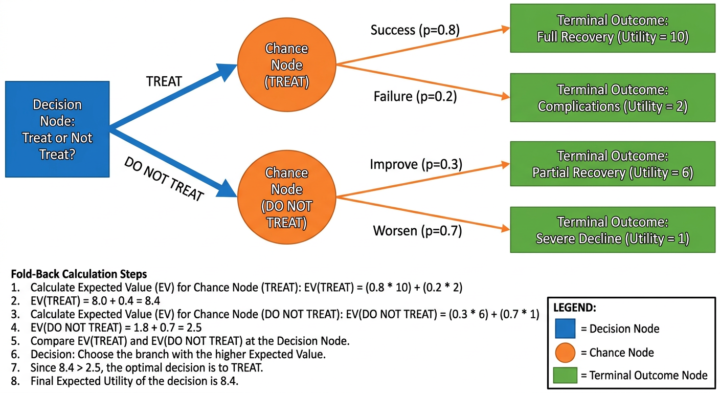
- Square node = Decision node (clinician chooses: Treat vs. Do Not Treat)
- Circle node = Chance node (nature decides: Disease Present vs. Absent, with probabilities summing to 1.0)
- Rectangle (terminal) = Outcome node with assigned utility value
- Fold-back: multiply each terminal utility by its probability, sum at each chance node, then compare the two decision branches - choose the branch with the highest expected value
2. Sensitivity Analysis
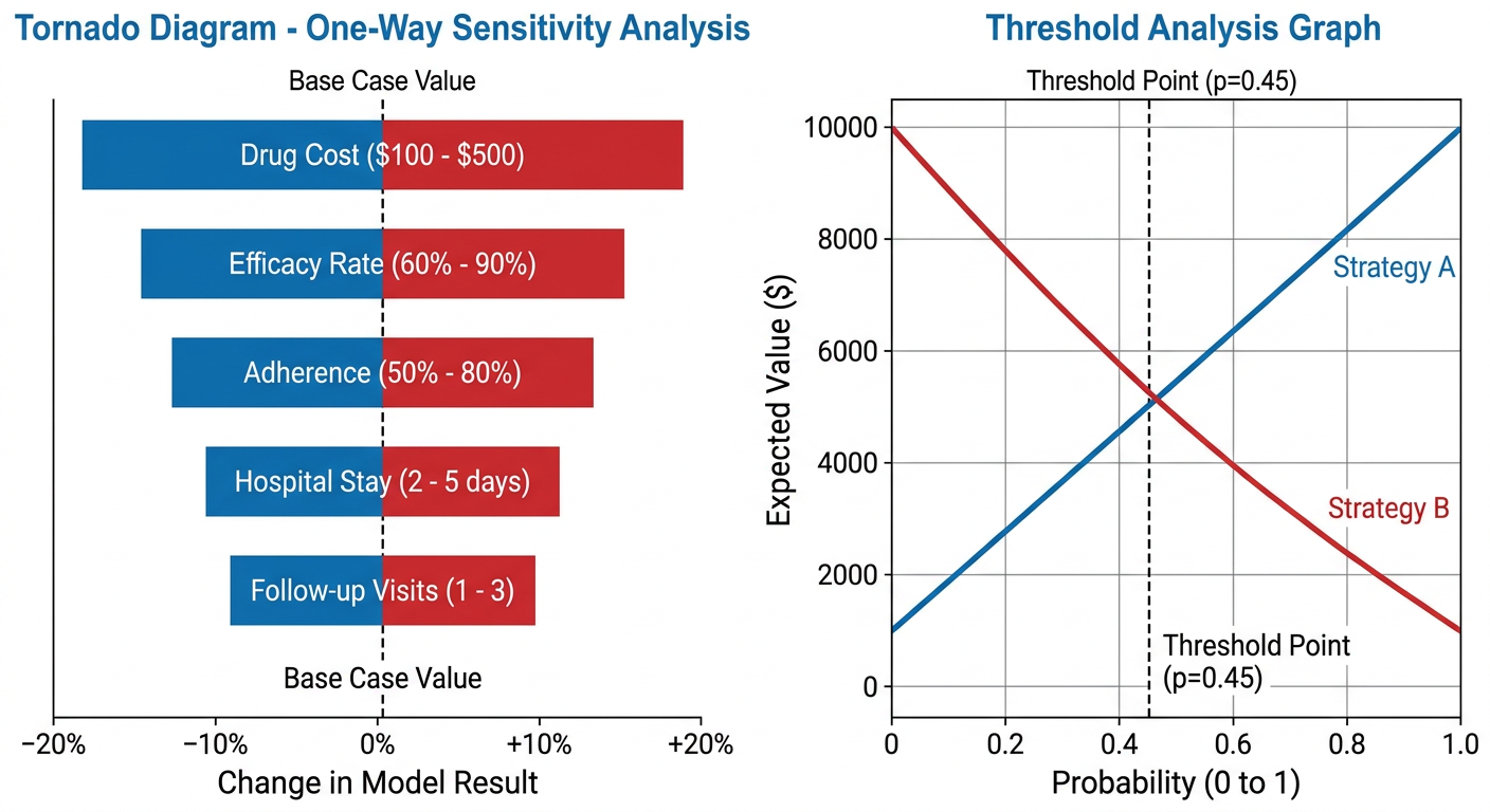
- Tornado diagram (left): Variables ranked by their influence on the result. The widest bar = most sensitive variable = most important target for further research.
- Threshold analysis (right): Shows where the optimal strategy switches. At the crossover point (threshold), both strategies yield equal expected value. Left of the line, one strategy dominates; right of the line, the other does.
3. Markov Model State-Transition Diagram
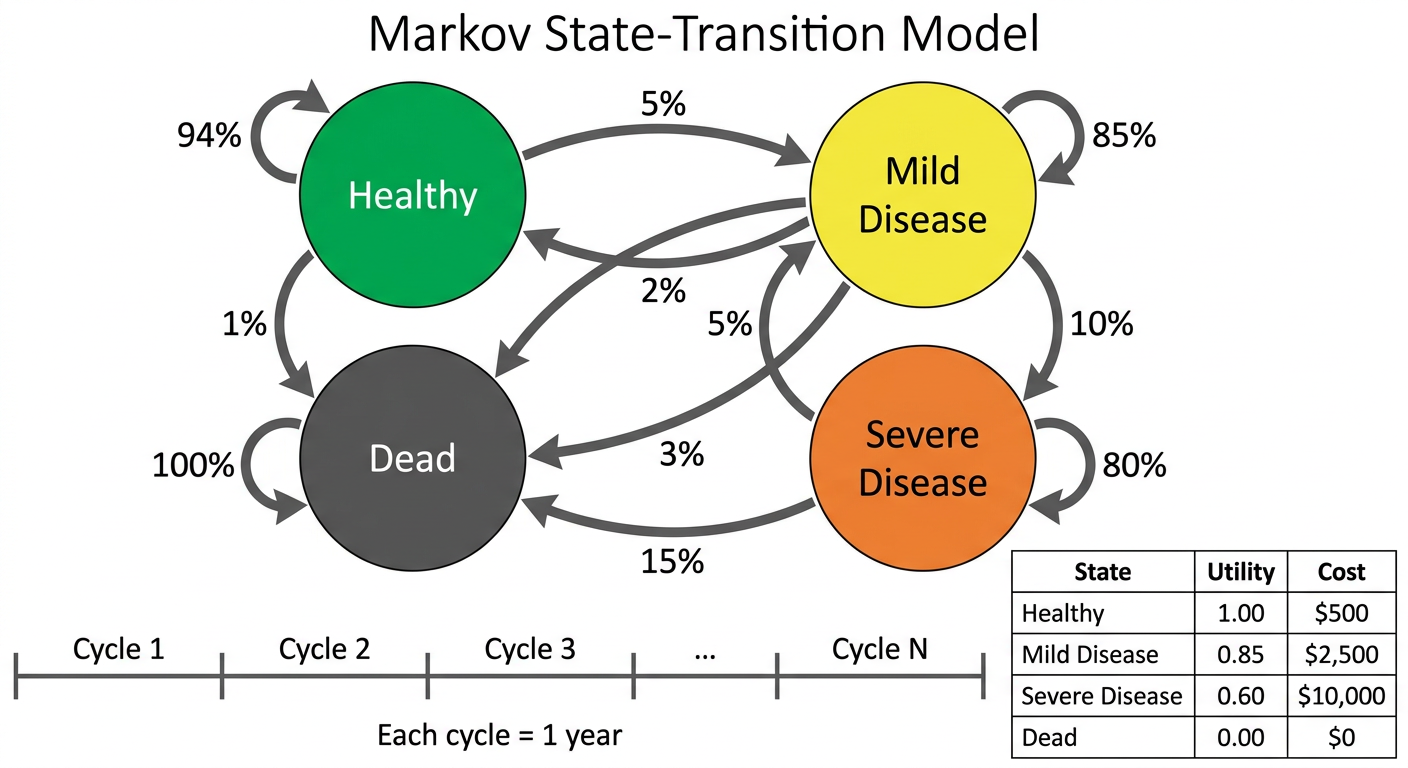
- Each circle is a health state patients can occupy
- Arrows show transitions between states each cycle, each labelled with a transition probability
- Self-loops show patients who remain in the same state
- Dead is the absorbing state (no exit)
- The model runs for N cycles; at each cycle the cohort redistributes across states, accumulating QALYs and costs that are summed to produce the final cost-effectiveness result
Explain markov model with example
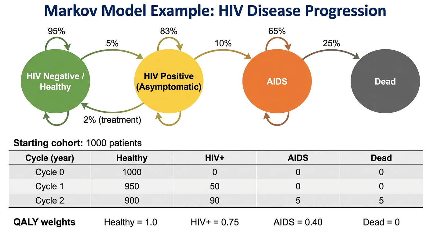
A detailed Markov model worked example diagram for HIV disease progression. Four colored circles as health states in a horizontal row: large green circle "HIV Negative / Healthy", large yellow circle "HIV Positive (Asymptomatic)", large orange circle "AIDS", large dark grey circle "Dead". Curved arrows between all states labeled with annual transition probabilities as percentages: Healthy to HIV+ 5%, HIV+ to AIDS 10%, AIDS to Dead 25%, HIV+ back to Healthy 2% (treatment), AIDS self-loop 65%, HIV+ self-loop 83%, Healthy self-loop 95%. Below the circles show a cohort table: "Starting cohort: 1000 patients". Show 3 cycles of the model as a table with columns: Cycle (year), Healthy, HIV+, AIDS, Dead. Cycle 0: 1000, 0, 0, 0. Cycle 1: 950, 50, 0, 0. Cycle 2: 900, 90, 5, 5. Below add QALY weights: Healthy=1.0, HIV+=0.75, AIDS=0.40, Dead=0. White background, medical textbook style, clean professional infographic with title "Markov Model Example: HIV Disease Progression".
A step-by-step Markov model process flowchart. Eight numbered steps shown as rounded rectangles connected by downward arrows in a vertical flow: Step 1 "Define Health States (Healthy, Sick, Dead)", Step 2 "Set Cycle Length (e.g. 1 year)", Step 3 "Assign Transition Probabilities between states", Step 4 "Define Starting Cohort (e.g. 1000 patients)", Step 5 "Assign Utilities (QALY weights) and Costs per state", Step 6 "Run Cycles: redistribute cohort each cycle using transition matrix", Step 7 "Accumulate QALYs and Costs across all cycles", Step 8 "Calculate ICER = Delta Cost / Delta QALY and compare strategies". Each step box has a small icon. On the right side show a small example transition matrix table 3x3 for From/To: Healthy, Sick, Dead. Clean white background, blue color scheme, professional medical infographic, clear readable fonts.
The Markov Model - Full Explanation with Example
What Is a Markov Model?
"Markov models assume that a patient is always in one of a finite number of discrete health states, each with a specified value and/or cost, and can transition from one health state to another over time based on known or estimated probabilities of events."
- Sabiston Textbook of Surgery
Step-by-Step Process
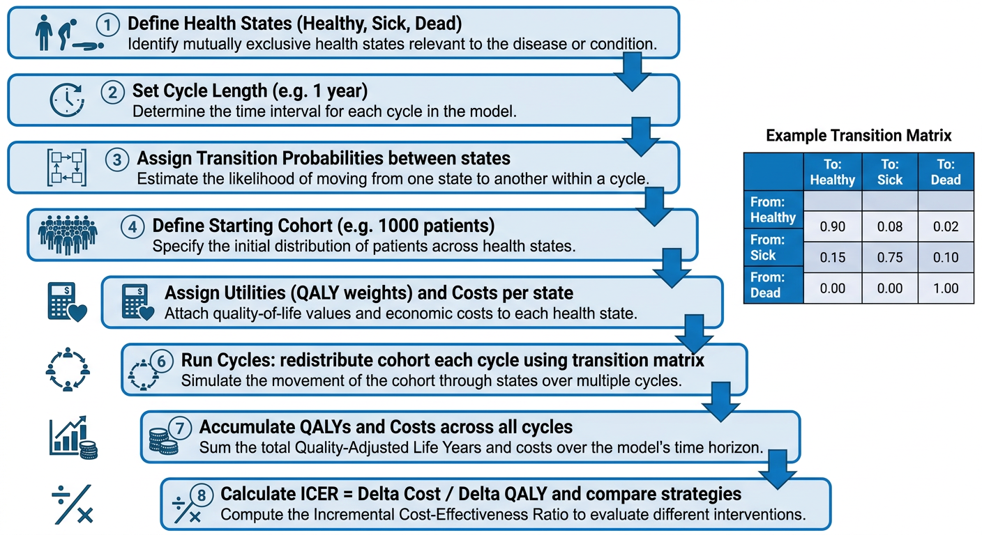
Worked Example: Colorectal Cancer Screening
Step 1 - Define Health States
| State | Description |
|---|---|
| Healthy (H) | No cancer, normal colonoscopy |
| Polyp (P) | Pre-cancerous polyp detected |
| Cancer (C) | Colorectal cancer diagnosed |
| Dead (D) | Absorbing state (no exit) |
Step 2 - Set Cycle Length
Step 3 - Assign Transition Probabilities (Annual)
| From → To | Healthy | Polyp | Cancer | Dead |
|---|---|---|---|---|
| Healthy | 0.93 | 0.06 | 0.01 | 0.00 |
| Polyp | 0.10 | 0.75 | 0.14 | 0.01 |
| Cancer | 0.00 | 0.00 | 0.65 | 0.35 |
| Dead | 0.00 | 0.00 | 0.00 | 1.00 |
Step 4 - Define Starting Cohort
| Cycle 0 | Healthy | Polyp | Cancer | Dead |
|---|---|---|---|---|
| Patients | 1,000 | 0 | 0 | 0 |
Step 5 - Assign Utilities and Costs
| State | Utility (QALY weight) | Annual Cost (No Screen) | Annual Cost (Screen) |
|---|---|---|---|
| Healthy | 1.00 | $200 | $800 |
| Polyp | 0.85 | $500 | $900 |
| Cancer | 0.50 | $40,000 | $40,000 |
| Dead | 0.00 | $0 | $0 |
Step 6 - Run the Cycles (Cohort Redistribution)
| Cycle (Year) | Healthy | Polyp | Cancer | Dead | QALYs This Cycle |
|---|---|---|---|---|---|
| 0 (start) | 1000 | 0 | 0 | 0 | - |
| 1 | 930 | 60 | 10 | 0 | 951 |
| 2 | 871 | 113 | 22 | 4 | 897 |
| 3 | 817 | 159 | 34 | 10 | 843 |
| ... | ... | ... | ... | ... | ... |
| 30 | 412 | 148 | 89 | 351 | 447 |
- QALYs = (Healthy × 1.0) + (Polyp × 0.85) + (Cancer × 0.50) + (Dead × 0)
- Cost = (Healthy × $200) + (Polyp × $500) + (Cancer × $40,000) + (Dead × $0)
Step 7 - Accumulate Over 30 Years (with 3% annual discount)
| Strategy | Total Discounted Cost | Total Discounted QALYs |
|---|---|---|
| No Screening | $142,000 | 14.2 QALYs |
| Annual Screening | $198,000 | 16.8 QALYs |
Step 8 - Calculate the ICER
State-Transition Diagram
Key Markov Model Rules
| Rule | Explanation |
|---|---|
| Markov property | The future state depends only on the current state, NOT on history ("memoryless") |
| Mutually exclusive states | A patient can only be in one state at a time |
| Exhaustive states | All possible conditions must be represented |
| Absorbing state | Dead is permanent - no transitions out |
| Rows sum to 1 | All transition probabilities from any state must total 1.0 |
Real-World Clinical Applications
| Application | What the Markov Model Compared |
|---|---|
| Colorectal cancer screening | Colonoscopy vs. stool DNA vs. no screening |
| HIV treatment | Early vs. deferred antiretroviral therapy |
| Coronary artery disease | CABG ($30,000/QALY) vs. PCI - Sabiston Textbook |
| Chronic sinusitis | Endoscopic sinus surgery vs. medical therapy over 30 years |
| Breast cancer | Contralateral prophylactic mastectomy vs. surveillance |
| Rheumatology | Biologic vs. conventional DMARD therapy over lifetime |
"By modeling the time dependence of probabilities for entering several different health states and outcomes, Markov models allow for many different scenarios to be estimated for any given clinical decision and are thus a valuable and versatile method for modeling the trade-offs between competing strategies."
- Sabiston Textbook of Surgery