
Mental health warning sign and causes
mental health warning signs and causes comprehensive overview
mental health warning signs diagram
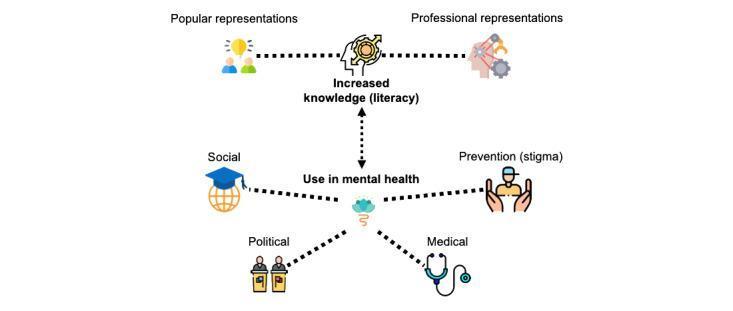
An educational infographic depicting a collaborative learner model for mental health literacy. The diagram is organized into two horizontal tiers. The top tier illustrates the integration of 'Popular representations' (laypeople, symbolized by an group icon and a lightbulb) and 'Professional representations' (experts, symbolized by a brain profile with gears) into a central node labeled 'Increased knowledge (literacy),' shown as a head with a complex internal gear system. The bottom tier, connected via a vertical bidirectional arrow to the knowledge node, outlines the 'Use in mental health' through four radiating domains: 1) Social (graduation cap and globe), 2) Political (figures at podiums), 3) Medical (stethoscope), and 4) Prevention/stigma (person protected by open hands). This pathophysiology-related diagram emphasizes the synthesis of community beliefs and clinical expertise to improve public health outcomes, specifically in the context of neurodevelopmental conditions like ASD. It serves as a visual framework for medical sociology and psychiatric health education.
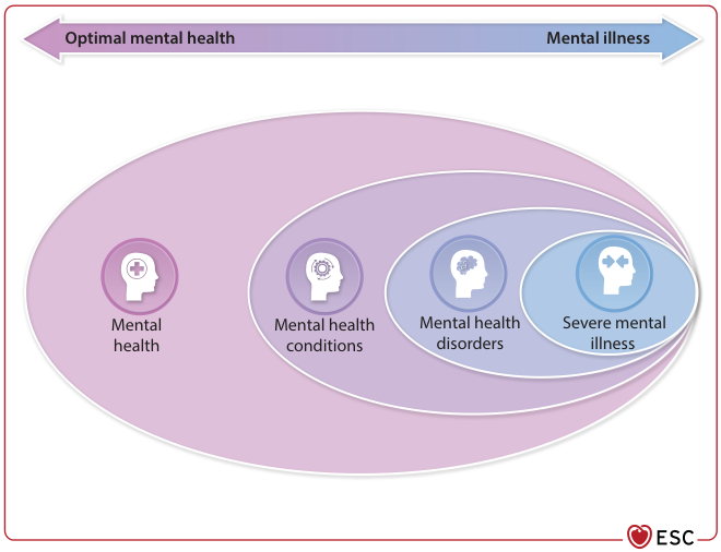
Summary : This figure illustrates the spectrum of mental health, ranging from optimal mental health to severe mental illness, using overlapping ovals to represent different categories and their relationships. conceptual diagram: # Spectrum Overview : • A horizontal arrow at the top labeled "Optimal mental health" on the left and "Mental illness" on the right, indicating a continuum. • The arrow visually suggests a progression from good mental health to severe mental illness. # Categories & Groupings : • Four main categories are depicted as overlapping ovals, each with an icon and label: – Mental health (leftmost, smallest oval) – Mental health conditions (next oval, overlapping with mental health) – Mental health disorders (next oval, overlapping with conditions) – Severe mental illness (rightmost, smallest oval, nested within disorders) • Each category is nested within the previous, showing increasing severity and overlap. # Design Encodings : • Each category uses a distinct icon within a head silhouette: – Mental health: plus sign – Mental health conditions: gear – Mental health disorders: brain – Severe mental illness: two puzzle pieces • Ovals are shaded in progressively darker hues from left to right. • The ESC logo is present in the bottom right corner. # Analysis : • The diagram visually communicates that mental health exists on a spectrum, with increasing severity and overlap among conditions, disorders, and severe illness. • Severe mental illness is a subset of mental health disorders, which are themselves a subset of mental health conditions, all nested within the broader concept of mental health. • The continuum arrow reinforces that mental health and illness are not binary but exist along a gradient.
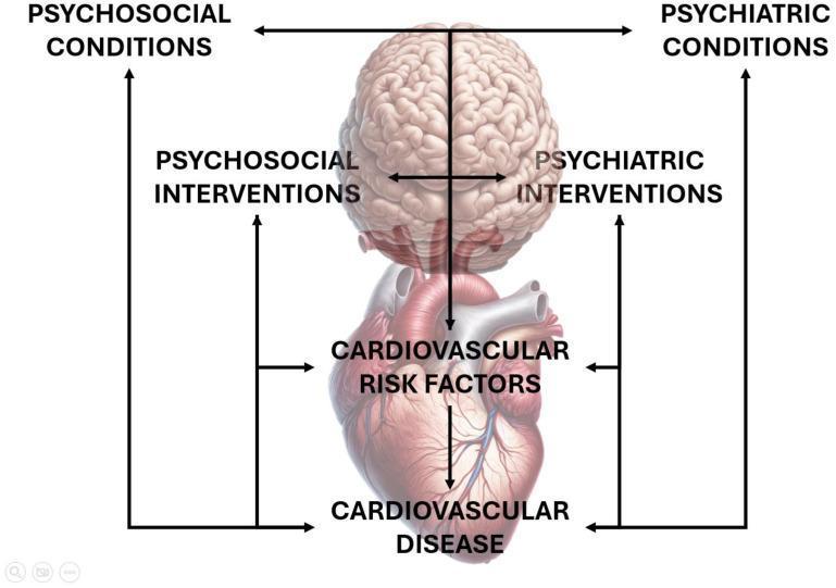
A pathophysiology diagram illustrating the bidirectional relationship between mental health and cardiovascular health. The visual features an anatomical illustration of a human brain positioned vertically above a human heart. The brain region is annotated with 'Psychosocial Conditions' and 'Psychiatric Conditions' at the top, and 'Psychosocial Interventions' and 'Psychiatric Interventions' at its base, with bidirectional arrows suggesting reciprocal influence. A central vertical arrow descends from the brain through the heart, connecting the neurological domain to 'Cardiovascular Risk Factors' and ultimately 'Cardiovascular Disease.' Peripheral arrows create feedback loops between cardiac outcomes and mental health states/interventions. The diagram serves as an educational tool for understanding the psychosomatic interplay in cardiology, specifically how psychiatric status and interventions can influence the progression from risk factors to clinical cardiovascular disease, and vice versa. It is intended for intermediate to advanced medical students and practitioners focusing on behavioral medicine, psychiatry, or cardiology.
Mental Health: Warning Signs & Causes
Warning Signs
In Adults and Adolescents
- Prolonged sadness, hopelessness, or emptiness
- Excessive worry, fear, or anxiety that interferes with daily life
- Extreme mood swings - sudden highs and lows
- Confused or disorganized thinking
- Unusual or strange thoughts (delusions)
- Seeing or hearing things that aren't there (hallucinations)
- Persistent feelings of worthlessness or guilt
- Thoughts of harming oneself or others
- Difficulty concentrating, remembering, or making decisions
- Social withdrawal - pulling away from friends, family, activities
- Dramatic changes in eating habits (overeating or loss of appetite)
- Significant changes in sleep patterns (insomnia or sleeping too much)
- Declining performance at work or school
- Loss of interest in activities previously enjoyed
- Substance use (alcohol, drugs) as a coping mechanism
- Neglecting personal hygiene and responsibilities
- Unexplained anger, hostility, or irritability
- Self-harm behaviors
- Persistent fatigue or low energy
- Unexplained physical symptoms: headaches, stomachaches, back pain
- Rapid weight changes
In Older Children and Pre-Adolescents
- Sudden drop in school performance
- Refusal to attend school
- Changes in sleeping or eating habits
- Defiance of authority, truancy, or vandalism
- Intense, persistent fears
- Frequent anger outbursts
- Prolonged negative mood with poor appetite
In Younger Children
- Changes in school performance
- Excessive worry or anxiety (refusing to go to bed or school)
- Hyperactivity
- Persistent nightmares
- Persistent disobedience or aggression
- Poor grades despite strong effort
Warning Signs by Specific Condition
| Condition | Key Warning Signs |
|---|---|
| Depression | Persistent sadness, loss of interest, fatigue, changes in sleep/appetite, thoughts of death |
| Anxiety Disorders | Excessive worry, difficulty concentrating, restlessness, physical symptoms (heart racing, sweating) |
| Bipolar Disorder | Alternating periods of elevated mood/energy (mania) and depression |
| Schizophrenia | Hallucinations, delusions, disorganized speech, social withdrawal |
| PTSD | Flashbacks, nightmares, hypervigilance, avoidance of triggers |
| Eating Disorders | Distorted body image, obsession with food/weight, extreme dietary restriction or purging |
| OCD | Intrusive thoughts, compulsive repetitive behaviors |
Causes of Mental Health Problems
1. Biological / Genetic Factors
- Genetics: Family history of mental illness significantly raises risk. Many disorders (depression, bipolar, schizophrenia) have heritable components.
- Brain chemistry: Imbalances in neurotransmitters (serotonin, dopamine, norepinephrine) are linked to depression, anxiety, and psychosis.
- Brain structure/injury: Certain mental disorders are associated with structural brain abnormalities or traumatic brain injury.
- Prenatal harm: Fetal brain damage from oxygen deprivation at birth or prenatal infections can increase risk of conditions like autism spectrum disorder.
- Infections: Some infections cause brain damage or trigger immune-mediated psychiatric symptoms (e.g., PANDAS - Pediatric Autoimmune Neuropsychiatric Disorder Associated with Streptococcal infections - linked to OCD in children).
- Hormonal changes: Puberty, pregnancy, postpartum period, and menopause can trigger or worsen mental health conditions.
2. Psychological Factors
- Trauma and abuse: Childhood abuse (physical, sexual, emotional), neglect, or witnessing violence are among the strongest risk factors.
- Chronic stress: Long-term stress from relationships, work, finances, or caregiving can overwhelm coping capacity.
- Adverse childhood experiences (ACEs): Significant early-life adversity is strongly linked to later mental health disorders.
- Personality traits: Certain temperament patterns (high neuroticism, low resilience) can increase vulnerability.
- Poor coping skills: Reliance on avoidance or substance use instead of healthy strategies.
3. Environmental / Social Factors
- Social isolation and loneliness: Lack of support networks is strongly associated with depression and anxiety.
- Poverty and economic insecurity: Financial stress and lack of resources increase mental health risk substantially.
- Discrimination and stigma: Racism, homophobia, and social stigma create chronic psychological stress.
- Substance abuse: Long-term alcohol and drug misuse can cause or worsen anxiety, depression, and paranoia.
- Chronic physical illness: Conditions like diabetes, epilepsy, heart disease, and cancer carry elevated rates of co-occurring depression and anxiety.
- Life events: Bereavement, divorce, job loss, or major transitions can precipitate episodes of mental illness in vulnerable individuals.
- Lack of sleep and poor lifestyle: Poor diet, physical inactivity, and chronic sleep deprivation all negatively impact mental wellbeing.
When to Seek Help
- Symptoms persist for more than 2 weeks
- Daily functioning at work, school, or home is impaired
- Relationships are being seriously affected
- There are any thoughts of self-harm or suicide
Filtration environment and health
What aspect of 'filtration, environment, and health' are you asking about?
water filtration environment and health effects drinking water safety
water filtration purification methods diagram
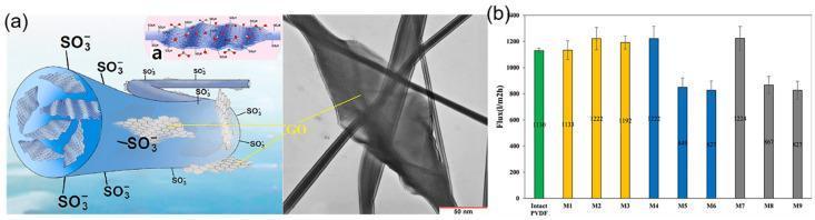
This composite educational image illustrates the synthesis and performance of electrospun nanofiber membranes (ENMs) for medical water purification. Panel (a) contains a schematic diagram and a corresponding Transmission Electron Microscopy (TEM) image of a sulfonated polyvinylidene fluoride/polyvinylidene fluoride/graphene oxide (S-PVDF/PVDF/GO) nanofiber. The schematic depicts a blue cylindrical nanofiber structure with surface-bound sulfonic acid groups (SO3-) and internal grey flaky layers representing graphene oxide (GO) embedded within the polymer matrix. The TEM image displays intersecting elongated nanofibers with irregular, cylindrical morphologies and smooth surfaces, confirming the physical structure of the synthesized material at a 50 nm scale. Panel (b) is a bar chart displaying water flux performance across various membrane compositions (Intact PVDF and M1–M9), measured in L/m²h. The data indicates how the incorporation of functionalized nanofibers and carbon-based nanomaterials influences membrane permeability, a critical factor in desalination and medical-grade water filtration technologies.
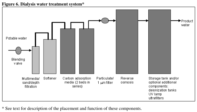
Summary : This figure presents a flowchart of a dialysis water treatment system, detailing the sequential components and processes that potable water undergoes to become product water suitable for dialysis. flowchart: # Nodes : • Blending valve (circle) – initial entry point for potable water. • Multimedia/sand/depth filtration (rectangle) – first filtration stage. • Softener (rectangle) – water softening stage. • Carbon adsorption media (2 beds in series) (rectangle) – dual carbon filtration. • Particulate/1 µm filter (small circle) – fine particulate filtration. • Reverse osmosis (large rectangle) – main purification stage. • Storage tank and/or optional additional components: deionization tanks, UV lamp, ultrafilters (large rectangle) – final storage and optional polishing. • Product water (arrow endpoint) – output for dialysis use. # Connectors : • All nodes are connected in a left-to-right linear sequence by arrows. • After the blending valve, water flows sequentially through each treatment stage. • After reverse osmosis, water enters the storage tank and/or optional components before becoming product water. # Layout : • The diagram is arranged horizontally, with each treatment stage represented by a rectangle or circle. • Optional additional components (deionization tanks, UV lamp, ultrafilters) are listed within the final storage tank node, indicating possible further treatment before product water output. # Analysis : • The flowchart illustrates a comprehensive, multi-stage water purification process for dialysis, beginning with basic filtration and softening, followed by carbon adsorption, fine particulate removal, and advanced purification via reverse osmosis. • The inclusion of optional components in the final stage allows for further customization and enhancement of water purity. • The process is strictly linear, with no branching or feedback loops, emphasizing a stepwise improvement in water quality at each stage.
WHO water quality contaminants health effects filtration methods 2024 2025
Water Filtration, Environment & Health
What is Water Filtration?
Why Filtration Matters: Health Threats in Unfiltered Water
1. Biological / Microbial Contaminants
| Pathogen Type | Examples | Health Effects |
|---|---|---|
| Bacteria | E. coli, Cholera (Vibrio cholerae), Salmonella | Diarrhea, dysentery, cholera, typhoid fever |
| Viruses | Hepatitis A, Norovirus, Rotavirus | Hepatitis, severe gastroenteritis, dehydration |
| Protozoa | Giardia, Cryptosporidium | Giardiasis, cryptosporidiosis (diarrheal illness) |
| Bacteria (water-linked) | Legionella | Legionnaires' disease (pneumonia) |
2. Chemical Contaminants
- Lead: Neurotoxic - damages cognitive development in children, causes cardiovascular disease in adults. Often leaches from old pipes (e.g., the Flint, Michigan water crisis).
- Arsenic: Chronic exposure is associated with cardiovascular disease, cancers (skin, bladder, lung), and neuropathy. The WHO guideline value is 10 µg/L, yet many regions exceed this.
- Mercury: Neurotoxic; impairs cognition and causes sensory ataxia.
- Manganese: Excessive exposure linked to neurological conditions including Alzheimer's and Parkinson's disease.
- Pesticides: Groundwater contamination from agricultural runoff; linked to endocrine disruption and neurological effects.
- Nitrates: From fertilizers; cause methemoglobinemia ("blue baby syndrome") in infants.
- PFAS ("Forever Chemicals"): Per- and polyfluoroalkyl substances from industrial discharge; linked to hormonal disruption, immune suppression, and cancer. Very resistant to conventional filtration - an active area of current research (2024-2025).
- Pharmaceuticals: From wastewater; cause hormonal changes, antibiotic resistance, and endocrine disorders.
- Linked to endocrine disruption, oxidative stress, gut microbiota disruption, and tissue inflammation. Long-term effects are still being studied.
3. Physical Contaminants
- Sediment, turbidity, heavy particulate matter
- Can carry and protect microorganisms from disinfectants
Types of Water Filtration Methods
Physical Methods
| Method | How It Works | What It Removes |
|---|---|---|
| Sedimentation | Gravity settles particles | Large solids, sediment |
| Sand/Multimedia Filtration | Water passes through layers of sand/gravel | Turbidity, suspended particles, some bacteria |
| Membrane Filtration | Forces water through micro/nano-porous membranes | Bacteria, protozoa, particulates |
Chemical Methods
| Method | How It Works | What It Removes |
|---|---|---|
| Chlorination | Chlorine disinfects water | Bacteria, viruses |
| Coagulation/Flocculation | Chemicals bind particles for settling | Turbidity, some chemicals |
| Activated Carbon Adsorption | Carbon absorbs organic compounds | Chlorine, pesticides, some PFAS, odors/taste |
Advanced Methods
| Method | How It Works | What It Removes |
|---|---|---|
| Reverse Osmosis (RO) | High pressure forces water through semi-permeable membrane | Heavy metals, dissolved salts, nitrates, PFAS, bacteria, viruses |
| UV Purification | UV light destroys DNA of microorganisms | Bacteria, viruses, protozoa |
| Ion Exchange Resins | Ions in water exchanged for harmless ions | Heavy metals, nitrates, PFAS |
| Distillation | Water boiled and condensed | Heavy metals, most contaminants |
Health Benefits of Proper Water Filtration
-
Reduced diarrheal disease: A large meta-analysis confirmed that household filtration (point-of-use) reduces childhood diarrhea by approximately 50%. Broader drinking-water interventions collectively reduce diarrhea risk by about 32% in children (PMC systematic review).
-
Prevention of waterborne outbreaks: Filtration + disinfection has eliminated endemic cholera, typhoid, and polio transmission in high-income countries.
-
Reduced heavy metal exposure: RO and carbon filtration systems reduce lead, arsenic, and mercury to safe levels, protecting neurological development in children.
-
Improved hydration: Clean water supports healthy kidney function, digestion, and organ health.
-
Better skin and hair health: Filtered water removes harsh chlorine and chemicals that dry out skin and hair.
Environmental Impact of Water Filtration
Positive Environmental Effects
- Reduces plastic bottle waste: Single-use plastic bottles take centuries to decompose, breaking down into harmful microplastics. Home filtration significantly reduces reliance on bottled water.
- Lowers carbon footprint: Bottled water production and transport generates significant greenhouse gas emissions - filtered tap water eliminates this.
- Protects aquatic ecosystems: Proper water treatment prevents release of human pathogens, chemicals, and pharmaceuticals into rivers and lakes.
- Conservation of water resources: Efficient filtration systems reduce water waste in treatment processes.
Environmental Challenges
- Filter waste: Spent filter cartridges, membranes, and activated carbon need proper disposal.
- PFAS disposal: Physical filtration methods capture PFAS but concentrate them in secondary waste streams requiring further destructive treatment - a significant ongoing challenge as of 2025.
- Energy consumption: Advanced systems like RO are energy-intensive.
- Brine discharge: RO systems produce concentrated salt/chemical waste that can harm aquatic environments if discharged improperly.
Key Global Context
- WHO Guidelines for Drinking-Water Quality (4th edition with addenda) sets global standards for over 100 contaminants including arsenic (10 µg/L), nitrates (50 mg/L), and lead (10 µg/L).
- Climate change worsens waterborne disease risk by increasing extreme precipitation, flooding sewage systems, and expanding the geographic range of water-linked pathogens (Harrison's Internal Medicine, 2025).
- Health disparities: Communities in poverty - and communities of color - bear disproportionate risk from contaminated water, as illustrated by the Flint water crisis and similar events (Robbins Pathologic Basis of Disease).
- PFAS ("forever chemicals") are an emerging priority: the WHO released a landscape review in 2024-2025 specifically on PFAS in drinking water and their health effects.
Summary
| Layer | Key Points |
|---|---|
| Why filter? | Removes pathogens, heavy metals, chemicals, and particulates that cause acute and chronic disease |
| Most effective methods | Reverse osmosis + UV for broadest protection; activated carbon for taste/organics |
| Health gains | ~50% reduction in diarrhea (children); prevents cholera, typhoid, heavy metal toxicity |
| Environment | Filtration reduces plastic waste and carbon emissions from bottled water; challenges remain with filter waste and PFAS |
| Global need | 2.1 billion people lack safe water; improving filtration access is central to UN SDG 6 |
Level of health care
levels of health care primary secondary tertiary quaternary explained
levels of healthcare pyramid primary secondary tertiary

Summary : This figure presents a structured overview of the three levels of disease prevention and health promotion (primary, secondary, tertiary) as applied to the management of malnutrition, frailty, and sarcopenia in patients with cirrhosis. It details aims, assessment strategies, and actions for each prevention level, and highlights the use of diagnostic and management toolboxes. flowchart/table hybrid: # Structure : • The figure is organized as a multi-row, multi-column table with flowchart elements. • Columns represent: Primary prevention, Secondary prevention, Tertiary prevention, and a final box for "Prevent the occurrence of undesirable health outcomes". • Rows represent: Aim, Assessment, Action. • Overlapping horizontal bars for "Diagnostic toolbox" and "Management toolbox" span relevant sections. # Columns (Prevention Levels) : • Primary prevention: Focuses on preventing development and delaying onset. • Secondary prevention: Focuses on early diagnosis, prompt initiation of treatment, and slowing progression. • Tertiary prevention: Focuses on rehabilitation and reversal. • Final box: "Prevent the occurrence of undesirable health outcomes". # Rows (Content Areas) : ## Aim : • Primary: Prevent development, delay onset. • Secondary: Early diagnosis, prompt initiation of treatment, slow progression. • Tertiary: Rehabilitate, reverse. ## Assessment : • Primary: Malnutrition screening, assessment of muscle dysfunction. • Secondary: Evaluate for etiologic risk factors, explore dietary preferences and barriers to exercise. • Tertiary: Reassess for progression of malnutrition, frailty, and/or sarcopenia despite primary and secondary preventative efforts. ## Action : • Primary: Educate patients and caregivers, encourage positive health behaviors, empower patients with specific skills. • Secondary: Apply management toolbox, co-management with registered dietitian and certified exercise physiologist/physical therapist if available. • Tertiary: Refer to registered dietitian, certified exercise physiologist/physical therapist, and/or health behavior specialist for co-management; consider center-based rehabilitation, intensive nutritional supplementation. # Toolboxes : • Diagnostic toolbox: Spans assessment row for primary and secondary prevention. • Management toolbox: Spans action row for secondary and tertiary prevention. # Layout : • Table format with horizontal flow from left (primary) to right (tertiary), culminating in prevention of undesirable outcomes. • Colour-coded sections: orange for primary/secondary, green for tertiary. # Analysis : • The figure visually organizes the progression from prevention to management in cirrhosis care, emphasizing a stepwise approach. • Each prevention level builds on the previous, with increasing intervention intensity. • The use of toolboxes highlights the integration of diagnostic and management strategies across levels. • The final outcome box underscores the goal of preventing undesirable health outcomes through tailored interventions at each stage.
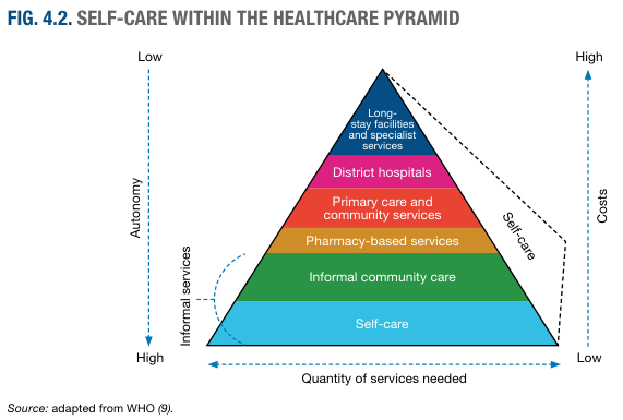
Summary : This figure presents a pyramid model illustrating the position of self-care within the healthcare system, showing how autonomy, costs, informal services, and quantity of services needed vary across different levels of care. pyramid diagram: # Structure & Levels : • The pyramid is divided into six horizontal layers, from bottom to top: – Self-care (blue) – Informal community care (green) – Pharmacy-based services (orange) – Primary care and community services (red) – District hospitals (magenta) – Long-stay facilities and specialist services (dark blue) # Axes & Directional Indicators : • Left vertical axis: "Autonomy" (High at base, Low at apex) • Right vertical axis: "Costs" (Low at base, High at apex) • Bottom horizontal axis: "Quantity of services needed" (High at base, Low at apex) • Curved arrow on left: "Informal services" (points from self-care to informal community care) • Diagonal dashed arrow on right: "Self-care" (points from base to apex) # Design Encodings : • Each pyramid layer is color-coded and labeled with its respective care type. • Dotted and dashed arrows indicate directionality of autonomy, costs, and service quantity. • The pyramid visually narrows from a wide base (self-care) to a narrow apex (specialist services). # Source & Attribution : • Source: adapted from WHO (9). # Analysis : • The figure demonstrates that self-care forms the broad base of the healthcare pyramid, representing high autonomy, low costs, and a high quantity of services needed. • As one moves up the pyramid, care becomes more specialized, autonomy decreases, costs increase, and the quantity of services needed decreases. • Informal and pharmacy-based services act as intermediate steps between self-care and formal healthcare facilities. • The model emphasizes the foundational role of self-care and informal care in the overall healthcare system.
Levels of Health Care
Overview
"Health services are usually organized at three levels, each level supported by a higher level to which the patient is referred."
- Park's Textbook of Preventive and Social Medicine
The 4 Levels of Health Care Delivery
Level 1 - Primary Health Care
- Closest to the community - geographically and socially accessible
- Handles the majority of prevailing health complaints and problems
- Emphasizes health promotion, disease prevention, and basic curative care
- Delivered through community participation
- General Practitioners (GPs) / Family physicians
- Primary Health Centres (PHCs) and sub-centres
- Community health workers (e.g., ASHA workers in India)
- Pharmacists, dentists, opticians
- Walk-in clinics, outpatient departments
- Routine checkups and immunizations
- Management of common illnesses (fever, cough, infections, minor injuries)
- Antenatal and postnatal care
- Health education and counseling
- Chronic disease monitoring (diabetes, hypertension)
- Referral to secondary care when needed
Level 2 - Secondary Health Care
- Reached by referral from primary care (not usually self-referred)
- Provides more specialized investigation and treatment beyond primary care capacity
- Includes both curative and some rehabilitative services
- District hospitals and community health centres
- Specialist outpatient clinics
- Accident & Emergency departments
- Planned surgical units
- Management of conditions requiring specialist expertise (cardiology, orthopedics, gynecology, etc.)
- Diagnostic investigations (CT scans, endoscopy, biopsies)
- Surgical procedures
- Inpatient hospital care
- Post-operative recovery and rehabilitation
Level 3 - Tertiary Health Care
- Reached by referral from secondary care
- Provides advanced diagnostic and treatment services not available at lower levels
- Also plays a role in planning, training, and teaching
- Regional and national/central level institutions
- Cancer centres, neurosurgery units, transplant centres
- Medical university teaching hospitals
- Highly specialized procedures (organ transplants, open-heart surgery, neurosurgery, complex cancer treatment)
- Advanced diagnostic services
- Management of rare and multi-system disorders
- Training specialized healthcare staff
- Supporting and complementing primary-level actions
Level 4 - Quaternary Health Care
- Highly unusual and limited to very few specialized centres globally
- Serves patients for whom standard tertiary care is insufficient
- Advanced academic medical centres and research hospitals
- Specialist units for rare conditions
- Clinical trials and experimental treatments
- Highly complex or pioneering procedures (e.g., advanced microsurgery, limb reimplantation, gene therapy)
- Research and development of new treatments
- Cases referred when all other options are exhausted
Levels of Prevention (Related Concept)
| Level | Target | Goal | Examples |
|---|---|---|---|
| Primordial | Entire population | Prevent risk factors from emerging in society | Healthy public policy, nutrition programs, anti-smoking laws |
| Primary | Healthy individuals | Prevent disease onset | Vaccinations, health education, safe water, condom use |
| Secondary | Early/presymptomatic disease | Early detection & prompt treatment | Screening (mammograms, BP checks), early diagnosis |
| Tertiary | Established disease | Limit disability, restore function | Rehabilitation, physiotherapy, chronic disease management |
"Three levels of prevention are now recognized: primary, intended to prevent disease among healthy people; secondary, directed towards those in whom the disease has already developed; and tertiary, to reduce the prevalence of chronic disability consequent to disease."
- Park's Textbook of Preventive and Social Medicine
Summary Comparison
| Feature | Primary | Secondary | Tertiary | Quaternary |
|---|---|---|---|---|
| Complexity | Low | Moderate | High | Very High / Experimental |
| Access | Self-referral | GP referral | Specialist referral | Tertiary referral |
| Setting | Community/clinic | District hospital | Regional/national hospital | Research/specialist centre |
| Focus | Prevention + common illness | Specialist diagnosis/treatment | Super-speciality | Experimental/rare conditions |
| Cost | Lowest | Moderate | High | Highest |
| Volume of patients | Largest | Moderate | Smaller | Very small |
Why This Structure Matters
- Efficiency: Routes patients to the most appropriate (and cost-effective) level of care
- Prevention focus: Keeps the bulk of care at the community level, emphasizing prevention over cure
- Equity: Primary care should be universally accessible regardless of income
- Continuity: Referral pathways ensure patients move smoothly between levels
- Resource allocation: Expensive specialist resources are concentrated where most needed
Epidemology introduction for 5 marks
Introduction to Epidemiology (5 Marks)
1. Definition
"The study of the occurrence and distribution of health-related events, states, and processes in specified populations, including the study of the determinants influencing such processes, and the application of this knowledge to control relevant health problems."
- Epi = among
- Demos = people
- Logos = study
2. Three Core Components
| Component | Meaning |
|---|---|
| Disease Frequency | Measuring how often disease occurs - expressed as rates and ratios (incidence rate, prevalence rate, death rate) |
| Distribution | Studying patterns by Time, Place, and Person (Who? Where? When?) |
| Determinants | Identifying biological, social, behavioural, environmental, and economic causes (risk factors) of disease |
3. Scope of Epidemiology
- Communicable and non-communicable diseases
- Chronic diseases (cancer, cardiovascular disease, diabetes)
- Mental health conditions
- Accidents and injuries
- Health-related states (blood pressure, nutrition, disability)
- Health services utilization and effectiveness
4. Aims of Epidemiology (IEA - 3 Main Aims)
5. Uses of Epidemiology (Morris - 7 Uses)
- Study of disease history - rise and fall of diseases in populations over time
- Community diagnosis - identifying and quantifying health problems (morbidity, mortality) in a community
- Planning and evaluation - rational allocation of resources; evaluating health programmes
- Evaluation of individual risks - identifying who is at risk ("search for causes")
- Completing the clinical picture - describes the full natural history of a disease beyond hospital cases
- Identification of syndromes - defining disease patterns and new syndromes
- Search for causes - testing aetiological hypotheses to find preventable causes
6. Importance / Relevance
- Epidemiology is the basic science of preventive and social medicine
- It provides the scientific foundation for public health interventions
- Identified risk factors for major killers: lung cancer (smoking), cardiovascular disease (hypertension, cholesterol), AIDS
- Guides health policy, disease surveillance, and outbreak investigation
"I keep six honest serving men; they taught me all I know. Their names are what, why, when, how, where and who." - Rudyard Kipling (quoted at the start of the Epidemiology chapter in Park's)