
Explain about pharmacology graphs
Reading File
Now let me search the medical library for pharmacology graphs content.
Finding Sources
Finding Sources
Finding Sources
Finding Sources
Good finds. Now let me read the most relevant sections from Goodman & Gilman's and Lippincott (the top pharmacology textbooks) in parallel.
Reading File
Reading File
Finding Sources
Excellent content found. Let me read more from Lippincott and also search for quantal dose-response and pharmacokinetic graphs.
Reading File
Finding Sources
Finding Sources
Reading File
Finding Sources
Reading File
Finding Sources
I now have rich content to write a comprehensive answer. Let me fetch the key graph images to include visually.
Loading Image
Loading Image
Loading Image
I now have comprehensive content and images. Let me also fetch the antagonist/partial agonist graph.
Loading Image
Loading Image
Those URLs were truncated. I have enough content and three high-quality images to write a thorough answer now.
Pharmacology Graphs - A Complete Guide
Pharmacology uses several types of graphs to describe how drugs behave in the body and at receptors. The major categories are: dose-response graphs, receptor binding graphs, agonist/antagonist graphs, and quantal dose-response / therapeutic index graphs.
1. Graded Dose-Response Curve
This is the most fundamental pharmacology graph. It plots the magnitude of a drug's effect (y-axis) against increasing drug concentration or dose (x-axis).
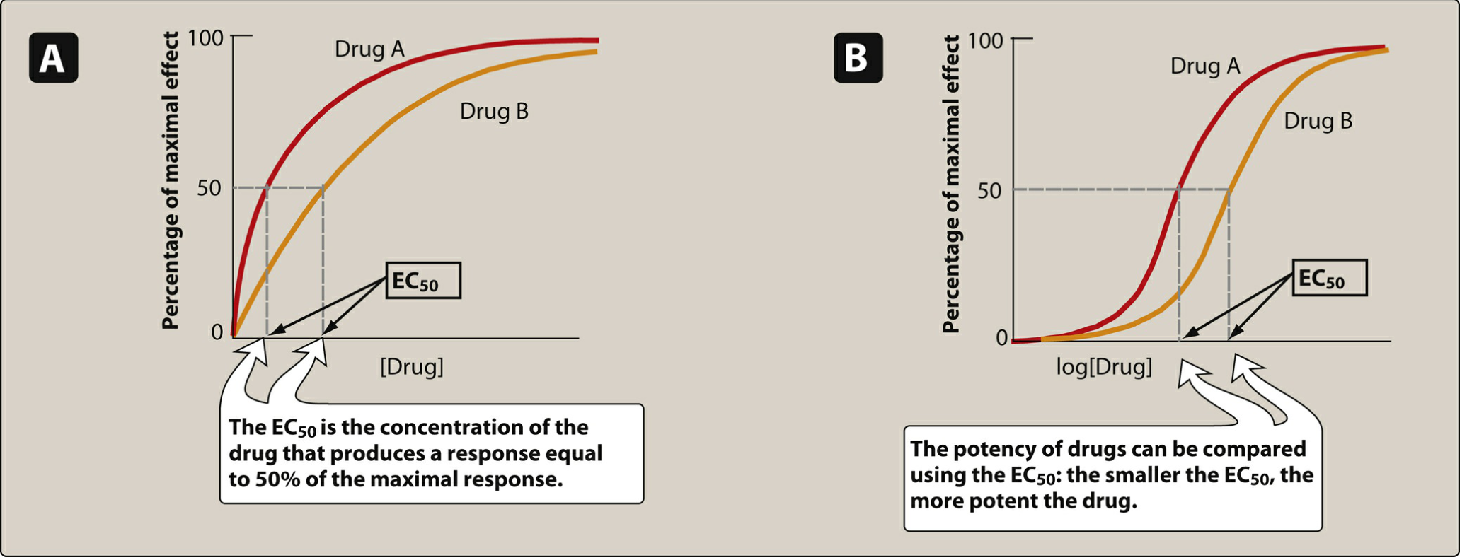
Figure: Panel A = linear plot; Panel B = semilogarithmic (sigmoidal) plot. The EC50 marks 50% of maximal effect.
Key features read from this graph:
| Parameter | Definition | What the graph shows |
|---|---|---|
| EC50 | Concentration producing 50% of maximal effect | Point on x-axis at 50% response - lower EC50 = more potent |
| Emax | Maximum effect a drug can produce | The plateau of the curve - indicates efficacy |
| Potency | Amount needed to produce an effect | Drug A (red) is more potent than Drug B because its EC50 is smaller |
| Efficacy | Magnitude of maximal response | Both drugs reach the same Emax here, so they have equal efficacy |
Why semilogarithmic (log scale)? Because the range of doses spans several orders of magnitude, plotting log dose converts the hyperbolic curve into a convenient S-shaped (sigmoidal) curve, making EC50 easy to read off the graph. - Lippincott Illustrated Reviews: Pharmacology, p. 95-96
Clinical example: Candesartan (dose range 4-32 mg) vs. irbesartan (75-300 mg) are both angiotensin receptor blockers - candesartan is more potent because it requires a lower dose to achieve the same effect, but both have equal efficacy for treating hypertension.
2. Potency vs. Efficacy Graph

This graph compares drugs with different potency AND efficacy simultaneously:
- A drug can be more potent but less efficacious (curve shifted left but lower plateau)
- A drug can be less potent but more efficacious (curve shifted right but higher plateau)
- Efficacy is clinically more important - morphine's greater efficacy makes it useful for severe cancer pain, where naproxen's identical efficacy to ibuprofen (just different potency) makes them therapeutically equivalent for headache.
3. Agonist Types on Dose-Response Curves
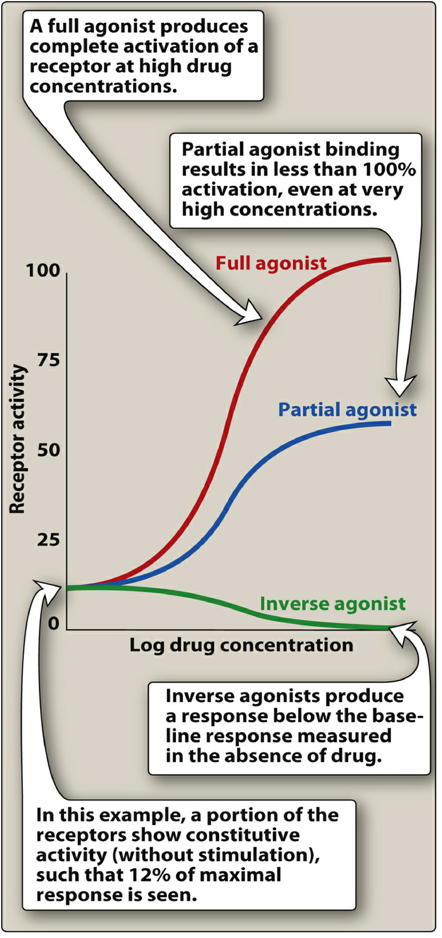
This graph shows three types of agonist behavior: - Lippincott Illustrated Reviews: Pharmacology, p. 101-103
| Drug Type | Curve Shape | Emax | Intrinsic Activity |
|---|---|---|---|
| Full agonist | Rises to 100% | Same as endogenous ligand | = 1 |
| Partial agonist | Rises but plateaus below full agonist | Less than full agonist, even at 100% receptor occupancy | 0 to 1 |
| Inverse agonist | Curve goes downward | Falls below baseline | < 0 (negative) |
| Competitive antagonist | Shifts full agonist curve to the right (same Emax) | Unchanged | = 0 |
| Non-competitive antagonist | Lowers the Emax plateau without shifting EC50 | Decreased | = 0 |
Partial agonist as a dual agent: A partial agonist can act as both agonist (when no full agonist is present) AND antagonist (competing with a full agonist, reducing its Emax to the partial agonist's ceiling). Aripiprazole exploits this in schizophrenia - it inhibits overactive dopamine pathways while stimulating underactive ones.
4. Effect of Antagonists - Rightward Shift
A very important graph pattern to recognize:
- Competitive (reversible) antagonist - dose-response curve shifts right in parallel (same shape, same Emax, higher EC50). The effect can be overcome by increasing the agonist dose.
- Non-competitive (irreversible) antagonist - curve is compressed downward (Emax falls, EC50 unchanged or altered). Cannot be reversed by adding more agonist.
5. Quantal Dose-Response Curve and Therapeutic Index
Unlike graded curves (individual responses), quantal curves show what fraction of a population responds to a given dose.
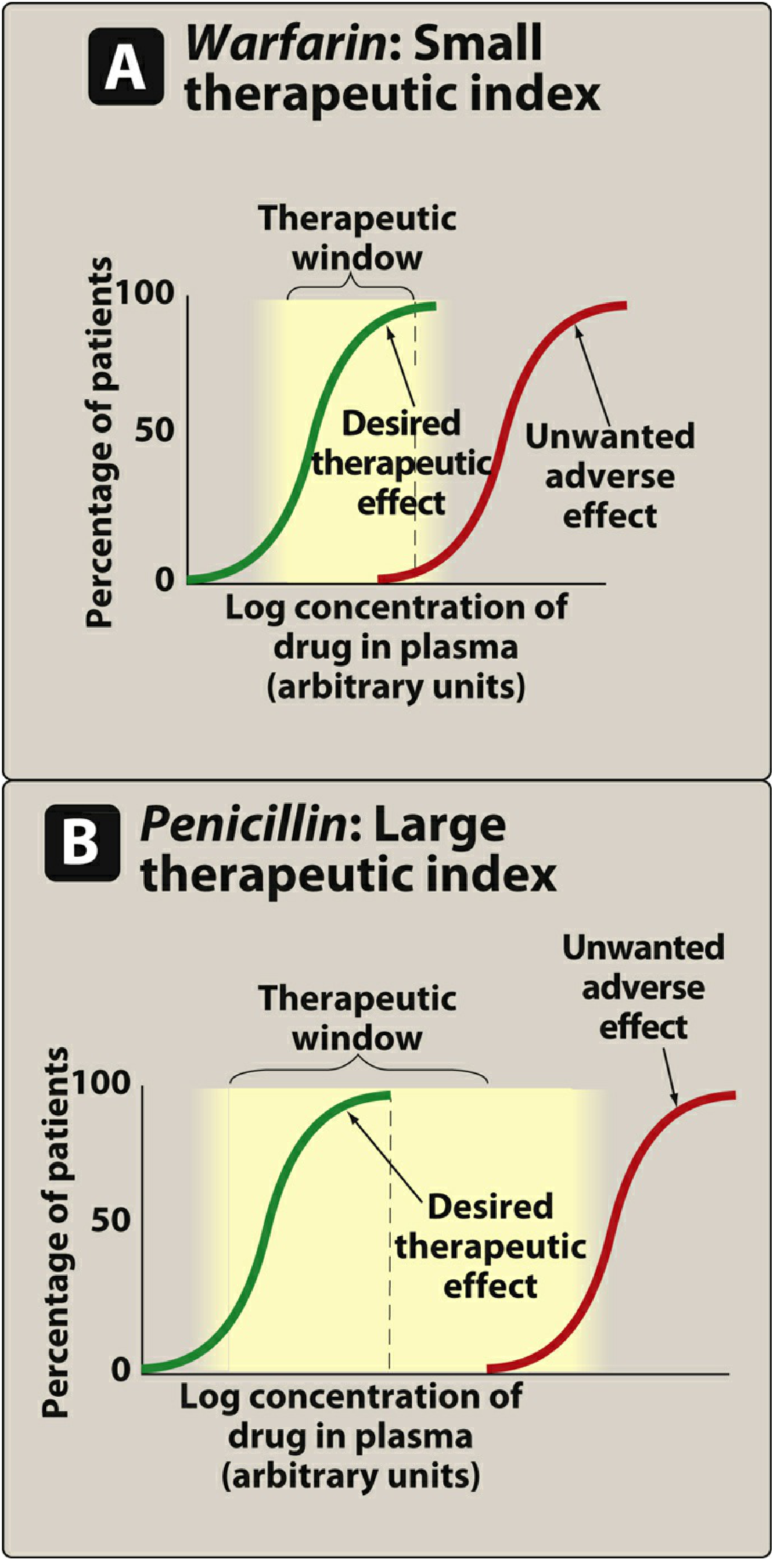
Figure: Green curve = desired therapeutic response; Red curve = toxic/adverse response. Yellow zone = therapeutic window.
Key parameters:
| Parameter | Definition |
|---|---|
| ED50 | Dose effective in 50% of the population |
| TD50 | Dose causing toxicity in 50% of the population |
| LD50 | Lethal dose in 50% of the population (used in animal studies) |
| Therapeutic Index (TI) | TI = TD50 / ED50 - larger value = safer drug |
Reading the graph:
- Warfarin (Panel A): The therapeutic (green) and toxic (red) curves are close together, meaning the therapeutic window is narrow. A small dose increase above the effective range causes bleeding. This demands careful monitoring.
- Penicillin (Panel B): The toxic curve is far to the right of the therapeutic curve - a very wide therapeutic window. You can give high doses without reaching toxic levels in most patients.
Drugs with low TI (digoxin, warfarin, lithium, aminoglycosides, theophylline) require therapeutic drug monitoring. - Lippincott Illustrated Reviews: Pharmacology, p. 108-110
6. Drug Concentration-Time Graph (Pharmacokinetics)
This graph plots plasma drug concentration (y-axis) vs. time after administration (x-axis):
Plasma           Peak (Cmax)
Concentration  ___
    |         /   \
    |        /     \___
    |       /           \___
    |______/                 \___
    |__________________________|___ Time
          Tmax         Half-life decay
Key features:
- Cmax - peak plasma concentration
- Tmax - time to peak concentration
- Half-life (t½) - time for plasma concentration to fall by 50%
- Area Under the Curve (AUC) - total drug exposure over time; used to calculate bioavailability
- On a log scale, first-order elimination appears as a straight line (exponential decay becomes linear)
- On a linear scale, elimination appears as a curve
Repeated dosing graph shows drug accumulating toward a steady state (typically reached after 4-5 half-lives) and then oscillating between a peak and trough concentration.
Summary Table of Graph Types
| Graph | X-axis | Y-axis | What it tells you |
|---|---|---|---|
| Graded dose-response (linear) | Drug concentration | % maximal effect | Potency (EC50), Efficacy (Emax) |
| Graded dose-response (log) | Log drug concentration | % maximal effect | Sigmoidal shape; easy comparison |
| Receptor binding | Drug concentration | Fraction receptors bound | Affinity (Kd) |
| Agonist comparison | Log concentration | Receptor activity | Full vs partial vs inverse agonist |
| Quantal | Log dose | % population responding | ED50, TD50, Therapeutic Index |
| Plasma concentration-time | Time | Drug concentration | t½, Cmax, AUC, bioavailability |
Source: Lippincott Illustrated Reviews: Pharmacology, 8th ed., Chapter 2 (Pharmacodynamics), pp. 95-110; Goodman & Gilman's The Pharmacological Basis of Therapeutics, Chapter 3 (Dose-Response)
This is a shared conversation. Sign in to Orris to start your own chat.