
Make this timeline much more presentable
A clean, modern, professional medical treatment timeline infographic titled "Treatment Timeline". The timeline is a horizontal flow with 6 milestone nodes arranged left to right, alternating above and below the central timeline bar for better spacing. Each node has a colored circle marker on the timeline connected by a vertical line to a card with the date and description. Node 1 (above): Date: "2023" | Description: "Started on steroids and maintenance therapy for SLE" Node 2 (below): Date: "2024" | Description: "Pulse steroids for flare with pericardial involvement" Node 3 (above): Date: "Dec 2025" | Description: "Cyclophosphamide induction + IV methylprednisolone followed by oral prednisolone for lupus nephritis flare" Node 4 (below): Date: "Jan 2026" | Description: "Diuretics, oxygen support, and antihypertensives for pulmonary edema" Node 5 (above): Date: "Mid-Jan 2026" | Description: "Escalated therapy for hypertensive crisis / suspected TMA" Node 6 (below): Date: "Feb 2026" | Description: "Antihypertensive therapy rationalized; continued on maintenance treatment" The central timeline bar is a deep teal/navy gradient with a right-pointing arrow ending in "Later". Above-timeline cards have a soft blue background with white text and rounded corners. Below-timeline cards have a light teal background with dark text and rounded corners. The timeline dots are bold and colored. The title "Treatment Timeline" is large, bold, dark navy at the top. White background. Clean medical presentation style with modern typography.
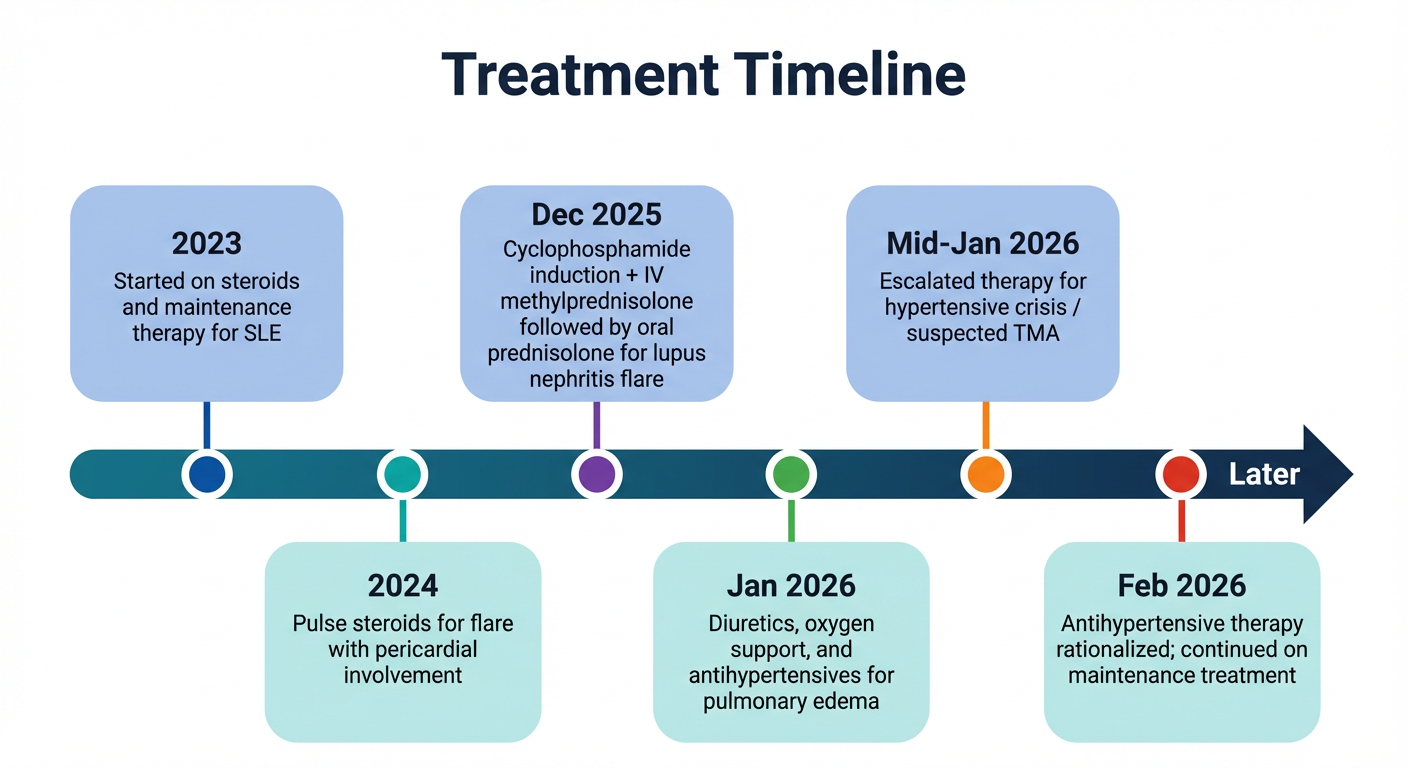
- Alternating layout — nodes alternate above and below the timeline, eliminating the cramped single-row design and giving each event more breathing room
- Color-coded cards — distinct background colors for above/below nodes make it easier to visually track each event
- Modern styling — rounded cards, bold circular markers, and a deep teal gradient timeline bar replace the flat dashed line and plain boxes
- Better typography — cleaner hierarchy between dates and descriptions
- Less clutter — the layout naturally spreads content horizontally without overlapping labels